


Introduction
Building a successful tattoo supply website requires more than simply putting products online. It demands a clear structure, intuitive navigation, and a design system that builds trust while guiding users toward purchase decisions. For a brand operating in a highly competitive niche like tattoo equipment, the website must balance professionalism, creativity, and usability.
In this project, we helped transform a tattoo supply business into a structured, conversion-focused WordPress website. From initial setup to refined page design, every step was guided by one goal: creating a seamless shopping experience that reflects the brand’s identity while maximizing usability and performance.
This case study explores how we approached the website construction process, how design and structure work together, and how strategic decisions shaped the final result.
| Deliver Time | Category | Application Platform |
| 9days | Tattoo | WordPress |
| Designers Involved | Cost | Effect |
| Nancy | $800 | Sales📈297% |
Understanding the Project Goals
Defining the Core Objectives
Before starting the build, we aligned on several key goals:
- Create a professional and trustworthy brand presence
- Organize a large catalog of tattoo products clearly
- Improve navigation for both beginners and professionals
- Optimize the site for conversions without overwhelming users
- Ensure scalability for future product expansion
These goals shaped both the structure of the WordPress build and the visual direction of the design.
Our WordPress Website Construction Approach
Building a Strong Structural Foundation
We approached the project by first establishing a clean and scalable site structure. Instead of focusing on visual elements immediately, we prioritized:
- Logical product categorization
- Clear navigation hierarchy
- Page consistency across the site
- Simplified user journeys
This ensured that every design decision later would sit on top of a solid foundation.
Structuring the Main Pages
We organized the website into several key page types:
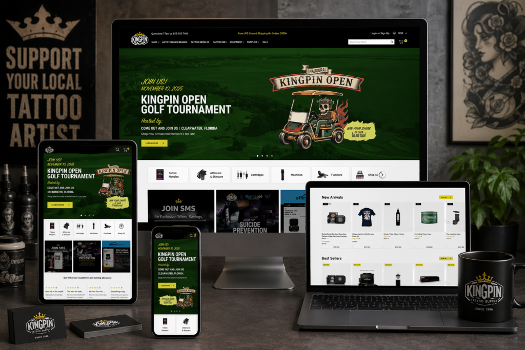
Homepage
The homepage serves as the central hub and first impression. It needed to:
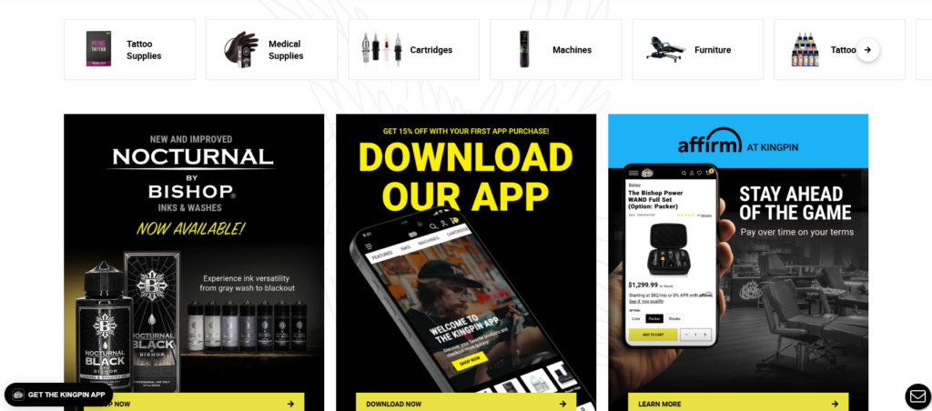
- Highlight core product categories
- Showcase featured and new products
- Reinforce brand identity
- Provide quick access to key sections
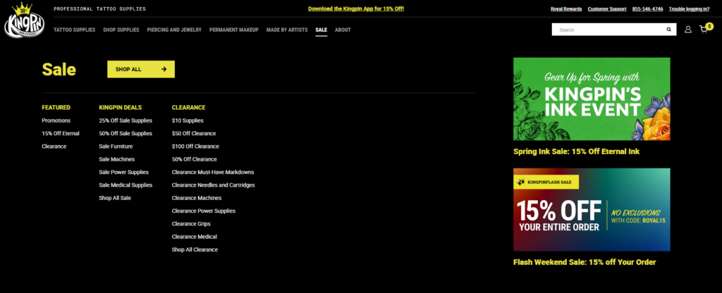
Category Pages
Each category page was designed to:
- Display products in a clean grid layout
- Allow easy browsing and filtering
- Maintain consistent spacing and typography
Product Pages
Product pages focus heavily on conversion:
- Clear product images and details
- Easy-to-scan descriptions
- Trust-building elements like reviews
Supporting Pages
We also structured:
- About page to build brand credibility
- Contact page for accessibility
- Blog section for long-term content strategy
Design Process and Visual Direction
Creating a Clean and Professional Look
In the tattoo industry, visual identity matters. We designed the website to feel:
- Bold but not overwhelming
- Modern and minimal
- Easy to navigate
We avoided clutter and focused on clear layouts that highlight the products.
Typography and Layout Decisions
We used:
- Strong, readable headings for hierarchy
- Clean body text for product descriptions
- Consistent spacing across all sections
This ensures users can quickly scan information without confusion.
Color Strategy
The color palette was carefully chosen to:
- Reflect the tattoo culture’s bold aesthetic
- Maintain readability and contrast
- Support product visibility
Homepage Design Breakdown
Hero Section
The hero section is the first visual users encounter. We designed it to:
- Showcase key products or collections
- Communicate the brand instantly
- Encourage immediate engagement
Product Highlights
We included sections for:
- Best sellers
- New arrivals
- Featured collections
These help guide users toward popular products quickly.
Category Navigation
Clear category blocks allow users to:
- Jump directly to what they need
- Reduce browsing friction
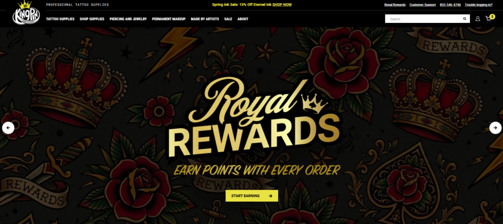
Trust Elements
To build credibility, we added:
- Customer reviews
- Brand messaging
- Professional imagery
Challenges We Encountered
Managing a Large Product Catalog
Tattoo supply stores often have extensive product ranges. The challenge was:
- Avoid overwhelming users
- Maintain clarity across categories
Balancing Style and Usability
Tattoo brands tend to favor strong visuals, but too much design can reduce usability. We needed to:
- Keep the design visually appealing
- Ensure it remains functional
Ensuring Consistency Across Pages
With multiple page types, maintaining consistency was critical:
- Layout uniformity
- Typography consistency
- Design system alignment
Our Solutions
Simplified Navigation Structure
We implemented a streamlined navigation system:
- Clear menu hierarchy
- Logical category grouping
- Minimal distractions
Modular Page Design
We used a modular approach:
- Reusable design sections
- Consistent layouts across pages
- Faster updates and scalability
Conversion-Focused Layouts
Every page was designed with conversion in mind:
- Clear calls to action
- Strategic product placement
- Reduced friction in user flow
Advantages of Our Approach
Improved User Experience
Users can:
- Find products faster
- Navigate effortlessly
- Understand the brand clearly
Strong Visual Identity
The design reinforces:
- Professionalism
- Brand consistency
- Industry relevance
Scalability for Growth
The structure allows:
- Easy addition of new products
- Expansion into new categories
- Future design updates
How Design and Structure Work Together
A key part of this project was ensuring that design and structure were not treated separately.
- Structure defines how users move
- Design enhances how users feel
By aligning both, we created a cohesive experience that supports both usability and branding.
Results and Impact
Better Navigation and Clarity
Users now experience:
- Faster browsing
- Clearer product organization
- Reduced confusion
Increased Engagement
The improved layout encourages:
- Longer browsing sessions
- More product exploration
Stronger Brand Presence
The website now communicates:
- Professionalism
- Trustworthiness
- Industry expertise
Our Methodology in Practice
Step 1: Research and Planning
We analyzed:
- Competitor websites
- User behavior expectations
- Industry standards
Step 2: Structure Design
We created:
- Site architecture
- Navigation systems
- Page frameworks
Step 3: Visual Design
We developed:
- Layout systems
- Typography hierarchy
- Color consistency
Step 4: Implementation
We built the site on WordPress with:
- Clean structure
- Flexible layouts
- Scalable components
Step 5: Optimization
We refined:
- User flow
- Page clarity
- Visual consistency
Why WordPress Was the Right Choice
WordPress provides:
- Flexibility for content and product management
- Easy scalability
- Strong ecosystem for eCommerce integration
For this project, it allowed us to focus on structure and design without unnecessary complexity.
Key Takeaways
- A successful website starts with structure, not visuals
- Clear navigation is essential for large catalogs
- Design should enhance usability, not compete with it
- Consistency across pages builds trust
- Conversion-focused layouts drive better results
Conclusion
This project demonstrates how thoughtful WordPress website construction can transform a tattoo supply business into a professional, scalable, and conversion-driven online store. By focusing on structure first and aligning design with user behavior, we created a site that not only looks strong but performs effectively.
At AIRSANG, we specialize in building and designing websites that prioritize clarity, user experience, and conversion. Our approach focuses on creating structured, scalable solutions that help brands grow in competitive markets—without relying on complex development or code-heavy processes.


Design and build a WordPress website or corporate site with a full eCommerce system for you.
Price range: $200.00 through $2,500.00Custom requirements or special quotations
Original price was: $2.00.$1.00Current price is: $1.00. Main Image Design for Amazon Home Physiotherapy Device Explained
Introduction: Building a Trustworthy Image for Home Therapy Devices on Amazon When designing the main image for a home therapy device on Amazon, our primary...

Main Image Design for Amazon Lipstick Conversion
Introduction: Designing a Lipstick Main Image That Sells on Amazon When we design a Main image for an Amazon lipstick, our responsibility goes far beyond...

How Hackers Steal WordPress Admin Emails (And How to Stop Them)
Let’s start with an uncomfortable truth: Your WordPress admin email is probably way more public than you think.And hackers? They love that. To them, your...

What Makes an Amazon Liquid Foundation Main Image Convert
Introduction Designing a Main image design for Amazon Liquid foundation is never just about making a product look beautiful. On Amazon, the main image and...

Designing an Effective Amazon Main Image for Filter Cartridges
Introduction Designing a Main image for Amazon is never just about making a product look attractive. It is about clarity, trust, and instant understanding—especially for...

Replay Attacks on WordPress: Real Threat or Overhyped Myth?
Let’s clear something up first. Replay attacks don’t look scary.They don’t smash passwords.They don’t inject evil code with green hacker text flying everywhere. They’re sneaky....

How to Duplicate WordPress Pages Without Breaking Anything
Let’s face it. Sometimes you don’t want to create a new page.You just want the same page… but slightly different. Same layout.Same blocks.Same settings. Because...

Five Pet WordPress Themes Compared
Introduction Choosing the right pet-related WordPress theme is more than a design decision—it directly affects usability, scalability, and long-term business growth. Pet care and pet...

Comparing Five Swimwear eCommerce Themes
Introduction Choosing the right theme for a swimwear or lingerie independent store is not just a visual decision—it directly affects conversion rates, scalability, and long-term...

How to Turn Off Comments in WordPress (Without Losing Your Mind)
Let’s talk about WordPress comments. In theory, comments are great.They encourage discussion.They build community.They make your website feel “alive.” In reality? They’re often a magnet...

Building a Scalable WordPress Website for a Science-Driven Brand: The AminoUSA Project
Introduction In today’s digital landscape, a website is more than a place to list products. For science-driven brands operating in regulated or research-focused industries, a...

Building a Scalable Shopify Store for a Global Blade Brand: The CoolKatana Project
Introduction In cross-border eCommerce, a Shopify website is more than a storefront.For brands operating in niche, culture-driven categories, the website must do far more than...

Designing a High-Conversion Shopify Store for Pokémon Cards
Introduction In the world of collectible eCommerce, especially within the Pokémon Trading Card Game (TCG) market, a website must do more than simply list products....

High-Converting Shopify Design for a Custom Brick Brand
Introduction In today’s competitive eCommerce landscape, especially in the personalized gift and collectible space, a Shopify website must do far more than display products. It...

How to Contact Shopify Support: Simple, Stress-Free Guide
Running a Shopify store should feel exciting—not confusing. When questions pop up or issues slow you down, Shopify offers several support paths depending on what...

How to Deactivate a Shopify Store: A Clear, Practical Guide
Deactivating a Shopify store isn’t complicated, but it does come with consequences many merchants overlook. This guide breaks the process down in a simple, educational...

Shopify Website Design Case Study for a Premium Floral Brand
Introduction In today’s competitive eCommerce landscape, a Shopify website must do far more than display products. It needs to communicate brand value instantly, guide users...

Shopify Design Case Study: Retro Gaming Store
Introduction In a highly competitive eCommerce environment, visual clarity and emotional connection often determine whether a visitor becomes a customer. This is especially true in...