


Introdução
Building a successful tattoo supply website requires more than simply putting products online. It demands a clear structure, intuitive navigation, and a design system that builds trust while guiding users toward purchase decisions. For a brand operating in a highly competitive niche like tattoo equipment, the website must balance professionalism, creativity, and usability.
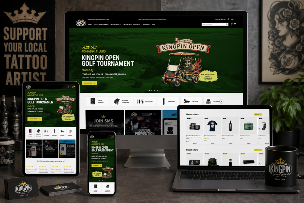
In this project, we helped transform a tattoo supply business into a structured, conversion-focused WordPress website. From initial setup to refined page design, every step was guided by one goal: creating a seamless shopping experience that reflects the brand’s identity while maximizing usability and performance.
This case study explores how we approached the website construction process, how design and structure work together, and how strategic decisions shaped the final result.
| Prazo de entrega | Categoria | Plataforma de Aplicação |
| 9 dias | Tattoo | WordPress |
| Designers envolvidos | Custo | Efeito |
| Nancy | $800 | Sales📈297% |
Understanding the Project Goals
Defining the Core Objectives
Before starting the build, we aligned on several key goals:
- Create a professional and trustworthy brand presence
- Organize a large catalog of tattoo products clearly
- Improve navigation for both beginners and professionals
- Optimize the site for conversions without overwhelming users
- Ensure scalability for future product expansion
These goals shaped both the structure of the WordPress build and the visual direction of the design.
Our WordPress Website Construction Approach
Building a Strong Structural Foundation
We approached the project by first establishing a clean and scalable site structure. Instead of focusing on visual elements immediately, we prioritized:
- Logical product categorization
- Clear navigation hierarchy
- Page consistency across the site
- Simplified user journeys
This ensured that every design decision later would sit on top of a solid foundation.
Structuring the Main Pages
We organized the website into several key page types:
Página inicial
The homepage serves as the central hub and first impression. It needed to:
- Highlight core product categories
- Showcase featured and new products
- Reinforce brand identity
- Provide quick access to key sections
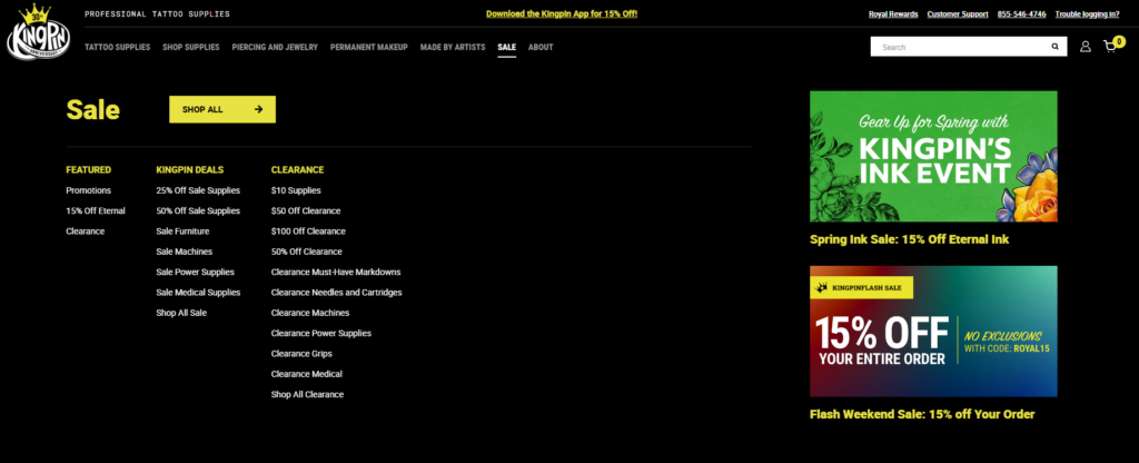
Category Pages
Each category page was designed to:
- Display products in a clean grid layout
- Allow easy browsing and filtering
- Maintain consistent spacing and typography
Product Pages
Product pages focus heavily on conversion:
- Clear product images and details
- Easy-to-scan descriptions
- Trust-building elements like reviews
Supporting Pages
We also structured:
- About page to build brand credibility
- Contact page for accessibility
- Blog section for long-term content strategy
Design Process and Visual Direction
Creating a Clean and Professional Look
In the tattoo industry, visual identity matters. We designed the website to feel:
- Bold but not overwhelming
- Modern and minimal
- Easy to navigate
We avoided clutter and focused on clear layouts that highlight the products.
Typography and Layout Decisions
Utilizamos:
- Strong, readable headings for hierarchy
- Clean body text for product descriptions
- Consistent spacing across all sections
This ensures users can quickly scan information without confusion.
Color Strategy
The color palette was carefully chosen to:
- Reflect the tattoo culture’s bold aesthetic
- Maintain readability and contrast
- Support product visibility
Homepage Design Breakdown
Hero Section
The hero section is the first visual users encounter. We designed it to:
- Showcase key products or collections
- Communicate the brand instantly
- Encourage immediate engagement
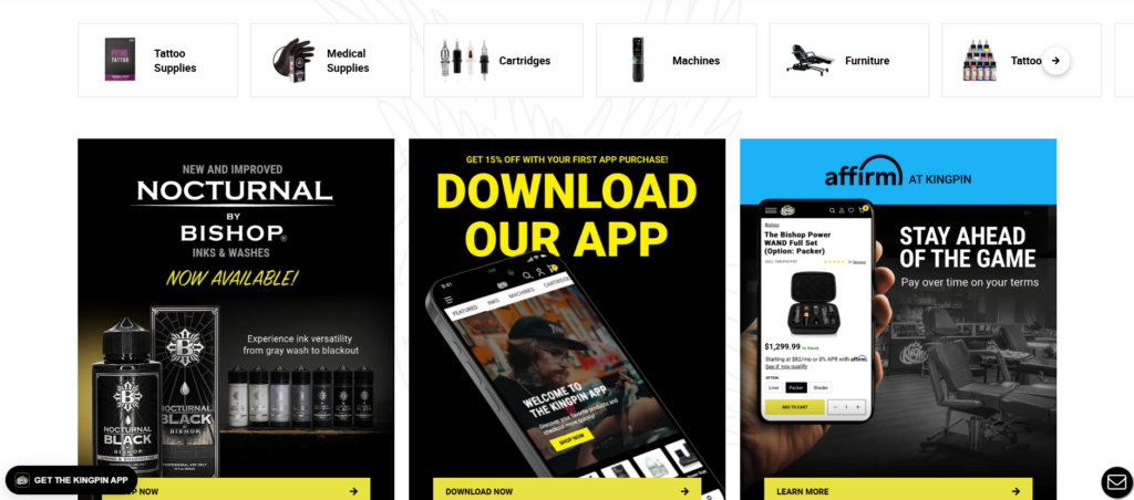
Product Highlights
We included sections for:
- Best sellers
- Novos recém-chegados
- Coleções em destaque
These help guide users toward popular products quickly.
Category Navigation
Clear category blocks allow users to:
- Jump directly to what they need
- Reduce browsing friction
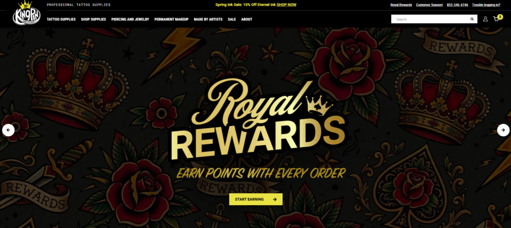
Trust Elements
To build credibility, we added:
- Avaliações de clientes
- Brand messaging
- Professional imagery
Desafios que encontramos
Managing a Large Product Catalog
Tattoo supply stores often have extensive product ranges. The challenge was:
- Avoid overwhelming users
- Maintain clarity across categories
Balancing Style and Usability
Tattoo brands tend to favor strong visuals, but too much design can reduce usability. We needed to:
- Keep the design visually appealing
- Ensure it remains functional
Ensuring Consistency Across Pages
With multiple page types, maintaining consistency was critical:
- Layout uniformity
- Typography consistency
- Design system alignment
Nossas soluções
Simplified Navigation Structure
We implemented a streamlined navigation system:
- Clear menu hierarchy
- Logical category grouping
- Minimal distractions
Design de página modular
We used a modular approach:
- Reusable design sections
- Consistent layouts across pages
- Faster updates and scalability
Layouts focados em conversão
Every page was designed with conversion in mind:
- Chamadas claras à ação
- Strategic product placement
- Reduced friction in user flow
Advantages of Our Approach
Experiência do usuário aprimorada
Users can:
- Find products faster
- Navigate effortlessly
- Understand the brand clearly
Strong Visual Identity
The design reinforces:
- Professionalism
- Consistência da marca
- Relevância para o setor
Scalability for Growth
The structure allows:
- Easy addition of new products
- Expansion into new categories
- Future design updates
How Design and Structure Work Together
A key part of this project was ensuring that design and structure were not treated separately.
- Structure defines how users move
- Design enhances how users feel
By aligning both, we created a cohesive experience that supports both usability and branding.
Resultados e impacto
Better Navigation and Clarity
Users now experience:
- Faster browsing
- Clearer product organization
- Reduced confusion
Increased Engagement
The improved layout encourages:
- Sessões de navegação mais longas
- More product exploration
Stronger Brand Presence
The website now communicates:
- Professionalism
- Trustworthiness
- Industry expertise
Nossa metodologia na prática
Step 1: Research and Planning
Analisamos:
- Sites concorrentes
- User behavior expectations
- Industry standards
Step 2: Structure Design
We created:
- Site architecture
- Navigation systems
- Page frameworks
Step 3: Visual Design
We developed:
- Layout systems
- Hierarquia tipográfica
- Color consistency
Step 4: Implementation
We built the site on WordPress with:
- Clean structure
- Flexible layouts
- Scalable components
Step 5: Optimization
We refined:
- Fluxo do usuário
- Page clarity
- Visual consistency
Por que o WordPress foi a escolha certa
WordPress provides:
- Flexibility for content and product management
- Easy scalability
- Strong ecosystem for eCommerce integration
For this project, it allowed us to focus on structure and design without unnecessary complexity.
Key Takeaways
- A successful website starts with structure, not visuals
- Clear navigation is essential for large catalogs
- Design should enhance usability, not compete with it
- Consistency across pages builds trust
- Conversion-focused layouts drive better results
Conclusão
Este projeto demonstra o quão atencioso é WordPress website construction can transform a tattoo supply business into a professional, scalable, and conversion-driven online store. By focusing on structure first and aligning design with user behavior, we created a site that not only looks strong but performs effectively.
Em AIRSANG, we specialize in building and designing websites that prioritize clarity, user experience, and conversion. Our approach focuses on creating structured, scalable solutions that help brands grow in competitive markets—without relying on complex development or code-heavy processes.


Conceber e construir um sítio Web WordPress ou um sítio empresarial com um sistema de comércio eletrónico completo para si.
Faixa de preço: $200.00 a $2,500.00custom-requirements-or-special-quotations
O preço original era: $2.00.$1.00O preço atual é: $1.00. Explicação do design da imagem principal para o dispositivo de fisioterapia doméstica da Amazon
Introdução: Construindo uma imagem confiável para dispositivos de terapia doméstica na Amazon Ao projetar a imagem principal de um dispositivo de terapia doméstica na Amazon, nosso principal...

Design da imagem principal para conversão de batom da Amazon
Introdução: Conceber uma imagem principal de batom que vende na Amazon Quando concebemos uma imagem principal para um batom da Amazon, a nossa responsabilidade vai muito além...

Como os hackers roubam e-mails de administradores do WordPress (e como impedi-los)
Vamos começar com uma verdade incómoda: o seu e-mail de administrador do WordPress é provavelmente muito mais público do que pensa e os hackers? Eles adoram isso. Para eles, o seu...

O que faz uma base líquida da Amazon converter a imagem principal?
Introdução: Criar uma imagem principal para a base líquida da Amazon não se resume apenas a deixar o produto bonito. Na Amazon, a imagem principal e...

Como projetar uma imagem principal eficaz para cartuchos de filtro Amazon
Introdução: Criar uma imagem principal para a Amazon nunca se resume apenas a tornar um produto atraente. Trata-se de clareza, confiança e compreensão imediata — especialmente para...

Ataques de repetição no WordPress: ameaça real ou mito exagerado?
Vamos esclarecer uma coisa primeiro. Ataques de repetição não parecem assustadores. Eles não quebram senhas. Eles não injetam código malicioso com texto verde de hacker voando por toda parte. Eles são sorrateiros...

Como duplicar páginas do WordPress sem danificar nada
Vamos ser sinceros. Às vezes você não quer criar uma página nova. Você só quer a mesma página… mas um pouco diferente. Mesmo layout. Mesmos blocos. Mesmas configurações. Porque….

Comparativo de cinco temas WordPress para animais de estimação
Introdução Escolher o tema WordPress certo para o seu negócio de animais de estimação é mais do que uma decisão de design — afeta diretamente a usabilidade, a escalabilidade e o crescimento a longo prazo. Cuidados com animais de estimação e...

Comparando cinco temas de e-commerce de moda praia
Introdução: Escolher o tema certo para uma loja independente de moda praia ou lingerie não é apenas uma decisão visual — afeta diretamente as taxas de conversão, a escalabilidade e o sucesso a longo prazo...

Como desativar os comentários no WordPress (sem enlouquecer)
Vamos falar sobre os comentários do WordPress. Em teoria, os comentários são ótimos. Eles incentivam a discussão, constroem comunidade e dão vida ao seu site. Na prática? Muitas vezes, eles atraem...

Criando um site WordPress escalável para uma marca voltada para a ciência: o projeto AminoUSA
Introdução No cenário digital atual, um website é mais do que um lugar para listar produtos. Para marcas com foco em ciência que atuam em setores regulamentados ou voltados para pesquisa, um...

Construindo uma loja Shopify escalável para uma marca global de lâminas: O Projeto CoolKatana
Introdução No comércio eletrônico internacional, um site Shopify é muito mais do que uma vitrine. Para marcas que atuam em nichos de mercado e categorias culturais específicas, o site precisa fazer muito mais do que...

Criando uma loja Shopify de alta conversão para cartas Pokémon.
Introdução No mundo do comércio eletrônico de itens colecionáveis, especialmente no mercado do Pokémon Trading Card Game (TCG), um site precisa fazer mais do que simplesmente listar produtos...

Design Shopify de alta conversão para uma marca de tijolos personalizada.
Introdução No cenário competitivo do comércio eletrônico atual, especialmente no segmento de presentes personalizados e itens colecionáveis, um site Shopify precisa fazer muito mais do que simplesmente exibir produtos. Ele...

Como entrar em contato com o suporte da Shopify: um guia simples e sem complicações.
Gerir uma loja Shopify deve ser uma experiência empolgante, não confusa. Quando surgem dúvidas ou problemas que atrapalham o seu trabalho, a Shopify oferece diversas opções de suporte, dependendo da situação.

Como desativar uma loja Shopify: um guia claro e prático
Desativar uma loja Shopify não é complicado, mas acarreta consequências que muitos lojistas ignoram. Este guia explica o processo de forma simples e didática...

Estudo de caso de design de website Shopify para uma marca de flores premium
Introdução No cenário competitivo do comércio eletrônico atual, um site Shopify precisa fazer muito mais do que exibir produtos. Ele precisa comunicar o valor da marca instantaneamente, guiar os usuários...

Estudo de Caso de Design da Shopify: Loja de Jogos Retrô
Introdução Em um ambiente de comércio eletrônico altamente competitivo, a clareza visual e a conexão emocional muitas vezes determinam se um visitante se torna um cliente. Isso é especialmente verdadeiro em...