


소개
Building a successful tattoo supply website requires more than simply putting products online. It demands a clear structure, intuitive navigation, and a design system that builds trust while guiding users toward purchase decisions. For a brand operating in a highly competitive niche like tattoo equipment, the website must balance professionalism, creativity, and usability.
In this project, we helped transform a tattoo supply business into a structured, conversion-focused WordPress website. From initial setup to refined page design, every step was guided by one goal: creating a seamless shopping experience that reflects the brand’s identity while maximizing usability and performance.
This case study explores how we approached the website construction process, how design and structure work together, and how strategic decisions shaped the final result.
| 배송 시간 | 범주 | 애플리케이션 플랫폼 |
| 9일 | Tattoo | 워드프레스 |
| 참여 디자이너 | 비용 | 효과 |
| 낸시 | $800 | Sales📈297% |
Understanding the Project Goals
Defining the Core Objectives
Before starting the build, we aligned on several key goals:
- Create a professional and trustworthy brand presence
- Organize a large catalog of tattoo products clearly
- Improve navigation for both beginners and professionals
- Optimize the site for conversions without overwhelming users
- Ensure scalability for future product expansion
These goals shaped both the structure of the WordPress build and the visual direction of the design.
Our WordPress Website Construction Approach
Building a Strong Structural Foundation
We approached the project by first establishing a clean and scalable site structure. Instead of focusing on visual elements immediately, we prioritized:
- Logical product categorization
- Clear navigation hierarchy
- Page consistency across the site
- Simplified user journeys
This ensured that every design decision later would sit on top of a solid foundation.
Structuring the Main Pages
We organized the website into several key page types:
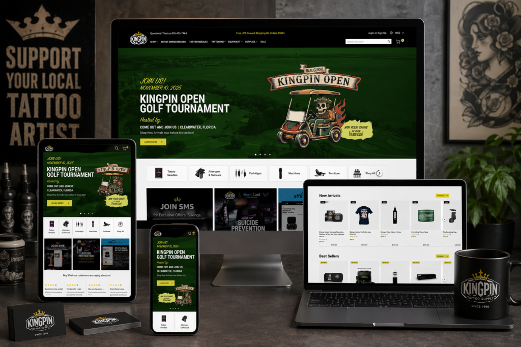
홈페이지
The homepage serves as the central hub and first impression. It needed to:
- Highlight core product categories
- Showcase featured and new products
- Reinforce brand identity
- Provide quick access to key sections
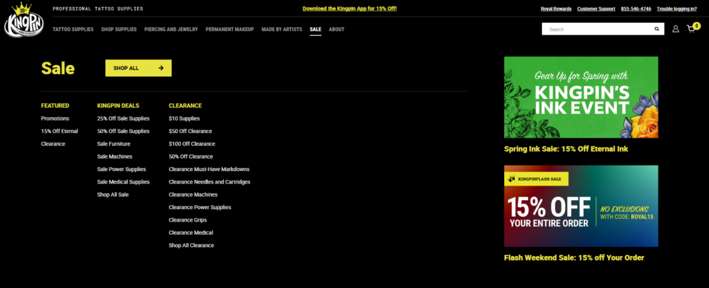
Category Pages
Each category page was designed to:
- Display products in a clean grid layout
- Allow easy browsing and filtering
- Maintain consistent spacing and typography
Product Pages
Product pages focus heavily on conversion:
- Clear product images and details
- Easy-to-scan descriptions
- Trust-building elements like reviews
Supporting Pages
We also structured:
- About page to build brand credibility
- Contact page for accessibility
- Blog section for long-term content strategy
Design Process and Visual Direction
Creating a Clean and Professional Look
In the tattoo industry, visual identity matters. We designed the website to feel:
- Bold but not overwhelming
- Modern and minimal
- Easy to navigate
We avoided clutter and focused on clear layouts that highlight the products.
Typography and Layout Decisions
우리는 다음을 사용했습니다:
- Strong, readable headings for hierarchy
- Clean body text for product descriptions
- Consistent spacing across all sections
This ensures users can quickly scan information without confusion.
Color Strategy
The color palette was carefully chosen to:
- Reflect the tattoo culture’s bold aesthetic
- Maintain readability and contrast
- Support product visibility
홈페이지 디자인 분석
Hero Section
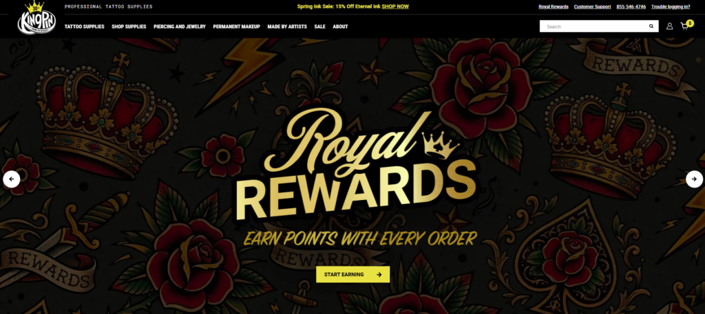
The hero section is the first visual users encounter. We designed it to:
- Showcase key products or collections
- Communicate the brand instantly
- Encourage immediate engagement
Product Highlights
We included sections for:
- Best sellers
- 신상품
- 주요 컬렉션
These help guide users toward popular products quickly.
Category Navigation
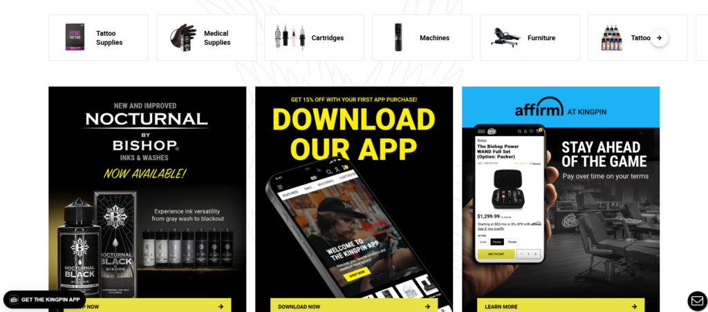
Clear category blocks allow users to:
- Jump directly to what they need
- Reduce browsing friction
Trust Elements
To build credibility, we added:
- Customer reviews
- Brand messaging
- Professional imagery
우리가 직면했던 어려움
Managing a Large Product Catalog
Tattoo supply stores often have extensive product ranges. The challenge was:
- Avoid overwhelming users
- Maintain clarity across categories
Balancing Style and Usability
Tattoo brands tend to favor strong visuals, but too much design can reduce usability. We needed to:
- Keep the design visually appealing
- Ensure it remains functional
Ensuring Consistency Across Pages
With multiple page types, maintaining consistency was critical:
- Layout uniformity
- Typography consistency
- Design system alignment
당사의 솔루션
Simplified Navigation Structure
We implemented a streamlined navigation system:
- Clear menu hierarchy
- Logical category grouping
- Minimal distractions
모듈형 페이지 디자인
We used a modular approach:
- Reusable design sections
- Consistent layouts across pages
- Faster updates and scalability
전환율 중심 레이아웃
Every page was designed with conversion in mind:
- 명확한 행동 촉구
- Strategic product placement
- Reduced friction in user flow
Advantages of Our Approach
사용자 경험 개선
Users can:
- Find products faster
- Navigate effortlessly
- Understand the brand clearly
Strong Visual Identity
The design reinforces:
- Professionalism
- 브랜드 일관성
- 산업적 관련성
Scalability for Growth
The structure allows:
- Easy addition of new products
- Expansion into new categories
- Future design updates
How Design and Structure Work Together
A key part of this project was ensuring that design and structure were not treated separately.
- Structure defines how users move
- Design enhances how users feel
By aligning both, we created a cohesive experience that supports both usability and branding.
결과 및 영향
Better Navigation and Clarity
Users now experience:
- Faster browsing
- Clearer product organization
- Reduced confusion
Increased Engagement
The improved layout encourages:
- 더 긴 브라우징 세션
- More product exploration
Stronger Brand Presence
The website now communicates:
- Professionalism
- Trustworthiness
- Industry expertise
Our Methodology in Practice
Step 1: Research and Planning
We analyzed:
- Competitor websites
- User behavior expectations
- Industry standards
Step 2: Structure Design
We created:
- Site architecture
- Navigation systems
- Page frameworks
Step 3: Visual Design
We developed:
- Layout systems
- 타이포그래피 계층 구조
- Color consistency
Step 4: Implementation
We built the site on WordPress with:
- Clean structure
- Flexible layouts
- Scalable components
Step 5: Optimization
We refined:
- 사용자 흐름
- Page clarity
- 시각적 일관성
워드프레스가 올바른 선택이었던 이유
WordPress provides:
- Flexibility for content and product management
- Easy scalability
- Strong ecosystem for eCommerce integration
For this project, it allowed us to focus on structure and design without unnecessary complexity.
Key Takeaways
- A successful website starts with structure, not visuals
- Clear navigation is essential for large catalogs
- Design should enhance usability, not compete with it
- Consistency across pages builds trust
- Conversion-focused layouts drive better results
결론
이 프로젝트는 얼마나 사려 깊은지를 보여줍니다. 워드프레스 website construction can transform a tattoo supply business into a professional, scalable, and conversion-driven online store. By focusing on structure first and aligning design with user behavior, we created a site that not only looks strong but performs effectively.
에서 AIRSANG, we specialize in building and designing websites that prioritize clarity, user experience, and conversion. Our approach focuses on creating structured, scalable solutions that help brands grow in competitive markets—without relying on complex development or code-heavy processes.


완전한 전자상거래 시스템을 갖춘 워드프레스 웹사이트 또는 기업 사이트를 디자인하고 구축하세요.
가격 범위: $200.00~$2,500.00custom-requirements-or-special-quotations
원래 가격: $2.00.$1.00현재 가격: $1.00. 아마존 가정용 물리치료 기기 메인 이미지 디자인 설명
소개 소개: 아마존에서 홈 테라피 기기의 신뢰할 수 있는 이미지 구축 아마존에서 홈 테라피 기기의 기본 이미지를 디자인할 때 기본 ...

아마존 립스틱 전환을 위한 메인 이미지 디자인
소개: 소개: 아마존에서 판매되는 립스틱 메인 이미지 디자인하기 아마존 립스틱의 메인 이미지를 디자인할 때 우리의 책임은 그 이상입니다.

해커들이 워드프레스 관리자 이메일을 훔치는 방법(그리고 이를 막는 방법)
불편한 진실부터 말씀드리자면, 워드프레스 관리자 이메일은 생각보다 훨씬 더 많이 공개되어 있습니다. 그들은 그것을 좋아합니다. 해커에게 여러분의...

아마존 리퀴드 파운데이션 메인 이미지 변환의 특징은 무엇일까요?
서론 아마존 리퀴드 파운데이션의 메인 이미지 디자인은 단순히 제품을 아름답게 보이게 하는 것만이 아닙니다. 아마존에서 메인 이미지와...

필터 카트리지 제품을 위한 효과적인 아마존 메인 이미지 디자인하기
서론 아마존 메인 이미지 디자인은 단순히 제품을 매력적으로 보이게 하는 것만이 아닙니다. 명확성, 신뢰, 그리고 즉각적인 이해를 제공하는 것이 중요합니다. 특히...

워드프레스에 대한 리플레이 공격: 실제 위협인가, 과장된 신화인가?
먼저 한 가지를 분명히 해두죠. 리플레이 공격은 겉보기에 무섭지 않습니다. 비밀번호를 날려버리지도 않고, 초록색 해커 텍스트가 사방에 흩날리는 악성 코드를 주입하지도 않습니다. 그저 교묘하게 이루어질 뿐입니다.

WordPress 페이지를 손상 없이 복제하는 방법
솔직히 말해봅시다. 때로는 새 페이지를 만들고 싶지 않을 때가 있죠. 그냥 기존 페이지를 약간만 다르게 하고 싶을 때가 있어요. 레이아웃도, 블록도, 설정도 그대로요. 왜냐하면...

반려동물 관련 워드프레스 테마 5가지 비교
서론 반려동물 관련 워드프레스 테마를 선택하는 것은 단순한 디자인 결정 이상의 의미를 지닙니다. 사용성, 확장성, 그리고 장기적인 비즈니스 성장에 직접적인 영향을 미치기 때문입니다. 반려동물 관리 및 관련...

수영복 온라인 쇼핑몰 테마 5가지 비교
서론 수영복이나 란제리 독립 매장에 적합한 테마를 선택하는 것은 단순히 시각적인 결정에 그치는 것이 아니라, 전환율, 확장성, 그리고 장기적인 성공에 직접적인 영향을 미칩니다.

워드프레스에서 댓글 기능을 끄는 방법 (정신줄 놓지 않고)
워드프레스 댓글에 대해 이야기해 봅시다. 이론적으로 댓글은 훌륭합니다. 토론을 장려하고, 커뮤니티를 형성하며, 웹사이트에 생동감을 불어넣습니다. 하지만 현실은 어떨까요? 댓글은 종종 문제를 야기하기도 합니다...

과학 중심 브랜드를 위한 확장 가능한 워드프레스 웹사이트 구축: 아미노USA 프로젝트
서론 오늘날의 디지털 환경에서 웹사이트는 단순히 제품을 나열하는 공간 이상의 의미를 지닙니다. 규제 산업이나 연구 중심 산업에서 활동하는 과학 기반 브랜드에게 웹사이트는 더욱 중요한 역할을 합니다.

글로벌 블레이드 브랜드를 위한 확장 가능한 쇼피파이 스토어 구축: 쿨카타나 프로젝트
서론: 국경을 넘나드는 전자상거래에서 Shopify 웹사이트는 단순한 매장 이상의 의미를 지닙니다. 특정 문화권에서 사업을 운영하는 브랜드의 경우, 웹사이트는 단순한 판매 공간을 넘어 훨씬 더 많은 기능을 수행해야 합니다.

포켓몬 카드 판매를 위한 높은 전환율을 자랑하는 쇼피파이 스토어 디자인하기
서론 수집품 전자상거래, 특히 포켓몬 트레이딩 카드 게임(TCG) 시장에서 웹사이트는 단순히 제품 목록을 나열하는 것 이상의 역할을 해야 합니다.

맞춤형 오프라인 브랜드에 최적화된 전환율 높은 쇼피파이 디자인
서론 오늘날 경쟁이 치열한 전자상거래 환경, 특히 맞춤형 선물 및 수집품 분야에서 Shopify 웹사이트는 단순히 제품을 전시하는 것 이상의 역할을 해야 합니다. ...

Shopify 고객 지원팀에 문의하는 방법: 간단하고 스트레스 없는 가이드
쇼피파이 스토어 운영은 흥미진진해야지 혼란스러워서는 안 됩니다. 궁금한 점이 생기거나 문제가 발생하여 진행이 늦어질 때, 쇼피파이는 상황에 따라 다양한 지원 경로를 제공합니다.

쇼피파이 스토어 비활성화 방법: 명확하고 실용적인 가이드
쇼피파이 스토어를 비활성화하는 것은 복잡하지 않지만, 많은 판매자가 간과하는 몇 가지 결과가 따릅니다. 이 가이드에서는 비활성화 과정을 간단하고 유익하게 설명합니다.

프리미엄 꽃집 브랜드를 위한 쇼피파이 웹사이트 디자인 사례 연구
서론 오늘날 경쟁이 치열한 전자상거래 환경에서 Shopify 웹사이트는 단순히 제품을 보여주는 것 이상의 역할을 해야 합니다. 브랜드 가치를 즉시 전달하고 사용자를 안내해야 합니다...

Shopify 디자인 사례 연구: 레트로 게임 스토어
서론: 경쟁이 치열한 전자상거래 환경에서 시각적 명확성과 감정적 연결은 방문자가 고객이 될지 여부를 결정짓는 중요한 요소입니다. 특히 다음과 같은 경우에 더욱 그렇습니다...