Introduction
Building a successful tattoo supply website requires more than simply putting products online. It demands a clear structure, intuitive navigation, and a design system that builds trust while guiding users toward purchase decisions. For a brand operating in a highly competitive niche like tattoo equipment, the website must balance professionalism, creativity, and usability.
In this project, we helped transform a tattoo supply business into a structured, conversion-focused WordPress website. From initial setup to refined page design, every step was guided by one goal: creating a seamless shopping experience that reflects the brand’s identity while maximizing usability and performance.
This case study explores how we approached the website construction process, how design and structure work together, and how strategic decisions shaped the final result.
| Délai de livraison | Catégorie | Plateforme d'application |
| 9 jours | Tattoo | WordPress |
| Concepteurs impliqués | Coût | Effet |
| Nancy | $800 | Sales📈297% |
Comprendre les objectifs du projet
Defining the Core Objectives
Before starting the build, we aligned on several key goals:
- Create a professional and trustworthy brand presence
- Organize a large catalog of tattoo products clearly
- Improve navigation for both beginners and professionals
- Optimize the site for conversions without overwhelming users
- Ensure scalability for future product expansion
These goals shaped both the structure of the WordPress build and the visual direction of the design.
Our WordPress Website Construction Approach
Building a Strong Structural Foundation
We approached the project by first establishing a clean and scalable site structure. Instead of focusing on visual elements immediately, we prioritized:
- Logical product categorization
- Clear navigation hierarchy
- Page consistency across the site
- Simplified user journeys
This ensured that every design decision later would sit on top of a solid foundation.
Structuring the Main Pages
We organized the website into several key page types:
Page d'accueil
The homepage serves as the central hub and first impression. It needed to:
- Highlight core product categories
- Showcase featured and new products
- Reinforce brand identity
- Provide quick access to key sections
Category Pages
Each category page was designed to:
- Display products in a clean grid layout
- Allow easy browsing and filtering
- Maintain consistent spacing and typography
Product Pages
Product pages focus heavily on conversion:
- Clear product images and details
- Easy-to-scan descriptions
- Trust-building elements like reviews
Supporting Pages
We also structured:
- About page to build brand credibility
- Contact page for accessibility
- Blog section for long-term content strategy
Design Process and Visual Direction
Creating a Clean and Professional Look
In the tattoo industry, visual identity matters. We designed the website to feel:
- Bold but not overwhelming
- Modern and minimal
- Easy to navigate
We avoided clutter and focused on clear layouts that highlight the products.
Typography and Layout Decisions
Nous avons utilisé :
- Strong, readable headings for hierarchy
- Clean body text for product descriptions
- Consistent spacing across all sections
This ensures users can quickly scan information without confusion.
Color Strategy
The color palette was carefully chosen to:
- Reflect the tattoo culture’s bold aesthetic
- Maintain readability and contrast
- Support product visibility
Homepage Design Breakdown
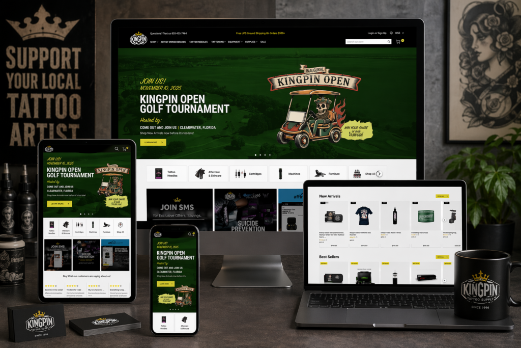
Hero Section
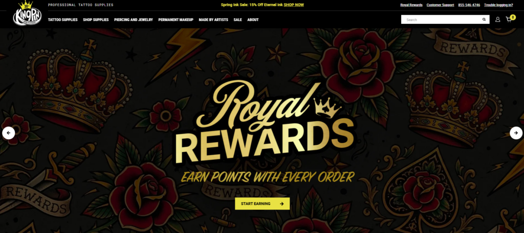
The hero section is the first visual users encounter. We designed it to:
- Showcase key products or collections
- Communicate the brand instantly
- Encourage immediate engagement
Product Highlights
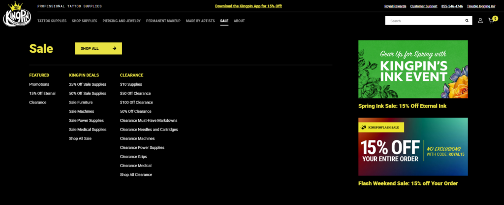
We included sections for:
- Best sellers
- Nouveautés
- Collections en vedette
These help guide users toward popular products quickly.
Category Navigation
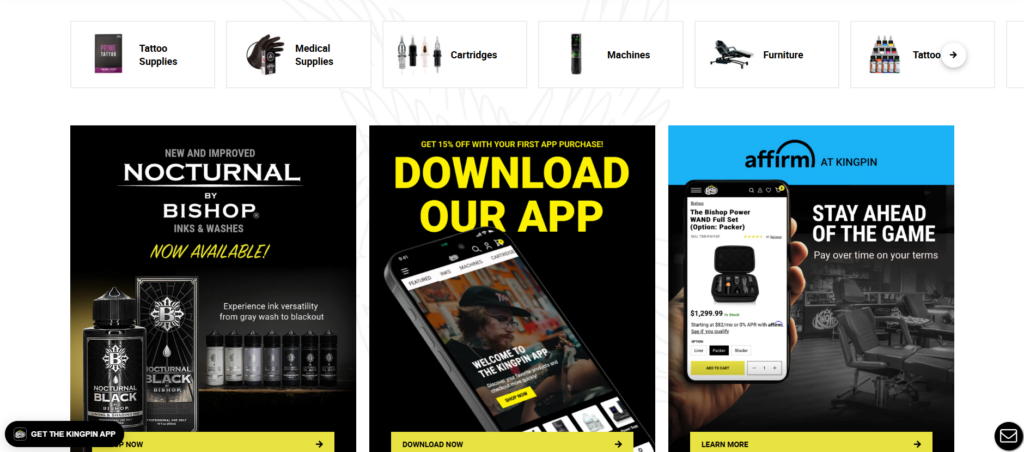
Clear category blocks allow users to:
- Jump directly to what they need
- Reduce browsing friction
Trust Elements
To build credibility, we added:
- Customer reviews
- Brand messaging
- Professional imagery
Les défis que nous avons rencontrés
Managing a Large Product Catalog
Tattoo supply stores often have extensive product ranges. The challenge was:
- Avoid overwhelming users
- Maintain clarity across categories
Balancing Style and Usability
Tattoo brands tend to favor strong visuals, but too much design can reduce usability. We needed to:
- Keep the design visually appealing
- Ensure it remains functional
Ensuring Consistency Across Pages
With multiple page types, maintaining consistency was critical:
- Layout uniformity
- Typography consistency
- Design system alignment
Nos solutions
Simplified Navigation Structure
We implemented a streamlined navigation system:
- Hiérarchie du menu claire
- Logical category grouping
- Minimal distractions
Conception de page modulaire
We used a modular approach:
- Reusable design sections
- Consistent layouts across pages
- Faster updates and scalability
Mises en page axées sur la conversion
Every page was designed with conversion in mind:
- Des appels à l'action clairs
- Strategic product placement
- Reduced friction in user flow
Advantages of Our Approach
Expérience utilisateur améliorée
Users can:
- Find products faster
- Navigate effortlessly
- Understand the brand clearly
Strong Visual Identity
The design reinforces:
- Professionalism
- Cohérence de la marque
- Pertinence pour l'industrie
Scalability for Growth
The structure allows:
- Easy addition of new products
- Expansion into new categories
- Future design updates
How Design and Structure Work Together
A key part of this project was ensuring that design and structure were not treated separately.
- Structure defines how users move
- Design enhances how users feel
By aligning both, we created a cohesive experience that supports both usability and branding.
Résultats et impact
Better Navigation and Clarity
Users now experience:
- Faster browsing
- Clearer product organization
- Reduced confusion
Increased Engagement
The improved layout encourages:
- Sessions de navigation plus longues
- More product exploration
Stronger Brand Presence
The website now communicates:
- Professionalism
- Trustworthiness
- Industry expertise
Our Methodology in Practice
Step 1: Research and Planning
We analyzed:
- Competitor websites
- User behavior expectations
- Industry standards
Step 2: Structure Design
We created:
- Site architecture
- Navigation systems
- Page frameworks
Step 3: Visual Design
We developed:
- Layout systems
- Hiérarchie typographique
- Color consistency
Step 4: Implementation
We built the site on WordPress with:
- Clean structure
- Flexible layouts
- Scalable components
Step 5: Optimization
We refined:
- Flux utilisateur
- Page clarity
- Visual consistency
Pourquoi WordPress était le bon choix
WordPress provides:
- Flexibility for content and product management
- Easy scalability
- Strong ecosystem for eCommerce integration
For this project, it allowed us to focus on structure and design without unnecessary complexity.
Key Takeaways
- A successful website starts with structure, not visuals
- Clear navigation is essential for large catalogs
- Design should enhance usability, not compete with it
- Consistency across pages builds trust
- Conversion-focused layouts drive better results
Conclusion
Ce projet démontre à quel point il est réfléchi WordPress website construction can transform a tattoo supply business into a professional, scalable, and conversion-driven online store. By focusing on structure first and aligning design with user behavior, we created a site that not only looks strong but performs effectively.
Au AIRSANG, we specialize in building and designing websites that prioritize clarity, user experience, and conversion. Our approach focuses on creating structured, scalable solutions that help brands grow in competitive markets—without relying on complex development or code-heavy processes.