Introduction
In a highly competitive eCommerce environment, visual clarity and emotional connection often determine whether a visitor becomes a customer. This is especially true in niche categories such as retro gaming, where buyers are driven not only by product specifications, but also by nostalgia, aesthetics, and community identity.
This case study explores how we partnered with ToRetro to design a Shopify storefront that feels immersive, intuitive, and conversion-focused—without relying on heavy technical customization. Instead, we focused on design strategy, layout logic, visual storytelling, and user-centric structure to transform a product catalog into a compelling brand experience.
Rather than approaching this project as a simple “store setup,” we treated it as a full visual system design: one that balances promotional flexibility, product discoverability, and emotional appeal, while remaining scalable for future campaigns and product launches.
| Deliver Time | Category | Application Platform |
| 22days | game console | Shopify |
| Designers Involved | Cost | Effect |
| Lin Zhang | $2800 | Purchase rate📈241% |
Understanding the Brand and Its Audience
A Retro Gaming Store With Modern Expectations
ToRetro serves a global audience of retro gaming enthusiasts, collectors, and first-time buyers who are drawn to handheld consoles inspired by classic gaming eras. The challenge was clear:
How do you design a storefront that feels nostalgic without looking outdated?
From the start, our design direction focused on three core brand perceptions:
- Playful but trustworthy
- Retro-inspired yet modern
- Product-rich but not overwhelming
Audience Behavior and Design Implications
Through our early research and client discussions, we identified several key audience behaviors:
- Visitors often browse across multiple product categories before deciding
- Visual comparison (colors, form factors, editions) matters more than technical specs
- Promotions and limited offers strongly influence conversion timing
These insights shaped every design decision we made—from homepage structure to product card layout.
Design Goals and Objectives
Before moving into visual execution, we defined clear, design-led objectives for the project.
Primary Design Goals
- Create a strong first impression within the first 3–5 seconds
- Make browsing feel fun, effortless, and exploratory
- Highlight promotions without sacrificing visual hierarchy
- Build a homepage that can easily adapt to seasonal campaigns
Secondary Business Goals (Supported Through Design)
- Improve product discovery across multiple collections
- Reduce visual friction on mobile devices
- Encourage deeper scrolling and cross-category exploration
Our role was not to modify Shopify’s underlying functionality, but to maximize what the platform already does well through thoughtful design decisions.
Our Shopify Design Process
Step 1 – Visual Audit and Competitive Benchmarking
We began with a full visual audit of the existing site and reviewed competing retro gaming and electronics stores. This helped us identify:
- Overused dark layouts that reduce readability
- Inconsistent product card spacing
- Promotion banners that compete with core content
From this, we established a design principle:
Every section must earn its place visually and strategically.
Step 2 – Homepage Structure and Visual Hierarchy
The homepage became the foundation of the entire experience.
Hero Section Design
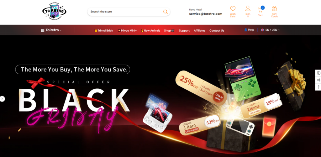
The hero banner was designed to do more than announce promotions—it sets the emotional tone of the brand.
Key design choices included:
- High-contrast visuals with neon-inspired accents
- Clear promotional messaging (“Black Friday,” limited offers)
- Product imagery arranged to create depth and motion
This section immediately communicates excitement while keeping the messaging easy to scan.
Feature Trust Blocks
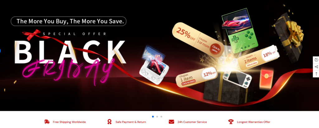
Directly below the hero, we introduced a row of icon-based trust indicators:
- Free shipping
- Secure payments
- Customer support
- Warranty or satisfaction messaging
These elements are subtle, but they play a critical role in reducing hesitation for first-time visitors.
Step 3 – Product Discovery Through Design
Collection-First Layout
Rather than overwhelming users with endless products, we structured the homepage around curated collections, such as:
- Featured retro handhelds
- New arrivals
- Consoles for beginners vs. enthusiasts
Each collection block uses consistent card styles, spacing, and hover behavior to create visual rhythm.
Product Card Optimization
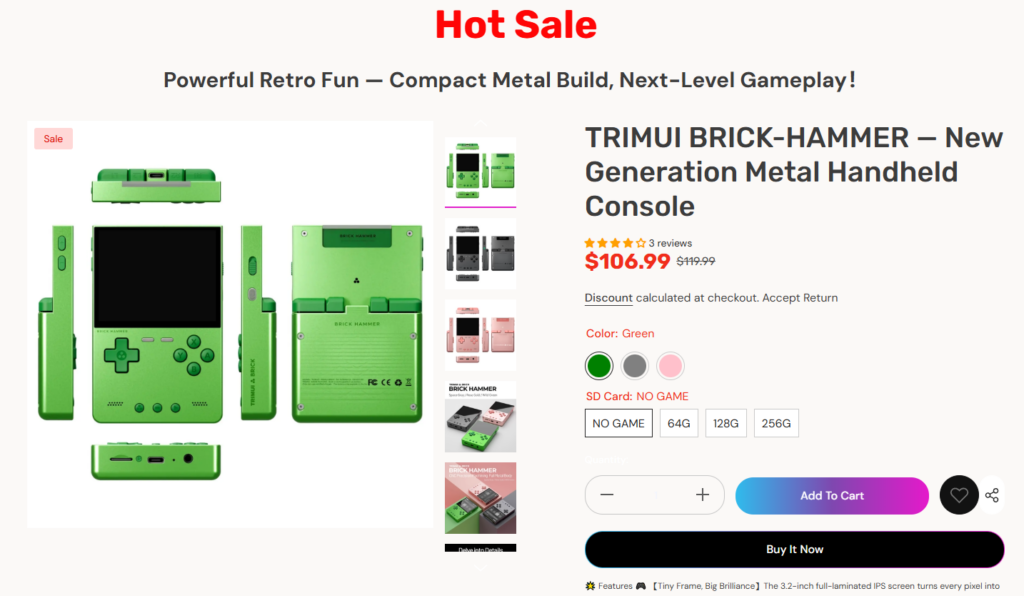
Without altering Shopify’s core product system, we refined the presentation by focusing on:
- Clean product photography alignment
- Clear pricing hierarchy (sale vs. original price)
- Color variant indicators that feel intuitive
This allows users to compare options quickly without opening multiple tabs.
Designing for Campaigns and Promotions
Seasonal Flexibility by Design
One of ToRetro’s key needs was the ability to run frequent promotions—Black Friday, limited stock offers, and themed sales.
Our solution was to design campaign-ready sections that can be visually refreshed without restructuring the page.
Examples include:
- Full-width promotional banners
- Highlighted “Hot Sale” product sections
- Animated or illustrated separators that signal urgency
By keeping the layout modular, the store can remain visually fresh while maintaining consistency.
Addressing Design Challenges
Challenge 1 – Managing a Product-Heavy Homepage
With dozens of SKUs, the risk was visual overload.
Our design solution:
- Clear section breaks using color and spacing
- Limiting each collection preview to a curated number of products
- Encouraging deeper exploration through “View All” prompts
This approach keeps the homepage scannable while still showcasing variety.
Challenge 2 – Balancing Nostalgia With Modern UX
Retro aesthetics can quickly become cluttered or hard to read.
Our design solution:
- Use nostalgic color accents without compromising contrast
- Combine playful graphics with modern typography
- Maintain consistent alignment and grid systems
The result feels inspired by the past, but clearly built for today’s users.
Challenge 3 – Mobile Experience Without Compromise
A significant portion of ToRetro’s traffic comes from mobile users.
Our design considerations included:
- Touch-friendly product cards
- Simplified navigation hierarchy
- Vertical spacing optimized for thumb scrolling
Every section was reviewed from a mobile-first visual perspective to ensure clarity on smaller screens.
Results and Visual Impact
What the Final Design Achieved
After implementing the new design system, the ToRetro storefront achieved several key outcomes:
- A stronger brand identity aligned with retro gaming culture
- Improved visual flow from hero section to product discovery
- A homepage that supports both storytelling and sales
- Greater flexibility for future campaigns and content updates
Most importantly, the site now feels cohesive—each page and section speaks the same visual language.
Why This Project Reflects Our Shopify Design Philosophy
We believe great Shopify design is not about custom code or complex development. It’s about:
- Understanding user intent
- Structuring content with purpose
- Using visuals to guide decisions
- Designing systems that scale with the brand
This project demonstrates how thoughtful design alone can elevate an eCommerce experience and support real business goals.
Conclusion
The ToRetro Shopify website is a clear example of how strategic design can transform a product-driven store into a memorable brand experience. By focusing on layout logic, visual storytelling, and user-centric structure, we helped create a storefront that feels engaging, trustworthy, and ready to grow.
This approach reflects how we help brands turn Shopify into more than just a selling platform—it becomes a visual extension of their identity.
At the core of this project is the same philosophy we bring to all of our work at AIRSANG: design should not just look good, it should work hard for the brand.