Introduction
In today’s competitive eCommerce landscape, a Shopify website must do far more than display products. It needs to communicate brand value instantly, guide users intuitively, and create an emotional connection that encourages action. This is especially true for lifestyle-driven industries such as weddings, events, and luxury décor—where purchasing decisions are often emotional rather than purely functional.
Rose Morning is a premium floral wall brand serving weddings, event planners, photographers, and interior designers. The challenge was clear: design a Shopify website that not only showcased the beauty of the products, but also reflected elegance, reliability, and scale—while remaining conversion-focused.
In this article, we break down how we approached the design of rosemorning.com, from visual strategy to page structure and user journey planning. This case study focuses entirely on design thinking, layout, and brand storytelling, highlighting how thoughtful Shopify design can elevate a product-based business without relying on complex development or custom code.
| Deliver Time | Category | Application Platform |
| 20days | Preserved flowers | Shopify |
| Designers Involved | Cost | Effect |
| Nancy | $2700 | Subscription volume📈203% |
Understanding the Brand and Its Audience
Defining the Brand Positioning

Before any visual decisions were made, we aligned on Rose Morning’s brand identity:
- Premium yet approachable
- Romantic, elegant, and refined
- Professional-grade products for high-stakes events
- Reliable logistics and fast fulfillment
The brand needed to feel luxurious without being intimidating, and scalable without feeling mass-produced.
Knowing the Target Users
The primary audiences include:
- Wedding planners and coordinators
- Event designers and rental companies
- Professional photographers and stylists
- Brides and grooms planning statement décor
Each group visits the site with a different mindset, but all share one thing in common:
They need visual reassurance before making a decision.
That insight shaped every design choice we made.
Design Goals and Strategic Objectives
We established clear goals for the project to ensure the design served both brand and business needs.
Primary Design Objectives
- Instantly communicate product quality and scale
- Build emotional resonance through lifestyle imagery
- Simplify browsing for a large product catalog
- Reinforce trust with social proof and real-use scenarios
- Support conversion without aggressive sales language
Shopify-Specific Design Considerations
While Shopify provides a strong foundation, the true impact comes from how pages are structured and styled. Our focus was on:
- Homepage storytelling flow
- Visual hierarchy for product collections
- Image-driven persuasion
- Clear calls to action without clutter
Homepage Design: Creating a First Impression That Converts
Hero Section: Visual Impact First
The homepage opens with a large, immersive hero section that immediately communicates scale and elegance. Instead of leading with technical specifications, the design prioritizes:
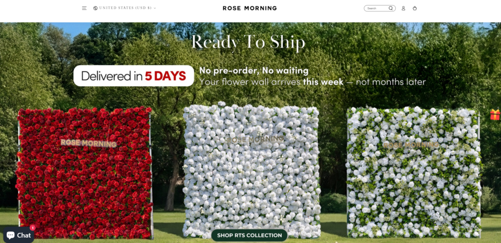
- Full-width lifestyle imagery
- Natural outdoor settings
- Clear messaging around availability and delivery timelines
This approach reassures users within seconds that they are looking at a professional, ready-to-ship solution, not a custom-order risk.
Messaging Hierarchy
We structured hero copy to answer key user questions in order:
- Is this available now?
- How fast can it ship?
- What does it look like in real life?
Short, confident statements paired with strong visuals keep cognitive load low while maintaining clarity.
Product Presentation and Collection Design
Designing for Visual Comparison

Floral wall products are highly visual, so the collection layout was designed to support:
- Side-by-side comparison
- Consistent image framing
- Clear color and texture differentiation
We avoided overloading product cards with text. Instead, the design lets imagery lead, supported by subtle labels and pricing.
In-Stock Emphasis
An “In Stock Now” visual cue was incorporated into collection sections to reduce hesitation. This design choice directly supports conversion by eliminating uncertainty—a critical factor for event-based purchases.
Lifestyle Sections: Selling the Experience, Not Just the Product
Design Focus Areas

One of the most important design sections on the homepage highlights real-world use cases:
- Weddings
- Floral walls for ceremonies
- Bridal party and couple photography
These sections are intentionally designed as visual storytelling blocks, not product grids.
Emotional Anchoring Through Imagery
By showing the products in emotionally charged moments—weddings, celebrations, intimate settings—the design helps users imagine their own event. This emotional anchoring is far more effective than technical descriptions alone.
Featured Products and Visual Consistency
Maintaining Brand Cohesion
Consistency across product imagery was essential. We designed layouts that ensure:
- Uniform background tones
- Balanced spacing
- Consistent shadow and lighting feel
This creates a polished, catalog-like experience that reinforces brand credibility.
Clear Visual Path to Action
Each featured product section includes:
- A dominant image
- Minimal but confident copy
- A clear, unobtrusive call to action
The goal is to guide users forward without pressure.
Highlight Section: Spotlighting a Signature Product
Creating a Visual Pause

Midway through the homepage, we introduced a large highlight section dedicated to a hero product. This section uses:
- Darker, cinematic background imagery
- Ample negative space
- Strong contrast between text and visuals
This design pause resets user attention and reinforces product value.
Price Framing Through Design
Instead of aggressive pricing tactics, we used layout and composition to frame value—allowing the product’s visual impact to justify its positioning naturally.
Social Proof Through Design, Not Testimonials Alone
Customer Showcase Section

Rather than relying solely on text reviews, we designed a customer showcase built around:
- Real event photography
- User-submitted imagery
- Authentic environments
This visually-driven social proof feels organic and trustworthy.
Planner Feedback Layout
Testimonials from planners are presented in a clean, editorial-style layout. The design emphasizes readability and authenticity, avoiding overly promotional styling.
Challenges Faced During the Design Process
Balancing Luxury with Accessibility
One challenge was ensuring the site felt premium without alienating first-time buyers. We solved this by:
- Keeping navigation intuitive
- Avoiding excessive jargon
- Using warmth in imagery rather than cold minimalism
Managing Visual Density
Floral walls are visually dense by nature. To prevent overwhelming users, we carefully controlled:
- White space
- Section breaks
- Image sizing and repetition
This ensures the site feels rich but never cluttered.
Our Design Methodology
Step-by-Step Design Approach
1. Brand & Visual Audit
We evaluated existing assets, tone, and references to define a cohesive direction.
2. User Journey Mapping
We mapped how different user types would navigate the site and designed sections accordingly.
3. Wireframe-Level Layout Planning
Before final visuals, we structured the page flow to ensure clarity and rhythm.
4. Visual Execution & Refinement
Imagery, spacing, typography, and hierarchy were refined to align with brand goals.
Design Without Over-Engineering
Importantly, this project demonstrates how strong Shopify design does not require heavy customization or development. Strategic layout, content placement, and visual storytelling can achieve powerful results on their own.
Results and Impact
Visual Outcomes
- A cohesive, premium brand presentation
- Strong emotional resonance with target users
- Clear differentiation from generic floral suppliers
Business-Oriented Results
- Improved user engagement
- Longer time on page
- Smoother browsing experience
- Clearer conversion pathways
While exact metrics remain confidential, the redesigned experience supports both brand growth and sales confidence.
Conclusion: Design as a Strategic Business Tool
The Rose Morning Shopify website demonstrates how intentional design can transform a product catalog into a compelling brand experience. By focusing on visual hierarchy, emotional storytelling, and user clarity, the site communicates trust and value without relying on technical complexity.
This project reflects the philosophy we bring to every Shopify design engagement:
design should serve both aesthetics and outcomes.
At the end of the day, great eCommerce design is not about trends or features—it’s about clarity, emotion, and alignment between brand and audience.
This approach is at the core of how AIRSANG works with brands worldwide, offering Shopify design services that prioritize visual strategy, conversion-focused layouts, and long-term brand growth without unnecessary technical overhead.