


Introduction
A strong beauty website does more than display products. It creates desire, explains value, builds trust, and guides visitors toward action without making the shopping journey feel forced. The SHEGLAM website is a good example of how modern beauty e-commerce can combine entertainment, product education, brand storytelling, social proof, and conversion design into one complete experience.
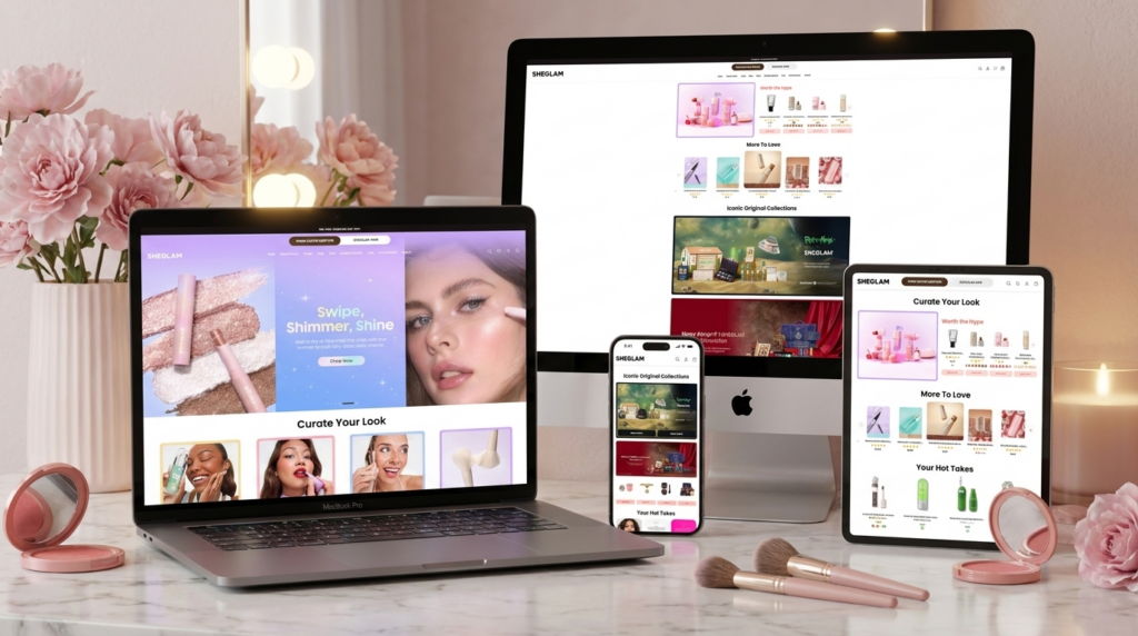
From a designer’s perspective, this website does not treat each section as an isolated visual block. Instead, it builds a continuous journey. The homepage starts with emotional attraction, then moves into curated product discovery, campaign storytelling, customer reviews, brand values, and trust signals. The About page deepens the relationship by explaining the brand’s personality and history. The collection page helps customers browse efficiently, while the product page turns curiosity into purchase intent through strong visuals, clear information, and simple shopping actions.
What makes this website effective is the balance between visual excitement and commercial clarity. The design uses bright colors, playful typography, rounded shapes, large product images, model photography, and campaign graphics to create a youthful beauty mood. At the same time, it keeps key shopping elements easy to find: category navigation, product cards, ratings, prices, shade options, filters, quantity selectors, and Add to Cart buttons.
As designers, we can learn from this approach because it shows how a beauty website can sell products without looking purely transactional. Every page has a purpose. Every section supports the customer’s decision-making process. Every visual choice helps communicate the brand’s energy, product benefits, and lifestyle promise.
| Deliver Time | Category | Website Type |
| 20days | Beauty | Custom Website |
| Designers Involved | Cost | Effect |
| Nancy | $2200 | Sales📈266% |
Homepage Hero Section: Creating Immediate Beauty Desire
Why the First Screen Matters
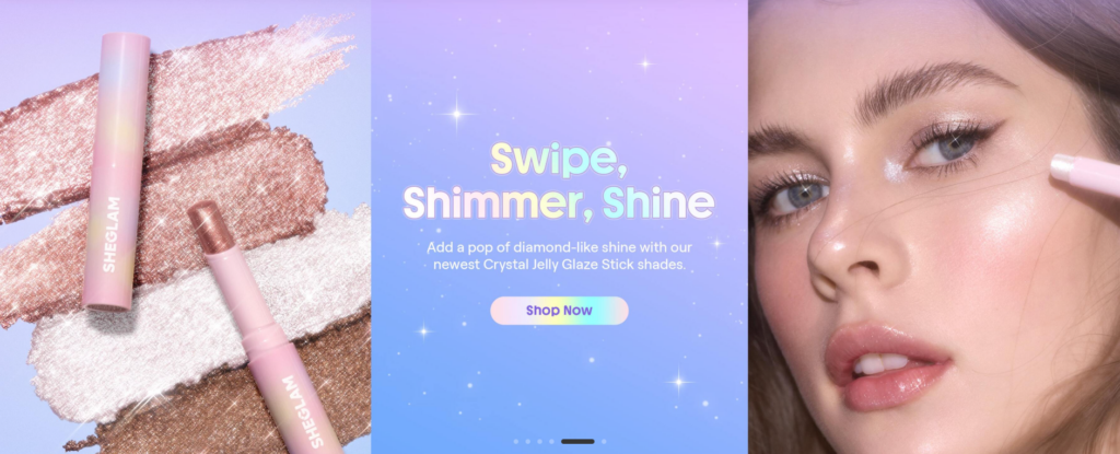
The homepage hero section is one of the most important areas of the website because it shapes the visitor’s first impression within seconds. SHEGLAM uses this space to present a campaign instead of a simple product banner. The “Swipe, Shimmer, Shine” section combines product texture, a central message, and a close-up model image to create a complete beauty story.
As designers, we can see that the layout uses three visual zones. The left side focuses on the product and its shimmering texture. The center carries the headline, supporting copy, and call-to-action button. The right side shows the makeup effect on a model’s face. This arrangement works because it answers three customer questions at once: What is the product? What feeling does it create? How does it look when applied?
Using Texture to Sell the Product
Beauty products are often difficult to sell online because customers cannot touch, test, or swatch them in person. That is why texture photography becomes so important. The left side of the hero section shows metallic shimmer strokes behind the product. This immediately communicates shine, glow, and color payoff.
We designed this kind of visual logic to make the product benefit visible before the customer reads any text. The shimmer texture acts like proof. It suggests that the product is creamy, reflective, and eye-catching. The product itself sits directly on top of the texture, so the customer connects the formula with the finish.
Building Emotion Through Color
The pastel purple and blue gradient in the center creates a dreamy, youthful, and playful atmosphere. This color direction supports the idea of shimmer and fantasy without overwhelming the product. Small sparkle details add movement and reinforce the “diamond-like shine” message.
The design does not use a hard, aggressive sales style. Instead, it uses soft color, rounded shapes, and glowing details to create attraction. The “Shop Now” button also follows this approach. It uses a gentle gradient instead of a harsh promotional color, so the call to action feels natural within the visual system.
Showing the Real Makeup Effect
The close-up model image on the right is essential because it gives the campaign credibility. Customers do not only want to see the packaging; they want to imagine the final look on skin. By showing the shimmer near the eyes and cheek area, the design connects the product with beauty results.
This combination of product, texture, message, and model image turns the first screen into a strong conversion tool. It does not ask customers to buy immediately without context. It first creates desire, then offers a clear shopping action.
Curate Your Look: Guiding Customers Through Visual Categories
Turning Categories Into Inspiration
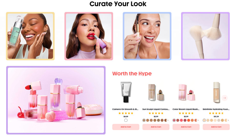
The next section, “Curate Your Look,” introduces a more guided shopping experience. Instead of presenting categories as plain text links, the page uses lifestyle images framed with colorful borders. This approach makes category browsing feel more emotional and visual.
As designers, we use this kind of layout to reduce decision fatigue. Beauty customers may not always know exactly what product they want. They may enter the site with a mood, a look, or a routine in mind. The four image cards help them quickly understand different beauty directions, such as face products, lip products, complexion items, or beauty tools.
Why the Colorful Borders Work
The colorful borders around each image make the section feel playful and clickable. They also create visual separation without needing heavy boxes or complicated design elements. Each card feels like its own small entry point, while the consistent size and spacing keep the layout organized.
This is important because beauty websites often have many product categories. If the navigation feels too plain, users may ignore it. If it feels too chaotic, users may feel overwhelmed. SHEGLAM finds a middle ground by making the categories attractive but still simple.
Connecting Inspiration With Commerce
Below the category cards, the “Worth the Hype” section introduces best-selling or highlighted products. This is a smart transition. The page first inspires the customer with lifestyle images, then immediately gives them specific products to consider.
The large product campaign image on the left creates a soft, feminine brand moment, while the product row on the right turns attention into shopping action. Each product card includes practical decision-making details such as image, name, rating, price, color options, and Add to Cart button.
From a design perspective, this section works because it balances emotion and function. The customer gets both inspiration and a direct path to purchase. The layout does not simply say “shop our products.” It says, “Here is a look you may want, and here are the products that can help you create it.”
Iconic Original Collections: Designing a Campaign World
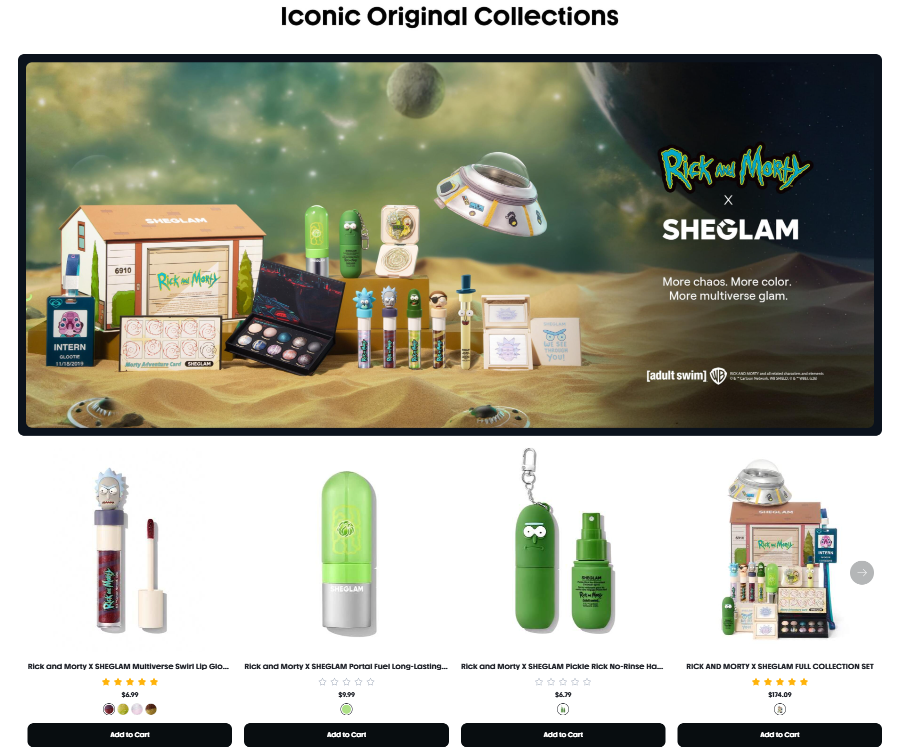
Making Collaboration Feel Collectible
The “Iconic Original Collections” section shows the Rick and Morty x SHEGLAM collaboration. This area uses a large cinematic banner to create a themed world around the collection. Instead of placing the products on a plain background, the design places them in a sci-fi desert scene with floating objects, dramatic atmosphere, and strong brand collaboration logos.
As designers, we use this strategy when a collection has entertainment value. A collaboration product line should not feel like a normal catalog row. It should feel limited, collectible, and story-driven. The large banner helps create that feeling immediately.
Why the Hero Banner Uses a Cinematic Scene
The sci-fi background supports the Rick and Morty theme and gives the collection its own universe. The product lineup sits in the center-left area, while the collaboration logo and short message sit on the right. This creates a clear hierarchy: first the customer sees the world, then the products, then the partnership identity.
The design also uses contrast effectively. The dark space area, green tones, sandy ground, and colorful packaging all work together to make the products stand out. This is important for collaboration campaigns because customers are often attracted by both the product and the cultural reference behind it.
Moving From Storytelling to Shopping
Below the campaign banner, the page presents individual products in a clean row. This transition is important. The banner creates emotional interest, but the product row allows customers to act on that interest.
The product cards keep the shopping structure consistent: image, name, rating, price, shade options, and Add to Cart button. This consistency helps users compare products quickly. Even though the campaign is playful, the shopping experience remains simple and direct.
From a designer’s perspective, this section shows how a brand can use entertainment to increase product appeal while still keeping the buying path clear.
Your Hot Takes: Turning Customer Reviews Into Visual Content
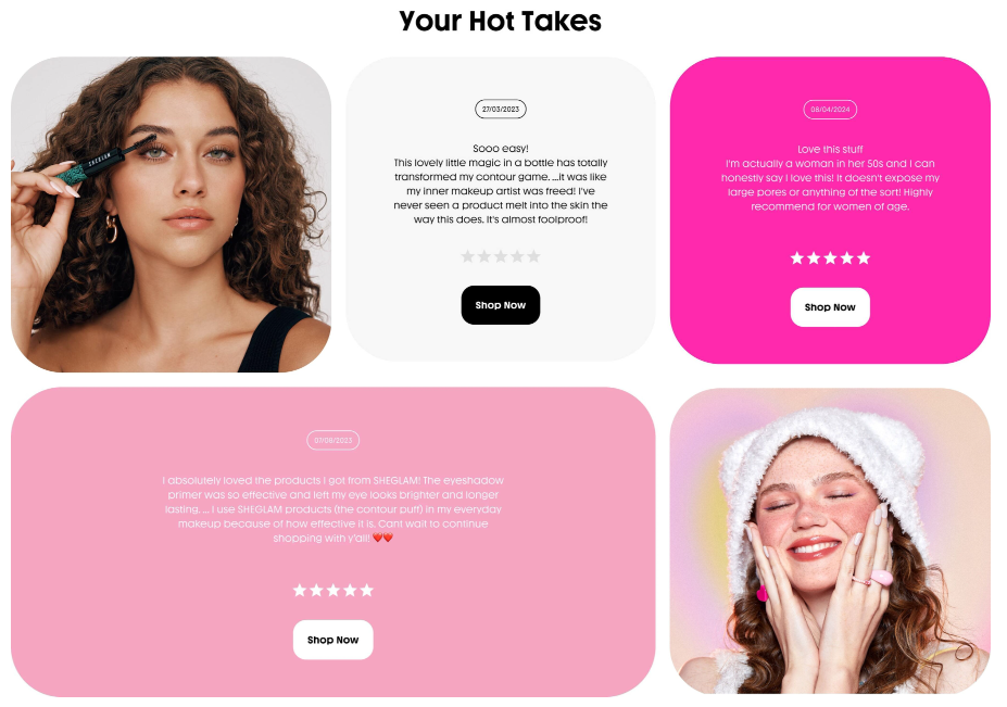
Making Social Proof Feel Like Part of the Brand
The “Your Hot Takes” section uses customer reviews, model images, star ratings, and call-to-action buttons in a card-based layout. Many e-commerce websites treat reviews as plain text blocks. SHEGLAM makes them feel like branded content.
This design choice matters because reviews are a major trust-building tool. Customers often want to know whether real people like the product before they buy. However, if reviews look boring or hidden, they may not influence the shopping decision. By turning reviews into large visual cards, the website makes social proof easy to notice.
Why the Layout Feels Playful
The section uses rounded corners, large image cards, and colorful review blocks. The bright pink card creates strong energy, while the softer pink and white cards balance the design. This keeps the page from feeling repetitive.
As designers, we use varied card sizes to create movement. The layout feels more editorial than mechanical. The model images add lifestyle context, while the text reviews provide authenticity. This combination helps customers connect emotionally with the product experience.
Turning Trust Into Action
The review cards include “Shop Now” buttons. This is a smart conversion detail because it places a shopping action directly after positive customer feedback. When a visitor reads a review and feels reassured, the button gives them a next step.
The design does not force the sale too early. It first shows that other customers enjoyed the products, then invites the visitor to explore. This makes the call to action feel more natural and persuasive.
Passion Meets Purpose: Communicating Values and Credibility
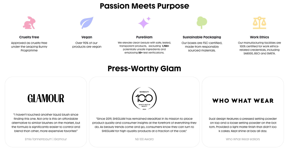
Showing What the Brand Stands For
The “Passion Meets Purpose” section focuses on brand values such as cruelty-free standards, vegan products, clean beauty, sustainable packaging, and work ethics. This type of section is important because modern beauty customers often care about more than color, packaging, or price. They also want to know whether the brand aligns with their values.
As designers, we use icons and short text blocks to make value-based information easy to scan. The icons help customers recognize each topic quickly, while the short descriptions prevent the page from becoming too text-heavy.
Why Minimal Icons Work Here
The icons use soft colors and simple shapes, which match the beauty brand’s friendly tone. They do not look overly corporate or technical. This keeps the value section approachable and easy to understand.
The spacing also matters. Each value has enough room to breathe, so the section feels clean and trustworthy. If this information were presented in a dense paragraph, many visitors would skip it. By turning values into small visual statements, the brand makes ethical and quality-related messages easier to absorb.
Adding Press Validation
Below the value section, “Press-Worthy Glam” introduces media recognition and award-style credibility. This is a second layer of trust. The value icons tell customers what the brand claims. The press cards suggest that outside voices also recognize the brand.
The design uses large white cards with rounded corners and recognizable publication-style names. This creates a premium and editorial feeling. The cards are not overcrowded, which helps the quotes feel more important.
From a designer’s perspective, this section strengthens brand authority. It tells customers that the brand is not only playful and affordable, but also respected, discussed, and validated.
About Page: Building a Strong Brand Personality
Designing Beyond a Basic Company Introduction
The About page uses a very different approach from a traditional brand history page. Instead of presenting a long corporate profile, it creates a colorful, illustrated, and story-driven brand experience. This matches the brand’s youthful beauty identity.
The hero section starts with a close-up beauty image and the message “Next Gen beauty made to explore.” This statement positions the brand as modern, expressive, and open to experimentation. The design uses the face as an emotional anchor, while the typography gives the page a bold voice.
Explaining the Brand Promise Clearly
The “SHEGLAM is more than beauty” section uses short highlighted words and a soft green message card. This makes the brand statement feel conversational rather than formal. The design suggests that the brand wants to be fun, accessible, and confidence-driven.
As designers, we use highlighted keywords to guide the reader’s eye. Visitors may not read every sentence, but they will notice the most important ideas. This helps communicate the brand promise quickly.
Presenting Values Through Image Cards
The “Our Values” section uses four image-based cards with colorful labels. Each card communicates a core idea, such as consumer focus, innovation, affordability, or quality. The background images add atmosphere, while the bright label blocks keep the messages clear.
This layout works because it avoids long value paragraphs. Instead, it turns values into visual statements. The user can scan the section quickly and still understand what the brand wants to represent.
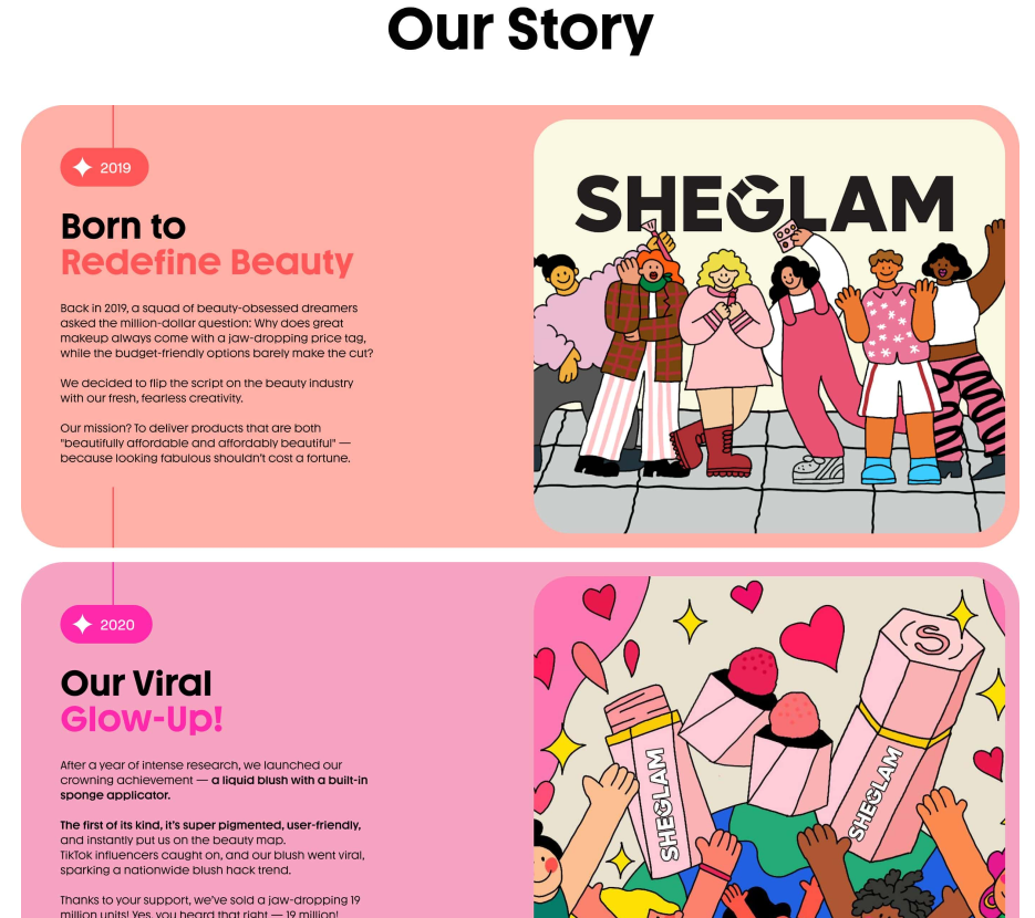
Turning Brand History Into a Timeline Experience
The “Our Story” timeline is one of the strongest design elements on the About page. Each year appears as a large colorful story block with text on one side and illustration-style artwork on the other. The layout makes the brand’s growth feel playful and memorable.
A timeline can easily become boring if it only lists dates and achievements. Here, the illustrations give each milestone a different personality. The colors separate each year, while the vertical timeline structure gives the page a sense of progression.
From a design perspective, this section helps visitors understand that the brand has evolved over time. It shows growth, popularity, product development, quality improvement, partnerships, and community connection. The page does not simply tell the brand story; it visualizes it.
Product Collection Page: Making Browsing Efficient
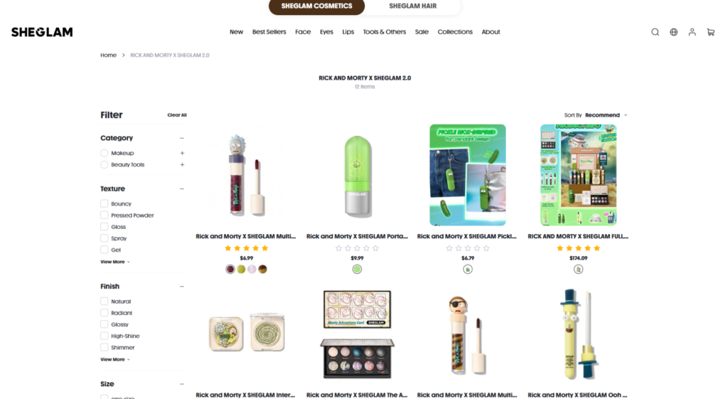
Why the Layout Uses Clean White Space
The product collection page has a much more functional purpose than the homepage or About page. Its job is to help customers browse, compare, filter, and choose products. Because of that, the page uses a clean white background, a structured grid, and simple product cards.
This design choice allows the colorful Rick and Morty product packaging to become the main visual focus. The page does not need a heavy background because the products already carry strong colors and character-driven details.
Helping Customers Narrow Their Choices
The left-side filter panel is a key part of the shopping experience. Customers can filter by category, texture, finish, size, and price. This is especially useful for beauty products because shoppers often have specific preferences.
As designers, we place filters on the left because it follows a familiar e-commerce pattern. Customers know where to look when they want to narrow results. The filter panel also stays visually separate from the product grid, which keeps the shopping area clean.
Why Product Card Consistency Matters
Each product card follows a consistent structure: product image, product name, rating, price, color options, and shopping action. This consistency makes comparison easier. Customers can scan across the grid and quickly evaluate which product interests them.
The ratings add social proof. The color dots show shade variety. The prices support fast decision-making. The product images give each item a clear visual identity. Together, these details help customers move from browsing to selection.
Supporting Different Shopping Behaviors
The sort option on the top right gives users more control. Some shoppers may want recommended items. Others may want best sellers, newest products, or price-based browsing. A good collection page should support different decision-making styles.
From a designer’s perspective, this page works because it does not distract from shopping. It removes unnecessary decoration, keeps the product grid readable, and gives customers the tools they need to make decisions quickly.
Product Detail Page: Turning Interest Into Purchase
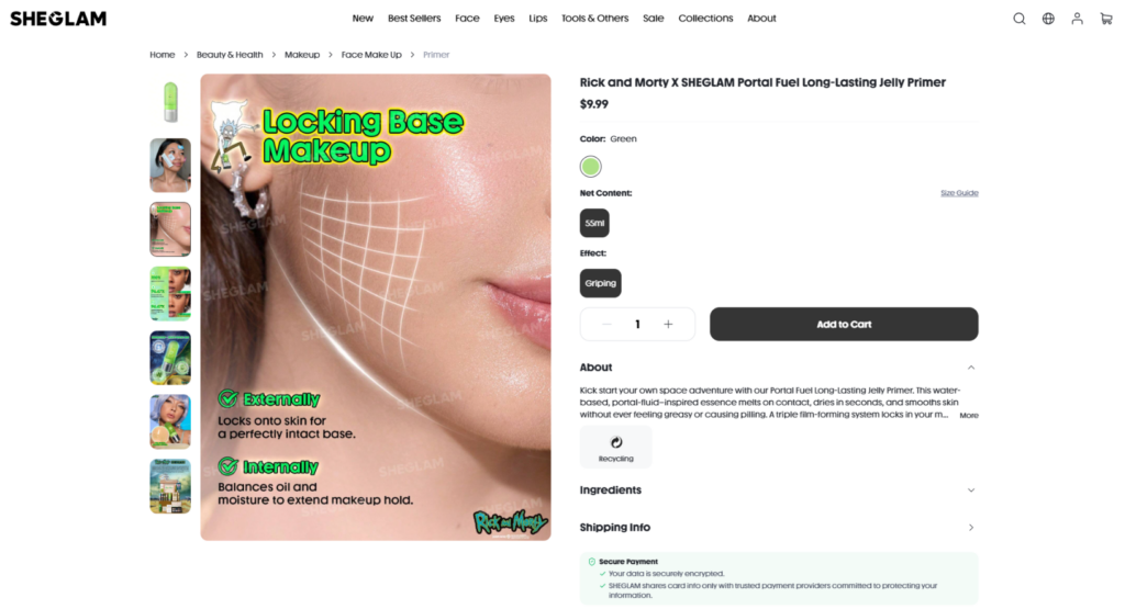
Structuring the Page Around Customer Decisions
The product detail page uses a classic two-column layout. The left side focuses on visual proof, while the right side focuses on product information and purchase action. This structure works because it matches how customers evaluate products online.
First, they look at the images. Then they check the name, price, shade, size, effect, and other details. Finally, they decide whether to add the product to the cart. The layout supports this flow clearly.
Using a Strong Main Image
The main product image explains the benefit of the primer through a campaign-style graphic. It shows the product in action and uses text overlays to communicate external and internal effects. This is important because primers can be less visually obvious than color products like lipstick or eyeshadow.
As designers, we need to make invisible benefits visible. A primer’s value may involve grip, smoothness, hydration, or makeup hold. The visual uses skin texture and graphic lines to explain how the product works. This helps customers understand the benefit faster.
Why the Thumbnail Gallery Matters
The vertical thumbnail gallery on the left allows customers to explore different product visuals without leaving the page. They can view usage scenes, texture explanations, packaging details, promotional graphics, and collection images.
This gives the product more depth. A single image may not answer every question, but a gallery can show the product from multiple angles. It also keeps the page interactive, which encourages users to spend more time evaluating the item.
Making the Purchase Area Clear
The right side organizes product information in a practical order. The product name and price appear first. Then the customer sees color, net content, effect, quantity selector, and Add to Cart button. This order follows a logical decision path.
The dark Add to Cart button creates strong contrast against the white page. It becomes the most obvious action on the screen. The quantity selector stays nearby, so the customer does not need to search for basic purchase controls.
Keeping Details Clean With Expandable Sections
The About, Ingredients, and Shipping Info sections use expandable blocks. This keeps the product page clean while still offering detailed information for customers who want it. The page does not overwhelm every visitor with long content immediately.
This is a useful design decision because customers have different information needs. Some customers want to buy quickly. Others want to check ingredients, shipping, or product details. Expandable sections serve both groups.
Adding Trust Near the Purchase Moment
The secure payment notice appears near the purchase area. This placement matters because customers often think about payment safety right before they add an item to the cart or continue to checkout. By placing reassurance close to the decision point, the page reduces hesitation.
Extending the Journey With Recommendations
The “More to Love” section appears below the main product area. This section keeps customers exploring after they view one item. It also supports cross-selling by showing related products from the same themed collection.
From a design perspective, this section increases browsing depth and potential order value. It gives the customer another path forward even if they are not ready to buy the current product.
Why This Overall Design Works
It Connects Emotion With Function
The biggest strength of this website is that it does not separate brand emotion from shopping function. The homepage creates desire through visuals, color, model photography, and campaign storytelling. The collection and product pages then turn that desire into practical shopping action.
This balance matters because beauty customers often buy with both emotion and logic. They want the product to feel exciting, but they also need clear information before purchasing. SHEGLAM supports both needs.
It Uses Visual Hierarchy Well
The website consistently guides attention. Large hero images attract the eye first. Headlines explain the message. Product cards organize choices. Buttons show the next action. Filters and expandable sections keep information manageable.
Good visual hierarchy reduces friction. Customers should not have to think too hard about where to look or what to do next. This website uses size, spacing, color, contrast, and layout structure to guide them.
It Makes the Brand Feel Young and Social
The bright colors, rounded cards, playful typography, customer review blocks, and collaboration visuals all make the brand feel social-media friendly. The website looks designed for customers who respond to trends, visual storytelling, and shareable product moments.
This is especially important in beauty e-commerce because many purchase decisions begin with visual inspiration. A strong beauty site should feel connected to the way customers discover products on social platforms.
It Builds Trust in Multiple Ways
The website builds trust through several layers: product imagery, model results, reviews, star ratings, press mentions, value statements, secure payment notices, and detailed product information. These trust signals appear across different parts of the journey, not just in one section.
This is good design because customers may hesitate for different reasons. Some need proof that the product looks good. Some need reassurance about ingredients or shipping. Some want to know whether other people like the product. The website answers these concerns through both visual and functional design.
Conclusion
The SHEGLAM website shows how a beauty e-commerce experience can become more than a product catalog. It uses campaign visuals to create desire, category cards to guide exploration, collaboration banners to build excitement, review cards to create trust, value sections to communicate responsibility, and structured shopping pages to support conversion.
From a designer’s perspective, every major page has a clear role. The homepage attracts and inspires. The About page builds brand personality. The collection page organizes discovery. The product page turns interest into action. Together, these pages create a complete customer journey that feels playful, modern, trustworthy, and commercially effective.
This design works because it understands how beauty customers shop online. They want inspiration, visual proof, easy navigation, clear product details, and reassurance before they buy. SHEGLAM combines all of these elements into a cohesive experience that feels both emotional and practical.
For brands that want to build a similar type of e-commerce presence, the key lesson is simple: good design should not only make a website look attractive. It should help customers understand the brand, connect with the product, trust the experience, and move naturally toward purchase. At AIRSANG, this is exactly the kind of design thinking we apply when helping cross-border brands create stronger, more conversion-focused online stores.

Design and build a WordPress website or corporate site with a full eCommerce system for you.
Price range: $200.00 through $2,500.00custom-requirements-or-special-quotations
Original price was: $2.00.$1.00Current price is: $1.00. Main Image Design for Amazon Home Physiotherapy Device Explained
Introduction: Building a Trustworthy Image for Home Therapy Devices on Amazon When designing the main image for a home therapy device on Amazon, our primary...
Main Image Design for Amazon Lipstick Conversion
Introduction: Designing a Lipstick Main Image That Sells on Amazon When we design a Main image for an Amazon lipstick, our responsibility goes far beyond...

How Hackers Steal WordPress Admin Emails (And How to Stop Them)
Let’s start with an uncomfortable truth: Your WordPress admin email is probably way more public than you think.And hackers? They love that. To them, your...
What Makes an Amazon Liquid Foundation Main Image Convert
Introduction Designing a Main image design for Amazon Liquid foundation is never just about making a product look beautiful. On Amazon, the main image and...
Designing an Effective Amazon Main Image for Filter Cartridges
Introduction Designing a Main image for Amazon is never just about making a product look attractive. It is about clarity, trust, and instant understanding—especially for...
Replay Attacks on WordPress: Real Threat or Overhyped Myth?
Let’s clear something up first. Replay attacks don’t look scary.They don’t smash passwords.They don’t inject evil code with green hacker text flying everywhere. They’re sneaky....

How to Duplicate WordPress Pages Without Breaking Anything
Let’s face it. Sometimes you don’t want to create a new page.You just want the same page… but slightly different. Same layout.Same blocks.Same settings. Because...

Five Pet WordPress Themes Compared
Introduction Choosing the right pet-related WordPress theme is more than a design decision—it directly affects usability, scalability, and long-term business growth. Pet care and pet...
Comparing Five Swimwear eCommerce Themes
Introduction Choosing the right theme for a swimwear or lingerie independent store is not just a visual decision—it directly affects conversion rates, scalability, and long-term...

How to Turn Off Comments in WordPress (Without Losing Your Mind)
Let’s talk about WordPress comments. In theory, comments are great.They encourage discussion.They build community.They make your website feel “alive.” In reality? They’re often a magnet...

Building a Scalable WordPress Website for a Science-Driven Brand: The AminoUSA Project
Introduction In today’s digital landscape, a website is more than a place to list products. For science-driven brands operating in regulated or research-focused industries, a...
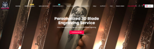
Building a Scalable Shopify Store for a Global Blade Brand: The CoolKatana Project
Introduction In cross-border eCommerce, a Shopify website is more than a storefront.For brands operating in niche, culture-driven categories, the website must do far more than...
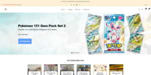
Designing a High-Conversion Shopify Store for Pokémon Cards
Introduction In the world of collectible eCommerce, especially within the Pokémon Trading Card Game (TCG) market, a website must do more than simply list products....
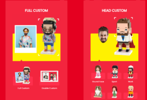
High-Converting Shopify Design for a Custom Brick Brand
Introduction In today’s competitive eCommerce landscape, especially in the personalized gift and collectible space, a Shopify website must do far more than display products. It...
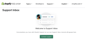
How to Contact Shopify Support: Simple, Stress-Free Guide
Running a Shopify store should feel exciting—not confusing. When questions pop up or issues slow you down, Shopify offers several support paths depending on what...
How to Deactivate a Shopify Store: A Clear, Practical Guide
Deactivating a Shopify store isn’t complicated, but it does come with consequences many merchants overlook. This guide breaks the process down in a simple, educational...
Shopify Website Design Case Study for a Premium Floral Brand
Introduction In today’s competitive eCommerce landscape, a Shopify website must do far more than display products. It needs to communicate brand value instantly, guide users...
Shopify Design Case Study: Retro Gaming Store
Introduction In a highly competitive eCommerce environment, visual clarity and emotional connection often determine whether a visitor becomes a customer. This is especially true in...