


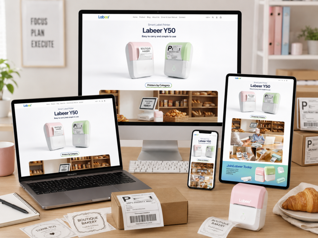
Introduction
A printer website can easily feel too technical, too product-heavy, or too plain. For Labeer, we wanted the opposite. We wanted the website to feel light, friendly, practical, and easy to understand from the first screen. Instead of treating label printers as cold office tools, we positioned them as helpful everyday products for small businesses, students, home offices, creative users, and online sellers.
Our design direction focused on one main idea: make printing feel simple. Every page section supports that idea through soft colors, clean spacing, realistic product use cases, and direct messaging. Visitors do not need to study long specifications before they understand the product value. They can see the printer, understand the category, explore common use scenarios, review best sellers, read customer feedback, and contact support through a clear page structure.
The overall website uses a calm visual style, rounded product cards, pastel product colors, white space, lifestyle photography, and simple navigation. These choices help reduce friction and make the shopping journey feel more approachable. From the homepage hero to the contact page, the design builds confidence step by step. It introduces the product clearly, organizes the product ecosystem, adds emotional brand appeal, highlights popular choices, reinforces trust through reviews, and ends with a support page that feels reliable and easy to use.
| Deliver Time | Category | Website Type |
| 15days | printer | shopify |
| Designers Involved | Cost | Effect |
| Lin Zhang | $1600 | Sales📈231% |
Homepage Hero Section: Clear Product Recognition First
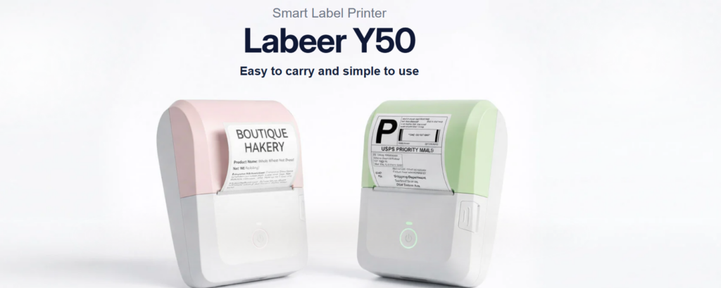
Creating an Immediate Product Story
The homepage opens with the Labeer Y50 hero section. We designed this section to explain the product in seconds. The headline “Labeer Y50” uses a large, bold type style that gives the product strong brand presence. Above it, the smaller phrase “Smart Label Printer” tells users what the product is. Below it, the line “Easy to carry and simple to use” explains the core benefit in plain language.
This hierarchy matters. Many visitors scan before they read. They need to know three things quickly: what the product is, what model they are seeing, and why it matters. The hero section answers all three without visual clutter. We avoided long paragraphs because the top of the homepage should not feel like a manual. It should feel like an invitation.
Using White Space to Make the Product Feel Simple
We used a bright white background because it supports the product message. A smart label printer should feel clean, compact, and easy to operate. A busy background would weaken that feeling. White space gives the product room to breathe and helps the soft pastel devices stand out.
The design also uses subtle shadows and soft lighting. These details give the printers a more realistic presence while keeping the visual style gentle. The printers do not look aggressive or industrial. They look friendly, modern, and suitable for daily use.
Showing Real Output Instead of Only Showing Hardware
We chose to show printed labels coming directly out of the machines because buyers care about results, not just the device shape. One printer shows a boutique bakery-style label, while another shows a shipping label. This immediately expands the perceived use case. Users can imagine using the product for product labels, packaging, shipping, small business branding, organization, and office work.
This visual decision reduces the need for explanation. Instead of saying the printer supports different label needs, the design shows it. That makes the homepage more intuitive and more persuasive.
Soft Colors for a Friendly Technology Product
The pink and green product colors create a softer personality. Many printer websites use gray, black, or purely technical visuals. For Labeer, we wanted to separate the brand from that predictable category style. The pastel colors make the product feel more personal and lifestyle-friendly.
This choice also helps attract a wider audience. Small boutique owners, handmade sellers, students, office users, and home organizers may all see the product as approachable. The printer does not feel like something only a warehouse or shipping department would use. It feels like a useful tool anyone can add to a daily workflow.
Printers by Category: Making the Product System Easy to Browse
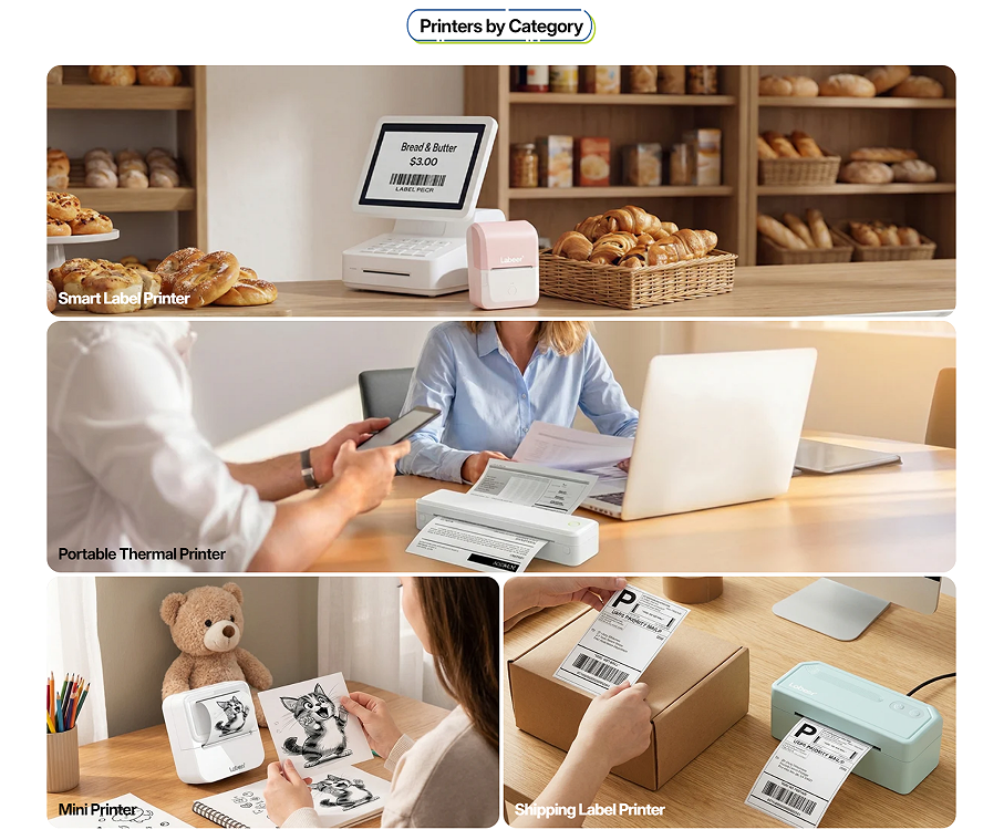
Turning Product Categories Into Real-Life Scenarios
The next section introduces “Printers by Category.” We designed this area to organize the product range in a visual way. Instead of listing product types in a plain grid, we paired each category with a realistic scene. The section includes Smart Label Printer, Portable Thermal Printer, Mini Printer, and Shipping Label Printer.
This matters because printer categories can sound similar to users who are not already familiar with them. A customer may not immediately know the difference between a mini printer and a portable thermal printer. By placing each category inside a real-life scene, we help visitors understand the purpose of each product faster.
The Bakery Scene for Smart Label Printer
The first large image shows a bakery environment with bread, shelves, a counter, and label-related equipment. This scene communicates small business use immediately. Bakeries, cafés, handmade food shops, and boutique stores all need clear labels for pricing, packaging, and product identification.
We used this image at the top because it feels warm and business-oriented. It tells users that the printer can help real stores improve presentation and workflow. The bakery setting also adds a human quality to the product. It is not just a device on a white background; it becomes part of a real business environment.
The Office Scene for Portable Thermal Printer
The second large image shows a professional workspace with a laptop, documents, and a portable printer. This scene supports users who need printing flexibility in office, travel, or remote work situations. The composition makes the printer feel practical and mobile.
We chose a bright office setting because portable printing should feel efficient, not complicated. The laptop, papers, and people in the scene help visitors imagine printing contracts, notes, drafts, or documents while working. It connects the product to productivity and convenience.
The Creative Desk Scene for Mini Printer
The mini printer category uses a warmer creative desk setup with drawings, a teddy bear, and stationery. This makes the printer feel playful and personal. We wanted this section to show that Labeer products are not only for business users. They can also support study notes, journaling, stickers, creative projects, and casual printing.
The scene adds emotional variety to the page. After the bakery and office images, the mini printer section introduces a softer lifestyle moment. This keeps the browsing experience from feeling repetitive and makes the product range feel broader.
The Shipping Table Scene for Shipping Label Printer
The shipping label printer category shows a package, a label, and a printer in a clean workspace. This image speaks directly to online sellers. It quickly communicates e-commerce, fulfillment, and order preparation.
We placed this category in a clear product-use context because shipping label printers often serve customers with practical goals. These users want speed, clarity, and reliability. The image helps them understand that the printer fits into a small business shipping workflow.
Why We Used a Card-Based Layout
The section uses large rounded image cards with category labels placed directly on the visuals. This layout creates a clean browsing experience. Users can scan the page quickly and select the product type that matches their need.
We also varied the image sizes to create rhythm. The two full-width horizontal cards give the section a strong visual foundation, while the two smaller cards at the bottom add variety and balance. This structure keeps the page organized without feeling too rigid.
Brand Banner: Building Emotional Connection With Labeer
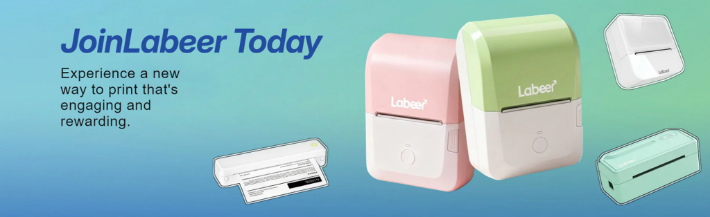
Moving Beyond Product Display
The “JoinLabeer Today” banner shifts the page from category browsing into brand storytelling. We designed this section to make the website feel more memorable. A product grid can explain what a brand sells, but a brand banner can explain how the brand wants users to feel.
The phrase “JoinLabeer Today” creates a sense of invitation. It does not simply say “Buy Now” or “Shop Printers.” Instead, it suggests that Labeer is building a more enjoyable way to print. This supports a warmer brand identity.
Using a Blue-Green Gradient for Energy and Freshness
We used a blue-green gradient background to create a fresh, modern atmosphere. The gradient adds movement without becoming too distracting. It also works well with the pastel pink and green printers, creating a cohesive color story across the page.
Blue often feels stable and trustworthy, while green can feel fresh and friendly. Together, they help the brand feel both practical and approachable. This is important for a product category that needs reliability but also benefits from a lighter lifestyle identity.
Balancing Text and Product Visuals
The banner places the main message on the left and the product visuals on the right. This creates a natural reading flow. Users first see the invitation, then they see the product family that supports it.
The large pink and green printers become the main visual anchor. Smaller floating product illustrations around them show variety and create a playful sense of motion. This composition makes the banner feel active and energetic without overwhelming the user.
Making Printing Feel Engaging and Rewarding
The supporting copy says, “Experience a new way to print that’s engaging and rewarding.” We designed the visual environment around that message. The product does not sit in a cold technical layout. It appears in a colorful, optimistic space.
This approach helps reposition printing as something easier and more enjoyable. For small business owners, printing labels can become part of branding. For students, printing notes can support organization. For creators, printing stickers can become part of a personal project. The banner captures that broader emotional value.
Best Seller Section: Guiding Purchase Decisions With Confidence
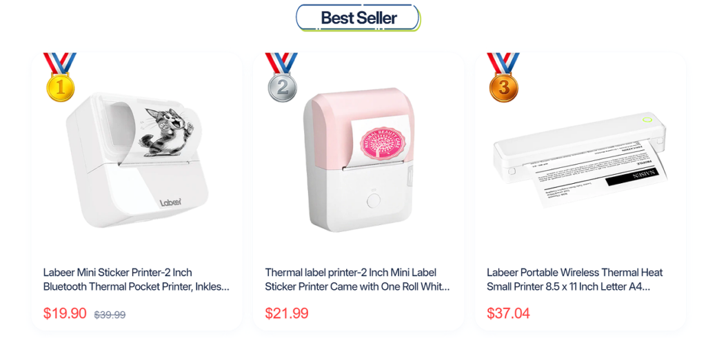
Helping Users Choose Faster
After introducing the brand and product categories, the page moves into the “Best Seller” section. We designed this area to help users make decisions faster. Many shoppers feel uncertain when a website offers several similar products. A best-seller section reduces that uncertainty by highlighting popular choices.
The section presents three products in a clean card layout. Each card includes a product image, product name, and price. This creates a simple comparison experience. Users can scan the options without reading a long product list.
Using Medal Icons as Visual Social Proof
We added medal icons numbered one, two, and three to create a clear ranking system. These medals immediately communicate popularity. They also add a small gamified element, making the section more visually engaging.
The medals work because users often trust what other buyers choose. A ranked best-seller layout suggests that these products have already earned attention. This can reduce hesitation and increase the likelihood that visitors will click into a product page.
Clean Product Cards for Better Focus
Each product appears inside a large white card with soft spacing. This keeps the section clean and easy to read. The product images sit at the top, giving users enough room to understand the shape, color, and output style of each printer.
The white background also matches the rest of the website’s light visual direction. We avoided heavy borders or dark blocks because the brand should feel soft and accessible. The card design supports clarity rather than visual noise.
Red Pricing for Strong Conversion Signals
We used red pricing to make the offer stand out. Price is one of the most important elements in a product card, so it needs a strong visual anchor. The red sale price draws the eye quickly and helps users understand the current buying opportunity.
For discounted items, the crossed-out original price creates a clear value comparison. This helps users see the difference between the original price and the current price. The design communicates savings without needing a long promotional sentence.
Keeping Product Names Informative
The product titles are shown under each image, and they include functional keywords such as mini sticker printer, thermal label printer, Bluetooth thermal pocket printer, and wireless thermal printer. This helps users understand what each product does.
Even when product names become slightly long, they still serve a useful role. Visitors can recognize whether a product fits their intended use. The layout keeps the titles readable while the images and prices provide quick visual context.
Customer Voices: Turning Reviews Into Trust Assets
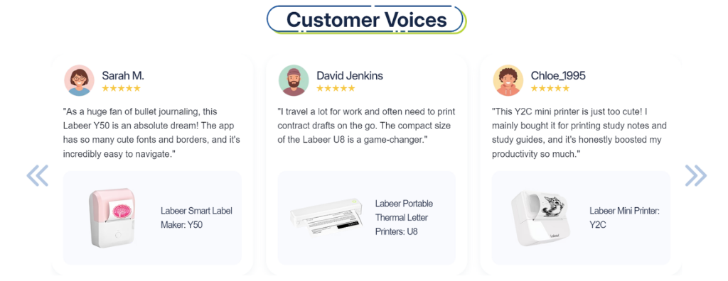
Why Testimonials Matter on a Printer Website
The “Customer Voices” section adds trust after the product recommendation area. We designed this section to answer a common buyer question: “Will this product work for someone like me?”
Reviews help because they show different user situations. One customer talks about bullet journaling, another mentions work travel, and another uses a mini printer for study notes and study guides. These examples show that the products support more than one type of buyer.
Humanizing the Shopping Experience
Each testimonial card includes an avatar, customer name, star rating, written review, product image, and product name. This structure makes the review feel more complete. It is not just anonymous praise floating on a page. It connects a person, a comment, and a specific product.
The avatars add personality and warmth. The names make the reviews easier to remember. The star ratings provide quick satisfaction signals. Together, these elements make the section feel more credible and more human.
Connecting Reviews to Actual Products
We placed the related product image at the bottom of each testimonial card. This is an important design choice. Many review sections show customer comments but do not clearly connect them to products. Here, the visitor can see which printer the customer is discussing.
This supports both trust and navigation. A user who relates to one review can quickly identify the product associated with it. For example, someone interested in journaling may notice the Labeer Smart Label Maker Y50. Someone who travels for work may notice the portable printer. Someone who studies may notice the mini printer.
Creating a Calm Testimonial Layout
The testimonial cards use rounded corners, soft shadows, and generous spacing. This keeps the section easy to scan. We wanted the reviews to feel like friendly recommendations rather than aggressive sales claims.
The left and right arrows suggest that the section can hold more reviews. This makes the page feel dynamic and expandable. It also gives visitors the impression that the brand has more customer feedback beyond the first three cards.
Using Reviews to Reduce Buying Anxiety
Printer buyers may worry about setup, app usability, print quality, portability, or whether the product fits their daily needs. The review section helps reduce those concerns by showing positive user experiences in different contexts.
This is especially useful for compact printers because customers often want reassurance before purchasing. The testimonials make the product feel tested, useful, and enjoyable in real life.
Contact Page: Designing Support as Part of the Brand Experience
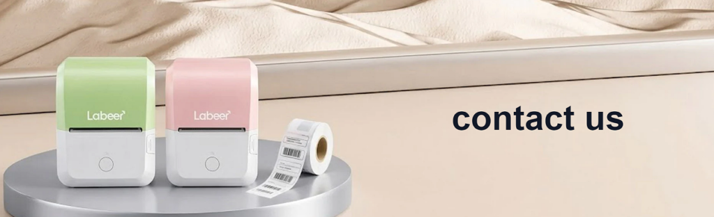
Extending the Brand Beyond the Homepage
The contact page continues the same soft, product-focused design language. We used a clean banner with Labeer printers displayed on a platform and a large “contact us” title. This keeps the support page connected to the product world rather than making it feel like a plain form page.
A contact page should not feel like an afterthought. It plays an important role in customer trust. If users believe support will be difficult to reach, they may hesitate before buying. We designed this page to feel open, organized, and reassuring.
Clear Banner With Product Context
The top banner uses a soft lifestyle product image. The printers appear on the left, while the “contact us” text sits on the right. This creates balance and clarity. Users immediately understand where they are and why the page exists.
The product image also reminds users that they are contacting a real product brand, not a faceless store. It keeps the page visually connected to the homepage hero and product sections.
Dividing Support Information and Contact Form
Below the banner, we divided the page into two main columns. The left column focuses on support information, while the right column contains the contact form. This structure supports different user needs.
Some visitors only need an email address or service hours. Others need to send a detailed question. By separating these actions, the page becomes easier to use. Users do not have to search through a cluttered support page to find what they need.
Making Help Feel Available
The left side starts with “Need help? Contact us anytime!” This message creates a welcoming tone. The email address and online customer service hours appear directly below it, making the page practical.
We also used small icons for email and chat support. Icons help users identify information faster and add a friendly visual rhythm. They keep the page from feeling like plain text while still maintaining a clean layout.
Adding FAQs to Reduce Repetitive Questions
The FAQ block appears on the same contact page. This is a smart support design choice because many users ask similar questions before contacting a brand. The listed questions cover practical concerns such as whether the printer requires ink or ribbons, whether the app is free, how to connect a phone to the printer, and whether users can print from a PC or laptop.
By placing FAQs near the contact information, we help users solve simple concerns quickly. This reduces support pressure and improves the customer experience. It also shows that the brand understands common buyer doubts.
Simple Form Design for Easy Communication
The contact form uses clear labels: name, email, phone, and question. The input boxes are simple and spacious. The submit button uses a direct blue color that stands out without feeling too aggressive.
We avoided unnecessary form fields because a contact page should not create more friction. When users need help, they want a fast and predictable process. The clean form layout supports that expectation.
Footer as a Trust and Navigation Hub
The footer continues the brand identity with a light blue background, logo, contact details, social media icons, payment icons, and organized link groups. The footer includes product links, support links, and company links, helping users continue browsing even after reaching the bottom of the page.
This structure makes the website feel complete. It shows that the brand has product categories, support resources, company information, social channels, and payment options. These details quietly support trust and professionalism.
Overall Design Strategy: Soft, Practical, and Conversion-Focused
Designing for Different Customer Types
The Labeer website works because it does not design for only one customer type. It speaks to small business owners, students, remote workers, creative users, and e-commerce sellers. Each page section introduces a different use case.
The hero section introduces the product clearly. The category section explains the product range. The brand banner adds emotion. The best-seller section guides purchase decisions. The review section builds trust. The contact page supports confidence after purchase consideration.
This sequence creates a smooth journey. Users move from awareness to understanding, then from interest to trust, and finally toward action.
Keeping the Visual Language Consistent
Across the site, we used soft colors, white space, rounded cards, friendly product imagery, and clean typography. This consistency makes the website feel professional and intentional.
A scattered design would weaken trust. When every section follows the same visual direction, users feel that the brand is more stable. The website becomes easier to remember and easier to navigate.
Reducing Technical Pressure
Although printers involve technical details, the website does not lead with complexity. It leads with use cases, benefits, and product clarity. This is important because many buyers want a solution, not a technical lesson.
The design shows what the printer can do before asking users to compare detailed specifications. This helps lower the barrier for first-time buyers. It also makes the website feel more friendly to non-technical users.
Supporting Conversion Without Feeling Pushy
The website uses several conversion tools: clear product names, best-seller rankings, sale prices, customer reviews, FAQ answers, and a direct contact form. However, the overall tone remains calm. The design does not rely on pressure tactics.
This balance matters. A friendly product like Labeer should not feel overly aggressive. The website encourages users through clarity, trust, and useful information. That creates a better long-term brand impression.
Conclusion
The Labeer website shows how a printer brand can create a shopping experience that feels simple, modern, and human. We designed the page flow to introduce the product clearly, organize printer categories through real-life scenes, build brand emotion with a colorful banner, guide decisions through best-seller cards, strengthen trust with customer voices, and support users through a clean contact page.
Every design choice serves a purpose. The white space makes the product feel simple. The pastel colors make the printers feel friendly. The lifestyle scenes explain real use cases. The medal icons create social proof. The reviews reduce hesitation. The contact page turns support into part of the customer experience.
For a Shopify printer store, this kind of design can do more than improve appearance. It can help customers understand products faster, feel more confident, and move through the buying journey with less friction. That is the value of a thoughtful, conversion-focused independent website design. At AIRSANG, we help brands build this type of clear, trustworthy, and market-ready online experience.


Design and build a WordPress website or corporate site with a full eCommerce system for you.
Price range: $200.00 through $2,500.00Custom requirements or special quotations
Original price was: $2.00.$1.00Current price is: $1.00. Main Image Design for Amazon Home Physiotherapy Device Explained
Introduction: Building a Trustworthy Image for Home Therapy Devices on Amazon When designing the main image for a home therapy device on Amazon, our primary...

Main Image Design for Amazon Lipstick Conversion
Introduction: Designing a Lipstick Main Image That Sells on Amazon When we design a Main image for an Amazon lipstick, our responsibility goes far beyond...

How Hackers Steal WordPress Admin Emails (And How to Stop Them)
Let’s start with an uncomfortable truth: Your WordPress admin email is probably way more public than you think.And hackers? They love that. To them, your...

What Makes an Amazon Liquid Foundation Main Image Convert
Introduction Designing a Main image design for Amazon Liquid foundation is never just about making a product look beautiful. On Amazon, the main image and...

Designing an Effective Amazon Main Image for Filter Cartridges
Introduction Designing a Main image for Amazon is never just about making a product look attractive. It is about clarity, trust, and instant understanding—especially for...

Replay Attacks on WordPress: Real Threat or Overhyped Myth?
Let’s clear something up first. Replay attacks don’t look scary.They don’t smash passwords.They don’t inject evil code with green hacker text flying everywhere. They’re sneaky....

How to Duplicate WordPress Pages Without Breaking Anything
Let’s face it. Sometimes you don’t want to create a new page.You just want the same page… but slightly different. Same layout.Same blocks.Same settings. Because...

Five Pet WordPress Themes Compared
Introduction Choosing the right pet-related WordPress theme is more than a design decision—it directly affects usability, scalability, and long-term business growth. Pet care and pet...

Comparing Five Swimwear eCommerce Themes
Introduction Choosing the right theme for a swimwear or lingerie independent store is not just a visual decision—it directly affects conversion rates, scalability, and long-term...

How to Turn Off Comments in WordPress (Without Losing Your Mind)
Let’s talk about WordPress comments. In theory, comments are great.They encourage discussion.They build community.They make your website feel “alive.” In reality? They’re often a magnet...

Building a Scalable WordPress Website for a Science-Driven Brand: The AminoUSA Project
Introduction In today’s digital landscape, a website is more than a place to list products. For science-driven brands operating in regulated or research-focused industries, a...

Building a Scalable Shopify Store for a Global Blade Brand: The CoolKatana Project
Introduction In cross-border eCommerce, a Shopify website is more than a storefront.For brands operating in niche, culture-driven categories, the website must do far more than...

Designing a High-Conversion Shopify Store for Pokémon Cards
Introduction In the world of collectible eCommerce, especially within the Pokémon Trading Card Game (TCG) market, a website must do more than simply list products....

High-Converting Shopify Design for a Custom Brick Brand
Introduction In today’s competitive eCommerce landscape, especially in the personalized gift and collectible space, a Shopify website must do far more than display products. It...

How to Contact Shopify Support: Simple, Stress-Free Guide
Running a Shopify store should feel exciting—not confusing. When questions pop up or issues slow you down, Shopify offers several support paths depending on what...

How to Deactivate a Shopify Store: A Clear, Practical Guide
Deactivating a Shopify store isn’t complicated, but it does come with consequences many merchants overlook. This guide breaks the process down in a simple, educational...

Shopify Website Design Case Study for a Premium Floral Brand
Introduction In today’s competitive eCommerce landscape, a Shopify website must do far more than display products. It needs to communicate brand value instantly, guide users...

Shopify Design Case Study: Retro Gaming Store
Introduction In a highly competitive eCommerce environment, visual clarity and emotional connection often determine whether a visitor becomes a customer. This is especially true in...