


Introduction
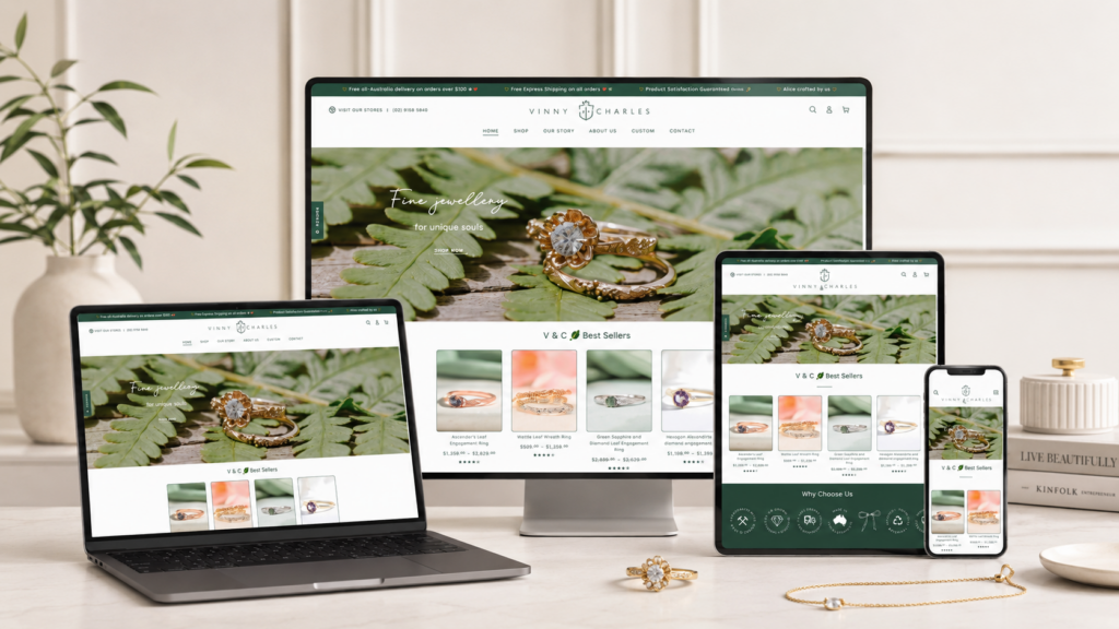
A strong jewelry website should do more than display beautiful products. It should create emotion, build trust, guide shoppers through meaningful choices, and turn interest into action. For a brand like Vinny & Charles, the website needed to feel intimate, refined, and personal while still working as a clear Shopify shopping experience.
Our design direction focused on the balance between storytelling and conversion. The brand already had a powerful foundation: handcrafted jewelry, nature-inspired details, unique engagement rings, wedding bands, custom options, and an ethical approach to materials. The challenge was to translate those qualities into a Shopify website that felt elegant, easy to explore, and ready for modern online shoppers.
Instead of treating the site as a simple product catalog, we approached it as a complete brand experience. The homepage became the emotional entry point. Collection pages helped shoppers narrow their choices. Product pages supported confidence and decision-making. Supporting pages added depth, care, and trust. Every section had a purpose: present the jewelry beautifully, explain the brand clearly, and guide customers toward the right piece.
| Deliver Time | Category | Application Platform |
| 26days | Jewelry | shopify |
| Designers Involved | Cost | Effect |
| Lin Zhang | $2300 | Sales📈277% |
Project Overview
Vinny & Charles is a jewelry brand with a soft, handcrafted, nature-inspired identity. Its products are not positioned as generic accessories. They carry meaning, emotion, and personal value. Many shoppers visit this type of Shopify store while looking for engagement rings, wedding rings, anniversary gifts, or custom jewelry. That means the design must feel both beautiful and reassuring.
Design Goal
The main goal was to create a Shopify website design that could express craftsmanship, romance, individuality, and trust. We wanted the site to feel premium without becoming cold, minimal without feeling empty, and emotional without becoming cluttered.
Brand Direction
The brand direction centered on four ideas:
Handcrafted Beauty
The visual language needed to show that each piece feels personal and carefully made.
Nature-Inspired Detail
Leaf patterns, floral forms, gemstones, and organic ring shapes needed to influence the mood of the website.
Ethical Luxury
The website had to communicate quality, sustainability, and responsible choices in a subtle but clear way.
Personal Connection
Because customers often buy jewelry for major life moments, the site needed to feel warm, human, and trustworthy.
Understanding the Customer Journey
Before designing the pages, we studied the customer journey from first impression to purchase decision. Jewelry shoppers usually do not buy only because of price. They compare style, meaning, quality, trust, reviews, materials, shipping, sizing, and customization options.
Homepage Visitors
Many visitors land on the homepage first. They need to understand the brand quickly. They want to see the jewelry style, feel the mood, and know whether the store matches their taste.
Collection Page Visitors
Other visitors enter through search or ads and land on a collection page. These shoppers need strong product organization, clear filters, beautiful thumbnails, and quick access to important product details.
Product Page Visitors
Product page visitors are closer to buying, but they still need reassurance. They want to understand materials, sizing, customization, delivery, returns, and whether the piece will feel special in real life.
Returning Visitors
Some shoppers return after comparing options. For them, consistent navigation, reviews, saved emotional value, and memorable brand storytelling all support conversion.
Homepage Design Strategy
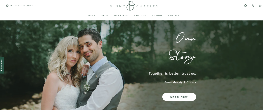
The homepage became the most important storytelling page. It needed to introduce the brand, show the products, guide visitors into key categories, and build trust before shoppers moved deeper into the store.
Hero Section
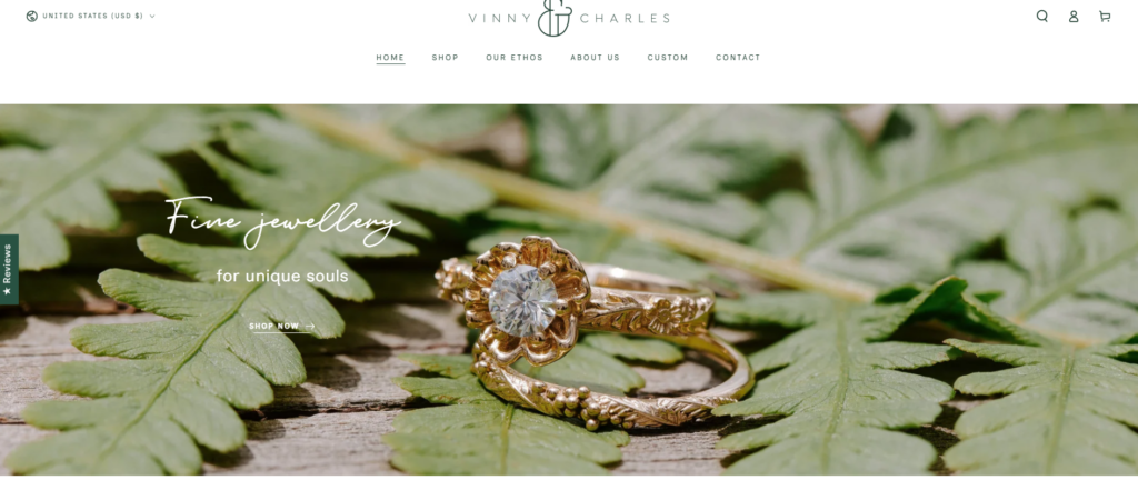
The hero section should create an immediate emotional impression. For a jewelry brand like Vinny & Charles, the first screen should not feel like a hard sales banner. It should feel romantic, refined, and intentional.
We designed the hero area around large lifestyle imagery, elegant typography, and a clear call-to-action. The visual style should highlight fine jewelry details while keeping the layout calm and spacious. A strong headline can communicate uniqueness, handcrafted value, or nature-inspired romance.
The call-to-action should guide shoppers toward key collections such as engagement rings, wedding rings, or custom jewelry. This helps the homepage work not only as a brand introduction but also as a conversion path.
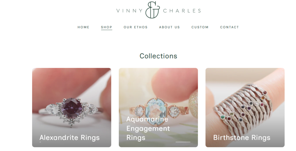
Featured Collections
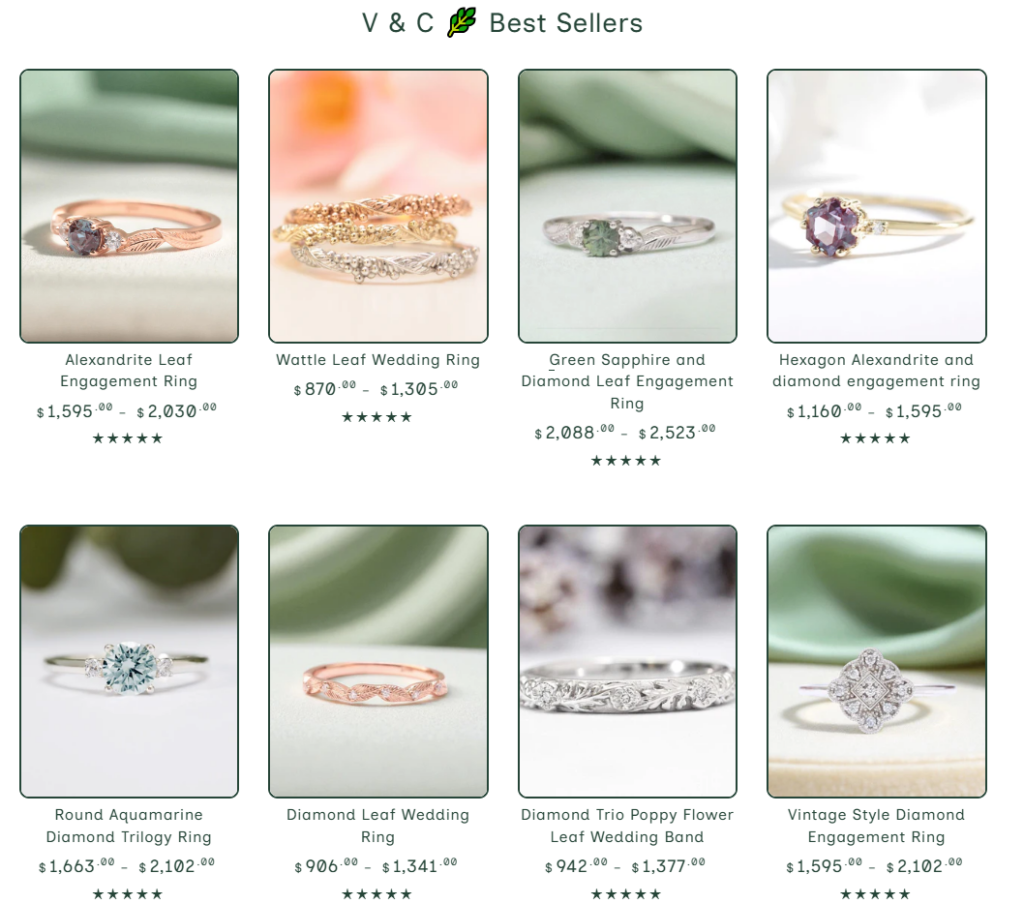
After the hero section, the homepage needs to help shoppers choose where to go next. Jewelry stores often carry many product types, so category structure matters.
We organized the featured collection area around high-intent shopping paths. These may include engagement rings, wedding rings, unique rings, gemstone rings, and custom jewelry. Each category should use clean product imagery, short copy, and direct navigation.
This section reduces confusion. Instead of forcing visitors to browse everything, it gives them clear entry points based on their shopping goal.
Brand Story Section
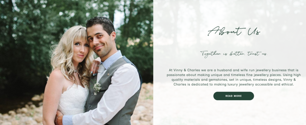
The brand story section gives the website its emotional depth. Vinny & Charles has a strong handcrafted and personal identity, so the design should make that story visible.
We used a warm, editorial-style section with image and text pairing. The copy should focus on the people behind the brand, the studio-made process, and the idea that each piece carries individual meaning. This design style helps the store feel more personal than a mass-market jewelry retailer.
Custom Jewelry Feature
Custom jewelry is an important trust and value builder. Many customers want something personal, especially for engagement and wedding pieces. A dedicated custom section on the homepage helps the brand speak directly to those customers.
The layout should feel inviting and simple. Instead of overwhelming users with every possible customization detail, the section should explain the idea clearly: shoppers can create something unique with guidance from the brand. A soft CTA such as “Start a Custom Piece” or “Explore Custom Rings” supports action without pressure.
Social Proof and Reviews
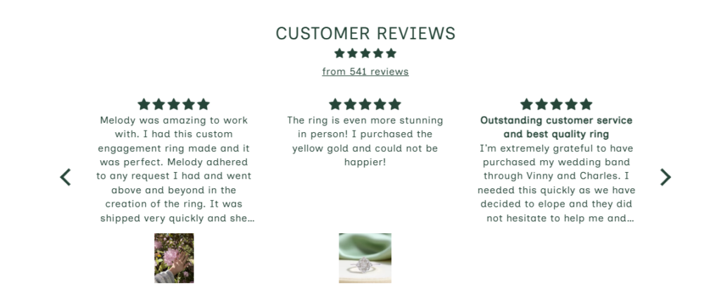
Reviews play a major role in jewelry eCommerce. Customers want reassurance before buying a meaningful and often high-value item. The homepage should include a well-designed review section that feels credible and easy to scan.
Rather than placing reviews as plain text, we recommend using a clean card layout. Each review card can highlight a short customer quote, product name, star rating, and customer name. This gives the page a stronger sense of trust while keeping the design polished.
Featured Press or Recognition
If the brand has been featured in wedding, jewelry, or lifestyle publications, the homepage can display those logos in a quiet credibility section. This does not need to dominate the page. A simple row of publication names or logo marks can strengthen authority and make new visitors feel more confident.
Collection Page Design
Collection pages are where Shopify website design becomes especially important. These pages must look beautiful, but they also need to support product discovery.
Clear Category Structure
For a jewelry store, collection pages should not feel like endless grids. We recommend a clear visual hierarchy with a collection title, short SEO-friendly description, filter options, and a refined product grid.
The title should confirm where the shopper is. The description should explain the collection’s value without becoming too long. The product grid should keep attention on the jewelry.
Product Card Design
Product cards should be simple and elegant. A strong product card can include the product image, product name, price, material detail, and a quick visual cue for style. The image should stay dominant because jewelry is highly visual.
Hover effects can support browsing by showing another angle, a lifestyle image, or a close-up detail. This creates a more interactive shopping experience without making the page feel busy.
Filtering and Browsing Experience
Jewelry shoppers often compare by material, gemstone, style, price, and occasion. The design should make filtering easy to understand. A clean sidebar or top filter bar can help customers narrow the selection quickly.
The goal is not to make the page complex. The goal is to help shoppers find the right piece with less effort.
SEO-Friendly Collection Copy
A Shopify collection page also needs search relevance. We designed the content structure so that important keywords can appear naturally, including terms related to unique rings, wedding rings, engagement rings, gemstone rings, and handcrafted jewelry.
The copy should support SEO while still sounding human. It should explain why the collection matters, what makes the pieces distinctive, and who they are designed for.
Product Page Design
The product page carries the most responsibility. It must turn interest into confidence.
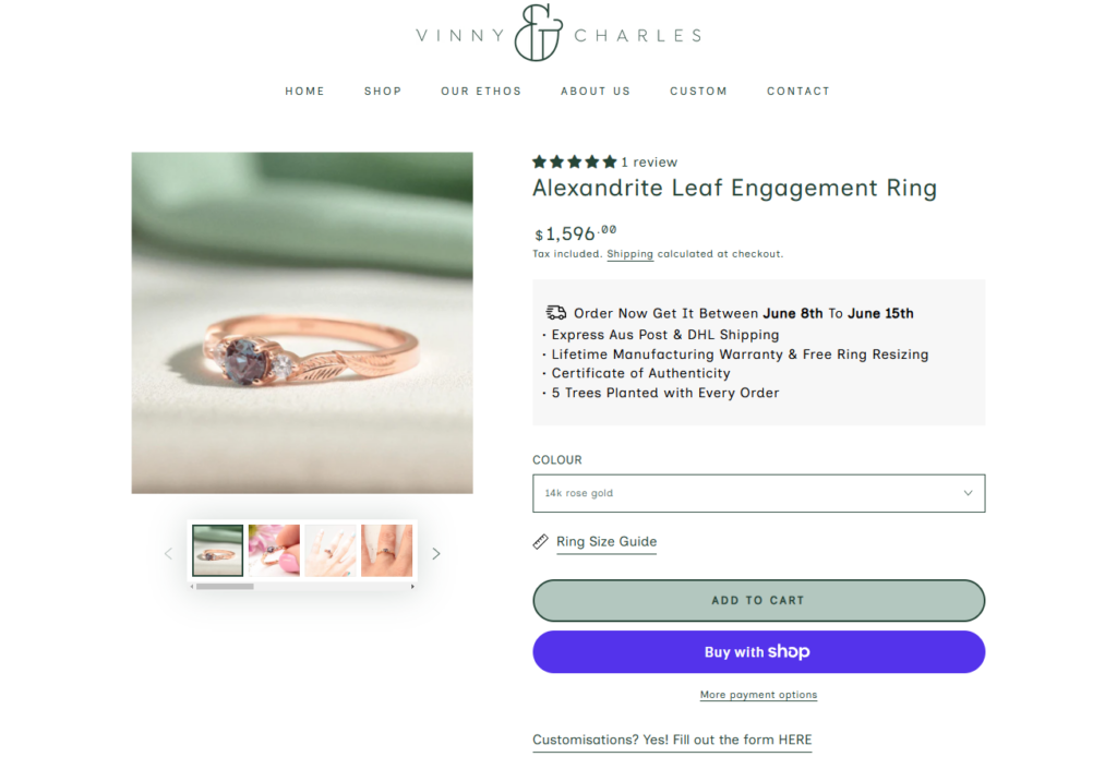
Product Image Layout
Jewelry products need close-up views, lifestyle images, and detail shots. We recommend a clean gallery layout with large primary imagery and easy thumbnail navigation. Customers should be able to inspect textures, gemstones, engraving, and shape.
The product image area should feel premium and uncluttered. White space helps the jewelry stand out and makes the page feel more refined.
Product Information Hierarchy
The product title, price, material options, size options, and add-to-cart button should be easy to find. Many jewelry shoppers also need extra details, but those details should not overwhelm the top of the page.
We recommend structuring product information in layers:
Primary Purchase Information
This includes title, price, options, and CTA.
Confidence Information
This includes shipping, sizing, resizing, warranty, and returns.
Emotional Product Story
This includes design inspiration, material meaning, gemstone details, and craftsmanship notes.
Customization and Options
Jewelry often includes important options such as metal type, ring size, stone choice, engraving, or personalization. These options should feel easy, not stressful.
The interface should use clean labels, helpful microcopy, and a logical order. When shoppers understand their choices, they feel more comfortable completing the purchase.
Trust Blocks
A product page should include short trust blocks near the buying area. These may highlight handcrafted quality, ethical materials, secure checkout, worldwide shipping, or customer support.
These details help reduce hesitation. They also support the brand’s positioning as thoughtful, premium, and customer-focused.
Review Placement
Product-specific reviews should appear lower on the page, after the main purchase section. This placement allows shoppers to first understand the product and then validate their decision through customer feedback.
Supporting Page Design
A strong Shopify jewelry website needs more than a homepage and product pages. Supporting pages help build the emotional and practical trust that jewelry customers need.
About Page
The About page should tell the brand story in a warm and personal way. For Vinny & Charles, this page can highlight the makers, the studio, the design philosophy, and the handcrafted process.
The design should feel editorial. Large imagery, short text sections, and soft spacing can make the page feel more human.
Custom Page
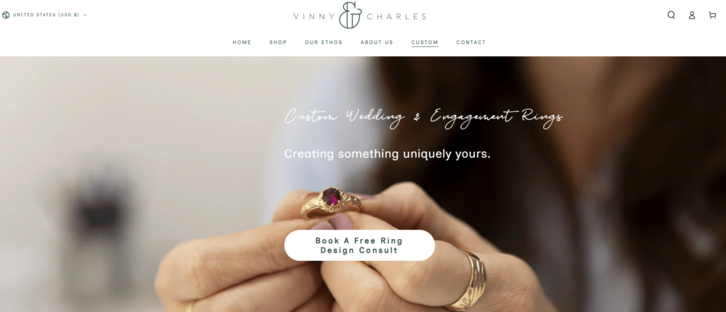
A dedicated custom jewelry page can explain the process step by step. This helps customers understand how to start, what to expect, and why custom work adds value.
The page should answer common questions without sounding too technical. The focus should stay on design guidance, personal meaning, and the final emotional result.
Ring Sizing Page
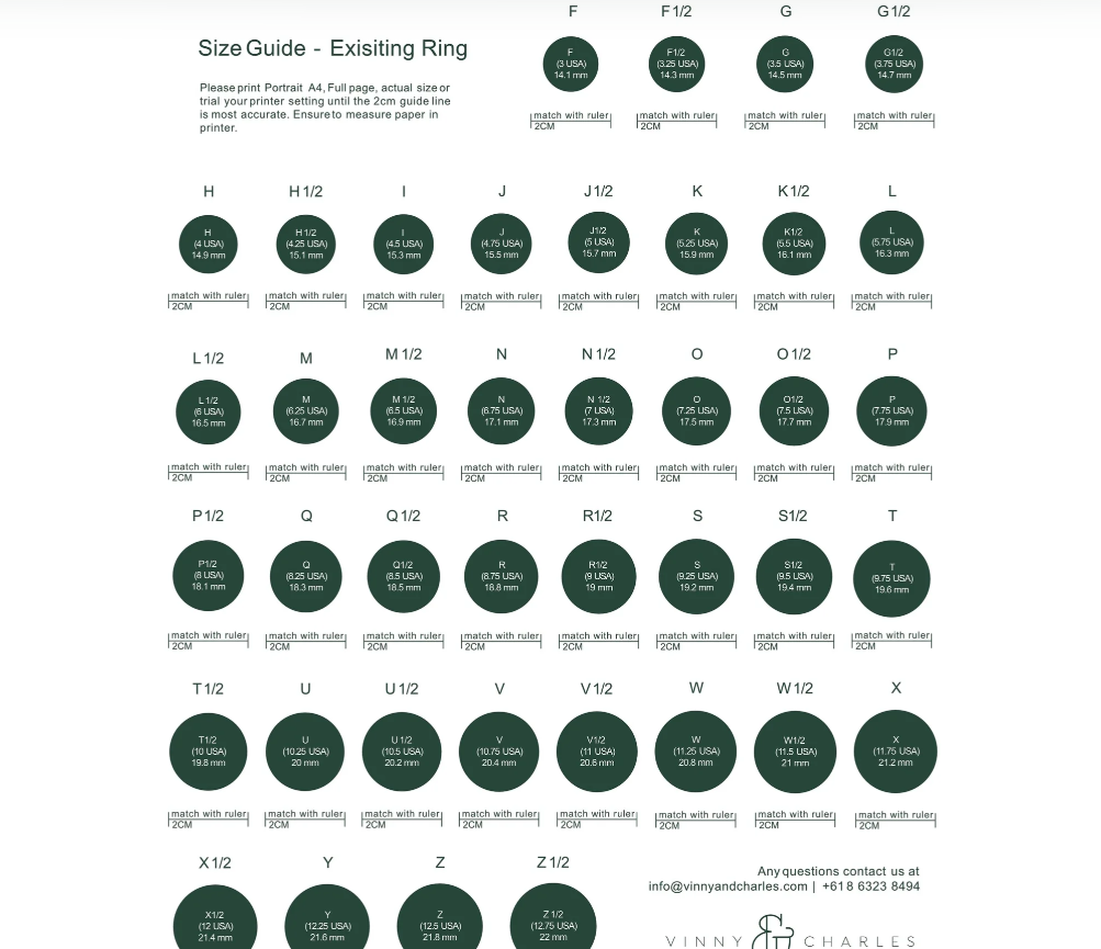
Ring sizing is a major concern for online jewelry shoppers. A clear ring sizing page supports customer confidence and reduces hesitation.
The design should make the information easy to scan. Visual guides, simple instructions, and helpful FAQs can make the page more useful.
FAQ Page
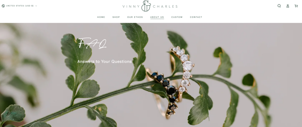
The FAQ page should support customers before they contact the brand. Topics may include shipping, returns, resizing, materials, order timelines, custom work, and care instructions.
A clean accordion layout works well because it keeps the page organized and easy to browse.
Blog Page
The blog can support SEO and brand education. Topics can include engagement ring guides, gemstone meanings, wedding band inspiration, jewelry care, custom ring ideas, and ethical jewelry choices.
A well-designed blog layout can help the brand attract organic traffic while reinforcing its expertise.
Visual Design Direction
The website needed a visual system that matched the jewelry style. The design should feel romantic, natural, refined, and trustworthy.
Color Palette
A soft neutral palette works well for handcrafted jewelry. Warm whites, ivory, muted beige, soft gray, and subtle gold tones can create a calm premium feeling. These colors allow gemstones and metal finishes to stand out.
Typography
Typography should feel elegant but readable. A refined serif can work well for headings, especially when paired with a clean sans-serif for body text. This combination gives the site a boutique jewelry feel while keeping product information clear.
Image Style
The image direction should combine product clarity with emotional lifestyle storytelling. Close-up product photography shows craftsmanship. Lifestyle photography adds romance and context. Studio imagery builds trust in the handmade process.
Spacing and Layout
Luxury design often depends on restraint. We used generous spacing, clean grids, and focused sections to avoid visual overload. This helps the products feel more valuable and makes the shopping experience calmer.
Our Design Process
A successful Shopify website design project needs a clear process. For this project, we followed a practical design workflow focused on brand understanding, page structure, visual direction, and conversion improvement.
Step 1: Brand and Product Review
We first reviewed the brand’s product categories, customer needs, visual identity, and key selling points. This helped us define the main design direction.
Step 2: Page Strategy
Next, we mapped the core pages: homepage, collection pages, product pages, About page, custom page, sizing page, FAQ page, and blog page. Each page received a clear purpose.
Step 3: Homepage Structure
We planned the homepage as a complete conversion journey. It moves from emotional brand impression to collection discovery, product highlights, story, custom work, reviews, and final action.
Step 4: Visual System
We created a consistent visual system for colors, typography, spacing, image use, button style, and section rhythm. This helped the whole Shopify site feel connected.
Step 5: Conversion Review
Finally, we reviewed the shopping path from a customer’s perspective. We checked whether the design answered key questions, reduced friction, and encouraged users to explore or purchase.
Challenges
Every Shopify design project has unique challenges. This jewelry website required a careful balance between emotion and usability.
Challenge 1: Presenting Luxury Without Feeling Distant
Luxury websites can sometimes feel too cold. For this brand, the design needed to feel refined but still personal. We solved this by combining elegant layouts with warm storytelling and handcrafted details.
Challenge 2: Organizing Many Product Choices
Jewelry shoppers compare many options. Without clear structure, the shopping experience can become confusing. We used thoughtful collection organization, clean product cards, and helpful filters to improve browsing.
Challenge 3: Building Trust Online
Buying jewelry online requires confidence. Customers need to trust the product, the materials, the sizing, the delivery, and the people behind the brand. We supported trust through reviews, care information, sizing guidance, brand story, and clear product details.
Challenge 4: Keeping SEO and Design Balanced
SEO content matters, but too much text can weaken the visual experience. We designed page sections that allow useful keyword-rich copy without making the site feel heavy.
Our Solution
Our solution focused on a design-led Shopify experience. We did not rely on complicated technical explanations or unnecessary development language. Instead, we used strong page planning, visual hierarchy, brand storytelling, and conversion-focused design.
A Homepage That Tells the Brand Story
The homepage introduces the jewelry style, the brand values, and the main shopping paths. It gives visitors a reason to stay and a clear direction to continue.
Product Pages That Support Confidence
The product pages organize product images, options, descriptions, trust elements, and reviews in a clear structure. This helps shoppers understand the value of each piece.
Collection Pages That Improve Discovery
The collection pages help visitors browse with purpose. Clear categories and refined product cards make the shopping experience easier and more enjoyable.
Support Pages That Reduce Questions
Pages such as ring sizing, custom jewelry, care, and FAQ help customers feel informed before purchasing. These pages also strengthen the overall customer experience.
Final Results
The final Shopify website design gives the brand a more complete digital presence. It presents handcrafted jewelry with elegance, supports clear product discovery, and gives shoppers the information they need to feel confident.
The homepage works as a strong brand introduction. The collection pages make browsing easier. The product pages support decision-making. The supporting pages build trust and answer important questions. Together, these elements create a Shopify jewelry website that feels beautiful, personal, and conversion-focused.
Conclusion
This project shows how thoughtful Shopify website design can turn a jewelry store into a stronger brand experience. For Vinny & Charles, the goal was not only to make the site look elegant. The goal was to create a clear, emotional, and trustworthy shopping journey for customers searching for meaningful jewelry.
At AIRSANG, we help cross-border brands create Shopify page designs that combine visual storytelling, product presentation, user experience, and conversion strategy, so each website feels polished, professional, and ready for growth.


Design and build a WordPress website or corporate site with a full eCommerce system for you.
Price range: $200.00 through $2,500.00custom-requirements-or-special-quotations
Original price was: $2.00.$1.00Current price is: $1.00. Main Image Design for Amazon Home Physiotherapy Device Explained
Introduction: Building a Trustworthy Image for Home Therapy Devices on Amazon When designing the main image for a home therapy device on Amazon, our primary...

Main Image Design for Amazon Lipstick Conversion
Introduction: Designing a Lipstick Main Image That Sells on Amazon When we design a Main image for an Amazon lipstick, our responsibility goes far beyond...

How Hackers Steal WordPress Admin Emails (And How to Stop Them)
Let’s start with an uncomfortable truth: Your WordPress admin email is probably way more public than you think.And hackers? They love that. To them, your...

What Makes an Amazon Liquid Foundation Main Image Convert
Introduction Designing a Main image design for Amazon Liquid foundation is never just about making a product look beautiful. On Amazon, the main image and...

Designing an Effective Amazon Main Image for Filter Cartridges
Introduction Designing a Main image for Amazon is never just about making a product look attractive. It is about clarity, trust, and instant understanding—especially for...

Replay Attacks on WordPress: Real Threat or Overhyped Myth?
Let’s clear something up first. Replay attacks don’t look scary.They don’t smash passwords.They don’t inject evil code with green hacker text flying everywhere. They’re sneaky....

How to Duplicate WordPress Pages Without Breaking Anything
Let’s face it. Sometimes you don’t want to create a new page.You just want the same page… but slightly different. Same layout.Same blocks.Same settings. Because...

Five Pet WordPress Themes Compared
Introduction Choosing the right pet-related WordPress theme is more than a design decision—it directly affects usability, scalability, and long-term business growth. Pet care and pet...

Comparing Five Swimwear eCommerce Themes
Introduction Choosing the right theme for a swimwear or lingerie independent store is not just a visual decision—it directly affects conversion rates, scalability, and long-term...

How to Turn Off Comments in WordPress (Without Losing Your Mind)
Let’s talk about WordPress comments. In theory, comments are great.They encourage discussion.They build community.They make your website feel “alive.” In reality? They’re often a magnet...

Building a Scalable WordPress Website for a Science-Driven Brand: The AminoUSA Project
Introduction In today’s digital landscape, a website is more than a place to list products. For science-driven brands operating in regulated or research-focused industries, a...

Building a Scalable Shopify Store for a Global Blade Brand: The CoolKatana Project
Introduction In cross-border eCommerce, a Shopify website is more than a storefront.For brands operating in niche, culture-driven categories, the website must do far more than...

Designing a High-Conversion Shopify Store for Pokémon Cards
Introduction In the world of collectible eCommerce, especially within the Pokémon Trading Card Game (TCG) market, a website must do more than simply list products....

High-Converting Shopify Design for a Custom Brick Brand
Introduction In today’s competitive eCommerce landscape, especially in the personalized gift and collectible space, a Shopify website must do far more than display products. It...

How to Contact Shopify Support: Simple, Stress-Free Guide
Running a Shopify store should feel exciting—not confusing. When questions pop up or issues slow you down, Shopify offers several support paths depending on what...

How to Deactivate a Shopify Store: A Clear, Practical Guide
Deactivating a Shopify store isn’t complicated, but it does come with consequences many merchants overlook. This guide breaks the process down in a simple, educational...

Shopify Website Design Case Study for a Premium Floral Brand
Introduction In today’s competitive eCommerce landscape, a Shopify website must do far more than display products. It needs to communicate brand value instantly, guide users...

Shopify Design Case Study: Retro Gaming Store
Introduction In a highly competitive eCommerce environment, visual clarity and emotional connection often determine whether a visitor becomes a customer. This is especially true in...