


No products in the cart.

When we design Ozon main images, we never treat them as simple product photos. We treat them as strategic conversion tools. Every composition, every color contrast, every typography decision must serve one goal: elevate perceived value while communicating function clearly and instantly.
In this project series, we developed multiple Ozon main image designs across different product categories — from lifestyle electronics to kitchen appliances and power tools. Although the products vary, the core objective remains the same: create a strong sense of sophistication, establish trust within seconds, and increase click-through rate in a competitive marketplace environment.
Below, we break down each design individually and explain the logic behind every visual decision.
| Deliver Time | Style | Application Platform |
| 9days | sense of sophistication | Ozon |
| Designers Involved | Cost | Effect |
| Lin Zhang | $150 | Store traffic📈217% |
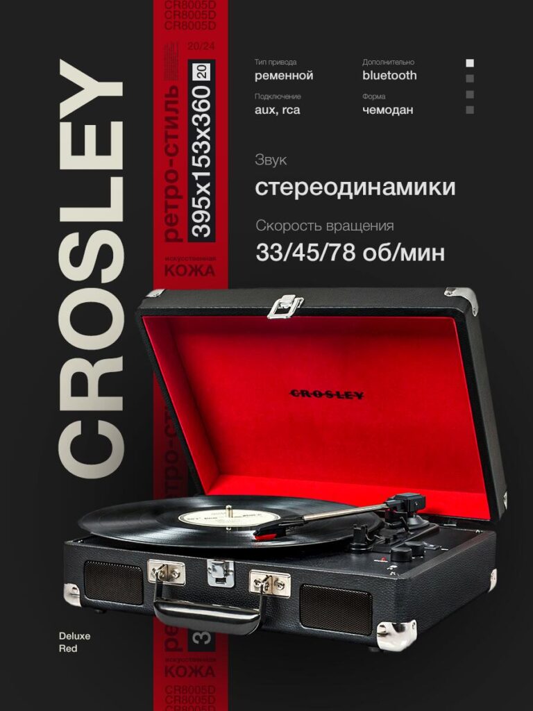
For the retro suitcase-style turntable, we focused on emotional luxury rather than technical overload.
We positioned the product at a three-quarter angle to create depth and tactile realism. The open lid with a bold red interior immediately builds visual contrast against the dark background. Red is not used randomly — it signals passion, vintage aesthetics, and musical energy.
The vertical typography on the left side builds a modern editorial feeling. It stretches the canvas vertically, creating visual hierarchy without clutter. Instead of crowding the image with too many features, we carefully structured the specifications on the right:
The structured grid aligns with Ozon’s browsing behavior: users scan quickly. By placing specs in short clusters, we allow the eye to digest information in less than two seconds.
Sophistication here comes from restraint. The dark gradient background removes distractions. The lighting emphasizes material texture — artificial leather surface, metal corners, and speaker mesh — all contributing to perceived premium quality.
We intentionally avoided excessive icons. The clean typography and negative space elevate the product above typical marketplace clutter.
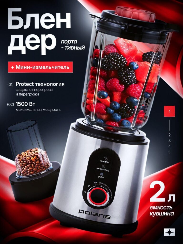
The blender design required a different strategy. Unlike the turntable, this is a power-driven kitchen appliance. Performance had to dominate visually.
We emphasized:
The product was shot from a slightly low angle to enhance power perception. The red flowing fabric background reinforces dynamic movement and energy. We used red not only as an accent but as a performance cue.
The fruits inside the transparent jar were intentionally vibrant — strawberries, blueberries, blackberries — to visually communicate blending strength and freshness.
The side mini-grinder attachment is positioned subtly but clearly to show added value.
Instead of making the design aggressive, we balanced bold power claims with clean white typography. The contrast between brushed metal texture and glossy glass enhances product credibility.
The sophistication here is technological confidence — not loud, but controlled.
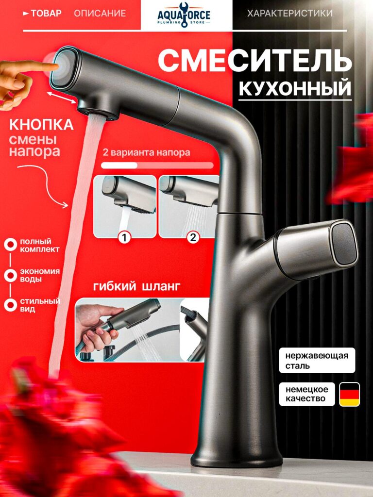
For the kitchen faucet, we shifted to a minimalist industrial aesthetic.
We created a split background:
This split visually frames the faucet, making it stand upright and dominant.
We highlighted:
We used inset boxes to demonstrate spray modes. These micro-frames allow customers to visualize usage scenarios instantly — very important for Ozon buyers who want quick functional clarity.
We avoided decorative elements. The faucet surface texture and metallic reflections speak for themselves.
The sophistication comes from precision lighting and balanced layout — no overcrowding, no unnecessary graphics.
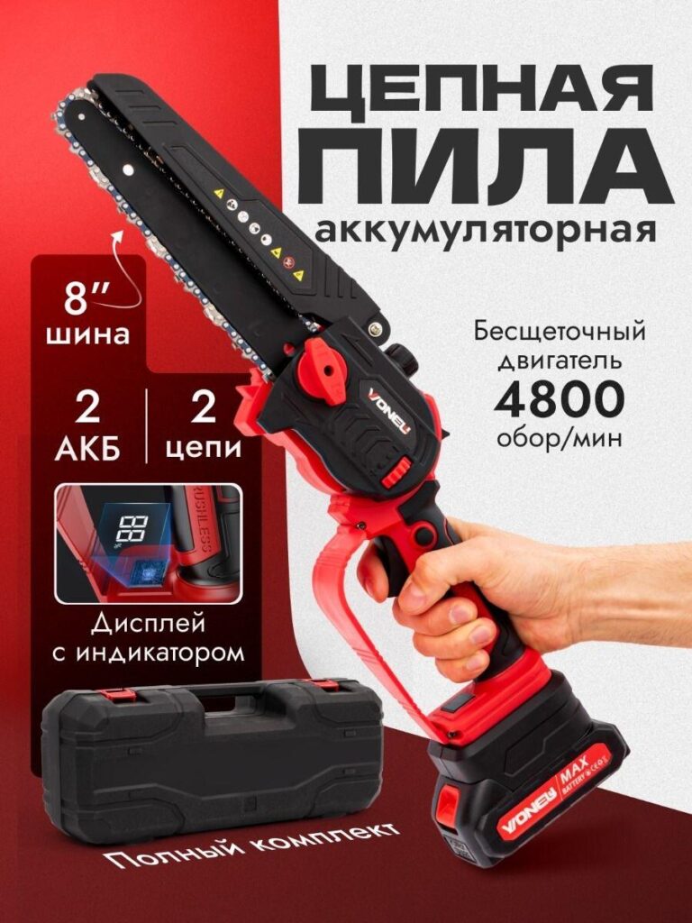
Power tools demand visual impact. For the cordless mini chainsaw, we emphasized strength without making the design chaotic.
We showcased:
The product is held in a hand to show scale and ergonomics. Human interaction increases trust and clarifies size immediately.
We positioned the carrying case at the bottom to reinforce “full set included.”
Sophistication in tools means engineering credibility. The typography is bold but structured. Red panels highlight performance stats without overwhelming the composition.
We used controlled shadows to create depth and weight.
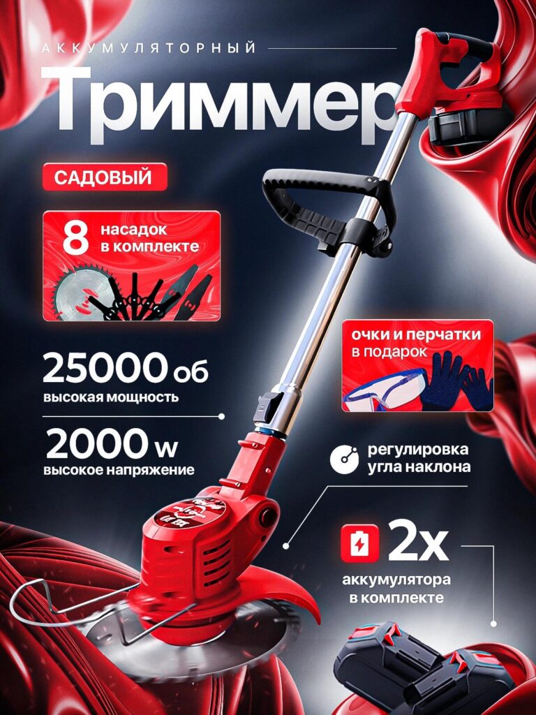
The trimmer image required dynamic energy.
We displayed:
The angled positioning of the trimmer creates diagonal motion. Diagonal lines imply activity and productivity.
We used layered red panels to separate benefit clusters. This prevents cognitive overload and guides the eye naturally.
Even with many features, we kept typography consistent and aligned. The metallic shaft contrasts with the red motor body, adding material variation and premium perception.
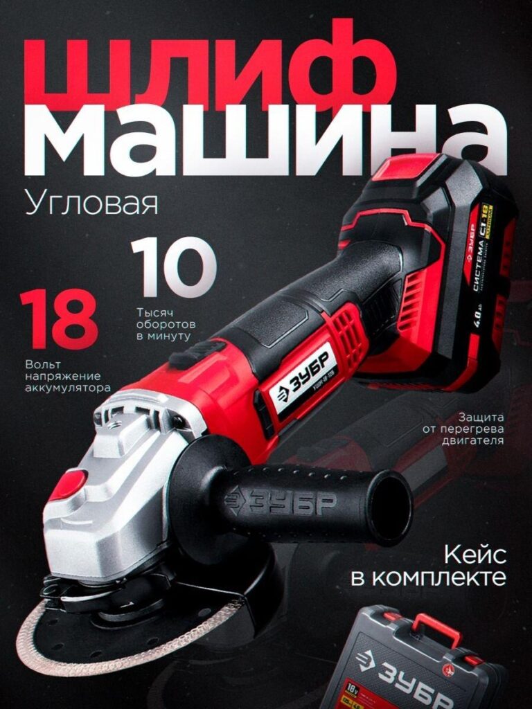
For the angle grinder, we adopted a darker industrial environment.
We emphasized:
The product is placed at a strong diagonal angle, dominating the frame. We enhanced metallic textures and grip surfaces to showcase durability.
The large typography behind the product creates layered depth — a common high-end commercial technique.
Industrial sophistication relies on weight and shadow. We used directional lighting to emphasize edges and structure.
The restrained color palette (black, red, silver) builds professional confidence.
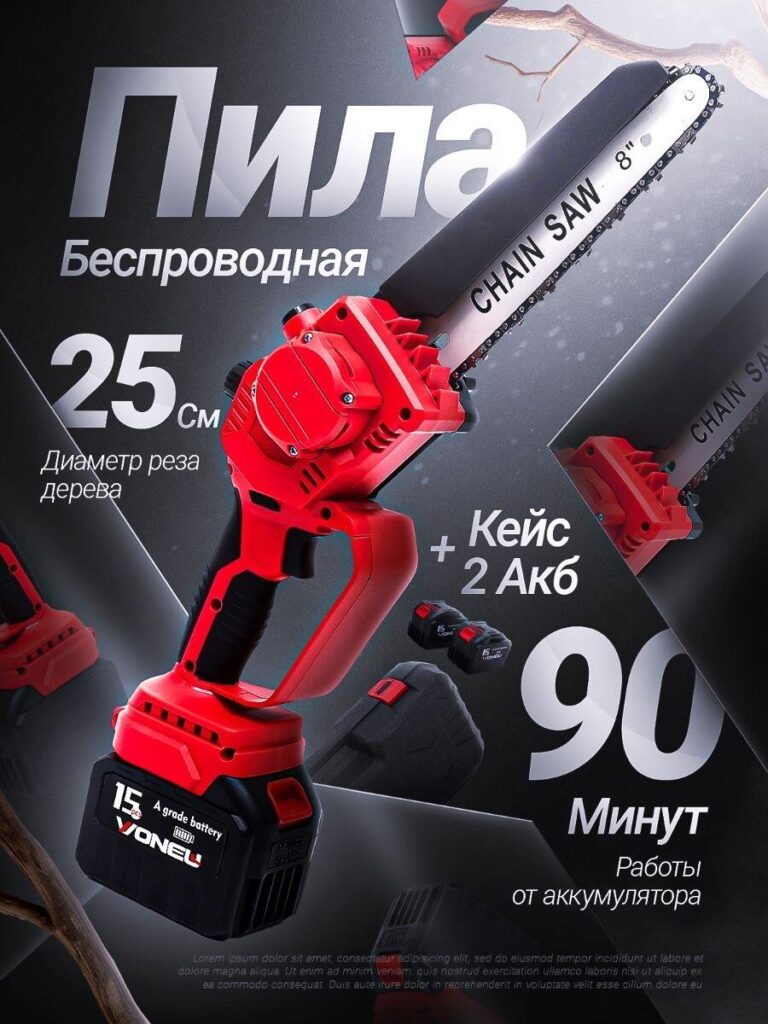
This design required endurance communication.
We highlighted:
We created mirrored background shapes to frame the chainsaw blade. This geometric framing adds modern structure.
The runtime number (“90 minutes”) is oversized because endurance reduces buyer hesitation.
Sophistication here is clarity. We minimized unnecessary decoration and let performance numbers speak visually.
The snow-like texture in the background subtly suggests outdoor use without distracting from the product.
Although each product differs, our Ozon main image strategy follows five consistent principles:
We prioritize one dominant benefit per design. Everything else supports it.
Red = energy, performance, urgency
Black = authority, premium
White = clarity
We use contrast strategically — never randomly.
Lighting highlights textures:
Material clarity increases perceived value.
We avoid chaotic text placement. Grid alignment creates a sense of engineering precision.
Ozon buyers scroll fast. Our designs:
Many sellers overload their main images with icons, arrows, badges, and promotional stickers. That approach often reduces perceived quality.
A refined, sophisticated image communicates:
When a product looks premium, customers expect it to perform better.
That expectation directly influences click-through rate and conversion.
Ozon main image design is not decoration — it is strategic positioning.
Across lifestyle electronics, kitchen appliances, and power tools, we applied the same disciplined framework:
Each image delivers clarity first, performance second, and sophistication throughout.
If you want your Ozon listings to stand out with a true sense of sophistication and measurable conversion improvement, this is exactly the kind of strategic visual system we build at AIRSANG.


