


Introduction
When designing a main image for an Ozon listing, we do far more than make a product look attractive. We design for clarity, trust, and instant understanding. Ozon shoppers scan fast, compare aggressively, and decide within seconds. For a Lithium-ion cordless drill, the main image must communicate power, reliability, and professional capability immediately—without confusion or visual noise.
This project focuses on building a complete main image system rather than a single isolated visual. Each image plays a specific role in guiding the buyer from first impression to purchase confidence. Through lighting, composition, typography, and scene selection, we structured a visual narrative that answers the buyer’s most important questions before they even read the product description.
Below, we break down every image in this Ozon main image set and explain why each design decision was made.
| Deliver Time | Category | Application Platform |
| 9days | Lithium-ion cordless drill | Ozon |
| Designers Involved | Cost | Effect |
| Lin Zhang | $150 | Store sales revenue📈321% |
Image 1: Built-In LED Lighting – Function Shown in Action
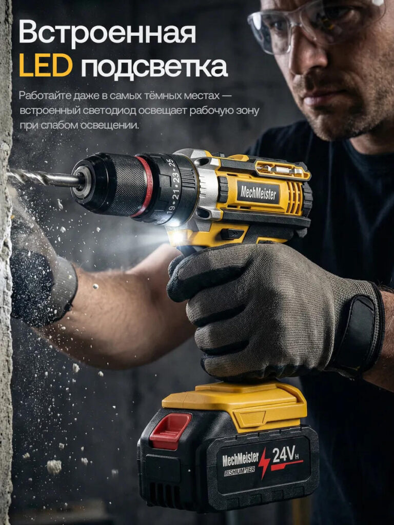
The first image introduces the cordless drill in a real working environment, drilling into a hard surface under low-light conditions. We deliberately activated the built-in LED light and made it a visible, functional highlight rather than a decorative element.
This design choice solves a real buyer concern: visibility during work in dark or tight spaces. Instead of listing “LED light” as a feature, we show how it illuminates the drilling area directly at the point of contact. Dust particles, debris, and motion blur reinforce realism and power.
From a design perspective, we positioned the drill diagonally to create forward momentum, while the worker’s focused posture builds emotional credibility. The text placement stays clear and high-contrast, ensuring readability on both desktop and mobile screens within Ozon’s interface.
This image works as a hook. It tells users immediately: this tool works when conditions are not perfect.
Image 2: Dual Bearing Construction – Precision and Stability

The second image shifts from environment to control. Here, the drill operates vertically on a solid wooden block, emphasizing precision rather than force. We introduced the concept of a dual bearing structure because buyers of power tools care deeply about stability, lifespan, and vibration control.
Instead of technical diagrams, we chose a workshop setting that feels authentic and professional. Wood shavings accumulate naturally around the drill bit, reinforcing realism. The gloves, workbench, and tools in the background signal serious craftsmanship.
Design-wise, the drill stays centered and upright to symbolize balance and mechanical accuracy. The text hierarchy keeps the main feature bold while supporting text remains secondary, avoiding clutter. This image reassures buyers that internal construction quality matches external performance.
Image 3: 80 Nm Torque – Power Under Aggressive Conditions
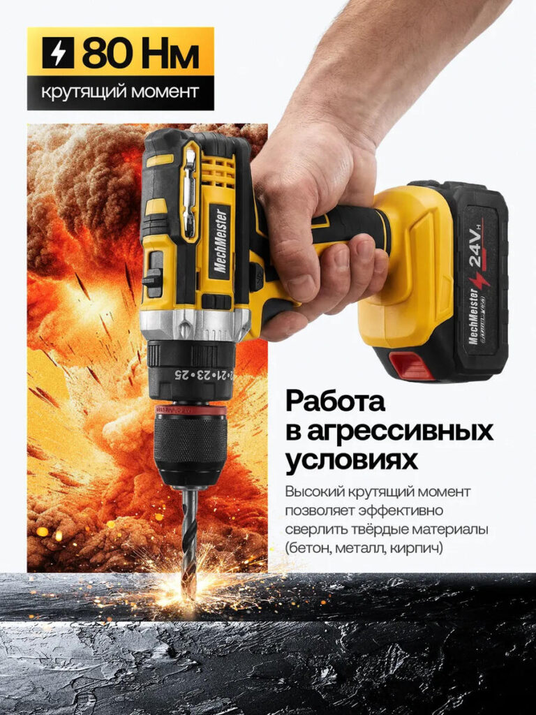
This image delivers raw impact. We designed it to visually communicate torque and strength without relying on exaggerated claims. The drill penetrates a hard surface with sparks and debris flying, instantly signaling high torque output.
We used strong contrast between the background and the drill body to keep the product readable even with dramatic effects. The “80 Nm torque” message sits prominently but does not overpower the image.
From a marketplace standpoint, this image targets buyers who compare specifications aggressively. It visually answers the question: “Can this drill handle tough materials like metal, brick, or concrete?” The answer is shown, not told.
This image anchors the product’s power positioning within the entire image set.
Image 4: Brushless Copper Motor – Internal Performance Visualization
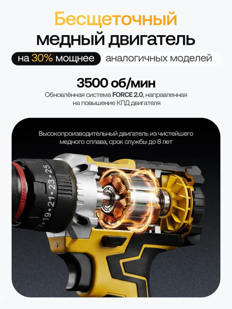
For the fourth image, we transitioned from external action to internal engineering. We exposed the internal motor using a semi-transparent cutaway visualization to highlight the brushless copper motor.
This design bridges the gap between marketing and engineering. Many buyers may not fully understand brushless technology, but they understand durability, efficiency, and lifespan. Showing copper windings glowing with controlled energy helps translate abstract technical benefits into visual logic.
The dark background isolates the motor, while warm lighting draws attention to the core component. Text remains minimal and educational, reinforcing credibility rather than hype.
This image builds trust by proving that performance comes from inside, not just surface design.
Image 5: Complete Product Set – What the Buyer Actually Gets
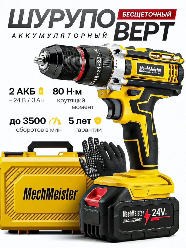
Clarity sells. In this image, we displayed the full product set: the drill, dual batteries, carrying case, and gloves. We intentionally used a clean white background to remove distractions and focus purely on inclusions.
Ozon buyers frequently worry about what is included in the box. This image eliminates uncertainty. The drill faces forward, batteries remain clearly labeled, and accessories stay visually separated.
We designed this layout symmetrically to feel organized and honest. Icons and short text blocks reinforce key specs without overcrowding the frame. This image reduces post-purchase disappointment and increases conversion by setting correct expectations.
Image 6: Anti-Slip Grip – Ergonomics and Comfort
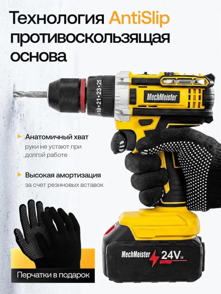
This image focuses on user experience. Instead of power or specs, it highlights grip comfort, vibration absorption, and long-term usability. We used a close-up angle on the hand and handle to show texture, rubber inserts, and ergonomic curves.
By showing the drill in use rather than isolated, we communicate how it feels during extended work sessions. The anti-slip concept becomes tangible through gloves, hand posture, and contact points.
From a design strategy perspective, this image appeals to professionals who value comfort as much as strength. It subtly communicates that this tool supports long working hours without fatigue.
Image 7: Durable Construction – German Quality Positioning
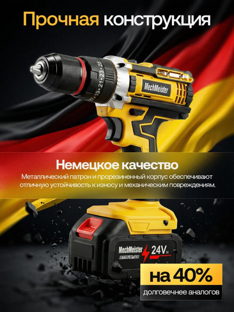
This image reinforces durability through symbolism. The drill appears against a dynamic background inspired by industrial strength and reliability, combined with visual cues associated with German engineering quality.
We emphasized the metal chuck, reinforced housing, and solid battery base. Small debris elements add motion without distracting from the product. The composition keeps the drill angled slightly upward, suggesting resilience and long-term reliability.
This image targets buyers who associate origin and build quality with trust. It visually supports longevity claims without sounding exaggerated.
Image 8: Lithium-Ion Battery System – Internal Structure and Endurance
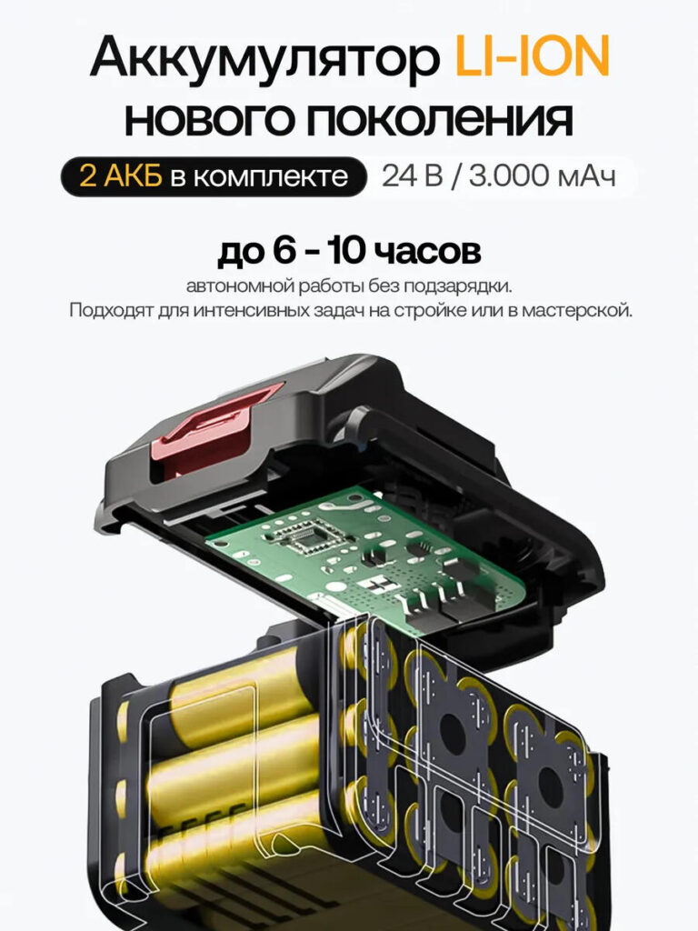
The final image explains battery performance visually. We presented a cutaway view of the lithium-ion battery pack, revealing internal cells and control circuitry.
This design choice answers two buyer questions: how long does it last, and how safe is it? Instead of text-heavy explanations, the internal visualization communicates advanced energy management and high capacity.
Clean backgrounds, clear labeling, and controlled perspective ensure technical clarity. This image completes the story by showing that power, runtime, and efficiency come from a well-engineered energy system.
Why This Main Image System Works on Ozon
Ozon rewards clarity, realism, and structured storytelling. This image set follows a deliberate sequence:
- Real-world use
- Mechanical stability
- Power demonstration
- Internal engineering
- Package transparency
- Ergonomic comfort
- Durability positioning
- Energy system explanation
Each image answers a specific buyer concern. Together, they reduce hesitation, build trust, and increase perceived value.
As designers, we did not design for decoration. We designed for decision-making.
Conclusion
Effective main image design for an Ozon listing requires strategic thinking, not isolated visuals. By aligning every image with a buyer question and presenting information visually rather than verbally, this Lithium-ion cordless drill listing transforms from a product display into a persuasive sales tool.
This project demonstrates how structured visual storytelling, grounded in real usage and clear communication, can significantly improve click-through rates and buyer confidence on competitive marketplaces like Ozon.
This is exactly the kind of conversion-driven marketplace design we specialize in at AIRSANG.


Design and build a WordPress website or corporate site with a full eCommerce system for you.
Price range: $200.00 through $2,500.00Custom requirements or special quotations
Original price was: $2.00.$1.00Current price is: $1.00. Main Image Design for Amazon Home Physiotherapy Device Explained
Introduction: Building a Trustworthy Image for Home Therapy Devices on Amazon When designing the main image for a home therapy device on Amazon, our primary...

Main Image Design for Amazon Lipstick Conversion
Introduction: Designing a Lipstick Main Image That Sells on Amazon When we design a Main image for an Amazon lipstick, our responsibility goes far beyond...

What Makes an Amazon Liquid Foundation Main Image Convert
Introduction Designing a Main image design for Amazon Liquid foundation is never just about making a product look beautiful. On Amazon, the main image and...

Designing an Effective Amazon Main Image for Filter Cartridges
Introduction Designing a Main image for Amazon is never just about making a product look attractive. It is about clarity, trust, and instant understanding—especially for...

Five Pet WordPress Themes Compared
Introduction Choosing the right pet-related WordPress theme is more than a design decision—it directly affects usability, scalability, and long-term business growth. Pet care and pet...

Building a Scalable WordPress Website for a Science-Driven Brand: The AminoUSA Project
Introduction In today’s digital landscape, a website is more than a place to list products. For science-driven brands operating in regulated or research-focused industries, a...

Building a Scalable Shopify Store for a Global Blade Brand: The CoolKatana Project
Introduction In cross-border eCommerce, a Shopify website is more than a storefront.For brands operating in niche, culture-driven categories, the website must do far more than...

Designing a High-Conversion Shopify Store for Pokémon Cards
Introduction In the world of collectible eCommerce, especially within the Pokémon Trading Card Game (TCG) market, a website must do more than simply list products....

High-Converting Shopify Design for a Custom Brick Brand
Introduction In today’s competitive eCommerce landscape, especially in the personalized gift and collectible space, a Shopify website must do far more than display products. It...

Shopify Website Design Case Study for a Premium Floral Brand
Introduction In today’s competitive eCommerce landscape, a Shopify website must do far more than display products. It needs to communicate brand value instantly, guide users...

Shopify Design Case Study: Retro Gaming Store
Introduction In a highly competitive eCommerce environment, visual clarity and emotional connection often determine whether a visitor becomes a customer. This is especially true in...

Shopify Design Case Study: Tactical Rescue Brand
Introduction A strong Shopify website does more than display products—it communicates purpose, builds trust, and guides users toward confident purchasing decisions. This is especially true...

Shopify Website Design Case Study for an Electric Bike Brand
Introduction In today’s competitive electric bike market, a Shopify website must do more than display products—it must tell a story, build trust, and guide users...

Scalable Shopify E-commerce for a Creative Brand
Introduction When creative brands grow, their websites often struggle to keep up. As product lines expand, content increases, and traffic rises, many visually driven brands...

Shopify Website Design Case Study for a Home Decor Brand
Introduction In the highly competitive home decor market, visual identity is no longer just about aesthetics—it directly influences trust, browsing behavior, and purchasing decisions. For...

Building a Scalable WordPress Subscription Website Case Study
Introduction For modern e-commerce brands, a website is no longer just a digital storefront. It is the engine that supports subscriptions, content storytelling, trust building,...

High-Conversion WordPress Design for Adult Brands
Introduction In highly competitive eCommerce markets, strong visuals alone are not enough. A successful WordPress website must guide visitors through a clear, intentional journey—one that...

Scalable WordPress Sex Doll E-commerce Website
Introduction Launching a high-performing cross-border eCommerce website is never just about putting products online.For brands operating in highly competitive and visually driven markets, the website...