Designing a High-Converting Shopify Experience for Solakon

Introduction

In the rapidly growing renewable energy market, clarity builds trust. For a brand like Solakon—focused on balcony solar systems and plug-and-play energy solutions—the website must do more than showcase products. It must educate, reassure, and convert.

When we partnered with Solakon to redesign their Shopify website, our objective was clear: create a visually compelling, conversion-driven eCommerce experience that communicates technical value in a simple, approachable way. Rather than overwhelm visitors with complexity, we structured the website to guide users confidently from awareness to purchase.

This case study explores how we approached the Shopify design process, the challenges we faced, the strategies we implemented, and the measurable results achieved.

Understanding the Brand and Market Position

The Renewable Energy Buyer Journey

Balcony solar systems are not impulse purchases. They are considered investments. Customers want to know:

  • How much energy will I save?
  • Is installation easy?
  • Is it legally compliant?
  • Is this safe and reliable?
  • Is the brand trustworthy?

This means the website must function as:

  1. A product catalog
  2. An educational platform
  3. A trust-building mechanism
  4. A conversion funnel

Our Shopify design strategy addressed all four.

Positioning Solakon as an Authority

Solakon already had strong product credibility. Our task was to translate that credibility visually. We built a design language that feels:

  • Modern
  • Structured
  • Technically confident
  • Transparent
  • Conversion-oriented

The result is a Shopify experience that balances engineering precision with approachable usability.

Our Shopify Design Objectives

Before moving into layout and visuals, we defined measurable design goals:

Primary Objectives

  • Increase conversion rate
  • Improve product clarity
  • Simplify technical information
  • Strengthen brand authority
  • Enhance mobile user experience
  • Reduce decision friction

Secondary Objectives

  • Improve visual hierarchy
  • Strengthen trust indicators
  • Support bundle upsells
  • Highlight savings calculators and energy benefits

Because we specialize in Shopify design strategy—not custom development—our focus remained on layout structure, visual systems, UX flow, content architecture, and conversion psychology.

Our Shopify Design Process

Phase 1: Discovery & UX Mapping

We began with a structural audit of the existing Shopify site:

  • Navigation clarity
  • Category structure
  • Product page layout
  • Information depth
  • Conversion barriers
  • Mobile performance

We mapped the entire customer journey from homepage entry to checkout intent.

We identified friction points:

  • Technical overload too early in the journey
  • Value proposition not immediately clear
  • Social proof buried below the fold
  • Bundle logic unclear

From this, we rebuilt the UX architecture.

Phase 2: Homepage Strategy & Visual Hierarchy

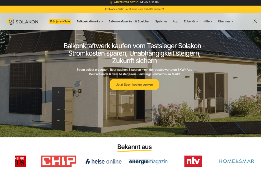
The homepage acts as the brand’s strongest sales tool.

Hero Section Redesign

We focused on:

  • Clear seasonal promotional messaging
  • Immediate value proposition (“balcony solar made simple”)
  • Savings percentage visibility
  • Clean call-to-action placement
  • Strong product imagery with environmental context

We avoided clutter and instead prioritized:

  • Readability
  • Energy savings highlight
  • Trust badges
  • Visual reassurance

The hero needed to communicate in under five seconds:
What is this? Why does it matter? Why trust this brand?

Phase 3: Modular Content Structure

To prevent overwhelming visitors, we built a modular homepage system:

Sectional Flow:

  1. Brand credibility strip (media logos, awards)
  2. Product categories overview
  3. Savings statistics module
  4. Feature breakdown grid
  5. Bundle comparison cards
  6. Product carousel
  7. Accessory upsell section
  8. Social proof block
  9. Brand story
  10. FAQ accordion
  11. Support CTA

Each section has a defined purpose.

We removed visual noise and introduced spacing discipline, strong typography contrast, and consistent iconography.

Product Page Design Strategy

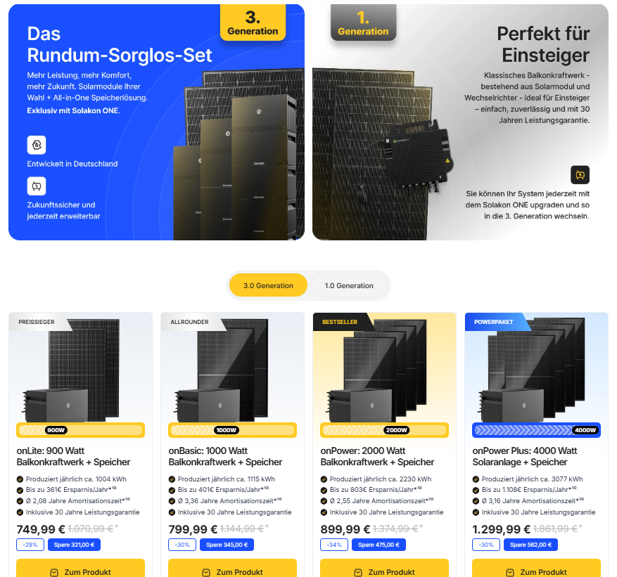
The product page is where revenue happens.

Above-The-Fold Optimization

Designing a High-Converting Shopify Experience for Solakon-Product Page Design Strategy-Above-The-Fold Optimization

We structured the layout to prioritize:

  • Strong product photography
  • Clear naming
  • Energy output summary
  • Savings highlight
  • Delivery time reassurance
  • Trust badges
  • Simplified add-to-cart zone

We placed technical specifications below persuasive elements rather than at the top. This keeps emotional momentum intact.

Bundle Presentation & Decision Simplification

Balcony solar kits often include:

  • Panels
  • Inverters
  • Mounting kits
  • Optional accessories

We redesigned bundle presentation using:

  • Clear visual stack comparisons
  • Highlighted “Best Value” badges
  • Structured benefit bullets
  • Visual energy production icons

This reduces mental load and increases average order value.

Design Challenges & Our Solutions

Challenge 1: Technical Complexity

Renewable energy products naturally include technical data.

Our Solution:
We translated complexity into visual communication.

  • Icons instead of dense paragraphs
  • Visual output comparisons
  • Structured spec blocks
  • Layered information hierarchy

We allowed users to dive deeper only when they want to.

Challenge 2: Trust Building in a Regulated Market

Customers hesitate when products connect to home electrical systems.

Our Solution:

We emphasized:

  • Certifications
  • Media mentions
  • Real customer testimonials
  • Installation reassurance
  • FAQ transparency

Trust signals appear consistently throughout the journey—not just once.

Challenge 3: Balancing Promotion & Authority

Designing a High-Converting Shopify Experience for Solakon-Design Challenges & Our Solutions-Balancing Promotion & Authority

Discount messaging must not undermine technical credibility.

Our Solution:

We maintained:

  • Clean typography
  • Controlled color use (yellow highlights as accent only)
  • Structured layouts
  • Professional imagery

Promotions feel intentional—not aggressive.

Visual Design System

Color Strategy

We retained Solakon’s brand yellow but refined its application:

  • Used as highlight, not background dominance
  • CTA buttons only
  • Savings indicators
  • Key value markers

Neutral backgrounds provide visual breathing room.

Typography Hierarchy

We established a clear system:

  • Strong, bold value statements
  • Structured sectional clarity
  • Body: Highly readable sans-serif
  • Microcopy: Supporting reassurance

This improves scanability—critical for Shopify conversion.

Iconography & Graphic Language

We created consistent icon systems for:

  • Energy output
  • Installation ease
  • Warranty
  • Efficiency
  • Safety

Icons replace heavy technical paragraphs and increase comprehension speed.

Conversion-Focused UX Enhancements

Social Proof Positioning

Instead of isolating reviews at the bottom, we:

  • Inserted testimonials mid-page
  • Highlighted star ratings near pricing
  • Added real installation imagery

Social validation appears before purchase hesitation.

FAQ Optimization

Designing a High-Converting Shopify Experience for Solakon-FAQ Optimization

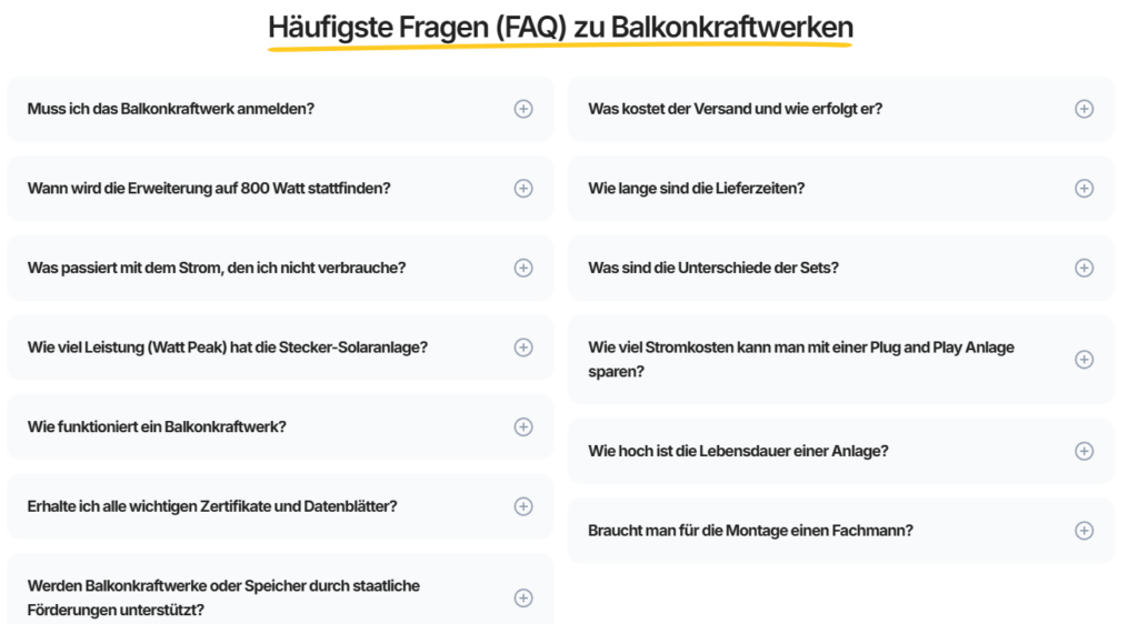
We redesigned the FAQ section to:

  • Address common objections
  • Clarify legal requirements
  • Explain installation simplicity
  • Reinforce compatibility

Accordion format improves readability and keeps the layout clean.

Support Visibility

We included a visible customer support module:

  • Contact CTA
  • Expert reassurance messaging
  • Friendly brand tone

Energy products require reassurance. We made support feel accessible.

Mobile-First Shopify Design

More than half of renewable energy shoppers browse on mobile.

We:

  • Simplified stacking order
  • Optimized button size
  • Reduced vertical clutter
  • Repositioned key trust signals higher
  • Shortened paragraph blocks

The mobile journey mirrors the desktop logic without overwhelming scroll fatigue.

Results & Performance Impact

After launch, the improvements were measurable.

Observed Improvements:

  • Higher add-to-cart engagement
  • Increased time on product pages
  • Improved bundle selection clarity
  • Better homepage engagement
  • Reduced bounce rate

Most importantly, the website now communicates authority immediately.

Why Our Shopify Design Approach Works

We do not approach Shopify design as decoration.
We approach it as conversion architecture.

Our philosophy includes:

  • Strategic visual hierarchy
  • Structured persuasion flow
  • Minimal cognitive friction
  • Clear brand positioning
  • Modular scalability

We do not rely on heavy development.
We rely on intelligent design systems.

Our Methodology in Summary

1. Strategy Before Aesthetics

We define goals before layouts.

2. Conversion Before Decoration

Every section must justify its existence.

3. Clarity Over Complexity

Especially in technical industries.

4. Modular Scalability

Future campaigns can plug into existing structure.

5. Design as Business Growth

Not just visual refresh.

The Final Outcome

Solakon’s Shopify website now feels:

  • Structured
  • Confident
  • Clear
  • Trustworthy
  • Conversion-focused

It positions the brand not just as a seller of solar systems—but as a reliable energy partner.

The website educates without overwhelming.
It promotes without feeling pushy.
It builds trust before asking for purchase.

Conclusion

Design in the renewable energy space must communicate credibility and clarity at the same time. Through strategic Shopify design, we helped Solakon transform complex solar technology into an approachable, high-converting online experience.

This project reflects how powerful structured Shopify design can be when built around user psychology, trust architecture, and visual precision.

At the intersection of brand storytelling and conversion-focused Shopify design stands AIRSANG—where strategic eCommerce design transforms products into trusted digital experiences.

Delivered Worldwide

AIRSANG delivers cost-effective website design, brand visual identity, and e-commerce solutions. From Shopify and WordPress to Amazon product images, we help global brands build, elevate, and grow their online business.

Design and build a WordPress website or corporate site with a full eCommerce system for you.

Design and build a WordPress website or corporate site with a full eCommerce system for you.

Price range: $200.00 through $2,500.00
Custom requirements or special quotations

Custom requirements or special quotations

Original price was: $2.00.Current price is: $1.00.

Ready to transform your business?

Book a call to learn more about how our digital marketing agency can take your business to the next level.