


Introduction
Designing a main image for a Food vacuum sealer on Ozon is not simply about making a product look attractive. It is about translating technical capability into immediate visual understanding, doing so within strict marketplace rules, and aligning the design with the mindset of Russian-speaking consumers who value clarity, power, and completeness.
In this article, we break down the Main image design for Ozon Food vacuum sealer from a designer’s perspective. Every image in this set was intentionally crafted to answer a specific user question: How powerful is it? What can it do? What do I get? Why do I need it? And can I trust it?
Below, we explain how each image works as part of a structured visual sales funnel—and why this approach significantly improves click-through rate and conversion on Ozon.
| Deliver Time | Category | Application Platform |
| 7days | Food vacuum sealer | Ozon |
| Designers Involved | Cost | Effect |
| Lin Zhang | $110 | Purchase quantity📈249% |
Image 1: The Hero Main Image — Power and Trust at First Sight
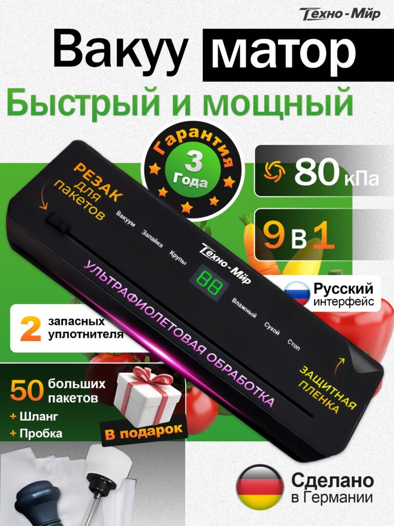
The first image functions as the primary Ozon main image, and its role is singular: stop the scroll.
We deliberately placed the Food vacuum sealer at a strong diagonal angle to create a sense of motion and energy. Static, flat product shots often look passive; the angled presentation immediately communicates power and action. The device dominates the frame, ensuring it remains readable even on mobile screens.
Key design decisions in this image include:
- Clear headline hierarchy
The words “Vacuum motor” and “Fast and powerful” are large, bold, and highly legible. This instantly answers the most important question buyers have: Is it strong enough? - 80 kPa highlighted as a visual badge
Vacuum pressure is a core decision factor. Instead of hiding it in text, we surfaced “80 kPa” as a graphical element, making performance visible at a glance. - 3-year warranty symbol
Trust indicators matter on Ozon. The warranty badge reassures buyers that this is not a disposable appliance, but a durable kitchen tool. - 9-in-1 functionality callout
Rather than listing features, we condensed them into a single “9 in 1” block, signaling versatility without overwhelming the viewer. - Localized reassurance
The Russian-language interface and “Made in Germany” badge are positioned where the eye naturally travels, reinforcing credibility and usability for the target market.
This image is intentionally dense with value cues, because on Ozon, the first image must communicate everything that matters in under two seconds.
Image 2: Demonstrating Power Through Action
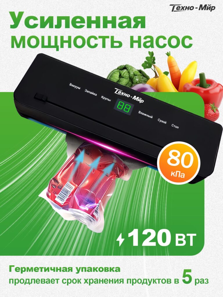
The second image shifts from promise to proof.
Instead of repeating specifications, we visually demonstrate enhanced pump power by showing the vacuum sealer actively extracting air from a food package. The airflow graphics and compression effect inside the bag visually translate the invisible force of vacuum pressure into something the viewer can feel.
Design highlights include:
- 120 W power callout
Electrical power is displayed cleanly and prominently, reinforcing the machine’s strength without clutter. - 80 kPa repetition for memory retention
Repeating key specs across images increases recall and reinforces perceived performance. - Green motion background
The dynamic green gradient suggests speed, efficiency, and freshness—qualities strongly associated with food preservation. - Shelf-life benefit clearly stated
“Extends storage life up to 5 times” reframes power as a real-world benefit, not just a number.
This image is critical because it connects technical performance to practical outcomes, which is what ultimately drives purchase decisions.
Image 3: Feature Depth — 8 Operating Modes Explained Visually
Complex appliances often fail to convert because buyers feel uncertain about usability. To eliminate this friction, we dedicated a full image to explaining 8 operating modes in a clean, structured layout.
Instead of icons alone, we paired short Russian descriptions with plus symbols, creating a checklist-style presentation that feels reassuring and complete.
The modes include:
- Vacuum sealing for wet foods
- Vacuum sealing for dry foods
- UV treatment
- Grain vacuum mode
- Container vacuuming
- Bottle vacuuming
- Sealing without vacuum
- Manual control mode
We placed special emphasis on touch control, shown through a hand interaction, to communicate ease of use. This subtly counters the fear that “multi-function” means “complicated.”
By visually organizing these modes, we transformed complexity into confidence.
Image 4: Full Kit Transparency — What You Get Matters
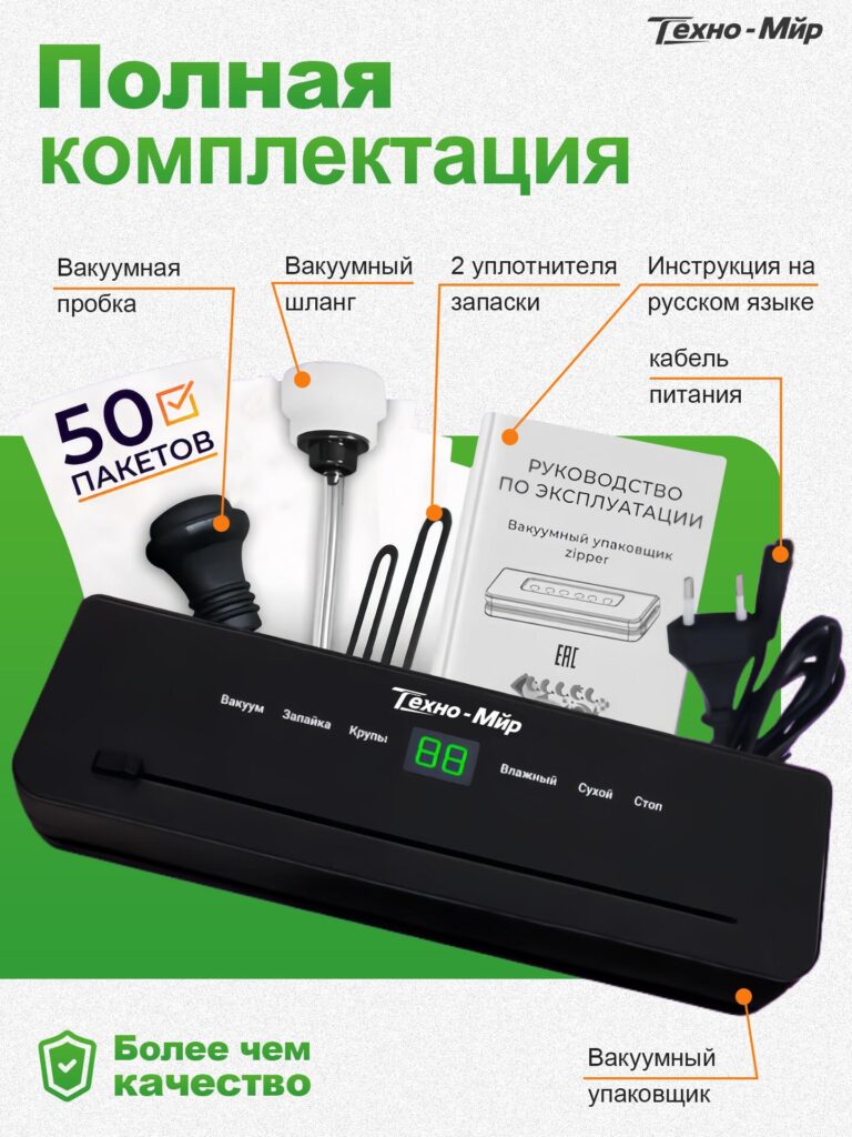
One of the biggest conversion killers on marketplaces is uncertainty about what’s included. This image eliminates that doubt entirely.
We laid out the full package contents in a clear, labeled format:
- Food vacuum sealer unit
- 50 vacuum bags
- Vacuum hose
- Vacuum bottle stopper
- 2 spare sealing gaskets
- Power cable
- Russian instruction manual
Each item is visually connected to a label, leaving no room for interpretation. The message here is simple: this is a complete solution, not just a machine.
By emphasizing completeness, we also justify price positioning and reduce post-purchase dissatisfaction.
Image 5: Why You Need a Food Vacuum Sealer
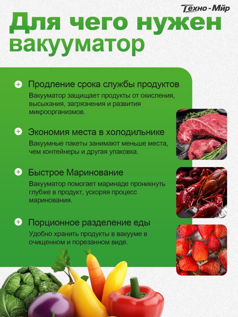
This image reframes the product from appliance to lifestyle upgrade.
Rather than talking about the machine, we talk about problems it solves:
- Protects food from oxidation, moisture loss, and bacteria
- Saves refrigerator space
- Speeds up marination
- Makes portion storage easier
Each benefit is paired with realistic food imagery—meat, seafood, strawberries—helping users immediately imagine the product in their own kitchen.
This emotional connection is critical. Buyers don’t purchase vacuum sealers because they love appliances; they purchase them because they want less waste, more freshness, and better organization.
Image 6: Quality in the Details — Speed and Precision
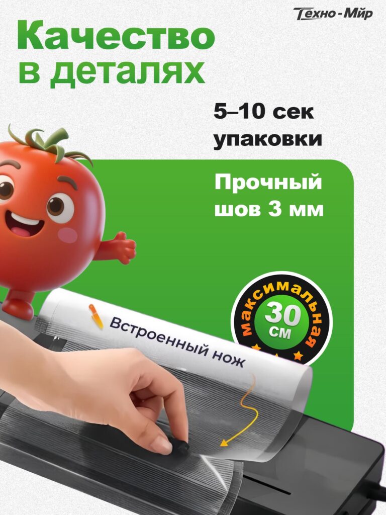
The final image zooms in on craftsmanship.
We highlighted:
- 5–10 seconds sealing speed
- Strong 3 mm sealing seam
- Built-in cutter with up to 30 cm bag width
These details appeal to experienced users who compare products more carefully. The close-up view of the sealing process, combined with a friendly visual element, humanizes the technology and makes it feel approachable.
Ending the image sequence with quality details reinforces a final impression of reliability and engineering precision.
Why This Main Image Design Works on Ozon
This Main image design for Ozon Food vacuum sealer succeeds because it follows a deliberate structure:
- Attract attention with power and trust
- Prove performance visually
- Explain features clearly
- Show full value and completeness
- Connect emotionally through use cases
- Close with quality reassurance
Each image answers a specific buyer question, and together they form a seamless visual narrative that reduces hesitation and builds confidence.
Final Thoughts
Designing for Ozon requires more than aesthetic skill. It demands a deep understanding of marketplace psychology, cultural expectations, and how users process information visually.
This Food vacuum sealer image set was not designed to look “nice.” It was designed to sell clearly, honestly, and efficiently—which is exactly what high-performing Ozon listings require.
At the end of the day, strong conversion does not come from adding more elements, but from designing with intention.
This is the design philosophy we consistently apply at AIRSANG.


Design and build a WordPress website or corporate site with a full eCommerce system for you.
Price range: $200.00 through $2,500.00Custom requirements or special quotations
Original price was: $2.00.$1.00Current price is: $1.00. Main Image Design for Amazon Home Physiotherapy Device Explained
Introduction: Building a Trustworthy Image for Home Therapy Devices on Amazon When designing the main image for a home therapy device on Amazon, our primary...

Main Image Design for Amazon Lipstick Conversion
Introduction: Designing a Lipstick Main Image That Sells on Amazon When we design a Main image for an Amazon lipstick, our responsibility goes far beyond...

What Makes an Amazon Liquid Foundation Main Image Convert
Introduction Designing a Main image design for Amazon Liquid foundation is never just about making a product look beautiful. On Amazon, the main image and...

Designing an Effective Amazon Main Image for Filter Cartridges
Introduction Designing a Main image for Amazon is never just about making a product look attractive. It is about clarity, trust, and instant understanding—especially for...

Five Pet WordPress Themes Compared
Introduction Choosing the right pet-related WordPress theme is more than a design decision—it directly affects usability, scalability, and long-term business growth. Pet care and pet...

Building a Scalable WordPress Website for a Science-Driven Brand: The AminoUSA Project
Introduction In today’s digital landscape, a website is more than a place to list products. For science-driven brands operating in regulated or research-focused industries, a...

Building a Scalable Shopify Store for a Global Blade Brand: The CoolKatana Project
Introduction In cross-border eCommerce, a Shopify website is more than a storefront.For brands operating in niche, culture-driven categories, the website must do far more than...

Designing a High-Conversion Shopify Store for Pokémon Cards
Introduction In the world of collectible eCommerce, especially within the Pokémon Trading Card Game (TCG) market, a website must do more than simply list products....

High-Converting Shopify Design for a Custom Brick Brand
Introduction In today’s competitive eCommerce landscape, especially in the personalized gift and collectible space, a Shopify website must do far more than display products. It...

Shopify Website Design Case Study for a Premium Floral Brand
Introduction In today’s competitive eCommerce landscape, a Shopify website must do far more than display products. It needs to communicate brand value instantly, guide users...

Shopify Design Case Study: Retro Gaming Store
Introduction In a highly competitive eCommerce environment, visual clarity and emotional connection often determine whether a visitor becomes a customer. This is especially true in...

Shopify Design Case Study: Tactical Rescue Brand
Introduction A strong Shopify website does more than display products—it communicates purpose, builds trust, and guides users toward confident purchasing decisions. This is especially true...

Shopify Website Design Case Study for an Electric Bike Brand
Introduction In today’s competitive electric bike market, a Shopify website must do more than display products—it must tell a story, build trust, and guide users...

Scalable Shopify E-commerce for a Creative Brand
Introduction When creative brands grow, their websites often struggle to keep up. As product lines expand, content increases, and traffic rises, many visually driven brands...

Shopify Website Design Case Study for a Home Decor Brand
Introduction In the highly competitive home decor market, visual identity is no longer just about aesthetics—it directly influences trust, browsing behavior, and purchasing decisions. For...

Building a Scalable WordPress Subscription Website Case Study
Introduction For modern e-commerce brands, a website is no longer just a digital storefront. It is the engine that supports subscriptions, content storytelling, trust building,...

High-Conversion WordPress Design for Adult Brands
Introduction In highly competitive eCommerce markets, strong visuals alone are not enough. A successful WordPress website must guide visitors through a clear, intentional journey—one that...

Scalable WordPress Sex Doll E-commerce Website
Introduction Launching a high-performing cross-border eCommerce website is never just about putting products online.For brands operating in highly competitive and visually driven markets, the website...