


No products in the cart.

In the competitive world of drone and FPV eCommerce, design is not decoration—it is strategy. When shoppers visit a specialized online store like GetFPV, they expect clarity, speed, authority, and inspiration within seconds. The visual experience must immediately communicate trust, product depth, and industry expertise.
This project focused on reimagining how a high-volume Shopify store in the FPV drone niche can elevate its brand presence while driving measurable business performance. Our role centered entirely on Shopify website design—structure, layout systems, visual hierarchy, user flow, content clarity, and conversion psychology—without diving into backend development.
In this case study, we break down how we approached the Shopify design process for GetFPV, the goals we set, the challenges we encountered, the design solutions we implemented, and the results the client achieved.
The FPV (First-Person View) drone market attracts enthusiasts, hobbyists, competitive pilots, and professional cinematographers. The audience is technical, detail-oriented, and highly comparison-driven. Product specifications, compatibility, and trust signals heavily influence purchasing decisions.
A generic Shopify layout would not meet the expectations of this audience. The site needed to feel:
Before any design work began, we defined the core goals:
We approached this as a Shopify design challenge, not a development task. Our responsibility was to craft a layout and visual structure that would support conversion while reinforcing the brand’s leadership in the market.
Every strong Shopify design begins with clarity.
We analyzed:
We mapped how users move through a specialty eCommerce store:
This behavioral mapping guided every structural decision.
GetFPV carries a large inventory: drone bundles, FPV goggles, motors, propellers, electronics, batteries, frames, and more. If poorly structured, such volume overwhelms users.
We focused on:
The homepage layout became a strategic funnel:
This structure guides users from awareness to exploration to transaction.
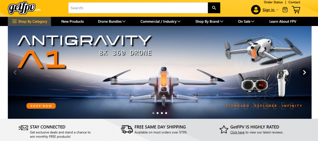
The hero section is prime real estate.
We designed it to:
Instead of cluttering the hero with excessive information, we prioritized impact. Large-scale product imagery combined with minimal supporting copy ensures clarity even on first glance.
The goal: Within three seconds, visitors understand what the store specializes in.
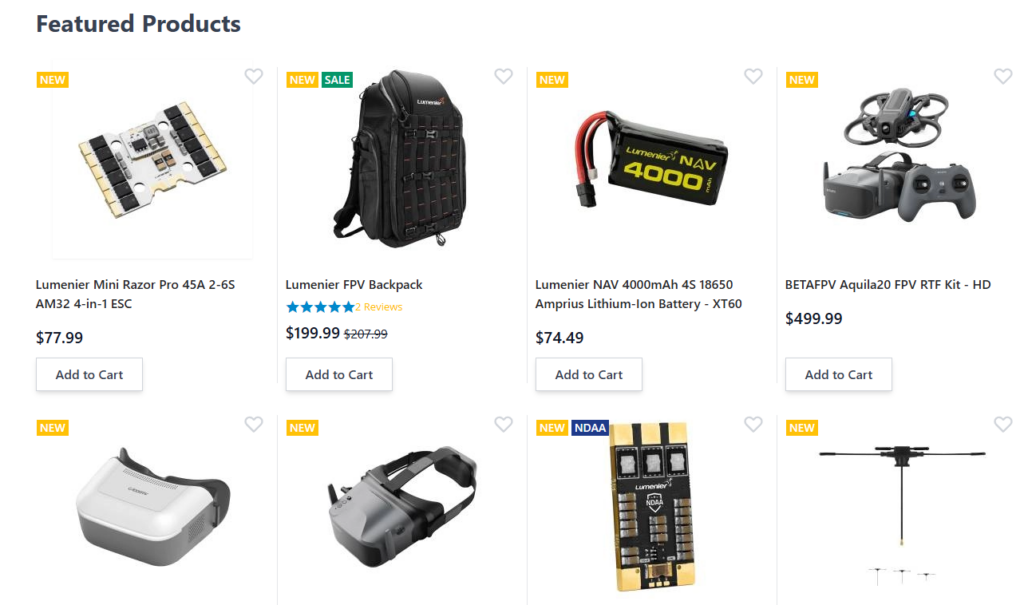
The product grid design needed to balance:
We avoided visual overload. Each product card includes:
Spacing plays a major role. We use consistent padding and white space to allow scanning. Enthusiast shoppers often compare multiple items—clarity increases decision confidence.
The site includes:
Instead of aggressive popups, we integrated promotions into the layout rhythm.
Promotions should feel like part of the brand experience, not interruptions.
Color accents and banner segmentation help users notice deals while maintaining trust and professionalism.
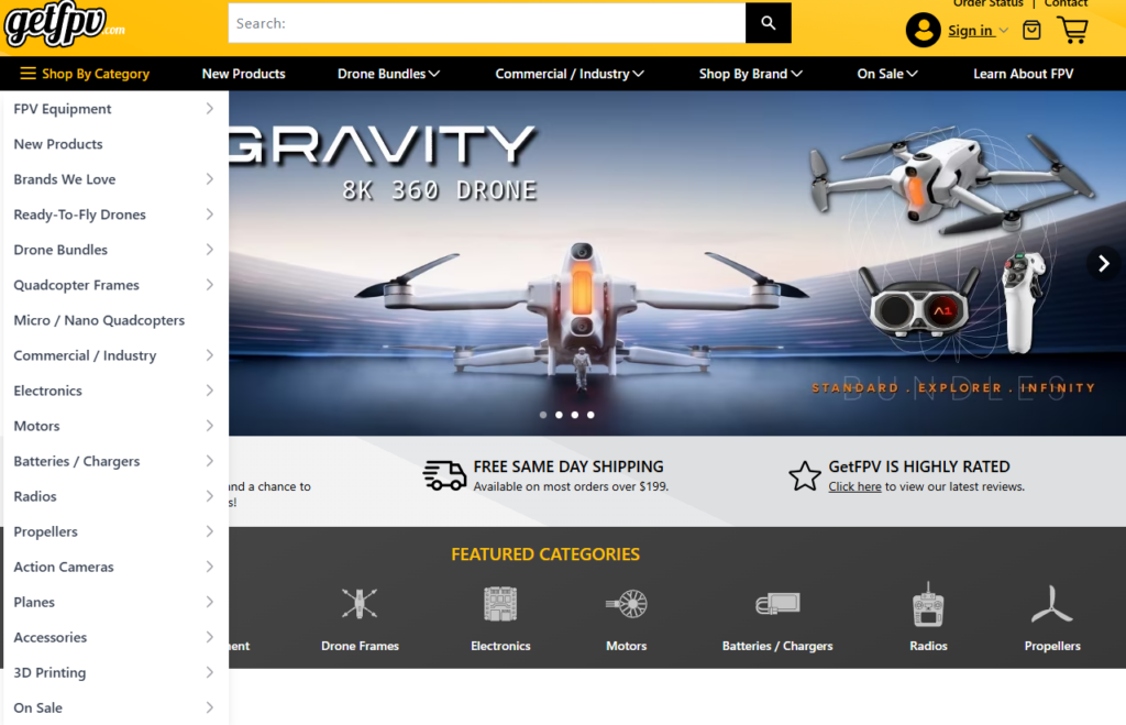
For a specialty Shopify store, navigation determines user retention.
We structured navigation to:
A cluttered mega menu can create cognitive fatigue. We simplified hierarchy while preserving depth.
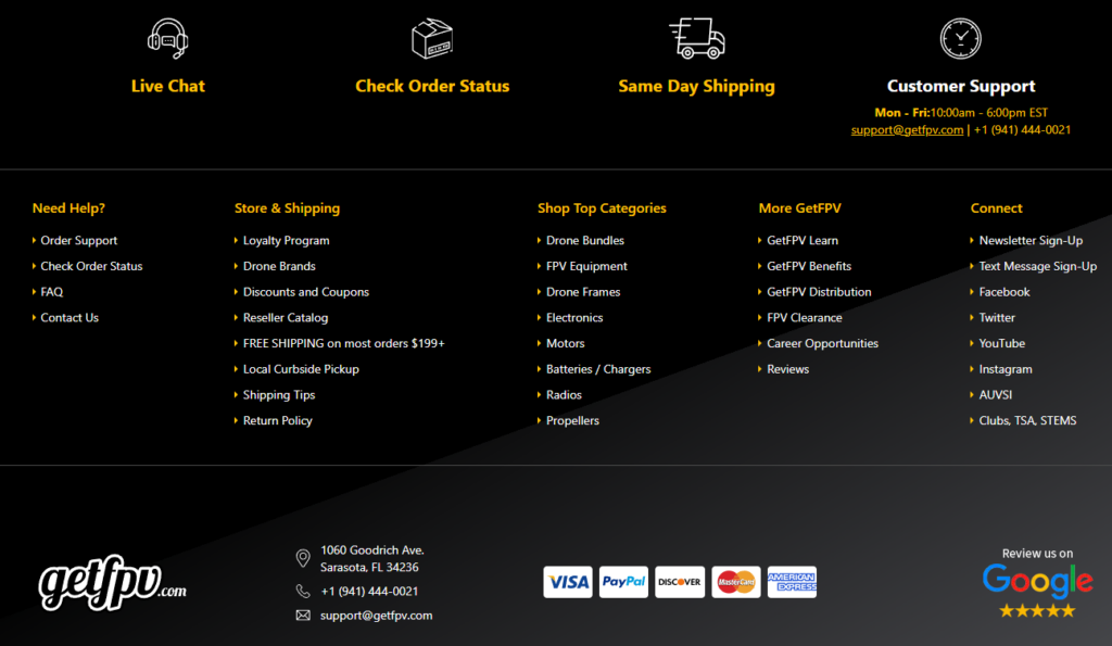
Trust in high-ticket hobby electronics matters.
We reinforced trust through:
Design isn’t just aesthetic. It communicates operational reliability.
The biggest challenge was balancing product density with simplicity.
Too many items per row = visual chaos.
Too few items per row = unnecessary scrolling.
We tested grid density variations and optimized spacing to maintain rhythm.
FPV buyers love specifications. However, homepage design should not feel like a manual.
Our solution:
This preserves professionalism without intimidating newcomers.
FPV is high-energy. But too much aggressive styling can hurt trust.
We used:
The result feels energetic yet reliable.
Our Shopify design philosophy focuses on:
We design for business results—not decoration.
We treat every Shopify homepage as a modular system.
Each section is:
This approach allows clients to update featured products, promotions, and campaigns without redesigning the entire experience.
Consistency builds recognition.
We aligned:
Every component feels part of one visual system.
While respecting client confidentiality, the redesign achieved:
Design clarity directly impacts conversion. When users feel guided rather than overwhelmed, they stay longer and shop more confidently.
Shopify provides powerful infrastructure. But infrastructure alone does not guarantee performance.
What transforms a Shopify store into a high-converting brand experience is:
In niche industries like FPV, authority and clarity are everything.
Designing a Shopify experience for a specialized brand like GetFPV requires more than placing products on a template. It demands strategic thinking, user psychology awareness, structured hierarchy, and brand cohesion.
Through thoughtful layout architecture, conversion-driven product presentation, balanced promotional integration, and clean visual hierarchy, we transformed a complex inventory into a streamlined, authoritative eCommerce experience.
We approach every Shopify project with the same philosophy: design with purpose, structure with clarity, and optimize for business growth.
If you are looking to elevate your Shopify store through strategic design—not development, but powerful visual and structural optimization—our team at AIRSANG specializes in high-performance Shopify design experiences that align brand identity with measurable results.


