


Introduction
Building a successful eCommerce website for a niche outdoor brand requires more than clean visuals—it demands a deep understanding of user intent, product storytelling, and conversion-focused structure. When working on the website for YakAttack, a premium kayak fishing accessories brand powered by BigCommerce, our primary focus was to elevate the design experience while preserving the rugged authenticity of the brand.
This project centered on creating a seamless, intuitive, and visually compelling journey that aligns with how real fishing enthusiasts explore, evaluate, and purchase gear online. Rather than simply redesigning a homepage, we approached the entire site as a connected system—where every page contributes to trust, clarity, and conversion.
| Deliver Time | Category | Application Platform |
| 24days | Outdoor fishing gear | BigCommerce |
| Designers Involved | Cost | Effect |
| Lin Zhang | $2100 | flow📈342% |
Understanding the Brand and Its Audience
Who Are We Designing For?
YakAttack serves a very specific audience: passionate kayak anglers who value durability, modular gear systems, and real-world performance. These users are:
- Highly product-aware
- Detail-oriented in their purchasing decisions
- Motivated by functionality over aesthetics—but influenced by strong visuals
Design Objective
Our goal was to bridge two worlds:
- The raw, outdoor identity of fishing culture
- The clean, structured clarity of modern eCommerce design
We needed to ensure the site felt both authentic and premium, without overwhelming users with technical complexity.
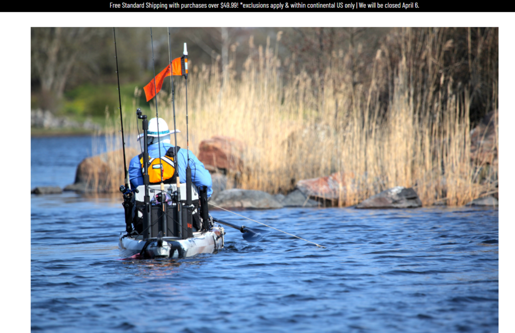
Homepage Design Strategy
Creating a Strong First Impression
The homepage acts as the entry point into the brand’s ecosystem. We designed it to immediately communicate three key ideas:
- Lifestyle immersion (kayak fishing in action)
- Product ecosystem clarity (modular gear categories)
- Brand authority and trust
Hero Section Approach
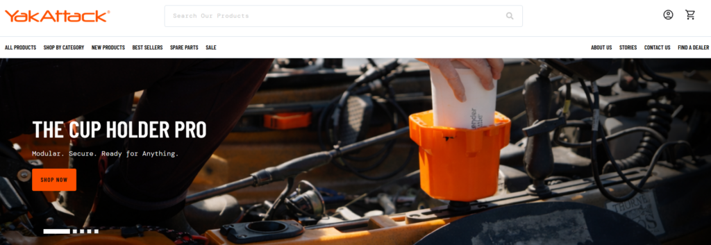
- Full-width lifestyle imagery showcasing real fishing scenarios
- Minimal but impactful headline messaging
- Clear primary CTA guiding users into product exploration
This approach avoids clutter and instead pulls users into an emotional context—helping them visualize themselves using the gear.
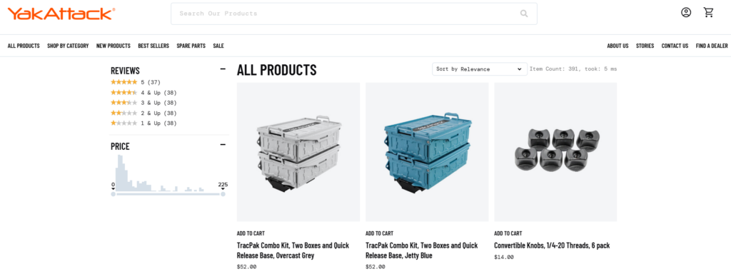
Structuring Product Discovery
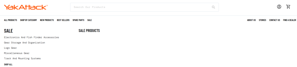
One of the biggest challenges in fishing gear websites is complexity. There are multiple product types, compatibility concerns, and technical variations.
We addressed this through structured category navigation:
Category Blocks
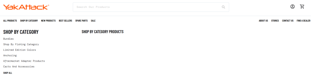
- Rod holders
- Mounting systems
- Storage solutions
- Accessories
Each category is visually represented with:
- Clean product imagery
- Short, benefit-driven descriptions
- Clear navigation hierarchy
This reduces cognitive load and allows users to quickly find what they need.
Balancing Visual Impact with Clarity
Outdoor brands often rely heavily on imagery, but too much visual noise can hurt usability.
Our design solution:
- Controlled use of high-quality visuals
- Strong spacing and grid alignment
- Consistent typography hierarchy
This ensures the site feels premium without sacrificing readability.
Product Page Design Optimization
Designing for Decision-Making
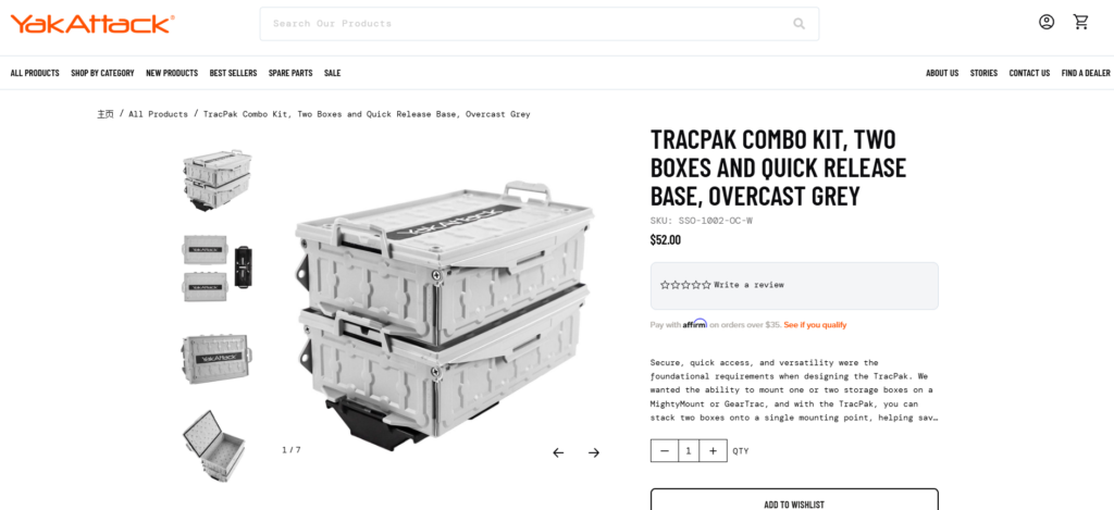
Product pages are where conversions happen. Instead of overwhelming users with technical data, we structured content to guide decision-making naturally.
Key Design Elements
- Above-the-fold clarity
- Product name, key benefits, and pricing visible immediately
- Visual storytelling
- Lifestyle images + close-up product details
- Structured information hierarchy
- Features → Benefits → Use cases
- Clear CTA positioning
- Prominent and always accessible
Simplifying Complex Product Systems
YakAttack products often work as part of a modular system. This can confuse users if not clearly explained.
We introduced:
- Visual compatibility cues
- Related product groupings
- Simple explanatory sections
This transforms complexity into clarity—helping users understand how products work together.
Collection Page Experience
Improving Browsing Efficiency
Collection pages were designed to support both:
- Quick scanning
- Deeper exploration
Design Enhancements
- Clean grid layout with consistent spacing
- Multi-line product titles with controlled truncation
- Subtle hover interactions for engagement
We avoided excessive filters or distractions, focusing instead on clarity and speed.
Visual Consistency Across Listings
Consistency builds trust. We ensured:
- Uniform product image ratios
- Balanced spacing between elements
- Predictable layout behavior
This makes the browsing experience feel stable and professional.
Supporting Pages and Brand Storytelling
About and Brand Pages
Rather than treating these as secondary pages, we designed them as trust-building assets.
Key Focus Areas
- Brand origin and mission
- Real-world product usage
- Community-driven identity
The layout emphasizes:
- Storytelling sections
- Lifestyle imagery
- Clean typography
Content and Educational Sections
Fishing enthusiasts often research before buying. We supported this behavior by structuring content areas that:
- Educate users on gear usage
- Showcase real applications
- Reinforce expertise
This approach positions the brand as both a product provider and a knowledge source.
Our Design Process
Step 1: Research and Analysis
We began by analyzing:
- Competitor websites
- User behavior patterns in outdoor niches
- Existing site structure and pain points
This helped us identify gaps in clarity, navigation, and visual hierarchy.
Step 2: Information Architecture
We restructured the site to:
- Simplify navigation paths
- Group related products logically
- Reduce unnecessary friction
The goal was to make every click feel intentional.
Step 3: Visual System Design
We established a consistent design language:
- Typography hierarchy
- Color usage aligned with outdoor branding
- Spacing and layout grids
This ensures visual coherence across all pages.
Step 4: Conversion-Focused Layouts
Every section was designed with a purpose:
- Guide users
- Reduce confusion
- Encourage action
We focused on clarity over decoration.
Challenges We Encountered
1. Complex Product Relationships
YakAttack’s modular system can be difficult to explain visually.
Our solution:
We simplified communication through layout structure and visual grouping instead of technical explanations.
2. Balancing Rugged Branding with Modern UX
Outdoor brands often lean heavily into rugged aesthetics, which can conflict with clean UX design.
Our solution:
We retained authentic imagery while applying modern layout principles to maintain usability.
3. Avoiding Information Overload
Too much product detail can overwhelm users.
Our solution:
We prioritized key selling points and structured additional details progressively.
Our Design Approach and Philosophy
Customer-First Experience
We design for how users think—not how brands want to present information.
This means:
- Clear navigation
- Logical content flow
- Reduced decision friction
Visual Clarity Over Complexity
Instead of adding more elements, we focus on:
- Better spacing
- Strong hierarchy
- Intentional design choices
Scalable Design Systems
We build designs that:
- Work across multiple pages
- Maintain consistency
- Adapt as the product catalog grows
Results and Impact
Improved User Experience
- Easier navigation across categories
- Faster product discovery
- Clearer understanding of product systems
Stronger Brand Perception
- More premium visual identity
- Increased trust through consistency
- Better storytelling across pages
Enhanced Conversion Potential
- Clear CTAs
- Reduced confusion
- More confident purchasing decisions
Conclusion
Designing an eCommerce website for a specialized outdoor brand like YakAttack requires more than aesthetics—it requires strategic thinking, user empathy, and a deep understanding of how design drives behavior.
By focusing on clarity, structure, and storytelling, we transformed the site into a cohesive digital experience that supports both exploration and conversion. Every page—from homepage to product detail—was designed to guide users naturally while reinforcing the brand’s identity.
At the end of the day, great eCommerce design is not about making things look better—it’s about making them work better.
At AIRSANG, we specialize in crafting high-converting, design-driven independent websites for global brands. If you’re looking to elevate your eCommerce experience through strategic design, our team is ready to help you build a site that not only looks premium—but performs.


Design and build a WordPress website or corporate site with a full eCommerce system for you.
Price range: $200.00 through $2,500.00Custom requirements or special quotations
Original price was: $2.00.$1.00Current price is: $1.00. Main Image Design for Amazon Home Physiotherapy Device Explained
Introduction: Building a Trustworthy Image for Home Therapy Devices on Amazon When designing the main image for a home therapy device on Amazon, our primary...

Main Image Design for Amazon Lipstick Conversion
Introduction: Designing a Lipstick Main Image That Sells on Amazon When we design a Main image for an Amazon lipstick, our responsibility goes far beyond...

How Hackers Steal WordPress Admin Emails (And How to Stop Them)
Let’s start with an uncomfortable truth: Your WordPress admin email is probably way more public than you think.And hackers? They love that. To them, your...

What Makes an Amazon Liquid Foundation Main Image Convert
Introduction Designing a Main image design for Amazon Liquid foundation is never just about making a product look beautiful. On Amazon, the main image and...

Designing an Effective Amazon Main Image for Filter Cartridges
Introduction Designing a Main image for Amazon is never just about making a product look attractive. It is about clarity, trust, and instant understanding—especially for...

Replay Attacks on WordPress: Real Threat or Overhyped Myth?
Let’s clear something up first. Replay attacks don’t look scary.They don’t smash passwords.They don’t inject evil code with green hacker text flying everywhere. They’re sneaky....

How to Duplicate WordPress Pages Without Breaking Anything
Let’s face it. Sometimes you don’t want to create a new page.You just want the same page… but slightly different. Same layout.Same blocks.Same settings. Because...

Five Pet WordPress Themes Compared
Introduction Choosing the right pet-related WordPress theme is more than a design decision—it directly affects usability, scalability, and long-term business growth. Pet care and pet...

Comparing Five Swimwear eCommerce Themes
Introduction Choosing the right theme for a swimwear or lingerie independent store is not just a visual decision—it directly affects conversion rates, scalability, and long-term...

How to Turn Off Comments in WordPress (Without Losing Your Mind)
Let’s talk about WordPress comments. In theory, comments are great.They encourage discussion.They build community.They make your website feel “alive.” In reality? They’re often a magnet...

Building a Scalable WordPress Website for a Science-Driven Brand: The AminoUSA Project
Introduction In today’s digital landscape, a website is more than a place to list products. For science-driven brands operating in regulated or research-focused industries, a...

Building a Scalable Shopify Store for a Global Blade Brand: The CoolKatana Project
Introduction In cross-border eCommerce, a Shopify website is more than a storefront.For brands operating in niche, culture-driven categories, the website must do far more than...

Designing a High-Conversion Shopify Store for Pokémon Cards
Introduction In the world of collectible eCommerce, especially within the Pokémon Trading Card Game (TCG) market, a website must do more than simply list products....

High-Converting Shopify Design for a Custom Brick Brand
Introduction In today’s competitive eCommerce landscape, especially in the personalized gift and collectible space, a Shopify website must do far more than display products. It...

How to Contact Shopify Support: Simple, Stress-Free Guide
Running a Shopify store should feel exciting—not confusing. When questions pop up or issues slow you down, Shopify offers several support paths depending on what...

How to Deactivate a Shopify Store: A Clear, Practical Guide
Deactivating a Shopify store isn’t complicated, but it does come with consequences many merchants overlook. This guide breaks the process down in a simple, educational...

Shopify Website Design Case Study for a Premium Floral Brand
Introduction In today’s competitive eCommerce landscape, a Shopify website must do far more than display products. It needs to communicate brand value instantly, guide users...

Shopify Design Case Study: Retro Gaming Store
Introduction In a highly competitive eCommerce environment, visual clarity and emotional connection often determine whether a visitor becomes a customer. This is especially true in...