


No products in the cart.

The Oasis fashion website represents a carefully engineered balance between editorial storytelling and high-performance e-commerce design. Every section is structured to guide users through a seamless journey—from inspiration to product discovery to final purchase—without overwhelming them with unnecessary complexity. Instead of relying on a purely transactional interface, the design leans heavily into lifestyle-driven visuals, curated collections, and emotionally engaging typography.
From a designer’s perspective, the entire system is built around one central principle: reduce friction while increasing desire. This is achieved through strategic layout hierarchy, consistent visual language, and intentional spacing that allows each product and campaign message to breathe. The following breakdown analyzes the website in the same sequence as its visual architecture, explaining why each design decision supports user engagement and conversion optimization.
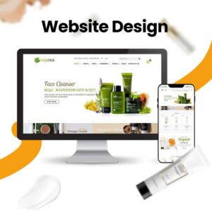
| Deliver Time | Category | Website Type |
| 20days | Women’s Clothing | Self-built website |
| Designers Involved | Cost | Effect |
| Nancy | $2200 | Sales📈284% |
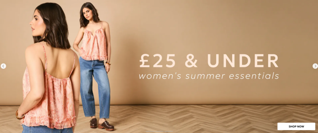
The hero section featuring “£25 & UNDER women’s summer essentials” is designed as the primary conversion driver. We intentionally place strong typographic emphasis on pricing because affordability is one of the fastest decision-making triggers in fashion e-commerce. The large-scale price text immediately communicates value before the user even processes product details.
The model imagery is positioned to the left, creating a natural reading flow that moves from emotional visual engagement to informational clarity. This left-to-right structure aligns with Western browsing behavior, ensuring users absorb the lifestyle appeal before processing transactional messaging.
We deliberately keep the supporting text minimal. “women’s summer essentials” is used as a contextual reinforcement rather than a descriptive paragraph. This avoids cognitive overload and ensures the user focuses on the core offer. The typography is light, modern, and evenly spaced to reflect a premium yet accessible brand identity.
The warm neutral background is not accidental. It creates a seasonal summer tone while ensuring the clothing remains the visual focal point. By avoiding high-contrast distractions, the design maintains a soft, editorial aesthetic that enhances product perception.
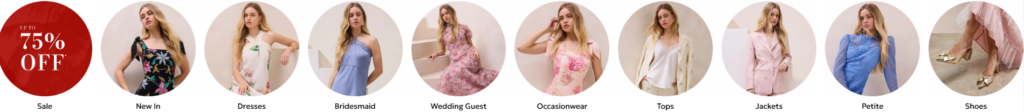
The circular category navigation module is designed to support rapid browsing behavior. Users in fashion e-commerce typically scan before they read, so each category is represented through strong visual cues rather than text-heavy menus.
Each circle functions as a micro-entry point into a product universe, reducing the time required to locate relevant items. Categories such as “Dresses,” “Occasionwear,” and “Shoes” are immediately recognizable through imagery, which improves click-through probability.
The “UP TO 75% OFF” badge is intentionally designed as a red circular anchor. This is not just decorative—it acts as a psychological trigger. Red is used to signal urgency, while the circular shape differentiates it from product categories, ensuring it stands out as the primary promotional gateway.
All category images follow a consistent framing system. This ensures that despite different product types, the layout remains visually balanced. Equal spacing and uniform sizing create rhythm, making the section easy to scan even on mobile devices.
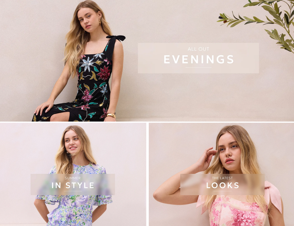
The editorial section featuring “ALL OUT EVENINGS,” “SUMMER IN STYLE,” and “THE LATEST LOOKS” is built like a digital fashion magazine. Instead of presenting products in isolation, each block communicates a lifestyle narrative.
We use a grid system that balances visual weight across three panels. The top hero panel dominates attention, while the two lower panels provide supporting lifestyle contexts. This hierarchy ensures users first engage with a strong emotional concept before exploring variations.
Typography overlays are placed directly on imagery with semi-transparent backgrounds. This technique ensures readability while preserving visual immersion. The phrases are short, aspirational, and mood-driven rather than descriptive, allowing users to interpret the style context emotionally.
All panels share a unified soft background tone. This consistency ensures that even when outfits vary in color and style, the overall interface remains cohesive. The design avoids visual fragmentation, which is critical for maintaining premium perception.
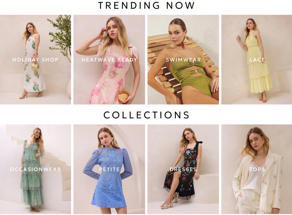
The “TRENDING NOW” and “COLLECTIONS” sections are structured as a dual-layer discovery system. The top layer focuses on seasonal trends, while the lower layer organizes long-term category shopping.
This separation allows users to shift between inspiration-driven browsing and structured shopping without cognitive conflict.
Each trending panel uses emotional keywords such as “SWIMWEAR,” “HEATWAVE READY,” and “HOLIDAY SHOP.” These labels are intentionally lifestyle-oriented rather than product-specific. This encourages users to imagine scenarios rather than simply evaluate products.
The full-height imagery reinforces this storytelling approach, making each item feel like part of a curated fashion moment.
The lower “COLLECTIONS” section introduces structured navigation logic. Categories like “DRESSES,” “TOPS,” and “PETITE” are arranged in a clean grid to support efficient browsing. Unlike the editorial section, this area prioritizes usability over emotional storytelling.
We deliberately alternate poses and compositions to avoid visual repetition while maintaining consistent lighting and tone.
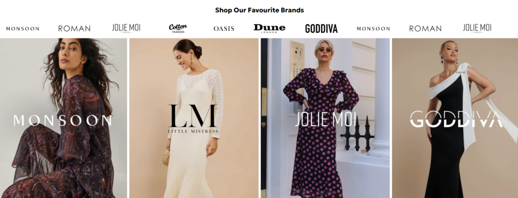
The “Shop Our Favourite Brands” module is designed to build immediate trust through recognizable fashion labels. Brand logos placed at the top act as credibility markers, signaling that the platform curates established and reliable fashion sources.
This reduces purchase hesitation, especially for new users who may not yet trust the platform itself.
Instead of listing brands in a basic row format, each brand is paired with full-height editorial imagery. This transforms brand browsing into a storytelling experience, where each label is represented by its aesthetic identity.
This method increases emotional differentiation between brands, helping users select based on style personality rather than price alone.
The alternating image layout ensures that no single brand dominates the section. Equal visual weight maintains fairness while still allowing each brand to express individuality.
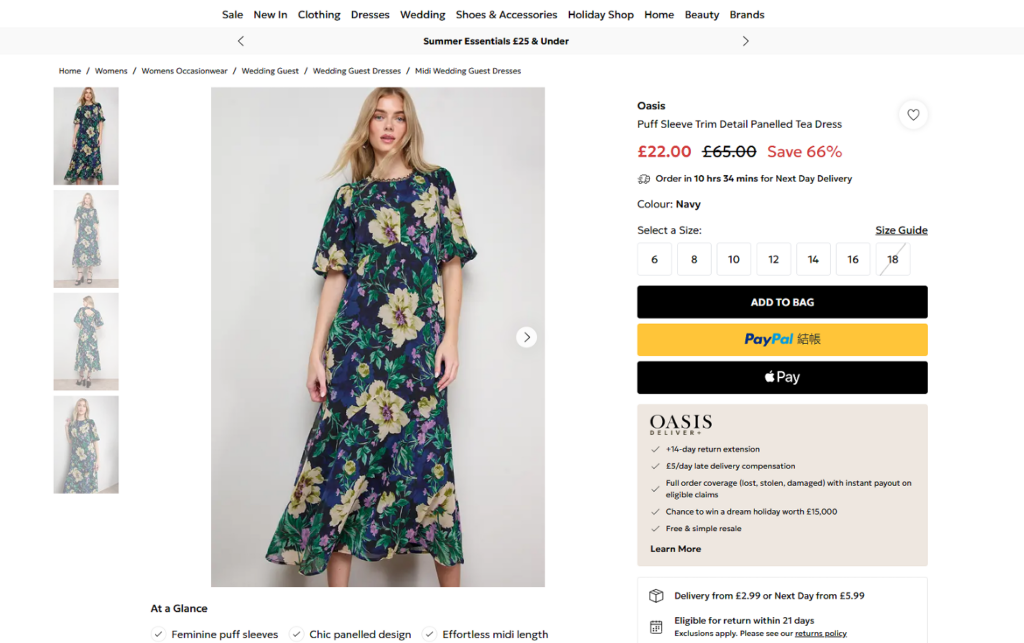
The product detail page is designed with a strict left-to-right hierarchy. The left side focuses on visual storytelling through multiple product images, while the right side handles transactional actions such as pricing, sizing, and purchase buttons.
This separation reduces cognitive conflict by isolating inspiration from decision-making.
Multiple product angles are provided to reduce uncertainty. In fashion e-commerce, users cannot physically interact with products, so imagery must compensate by showing texture, fit, and movement.
The main product image is intentionally larger to create emotional impact, while thumbnails allow controlled exploration.
Discounts are highlighted in red to create urgency and perceived value. The “ADD TO BAG” button is designed as the strongest visual element in the interaction hierarchy, ensuring it becomes the natural next step after viewing the product.
Below the main purchase section, information is structured into digestible layers:
This structure ensures both fast shoppers and detail-oriented users are accommodated.
The “Handpicked For You” module introduces product recommendations without disrupting the primary purchase flow. This increases average order value while maintaining focus on the selected product.
Across all sections, the website consistently blends editorial aesthetics with conversion-driven structure. Instead of forcing users into a rigid shopping interface, it invites them into a curated fashion experience.
Every module is designed with a dual purpose:
This balance ensures that users feel inspired while still being guided toward purchase decisions.
Despite varied content types—hero banners, grids, product pages—the system maintains consistency through:
This consistency builds trust and improves usability across the entire journey.
Ultimately, the Oasis fashion website succeeds because it treats e-commerce as a curated experience rather than a transactional interface. Every section is intentionally designed to reduce friction, guide attention, and elevate perceived product value through a combination of visual storytelling and structured UX logic. From promotional hero banners to editorial grids, category systems, and product detail pages, the entire journey is carefully orchestrated to move users from inspiration to confident purchase decisions.
As designers, we focus on creating a seamless emotional flow—where users first feel inspired by lifestyle imagery, then naturally transition into structured browsing, and finally arrive at a clear, frictionless checkout path. The strength of this system lies in its consistency: typography, spacing, imagery tone, and interaction patterns all work together to build trust and reinforce brand identity.
In a competitive fashion e-commerce landscape, this approach transforms the website into more than a shopping platform—it becomes a digital editorial space that reflects aspiration, identity, and style.