


No products in the cart.

When we design a main image for Ozon, we never treat it as a simple product display. We treat it as a strategic conversion tool. For this toy car project, our goal was clear: build a visually powerful, instantly understandable, and highly differentiated Ozon main image system that increases click-through rate while communicating function, scale, and value within seconds.
Ozon’s marketplace environment is competitive and information-dense. Shoppers scroll quickly. That means the main image must deliver clarity, hierarchy, and emotional impact immediately. For this toy car series, we created multiple visual directions tailored to different subcategories—drift racing models, stunt vehicles, off-road trucks, and construction-style building sets—while maintaining a unified logic of structure and persuasion.
Below, I break down the design strategy behind each image and explain how every visual decision supports performance and conversion.
| Deliver Time | Category | Application Platform |
| 8days | toy car | Ozon |
| Designers Involved | Cost | Effect |
| Nancy | $150 | Sales volume📈226% |
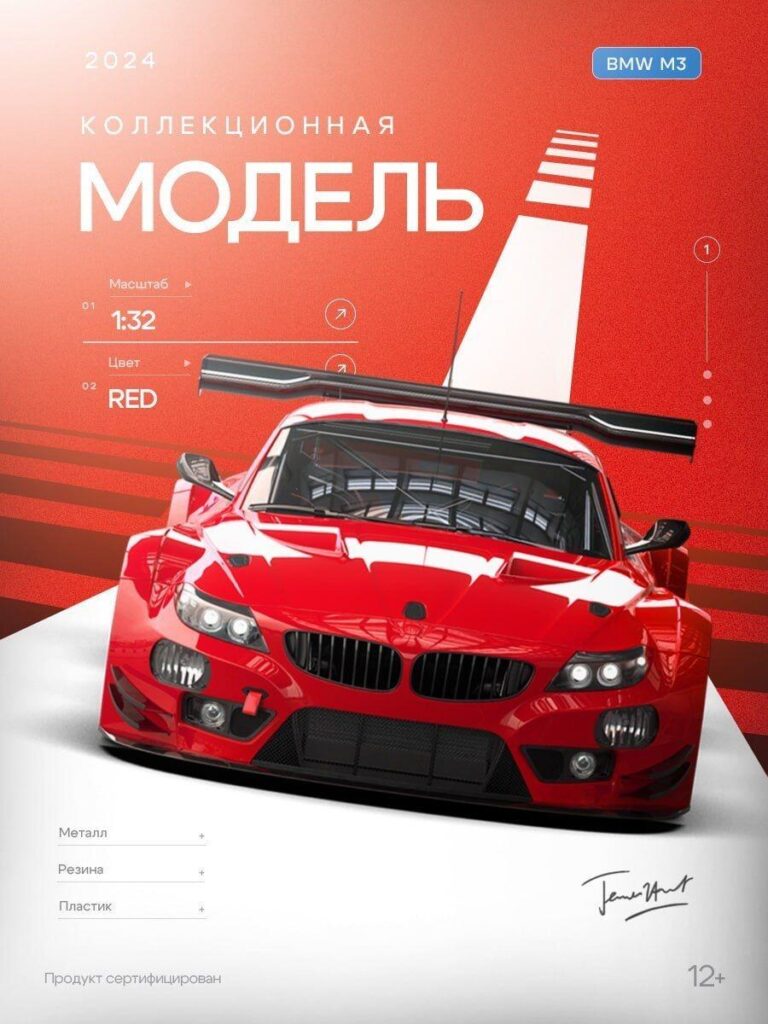
In the first image, we designed a premium collectible toy car presentation featuring a bold red racing model in 1:32 scale.
We chose a warm red gradient background with strong directional lighting to emphasize the car’s body lines and aerodynamic shape. Instead of cluttering the scene, we created a semi-abstract racing stripe perspective element in the background. This adds speed symbolism without distracting from the product.
On Ozon, clarity wins. The product must dominate the frame. That is why the vehicle occupies the majority of the composition, front-facing, symmetrical, and aggressive.
We structured the information in a clean vertical sequence:
By separating material information into subtle expandable-style lines, we reinforce product credibility without overwhelming the user visually.
This design speaks to parents buying collectible models or older children who appreciate realism. The red tone conveys power and performance. The frontal camera angle builds authority. The minimalism signals quality.
We intentionally avoided excessive visual effects. Premium products require restraint.
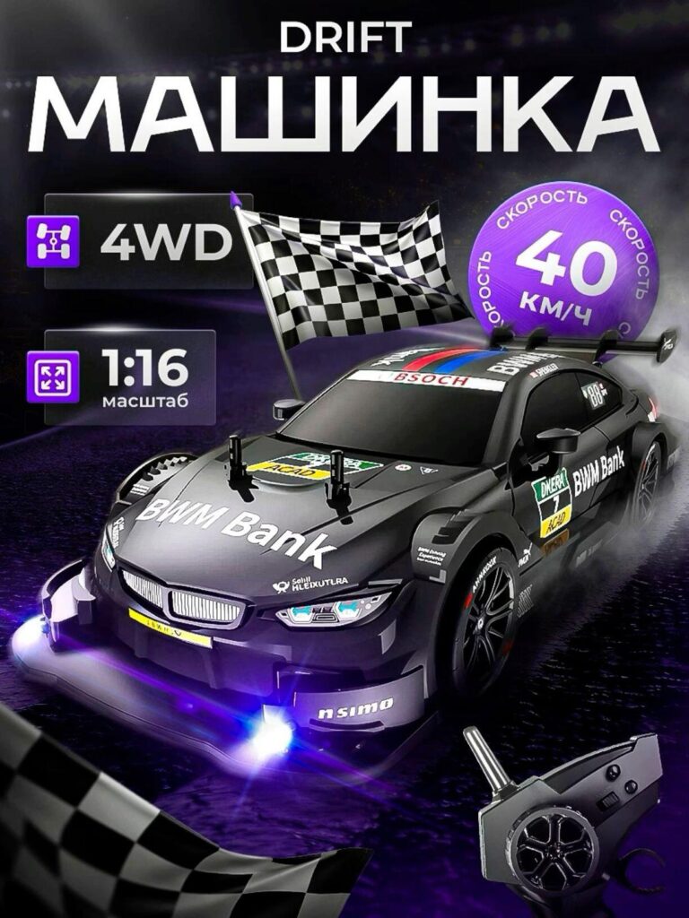
The second image shifts dramatically in tone. This model is about action.
We placed the car in a dramatic night racing environment with a checkered flag and purple glow accents. Purple and electric blue lighting enhance the perception of speed and excitement.
On Ozon, visual differentiation matters. Many competitors show toy cars on plain white backgrounds. By building a stylized racing environment, we immediately communicate category and function: drift racing.
We clearly highlight:
The circular speed badge becomes a focal point. It works like a “performance seal,” helping the buyer understand capability instantly.
We also included the remote controller in the lower corner. This reduces hesitation. Parents want to know what is included. Showing the controller prevents confusion and supports conversion.
This image is not about elegance. It is about energy.
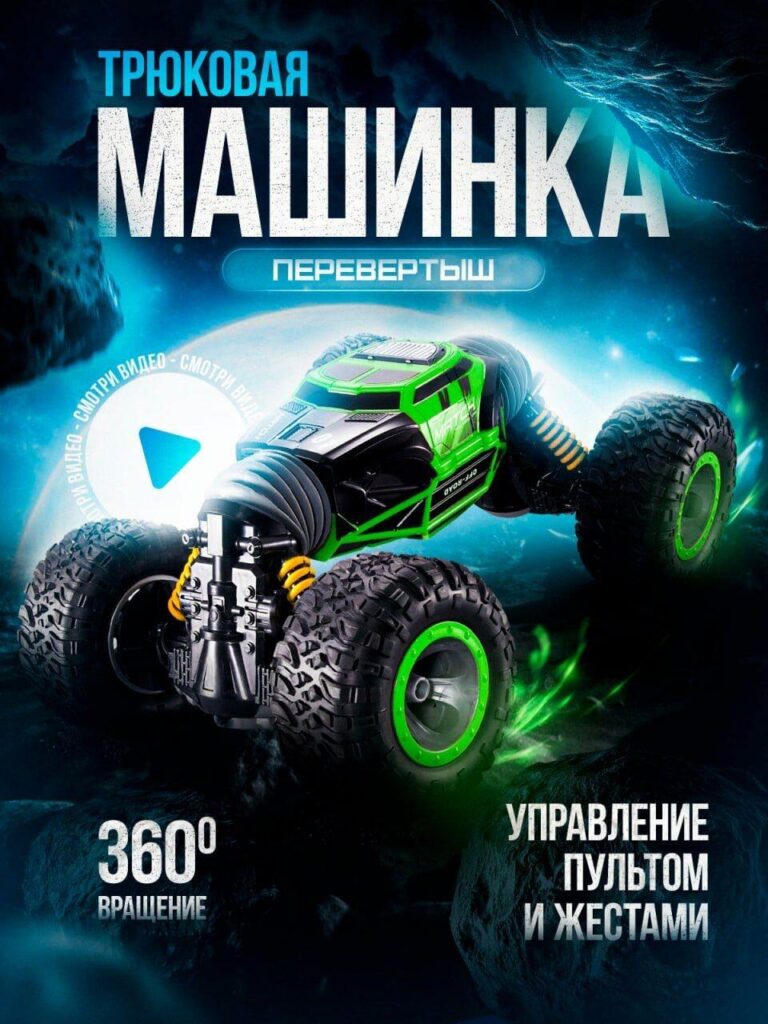
The third image presents a stunt flip car with oversized tires and 360-degree rotation capability.
We used a low-angle camera shot to make the wheels feel massive and dominant. Large tires visually communicate durability and shock resistance.
The green color scheme contrasts against the cool blue explosion-style background. This contrast increases thumbnail visibility on Ozon’s listing grid.
We integrated motion blur, energy light streaks, and dynamic shadows to suggest flipping and spinning capability. The “360° rotation” message is large and bold because this is the primary selling point.
We highlight both remote and gesture control. This is crucial. Dual control modes increase perceived value. Visually separating these features ensures buyers immediately understand versatility.
This design appeals strongly to younger children and parents looking for high-interaction toys.
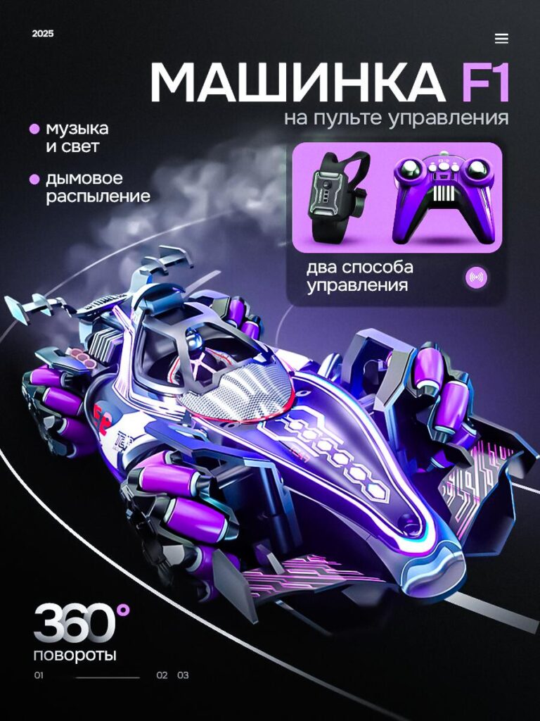
This image represents a more futuristic product with lighting effects and simulated smoke spray.
We built a dark racing track background with neon purple highlights. The car design already feels futuristic, so we enhanced that perception using glowing underlights and edge lighting.
We displayed both the wearable gesture controller and the handheld remote inside a purple info panel. Framing them together clarifies that the toy offers two operation methods.
We structured the feature list clearly:
This design balances aesthetics and clarity. It feels premium but remains readable.
On Ozon, feature clarity reduces refund risk. Buyers must understand functionality before purchase.
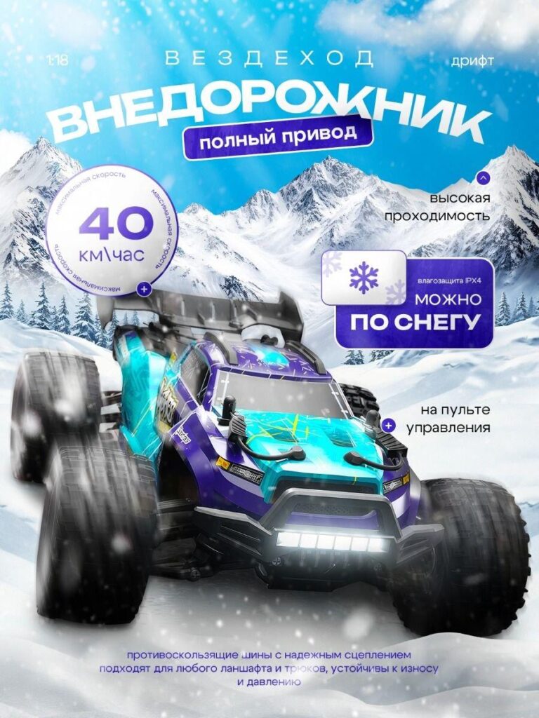
This image shifts into an outdoor adventure theme.
Instead of studio lighting, we placed the toy car in a snowy mountain scene. Snow particles and tire spray communicate terrain capability immediately.
We emphasize:
The large anti-slip tires are positioned prominently in the foreground. This builds trust in durability and terrain adaptability.
This design strategy targets buyers looking for robust outdoor play value. The environment becomes proof of performance.
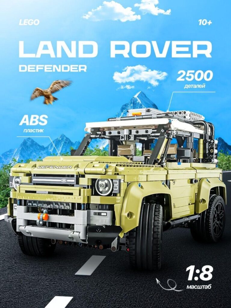
This image represents a construction-style toy car rather than a remote-controlled one.
We prominently display:
The mountain background reinforces adventure and realism.
We include “10+” in the design to clarify age appropriateness. This reduces buyer confusion and ensures correct audience targeting.
This image is structured to appeal to older kids and adult hobbyists who value assembly complexity and detail accuracy.
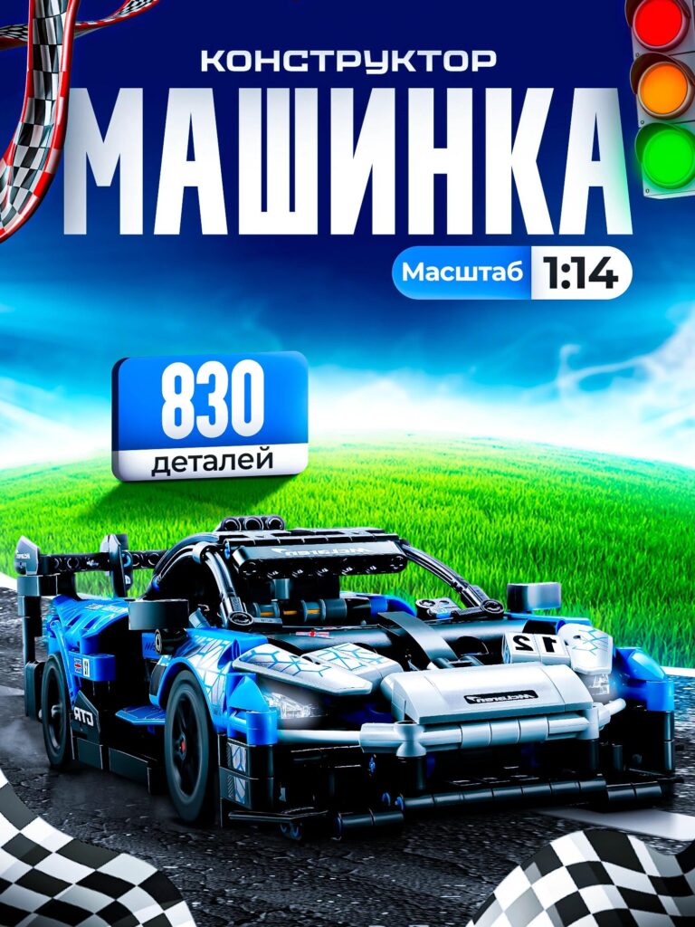
The final image presents a racing-style building set.
We used a bright blue sky and green grass background to contrast with the dark racing car. This improves color separation and visual punch.
The “830 pieces” badge becomes the central selling element. Construction toys compete on complexity. Piece count equals value perception.
We display 1:14 scale clearly to avoid misunderstanding.
This design targets mid-level builders who want performance aesthetics without extreme assembly difficulty.
Across all these toy car designs, we followed consistent principles:
We never overload information. Instead, we prioritize hierarchy.
On Ozon, thumbnails are small. If the message does not read clearly at reduced size, the design fails.
Each toy car variant targets a different emotional trigger:
Instead of using one universal style, we adapted design language to match product identity while preserving marketplace clarity.
That balance is critical.
Ozon shoppers often compare multiple products in seconds. When your main image communicates:
You win attention.
Strong lighting, scale labeling, and environment storytelling increase perceived professionalism. Professional visuals increase trust. Trust increases conversion.
That is the formula we apply.
Designing Ozon main images is not decoration. It is strategic retail engineering. Every shadow, every badge, every color decision supports performance.
If you are looking to elevate your marketplace visuals and build a high-converting image system for your toy car or other products, this is exactly what we specialize in.
We help brands transform standard listings into competitive visual assets.
— AIRSANG


