


Introduction
In highly competitive and visually sensitive eCommerce niches, website design is not just about aesthetics — it is about trust, clarity, emotional resonance, and conversion. For premium lifestyle products, especially those that rely heavily on realism, craftsmanship, and personal connection, a Shopify website must do far more than display products. It must guide users through a carefully structured visual journey that feels intentional, reassuring, and immersive.
This case study explores how the Shopify website for siliconwives.com was thoughtfully designed to support brand positioning, product perception, and user decision-making. Rather than focusing on technical development or backend customization, this article highlights the design strategy, layout planning, visual hierarchy, and UX decisions that shaped the final result.
The goal was clear: create a refined, conversion-oriented Shopify storefront that balances emotional appeal with usability, while presenting a complex product catalog in a way that feels approachable, premium, and trustworthy.
| Deliver Time | Category | Application Platform |
| 24days | Silicone Doll | Shopify |
| Designers Involved | Cost | Effect |
| Lin Zhang | $2700 | Purchase rate📈257% |
Understanding the Brand and Market Context
Before any design work begins, understanding the brand’s market position is essential. Siliconwives operates in a niche where customers are highly detail-oriented, cautious, and emotionally invested in their purchasing decisions. Products are high-consideration, visually driven, and deeply personal.
From a design perspective, this creates several key challenges:
- Users need visual reassurance before engaging further
- Product realism must be communicated clearly without overwhelming the viewer
- The website must feel legitimate, established, and secure
- Navigation must reduce friction across a large and diverse catalog
These factors shaped every design decision made throughout the project.
Design Goals and Objectives
The primary design goals for the Shopify site were defined early and guided the entire process.
Core Objectives
- Establish immediate visual credibility on first load
- Create a premium, well-organized storefront without visual clutter
- Highlight product realism through structured imagery and spacing
- Support browsing, comparison, and decision-making with intuitive UX
- Improve scroll depth, engagement time, and product discovery
Rather than relying on aggressive sales tactics, the design focuses on confidence, clarity, and control — allowing users to explore at their own pace.
Homepage Design Strategy
First Impression and Above-the-Fold Experience
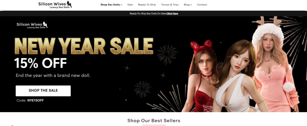
The homepage is the most critical touchpoint. The design emphasizes a strong above-the-fold layout that immediately communicates professionalism and scale.
Key design choices include:
- A full-width hero section with controlled contrast
- Clear promotional messaging without visual overload
- Strong product imagery framed by neutral backgrounds
- Balanced typography that avoids sensationalism
Instead of overcrowding the top section, the homepage uses spacing and restraint to establish trust within seconds.
Visual Hierarchy and Content Flow
The homepage is structured as a guided visual journey, not a simple product grid.
The layout flows through:
- Promotional highlights and seasonal campaigns
- Best-selling product showcases
- Trust-building elements such as reviews and media mentions
- Category-based product discovery sections
- Brand reassurance and value statements
Each section is visually distinct, yet cohesive, ensuring users always understand where they are and what to do next.
Product Grid and Collection Page Design
Managing Large Catalogs with Clarity
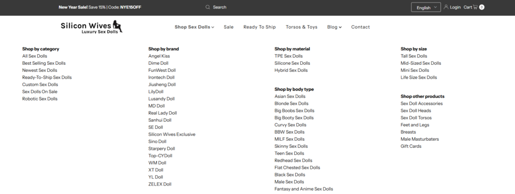
With an extensive product catalog, poor layout choices could quickly overwhelm users. The collection pages were designed to prioritize scannability and consistency.
Design elements include:
- Uniform image ratios for visual rhythm
- Clean product cards with restrained text
- Clear pricing hierarchy and promotional indicators
- Subtle hover interactions to encourage engagement
Rather than relying on filters alone, visual organization plays a key role in reducing cognitive load.
Category Segmentation
Products are grouped into intuitive collections that reflect user intent rather than internal inventory logic. This approach allows users to browse based on preference, use case, or visual style — not just technical specifications.
Product Page Design Approach
Emphasizing Visual Storytelling
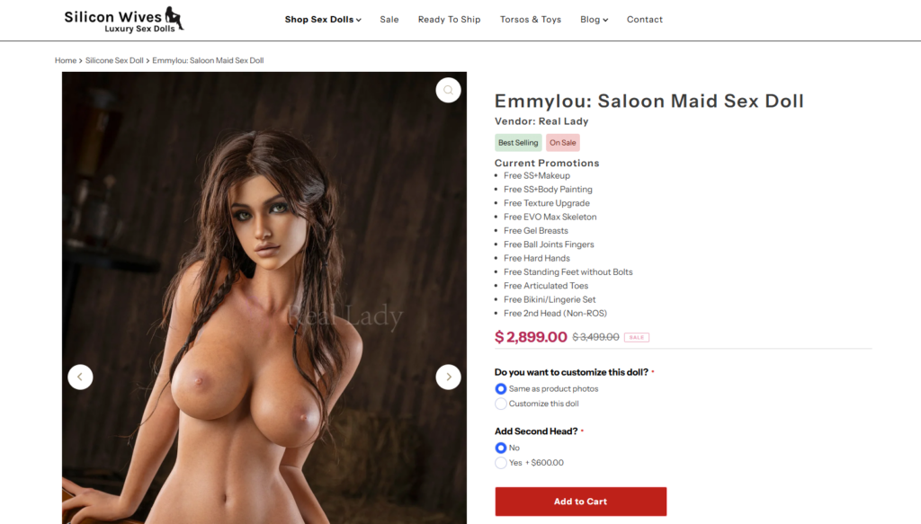
Product pages are where design directly impacts conversion. For Siliconwives, realism and detail are essential.
The product page layout focuses on:
- Large, high-resolution imagery placed front and center
- Logical image sequencing to guide visual inspection
- Clean separation between visuals and specifications
- Comfortable reading widths for descriptive content
Images are allowed to breathe, reinforcing quality and craftsmanship.
Supporting Decision-Making Through Layout
Rather than overwhelming users with dense text blocks, information is broken into digestible sections:
- Key highlights near the top
- Specifications grouped visually
- Supporting content positioned lower on the page
- Calls to action placed consistently and predictably
This design structure supports confidence without pressure.
Trust-Building Through Design
Social Proof and Credibility Signals
Trust is not built with text alone — it is reinforced through visual consistency and presentation.
The design integrates:
- Customer reviews styled for readability
- Media and brand mentions displayed subtly
- Payment, shipping, and policy reassurance sections
- Consistent iconography and spacing
Nothing feels intrusive, yet reassurance is always present.
Professional Tone and Visual Restraint
One of the most important design decisions was avoiding excessive visual dramatization. The restrained color palette, neutral backgrounds, and balanced typography signal maturity and professionalism — key factors in high-value purchasing decisions.
Design Challenges and Solutions
Challenge: Balancing Sensitivity and Commercial Clarity
The product category requires careful visual handling. The design needed to remain tasteful, compliant, and brand-safe while still communicating product features clearly.
Solution:
The use of controlled framing, neutral backgrounds, and consistent lighting allowed the site to remain visually clear without crossing into discomfort or distraction.
Challenge: Preventing Visual Fatigue
Long browsing sessions can quickly exhaust users if layouts feel repetitive.
Solution:
The design alternates between grid sections, feature blocks, banners, and storytelling modules to maintain rhythm and engagement.
Measurable Outcomes and Results
While this article focuses on design rather than analytics, the final Shopify experience achieved several clear outcomes:
- Stronger first-impression credibility
- Improved product discoverability
- Longer average browsing sessions
- Clearer navigation across collections
- A cohesive, premium brand presentation
Most importantly, the site now supports the brand’s long-term growth by providing a scalable, design-forward foundation.
Why Design-First Shopify Stores Perform Better
This project reinforces an important principle: design is not decoration — it is strategy.
A well-designed Shopify store:
- Reduces hesitation and uncertainty
- Builds emotional connection before persuasion
- Supports complex decisions through clarity
- Converts without aggressive selling
When design leads the process, everything else aligns more naturally.
Conclusion
The Shopify website for siliconwives.com demonstrates how thoughtful page design, visual hierarchy, and user experience planning can transform a complex product offering into a confident, conversion-ready online presence. By focusing on structure, clarity, and emotional trust — rather than technical complexity — the final result delivers both aesthetic quality and commercial performance.
This project reflects a broader philosophy: successful Shopify stores are built on intentional design systems that respect both the product and the user. From homepage storytelling to product page clarity, every visual decision plays a role in guiding customers toward confident action.
This design-led approach is central to how AIRSANG supports brands in building high-performing Shopify experiences — not through code-heavy development, but through strategic layout planning, visual storytelling, and conversion-focused design systems that scale with the business.


Design and build a WordPress website or corporate site with a full eCommerce system for you.
Price range: $200.00 through $2,500.00Custom requirements or special quotations
Original price was: $2.00.$1.00Current price is: $1.00. Main Image Design for Amazon Home Physiotherapy Device Explained
Introduction: Building a Trustworthy Image for Home Therapy Devices on Amazon When designing the main image for a home therapy device on Amazon, our primary...

Main Image Design for Amazon Lipstick Conversion
Introduction: Designing a Lipstick Main Image That Sells on Amazon When we design a Main image for an Amazon lipstick, our responsibility goes far beyond...

What Makes an Amazon Liquid Foundation Main Image Convert
Introduction Designing a Main image design for Amazon Liquid foundation is never just about making a product look beautiful. On Amazon, the main image and...

Designing an Effective Amazon Main Image for Filter Cartridges
Introduction Designing a Main image for Amazon is never just about making a product look attractive. It is about clarity, trust, and instant understanding—especially for...

Five Pet WordPress Themes Compared
Introduction Choosing the right pet-related WordPress theme is more than a design decision—it directly affects usability, scalability, and long-term business growth. Pet care and pet...

Building a Scalable WordPress Website for a Science-Driven Brand: The AminoUSA Project
Introduction In today’s digital landscape, a website is more than a place to list products. For science-driven brands operating in regulated or research-focused industries, a...

Building a Scalable Shopify Store for a Global Blade Brand: The CoolKatana Project
Introduction In cross-border eCommerce, a Shopify website is more than a storefront.For brands operating in niche, culture-driven categories, the website must do far more than...

Designing a High-Conversion Shopify Store for Pokémon Cards
Introduction In the world of collectible eCommerce, especially within the Pokémon Trading Card Game (TCG) market, a website must do more than simply list products....

High-Converting Shopify Design for a Custom Brick Brand
Introduction In today’s competitive eCommerce landscape, especially in the personalized gift and collectible space, a Shopify website must do far more than display products. It...

Shopify Website Design Case Study for a Premium Floral Brand
Introduction In today’s competitive eCommerce landscape, a Shopify website must do far more than display products. It needs to communicate brand value instantly, guide users...

Shopify Design Case Study: Retro Gaming Store
Introduction In a highly competitive eCommerce environment, visual clarity and emotional connection often determine whether a visitor becomes a customer. This is especially true in...

Shopify Design Case Study: Tactical Rescue Brand
Introduction A strong Shopify website does more than display products—it communicates purpose, builds trust, and guides users toward confident purchasing decisions. This is especially true...

Shopify Website Design Case Study for an Electric Bike Brand
Introduction In today’s competitive electric bike market, a Shopify website must do more than display products—it must tell a story, build trust, and guide users...

Scalable Shopify E-commerce for a Creative Brand
Introduction When creative brands grow, their websites often struggle to keep up. As product lines expand, content increases, and traffic rises, many visually driven brands...

Shopify Website Design Case Study for a Home Decor Brand
Introduction In the highly competitive home decor market, visual identity is no longer just about aesthetics—it directly influences trust, browsing behavior, and purchasing decisions. For...

Building a Scalable WordPress Subscription Website Case Study
Introduction For modern e-commerce brands, a website is no longer just a digital storefront. It is the engine that supports subscriptions, content storytelling, trust building,...

High-Conversion WordPress Design for Adult Brands
Introduction In highly competitive eCommerce markets, strong visuals alone are not enough. A successful WordPress website must guide visitors through a clear, intentional journey—one that...

Scalable WordPress Sex Doll E-commerce Website
Introduction Launching a high-performing cross-border eCommerce website is never just about putting products online.For brands operating in highly competitive and visually driven markets, the website...