


Introduction
A strong Shopify website does more than display products—it communicates purpose, builds trust, and guides users toward confident purchasing decisions. This is especially true for brands operating in mission-driven industries, where credibility, clarity, and emotional connection directly impact conversion.
For Rhino Rescue, a brand specializing in tactical first aid and emergency rescue equipment, the website needed to do more than look professional. It had to clearly convey reliability under pressure, reflect real-world use cases, and speak to a diverse group of users—from outdoor enthusiasts to trained professionals.
This case study explores how we designed the Shopify experience for Rhino Rescue, focusing on visual hierarchy, storytelling, and conversion-oriented layout decisions. Rather than technical development, this project centered on strategic design thinking—how each section, image, and interaction supports the brand’s mission and business goals.
| Deliver Time | Category | Application Platform |
| 20days | First aid kit | Shopify |
| Designers Involved | Cost | Effect |
| Lin Zhang | $2500 | Purchase rate📈230% |
Understanding the Brand and Its Audience
A Brand Built on Real-World Emergency Scenarios
Rhino Rescue operates in a niche where trust is non-negotiable. The products are designed for real emergencies, tactical scenarios, and high-risk environments. As designers, our first priority was to deeply understand what the brand stands for:
- Preparedness over aesthetics for aesthetics’ sake
- Professional credibility over generic eCommerce visuals
- Clear communication over marketing exaggeration
The website needed to reflect these values immediately, starting from the hero section.
Defining Core User Groups
Before any layout or visual direction was finalized, we identified the brand’s primary user segments:
- Tactical and military-style users
- Outdoor adventurers and survivalists
- Medical professionals and emergency responders
- Everyday users seeking personal safety solutions
Each group has different motivations, but they all share one expectation: clarity and trust. This insight guided the entire design structure.
Design Goals and Strategic Direction
Primary Objectives
Our design goals for the Rhino Rescue Shopify site were clear:
- Instantly communicate the brand’s mission and credibility
- Present products in real-use contexts rather than abstract displays
- Simplify navigation for users with different experience levels
- Increase engagement without overwhelming the user
- Support conversions through structure, not aggressive sales tactics
Every design decision tied back to at least one of these objectives.
Visual Tone and Emotional Direction
The brand operates in high-stakes environments, so the visual language needed to feel:
- Strong but not aggressive
- Professional but not cold
- Tactical yet accessible
We leaned into darker, grounded color palettes, high-contrast typography, and realistic photography to support this tone.
Homepage Design: Structuring the First Impression
Hero Section: Purpose Before Promotion

The homepage hero section sets the emotional foundation. Instead of leading with product grids or discounts, the design focuses on context and mission.
Large-scale imagery shows tactical gear in real scenarios, immediately signaling seriousness and real-world application. Seasonal messaging, such as holiday safety campaigns, was integrated carefully to maintain brand integrity while supporting promotional needs.
Key design considerations included:
- Clear headline hierarchy for fast comprehension
- Minimal call-to-action buttons to avoid decision fatigue
- Visual balance between imagery and text
The result is a hero section that invites users in without shouting at them.
Modular Content for Different User Needs
“Meet Needs of Different Users” Section
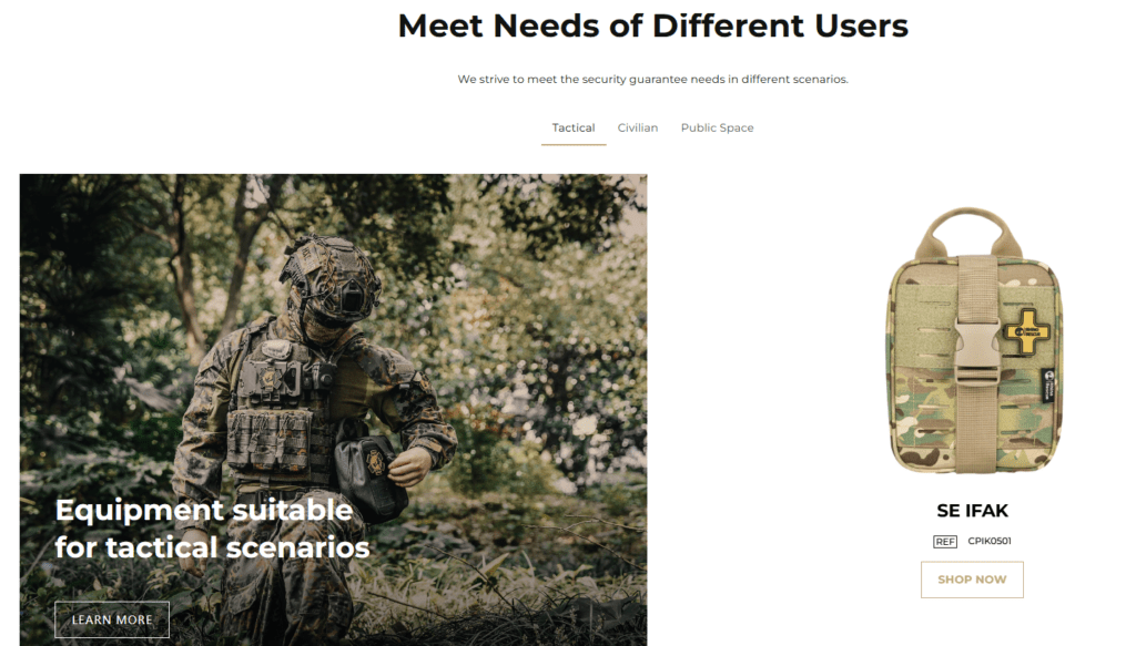
One of the most important design challenges was addressing multiple user types without fragmenting the experience. We solved this through a modular content structure that visually separates use cases while keeping the layout cohesive.
This section uses:
- Scenario-based imagery
- Short, direct copy
- Clear visual grouping
Users can instantly identify which products or scenarios are relevant to them, reducing friction and improving engagement.
Product Highlight Blocks
Rather than overwhelming users with large catalogs, we introduced focused product highlights. Each block emphasizes:
- Practical application
- Compact, readable information
- Consistent spacing and alignment
This approach keeps the page visually calm while still showcasing product variety.
Designing for Trust and Credibility
Hot Sale Section with Professional Restraint
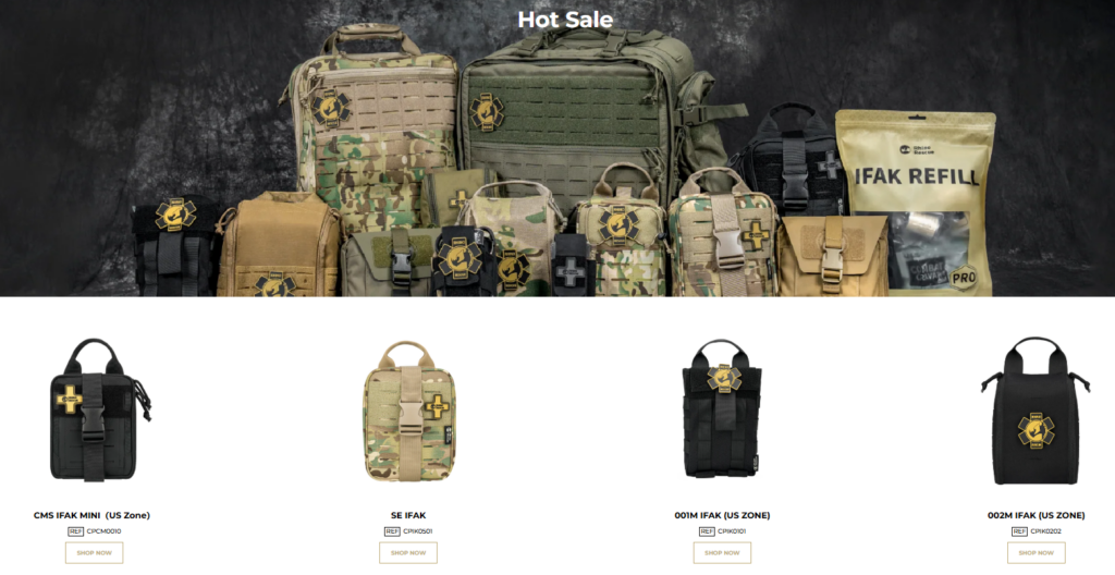
Promotional sections often risk feeling overly commercial, especially for mission-driven brands. The “Hot Sale” section was designed to highlight popular products without breaking the site’s serious tone.
We used:
- Neutral, controlled lighting in product visuals
- Consistent product sizing and alignment
- Clear labels without flashy badges
This ensures promotions feel informative rather than pushy.
Brand Storytelling Through Visual Design
Translating Brand History into Layout
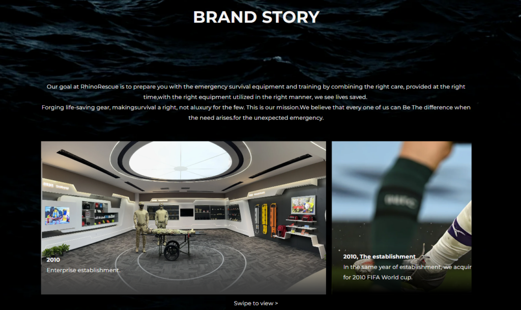
The Brand Story section plays a critical role in reinforcing trust. Instead of long paragraphs, we relied on visual storytelling supported by concise copy.
Design techniques included:
- Timeline-style content blocks
- Real-world photography
- Balanced text-to-image ratios
This allows users to absorb the brand’s background naturally as they scroll, without feeling like they are reading a corporate manifesto.
Community and Partnership Messaging
Join Our Partnership Network
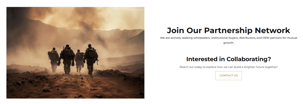
This section was designed to feel open and collaborative. The layout uses:
- Spacious composition
- Warm, human-centered imagery
- Clear but non-aggressive calls to action
The goal was to position Rhino Rescue not just as a seller, but as a partner within a broader safety and rescue ecosystem.
Social Proof and Real-World Validation
Real Users, Real Emergencies
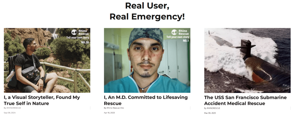
User stories and real-world applications are powerful trust signals. We structured this section to highlight authenticity over polish.
Key design choices included:
- Editorial-style cards
- Natural photography
- Clear separation between stories
This reinforces the idea that the products are used by real people in real situations.
Challenges and Design Solutions
Balancing Tactical Aesthetics with Accessibility
One challenge was avoiding an overly militarized look that could alienate everyday users. We addressed this by:
- Using clean typography
- Maintaining generous white space
- Keeping copy clear and non-technical
Managing Content Density
With many product categories and stories, content overload was a risk. We solved this through:
- Section prioritization
- Visual breathing room
- Clear scrolling rhythm
Results and Impact
After implementing the redesigned Shopify pages, the site achieved:
- Stronger first-impression clarity
- Improved user flow across homepage sections
- Clearer communication of brand values
- A more professional and trustworthy visual presence
Most importantly, the site now aligns the brand’s mission with its visual experience—supporting both user confidence and long-term growth.
Conclusion
Designing a Shopify website for a tactical rescue brand requires more than visual polish. It demands strategic thinking, empathy for users, and a deep understanding of how design influences trust and decision-making.
This project demonstrates how thoughtful page structure, visual storytelling, and conversion-focused design can elevate a mission-driven brand without relying on technical complexity.
Projects like Rhino Rescue reflect the type of Shopify design work we specialize in—where brand identity, user experience, and business goals align seamlessly.
This is exactly the kind of strategic, design-first approach delivered by AIRSANG, helping brands transform their Shopify presence into a powerful, trust-building digital experience.


Design and build a WordPress website or corporate site with a full eCommerce system for you.
Price range: $200.00 through $2,500.00Custom requirements or special quotations
Original price was: $2.00.$1.00Current price is: $1.00. Main Image Design for Amazon Home Physiotherapy Device Explained
Introduction: Building a Trustworthy Image for Home Therapy Devices on Amazon When designing the main image for a home therapy device on Amazon, our primary...

Main Image Design for Amazon Lipstick Conversion
Introduction: Designing a Lipstick Main Image That Sells on Amazon When we design a Main image for an Amazon lipstick, our responsibility goes far beyond...

What Makes an Amazon Liquid Foundation Main Image Convert
Introduction Designing a Main image design for Amazon Liquid foundation is never just about making a product look beautiful. On Amazon, the main image and...

Designing an Effective Amazon Main Image for Filter Cartridges
Introduction Designing a Main image for Amazon is never just about making a product look attractive. It is about clarity, trust, and instant understanding—especially for...

Five Pet WordPress Themes Compared
Introduction Choosing the right pet-related WordPress theme is more than a design decision—it directly affects usability, scalability, and long-term business growth. Pet care and pet...

Building a Scalable WordPress Website for a Science-Driven Brand: The AminoUSA Project
Introduction In today’s digital landscape, a website is more than a place to list products. For science-driven brands operating in regulated or research-focused industries, a...

Building a Scalable Shopify Store for a Global Blade Brand: The CoolKatana Project
Introduction In cross-border eCommerce, a Shopify website is more than a storefront.For brands operating in niche, culture-driven categories, the website must do far more than...

Designing a High-Conversion Shopify Store for Pokémon Cards
Introduction In the world of collectible eCommerce, especially within the Pokémon Trading Card Game (TCG) market, a website must do more than simply list products....

High-Converting Shopify Design for a Custom Brick Brand
Introduction In today’s competitive eCommerce landscape, especially in the personalized gift and collectible space, a Shopify website must do far more than display products. It...

Shopify Website Design Case Study for a Premium Floral Brand
Introduction In today’s competitive eCommerce landscape, a Shopify website must do far more than display products. It needs to communicate brand value instantly, guide users...

Shopify Design Case Study: Retro Gaming Store
Introduction In a highly competitive eCommerce environment, visual clarity and emotional connection often determine whether a visitor becomes a customer. This is especially true in...

Shopify Website Design Case Study for an Electric Bike Brand
Introduction In today’s competitive electric bike market, a Shopify website must do more than display products—it must tell a story, build trust, and guide users...

Scalable Shopify E-commerce for a Creative Brand
Introduction When creative brands grow, their websites often struggle to keep up. As product lines expand, content increases, and traffic rises, many visually driven brands...

Shopify Website Design Case Study for a Home Decor Brand
Introduction In the highly competitive home decor market, visual identity is no longer just about aesthetics—it directly influences trust, browsing behavior, and purchasing decisions. For...

Building a Scalable WordPress Subscription Website Case Study
Introduction For modern e-commerce brands, a website is no longer just a digital storefront. It is the engine that supports subscriptions, content storytelling, trust building,...

High-Conversion WordPress Design for Adult Brands
Introduction In highly competitive eCommerce markets, strong visuals alone are not enough. A successful WordPress website must guide visitors through a clear, intentional journey—one that...

Scalable WordPress Sex Doll E-commerce Website
Introduction Launching a high-performing cross-border eCommerce website is never just about putting products online.For brands operating in highly competitive and visually driven markets, the website...
Shopify Website Design for a Silicone Doll Brand
Introduction In highly competitive and visually sensitive eCommerce niches, website design is not just about aesthetics — it is about trust, clarity, emotional resonance, and...