


Introduction
When designing a main image set for an Ozon listing, our goal is never just to “show the product.” We design to explain, persuade, and remove doubt within seconds. For this vacuum packaging machine, we approached the project as designers who understand both the visual logic of Ozon and the decision-making psychology of buyers. Every image in this set serves a clear purpose: to communicate function, usability, power, and reliability—without overwhelming the customer.
In this article, we walk through the full main image design strategy for this vacuum packaging machine. We explain why each image exists, how visual hierarchy was built, and how technical features were translated into clear, conversion-focused visuals suitable for Ozon’s competitive marketplace.
| Deliver Time | Category | Application Platform |
| 8days | Vacuum packaging machine | Ozon |
| Designers Involved | Cost | Effect |
| Lin Zhang | $110 | Purchase rate📈325% |
Image 1: Multi-Mode Functionality as the Core Value Proposition
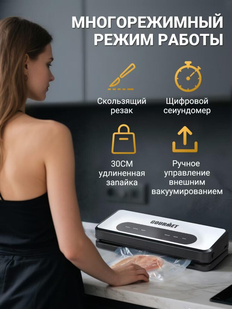
The first image introduces the product in a real-life kitchen environment, immediately grounding the vacuum packaging machine in everyday use. Instead of isolating the device on a plain background, we placed it in context to answer a critical buyer question: “Will this fit naturally into my kitchen routine?”
The headline focuses on multi-mode operation, which is one of the strongest selling points. Rather than listing modes in text-heavy paragraphs, we used icon-based visual language to make each function instantly recognizable. Sliding cutter, digital timer, extended sealing bar, and external vacuum control are all represented through simple, clean icons.
This design choice reduces cognitive load. A shopper scrolling through Ozon does not need to read deeply to understand that this machine does more than basic sealing. The neutral color palette ensures the product remains the visual anchor, while the warm accent color draws attention to key features without overpowering the scene.
Image 2: Three-Step Simplicity to Reduce User Anxiety
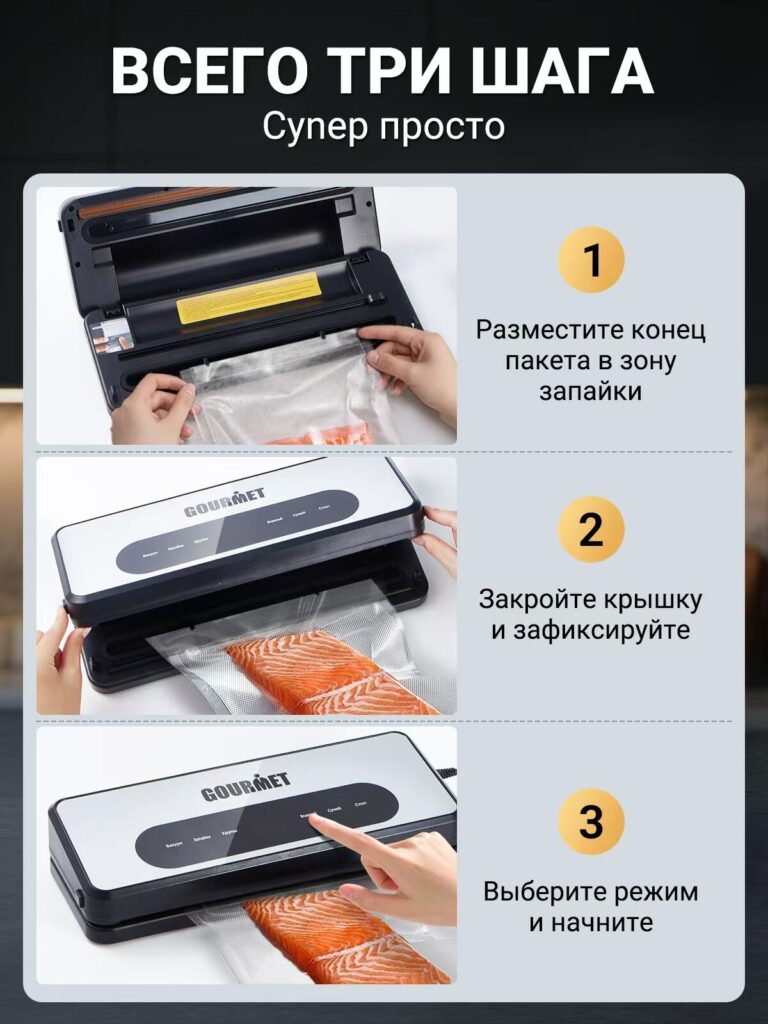
Complex appliances often fail to convert because buyers fear complicated setup. The second image directly addresses that concern by presenting the process as three simple steps.
We deliberately designed this image as a vertical instructional flow. Each step is visually separated, numbered, and paired with a clear action image. This layout mirrors how users naturally scan instructions—from top to bottom—making the process feel intuitive.
By showing hands interacting with the machine, we humanize the product. The buyer can imagine themselves performing the same actions. This approach builds confidence and reduces hesitation, especially for first-time vacuum packaging machine users.
The design avoids technical jargon and instead emphasizes ease of use, a critical factor for household appliances on Ozon.
Image 3: Control Panel Breakdown for Feature Transparency
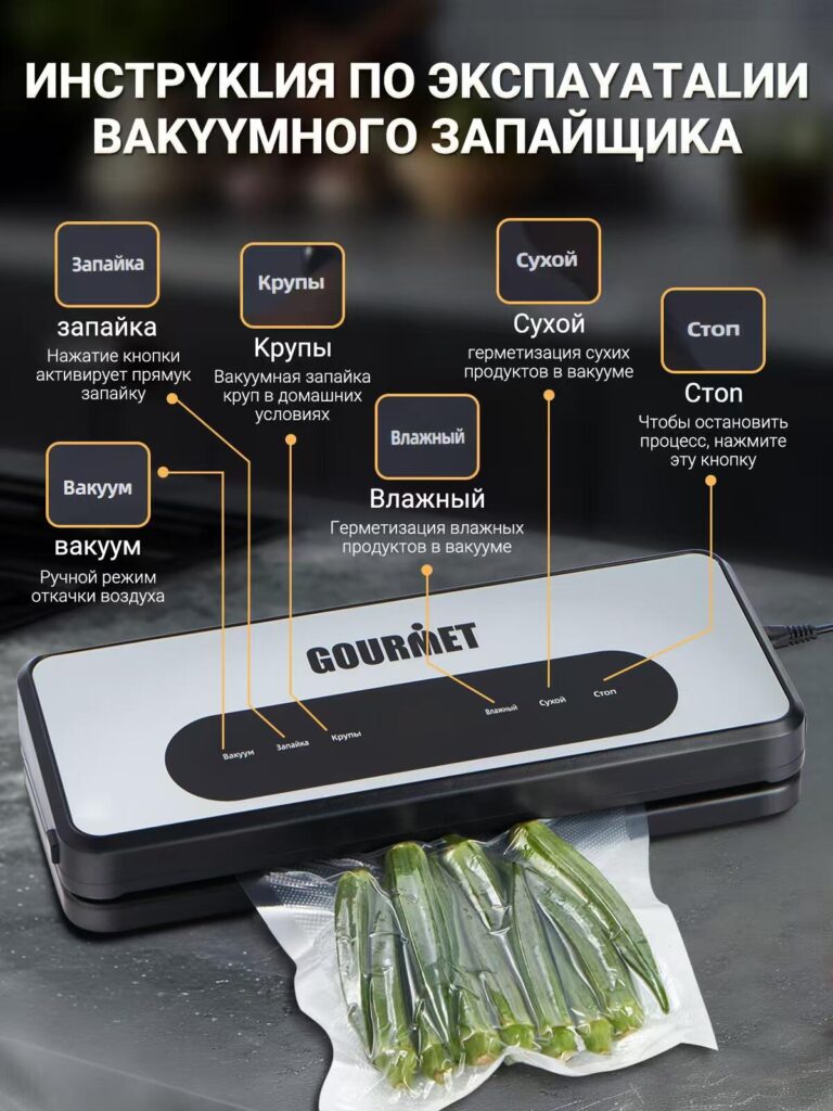
This image functions as a visual manual. Instead of hiding functionality behind marketing claims, we chose to explain every button clearly.
Each mode—sealing, grains, dry, wet, vacuum, and stop—is visually mapped to its position on the control panel. Lines and labels guide the viewer’s eye without clutter. This structured breakdown reassures buyers that the machine is versatile yet understandable.
From a design standpoint, this image builds trust through transparency. Buyers do not feel like features are being exaggerated or hidden. Everything is visible, labeled, and logically organized, which aligns perfectly with Ozon shoppers’ preference for practical clarity over abstract branding.
Image 4: Power, Speed, and Performance Visualization
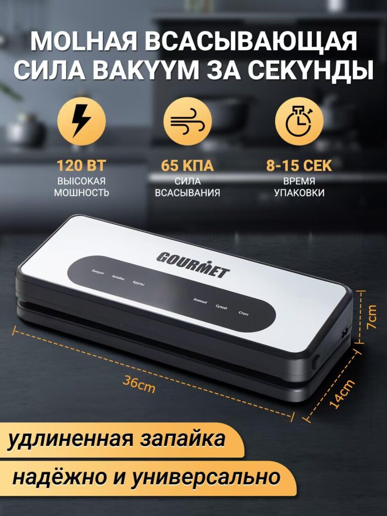
Performance metrics can easily feel abstract if presented only as numbers. In this image, we transformed technical specifications into visual proof.
The headline emphasizes fast vacuum suction, while icons and concise labels communicate power (120W), suction strength (65 kPa), and packaging time (8–15 seconds). The machine is shown prominently, with dimensional markings that subtly indicate its compact but capable form factor.
This image is designed for comparison shopping. On Ozon, users often compare multiple listings quickly. By surfacing key performance data in a clean, visual format, we ensure this product stands out as powerful, efficient, and professional at a glance.
Image 5: Internal Structure and Configuration Transparency
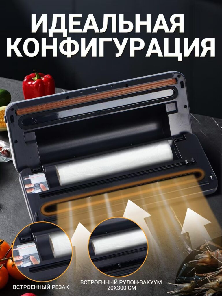
Trust increases when customers can see how a product works, not just what it does. This image opens the vacuum packaging machine to reveal its internal configuration.
We highlighted the built-in cutter and the integrated vacuum roll storage, including size specifications. Visual arrows and cutaway-style composition guide the viewer through the internal layout, making the engineering feel accessible rather than intimidating.
This design communicates durability and thoughtful construction. It subtly signals that this is not a disposable appliance but a well-designed kitchen tool built for repeated use.
Image 6: Product Positioning and Feature Summary
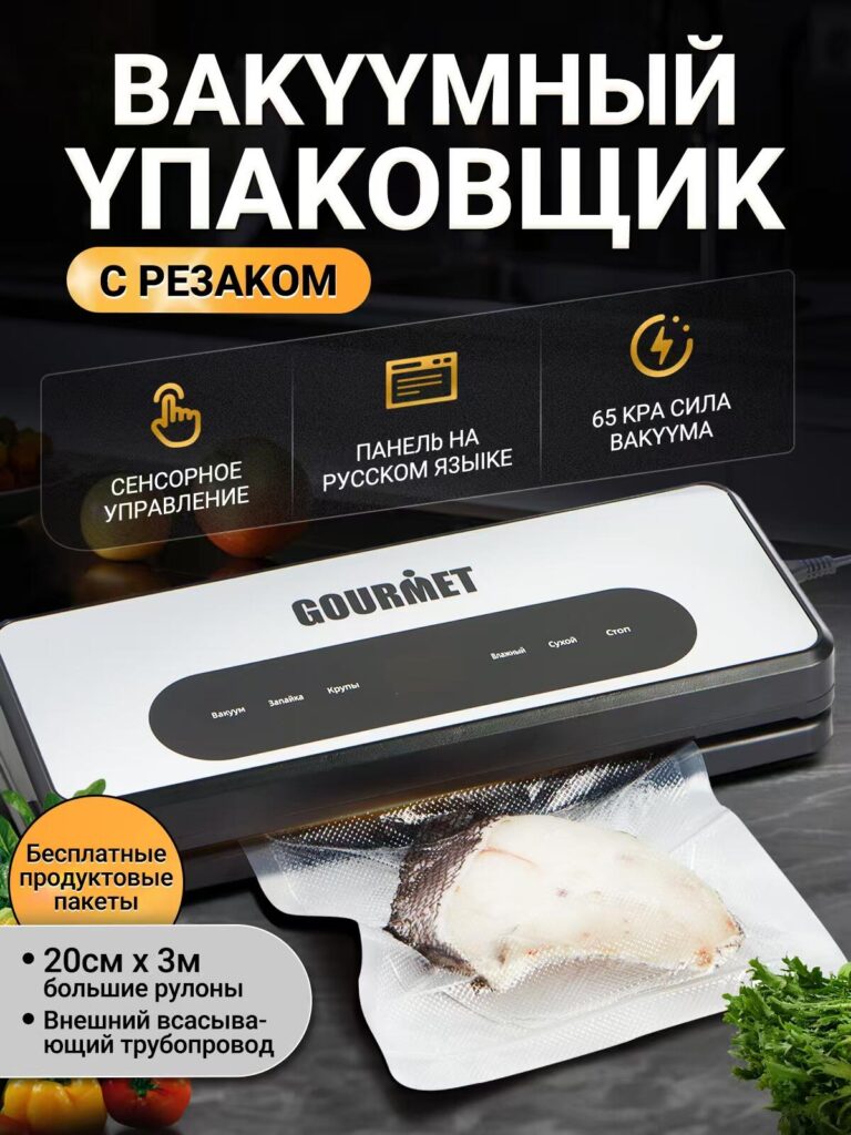
This image serves as a summary slide, reinforcing the product’s identity as a vacuum packaging machine with an integrated cutter. Rather than repeating earlier content, we consolidated key benefits into a clean, badge-style layout.
Touch control, Russian-language panel, and strong vacuum force are presented as clear value points. The product remains large and central, while supporting elements frame it without distraction.
This image is especially effective near the end of an Ozon image carousel, where buyers are already interested and looking for final confirmation.
Design Principles Behind the Entire Image Set
Throughout this main image design, we followed several core principles:
- Visual hierarchy over text density
We prioritized icons, spacing, and contrast to communicate quickly. - Real-world usability over abstract branding
Every image answers a practical buyer question. - Ozon-specific behavior awareness
The design assumes fast scrolling, comparison shopping, and mobile viewing. - Trust through clarity
We avoided exaggerated claims and focused on visible proof.
Why This Main Image Design Works for Ozon
Ozon is a marketplace where buyers expect information-rich visuals. Unlike purely lifestyle-driven platforms, Ozon users actively seek specifications, modes, and instructions before purchasing. This image set respects that mindset.
By structuring the visuals as a logical narrative—from overview, to usage, to power, to configuration, to value—we guide the buyer step by step toward confidence. The design does not rush the user; it educates them.
Final Thoughts
This vacuum packaging machine main image design is not just about aesthetics. It is a strategic visual system built to communicate function, quality, and usability in a highly competitive Ozon environment.
By aligning design decisions with real user concerns, platform behavior, and product strengths, we created a main image set that supports both brand credibility and conversion performance.
Projects like this reflect the design philosophy we apply across cross-border eCommerce platforms. This case was developed and executed by AIRSANG, where we specialize in conversion-focused visual design for global marketplaces.


Design and build a WordPress website or corporate site with a full eCommerce system for you.
Price range: $200.00 through $2,500.00Custom requirements or special quotations
Original price was: $2.00.$1.00Current price is: $1.00. Main Image Design for Amazon Home Physiotherapy Device Explained
Introduction: Building a Trustworthy Image for Home Therapy Devices on Amazon When designing the main image for a home therapy device on Amazon, our primary...

Main Image Design for Amazon Lipstick Conversion
Introduction: Designing a Lipstick Main Image That Sells on Amazon When we design a Main image for an Amazon lipstick, our responsibility goes far beyond...

What Makes an Amazon Liquid Foundation Main Image Convert
Introduction Designing a Main image design for Amazon Liquid foundation is never just about making a product look beautiful. On Amazon, the main image and...

Designing an Effective Amazon Main Image for Filter Cartridges
Introduction Designing a Main image for Amazon is never just about making a product look attractive. It is about clarity, trust, and instant understanding—especially for...

Five Pet WordPress Themes Compared
Introduction Choosing the right pet-related WordPress theme is more than a design decision—it directly affects usability, scalability, and long-term business growth. Pet care and pet...

Building a Scalable WordPress Website for a Science-Driven Brand: The AminoUSA Project
Introduction In today’s digital landscape, a website is more than a place to list products. For science-driven brands operating in regulated or research-focused industries, a...

Building a Scalable Shopify Store for a Global Blade Brand: The CoolKatana Project
Introduction In cross-border eCommerce, a Shopify website is more than a storefront.For brands operating in niche, culture-driven categories, the website must do far more than...

Designing a High-Conversion Shopify Store for Pokémon Cards
Introduction In the world of collectible eCommerce, especially within the Pokémon Trading Card Game (TCG) market, a website must do more than simply list products....

High-Converting Shopify Design for a Custom Brick Brand
Introduction In today’s competitive eCommerce landscape, especially in the personalized gift and collectible space, a Shopify website must do far more than display products. It...

Shopify Website Design Case Study for a Premium Floral Brand
Introduction In today’s competitive eCommerce landscape, a Shopify website must do far more than display products. It needs to communicate brand value instantly, guide users...

Shopify Design Case Study: Retro Gaming Store
Introduction In a highly competitive eCommerce environment, visual clarity and emotional connection often determine whether a visitor becomes a customer. This is especially true in...

Shopify Design Case Study: Tactical Rescue Brand
Introduction A strong Shopify website does more than display products—it communicates purpose, builds trust, and guides users toward confident purchasing decisions. This is especially true...

Shopify Website Design Case Study for an Electric Bike Brand
Introduction In today’s competitive electric bike market, a Shopify website must do more than display products—it must tell a story, build trust, and guide users...

Scalable Shopify E-commerce for a Creative Brand
Introduction When creative brands grow, their websites often struggle to keep up. As product lines expand, content increases, and traffic rises, many visually driven brands...

Shopify Website Design Case Study for a Home Decor Brand
Introduction In the highly competitive home decor market, visual identity is no longer just about aesthetics—it directly influences trust, browsing behavior, and purchasing decisions. For...

Building a Scalable WordPress Subscription Website Case Study
Introduction For modern e-commerce brands, a website is no longer just a digital storefront. It is the engine that supports subscriptions, content storytelling, trust building,...

High-Conversion WordPress Design for Adult Brands
Introduction In highly competitive eCommerce markets, strong visuals alone are not enough. A successful WordPress website must guide visitors through a clear, intentional journey—one that...

Scalable WordPress Sex Doll E-commerce Website
Introduction Launching a high-performing cross-border eCommerce website is never just about putting products online.For brands operating in highly competitive and visually driven markets, the website...