


Introduction
Designing a high-converting main image for a power bank on Ozon is not about decoration—it is about instant communication. Shoppers scroll fast, compare visually, and decide within seconds whether a product deserves a click. As designers, our responsibility is to translate technical specifications such as capacity, output power, and charging compatibility into a clear, visually compelling story that works within Ozon’s competitive marketplace environment.
In this project, we created a complete main image design system for Ozon power bank listings, using multiple visual styles while following one core logic: make the product’s value understandable at first glance. Below is a detailed breakdown of each image in the set, explaining why every angle, color, icon, and text placement was chosen, and how each design element supports higher click-through rates and stronger buyer confidence.
| Deliver Time | Category | Application Platform |
| 8days | Power bank | Ozon |
| Designers Involved | Cost | Effect |
| Petter | $110 | Purchase quantity📈249% |
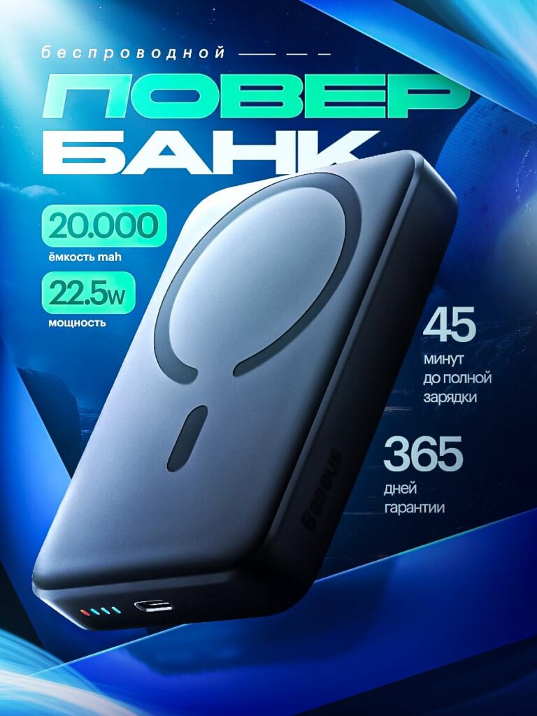
Image 1: High-Energy Technical Hero Visual
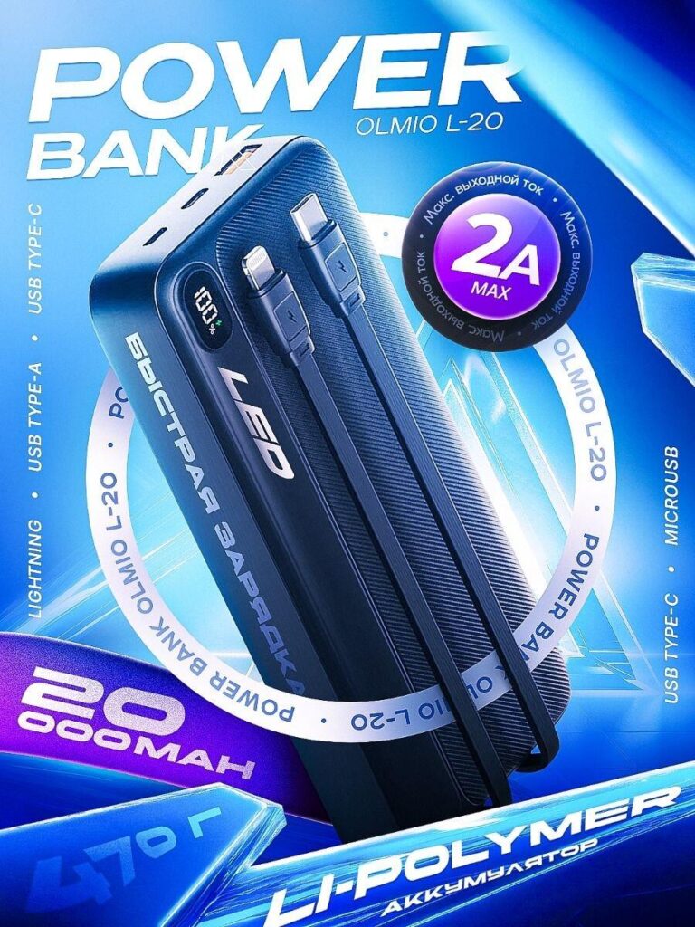
The first image introduces the power bank as a high-performance, modern tech product. We used a dynamic blue background combined with sharp lighting effects to immediately communicate power, speed, and reliability. Blue is strongly associated with technology and trust, making it ideal for electronics categories on Ozon.
The product is placed at a three-quarter angle, allowing users to see both the body texture and the integrated cables. This angle avoids the “flat catalog look” and adds depth, making the power bank feel more premium and substantial.
Key design decisions in this image include:
- Integrated cable visibility to reduce buyer uncertainty about compatibility
- Clear “20,000 mAh” capacity callout placed prominently without overwhelming the product
- “2A Max” output badge designed as a circular highlight to draw immediate attention
This image works as a classic Ozon hero shot: bold, information-rich, and optimized for small thumbnail viewing while still feeling premium at full size.
Image 2: Clean Capacity-Focused Commercial Layout
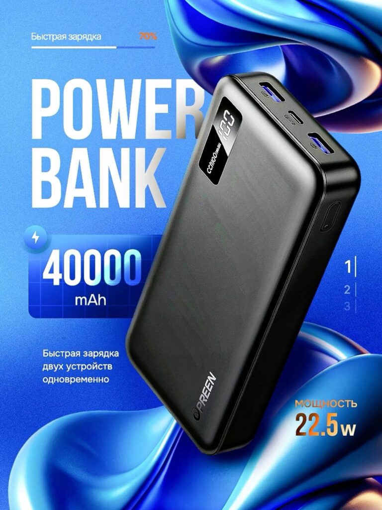
The second image shifts to a cleaner, more commercial presentation style. Here, the goal is clarity rather than drama. The background uses soft gradients and fluid shapes to keep visual interest without distracting from the product itself.
We emphasized 40,000 mAh capacity and 22.5W fast charging using large typography and iconography that remains readable on mobile screens. This is crucial for Ozon, where a significant percentage of traffic comes from mobile users.
Design highlights:
- Front-facing product orientation for easy recognition
- Digital battery display shown clearly, reinforcing usability and precision
- Minimal copy that focuses only on what matters most to buyers
This image is designed for users who quickly compare specifications across listings. It answers their top questions instantly: “How big is it?” and “How fast does it charge?”
Image 3: Power and Port Functionality Emphasis
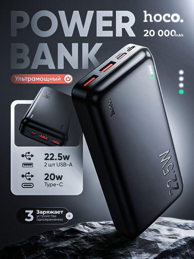
The third image focuses on output power and multi-port capability, two major decision factors for power bank buyers. We used a darker, high-contrast background to highlight port details and LED indicators.
The layout intentionally places the ports near the top edge of the frame so users immediately understand:
- Number of USB-A and Type-C outputs
- Maximum wattage per port
- Ability to charge multiple devices simultaneously
Icons and short text blocks replace long descriptions, which improves scanability. The lighting emphasizes the glossy surface and solid build quality, reinforcing durability and performance.
This image is particularly effective for users comparing charging ecosystems—phones, tablets, earbuds, and accessories—because it visually confirms versatility without requiring them to read specifications.
Image 4: Lifestyle-Driven Premium Power Message
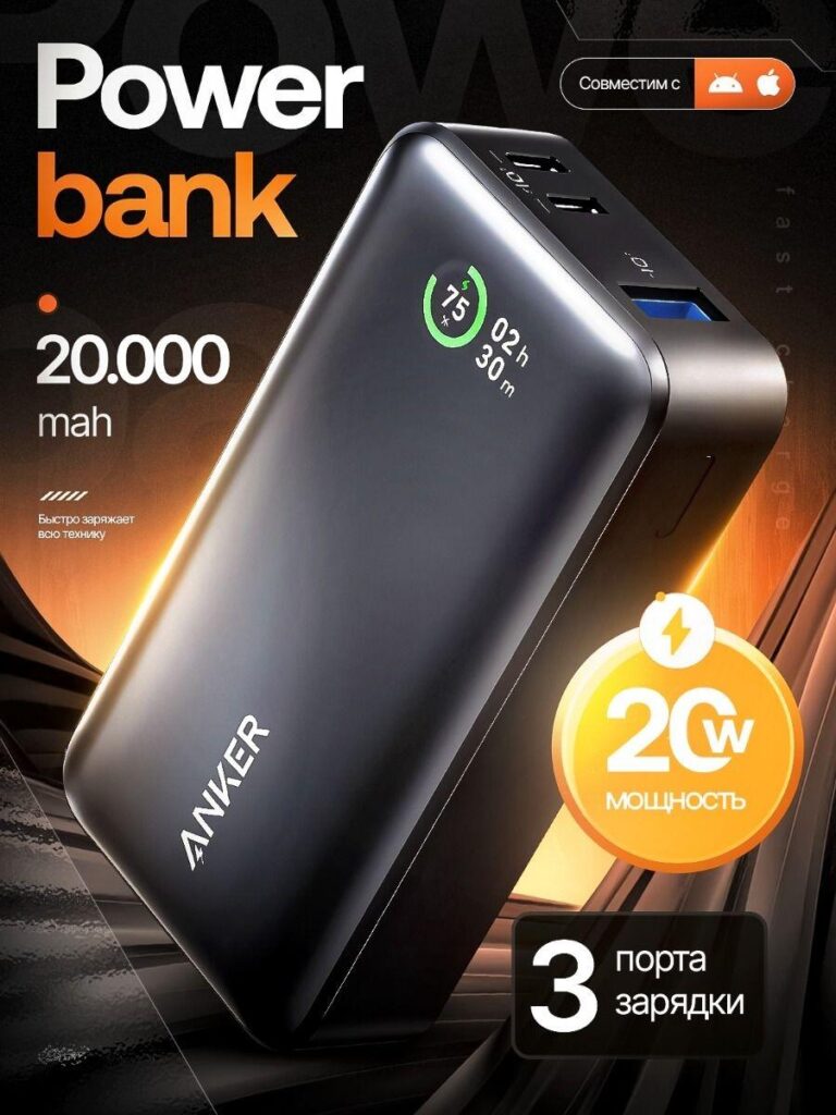
In the fourth image, we introduced a warmer color palette and dramatic lighting to shift the emotional tone. While previous images focus on specifications, this one emphasizes confidence and everyday power.
The power bank is presented as a reliable companion rather than just a technical object. The glowing accents and energy icons subtly communicate fast charging and endurance without overwhelming the product.
Key intentions behind this design:
- Lifestyle-adjacent atmosphere without adding people or clutter
- Balanced typography that supports the product rather than competing with it
- Strong visual hierarchy, guiding the eye from product to power rating to port count
This image helps bridge the gap between technical buyers and everyday users who want reassurance rather than raw numbers.
Image 5: Warranty, Charging Speed, and Trust Signals
The final image is designed to close the decision loop. It emphasizes charging speed, warranty period, and reliability, which are crucial trust factors in electronics purchases.
We used clean layouts and soft lighting to keep the tone professional and dependable. Rather than aggressive marketing language, we relied on structured information blocks that feel official and credible.
This image supports:
- Reduced purchase hesitation
- Stronger perception of brand responsibility
- Clear after-sales expectations
By placing this image later in the sequence, it reinforces confidence after the user has already understood the product’s core benefits.
Overall Design Strategy for Ozon
Across all images, we followed a consistent design framework tailored specifically for Ozon:
- Instant readability at thumbnail size
- Clear separation between product and text
- Consistent color logic across the image set
- Specification-first storytelling
- Visual trust building without clutter
Rather than relying on heavy promotional language, the design lets the product speak through clarity, structure, and professional presentation.
Conclusion
A successful main image design for Ozon power bank listings is not about adding more elements—it is about making the right information impossible to miss. By combining strong visual hierarchy, platform-specific layout logic, and buyer-focused storytelling, this image set transforms technical specifications into a clear, compelling sales narrative.
This approach helps products stand out in crowded Ozon categories, improves click-through rates, and builds trust before users even read a single line of product description.
If you are looking to elevate your Ozon listings through strategic, conversion-focused visual design, this is exactly the kind of system we build at AIRSANG.


Design and build a WordPress website or corporate site with a full eCommerce system for you.
Price range: $200.00 through $2,500.00Custom requirements or special quotations
Original price was: $2.00.$1.00Current price is: $1.00. Main Image Design for Amazon Home Physiotherapy Device Explained
Introduction: Building a Trustworthy Image for Home Therapy Devices on Amazon When designing the main image for a home therapy device on Amazon, our primary...

Main Image Design for Amazon Lipstick Conversion
Introduction: Designing a Lipstick Main Image That Sells on Amazon When we design a Main image for an Amazon lipstick, our responsibility goes far beyond...

What Makes an Amazon Liquid Foundation Main Image Convert
Introduction Designing a Main image design for Amazon Liquid foundation is never just about making a product look beautiful. On Amazon, the main image and...

Designing an Effective Amazon Main Image for Filter Cartridges
Introduction Designing a Main image for Amazon is never just about making a product look attractive. It is about clarity, trust, and instant understanding—especially for...

Five Pet WordPress Themes Compared
Introduction Choosing the right pet-related WordPress theme is more than a design decision—it directly affects usability, scalability, and long-term business growth. Pet care and pet...

Building a Scalable WordPress Website for a Science-Driven Brand: The AminoUSA Project
Introduction In today’s digital landscape, a website is more than a place to list products. For science-driven brands operating in regulated or research-focused industries, a...

Building a Scalable Shopify Store for a Global Blade Brand: The CoolKatana Project
Introduction In cross-border eCommerce, a Shopify website is more than a storefront.For brands operating in niche, culture-driven categories, the website must do far more than...

Designing a High-Conversion Shopify Store for Pokémon Cards
Introduction In the world of collectible eCommerce, especially within the Pokémon Trading Card Game (TCG) market, a website must do more than simply list products....

High-Converting Shopify Design for a Custom Brick Brand
Introduction In today’s competitive eCommerce landscape, especially in the personalized gift and collectible space, a Shopify website must do far more than display products. It...

Shopify Website Design Case Study for a Premium Floral Brand
Introduction In today’s competitive eCommerce landscape, a Shopify website must do far more than display products. It needs to communicate brand value instantly, guide users...

Shopify Design Case Study: Retro Gaming Store
Introduction In a highly competitive eCommerce environment, visual clarity and emotional connection often determine whether a visitor becomes a customer. This is especially true in...

Shopify Design Case Study: Tactical Rescue Brand
Introduction A strong Shopify website does more than display products—it communicates purpose, builds trust, and guides users toward confident purchasing decisions. This is especially true...

Shopify Website Design Case Study for an Electric Bike Brand
Introduction In today’s competitive electric bike market, a Shopify website must do more than display products—it must tell a story, build trust, and guide users...

Scalable Shopify E-commerce for a Creative Brand
Introduction When creative brands grow, their websites often struggle to keep up. As product lines expand, content increases, and traffic rises, many visually driven brands...

Shopify Website Design Case Study for a Home Decor Brand
Introduction In the highly competitive home decor market, visual identity is no longer just about aesthetics—it directly influences trust, browsing behavior, and purchasing decisions. For...

Building a Scalable WordPress Subscription Website Case Study
Introduction For modern e-commerce brands, a website is no longer just a digital storefront. It is the engine that supports subscriptions, content storytelling, trust building,...

High-Conversion WordPress Design for Adult Brands
Introduction In highly competitive eCommerce markets, strong visuals alone are not enough. A successful WordPress website must guide visitors through a clear, intentional journey—one that...

Scalable WordPress Sex Doll E-commerce Website
Introduction Launching a high-performing cross-border eCommerce website is never just about putting products online.For brands operating in highly competitive and visually driven markets, the website...