


Introduction
When customers browse laptops on Ozon, they do not read specifications first.
They look at images.
The role of a main image on Ozon is not to decorate the product page, but to compress information, emotion, and trust into a single visual moment. A laptop is a high-involvement product. Buyers want clarity, performance reassurance, and use-case confirmation before they even scroll.
For this laptop project, we designed a complete Ozon main image set that balances technical credibility, lifestyle storytelling, and gaming-inspired visual attraction. Each image serves a specific conversion purpose, guiding users from attention to understanding and finally to purchase confidence.
Below, we break down every image in this Ozon listing and explain why we designed it this way.
| Deliver Time | Category | Application Platform |
| 7days | Laptop | Ozon |
| Designers Involved | Cost | Effect |
| Lin Zhang | $100 | Sales revenue📈272% |
Image 1: Core Value and Instant Recognition
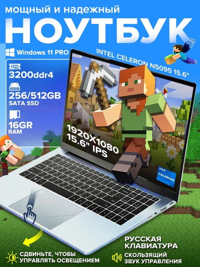
The first main image introduces the laptop as powerful, reliable, and ready for modern use.
We chose a bold blue background because it communicates technology, stability, and trust, which are essential for electronics on Ozon. The large headline immediately establishes the product category as a laptop, eliminating any ambiguity at thumbnail size.
We layered key selling points directly into the image:
- Windows 11 Pro
- Intel processor
- DDR4 memory
- SSD storage
- 15.6-inch IPS Full HD display
We intentionally structured these elements in a vertical hierarchy so users can scan them in seconds. The gaming-style visuals inside the screen reference Minecraft-like environments, which subtly signal smooth graphics performance without promising unrealistic AAA gaming power.
This image works as a hook. It captures attention, confirms the product type, and communicates value instantly.
Image 2: Clear Technical Specifications Overview
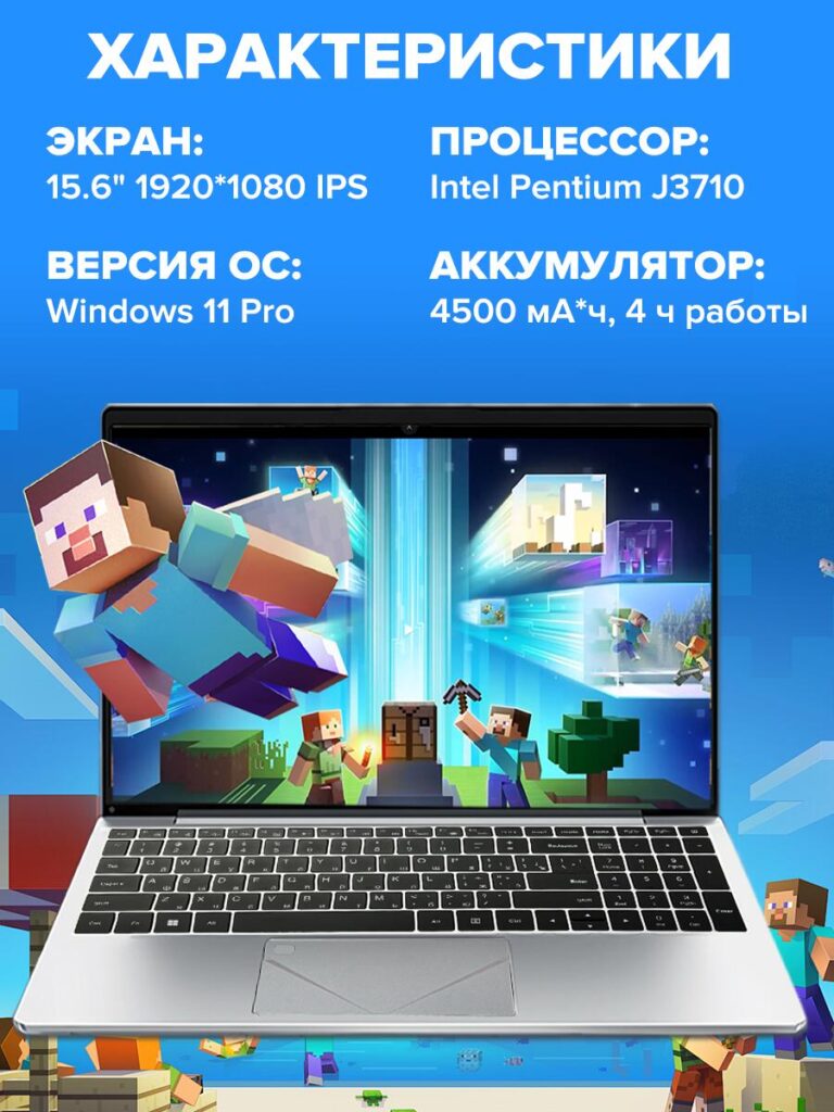
The second image shifts from emotional attraction to structured clarity.
Here, we present the laptop’s core specifications in a clean, readable layout:
- 15.6″ 1920×1080 IPS display
- Windows 11 Pro operating system
- Intel processor
- Battery capacity and usage time
We designed this image to function like a visual spec sheet. Many Ozon buyers scroll directly to images to confirm technical details instead of reading text descriptions. By presenting specs visually, we reduce friction and prevent users from leaving the page to compare elsewhere.
The blue background remains consistent with the first image to reinforce brand coherence across the listing.
Image 3: Processor Performance Visualization
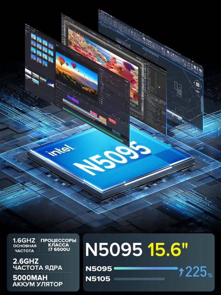
This image focuses entirely on performance perception.
Instead of listing numbers alone, we used a chip-level visualization to represent computing power. Showing the Intel processor as a central element creates a sense of engineering depth and internal strength.
Layered application windows floating above the chip visually explain multitasking capability. This design helps non-technical users understand performance intuitively:
more layers = smoother multitasking.
We also included comparison indicators to suggest improved performance efficiency. The goal is not to overwhelm users with benchmarks, but to build confidence that this laptop can handle everyday workloads smoothly.
Image 4: Touchpad Interaction and User Control
This image highlights human interaction.
By showing a hand using the touchpad with gesture indicators, we shift attention from hardware to daily usability. Many buyers care deeply about how a laptop feels during long work or study sessions.
We added visual cues for brightness and volume control to emphasize convenience. This design tells users that the laptop is intuitive and comfortable to operate, even for beginners.
Including interaction visuals helps reduce uncertainty and increases emotional connection.
Image 5: Webcam and Communication Quality
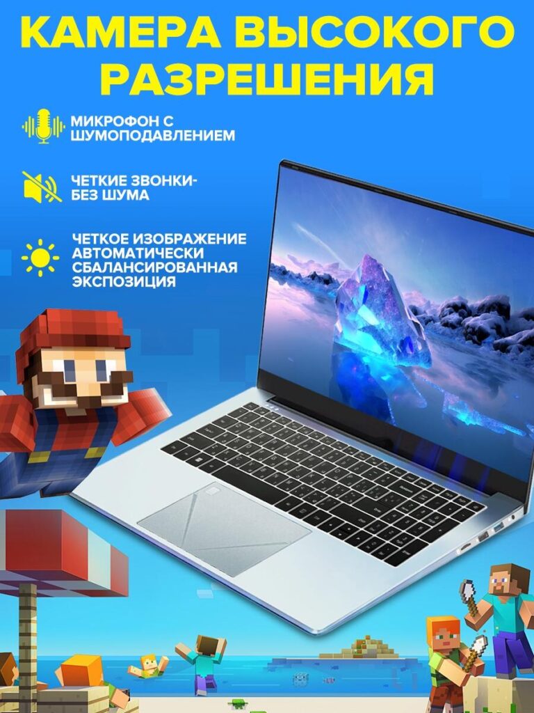
Remote communication is now a standard expectation.
This image focuses on the laptop’s camera and microphone system. We highlighted:
- Noise-reduction microphone
- Clear video quality
- Automatic exposure balance
We designed this image with a calm, clean composition to reflect professionalism. This reassures users who need the laptop for online meetings, remote learning, or video calls.
On Ozon, laptops that clearly communicate communication features often convert better because buyers immediately understand their practical value.
Image 6: Ports and Connectivity Breakdown
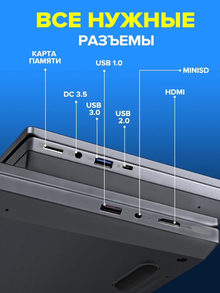
Connectivity clarity is critical.
In this image, we clearly labeled:
- USB 3.0
- USB 2.0
- HDMI
- MiniSD
- Audio jack
- Power input
We used callout lines to eliminate confusion and prevent misinterpretation. Many returns happen because buyers misunderstand port availability. This image reduces that risk.
From a design perspective, this image builds trust and transparency, which directly supports conversion.
Image 7: Use Case Coverage and Lifestyle Scenarios
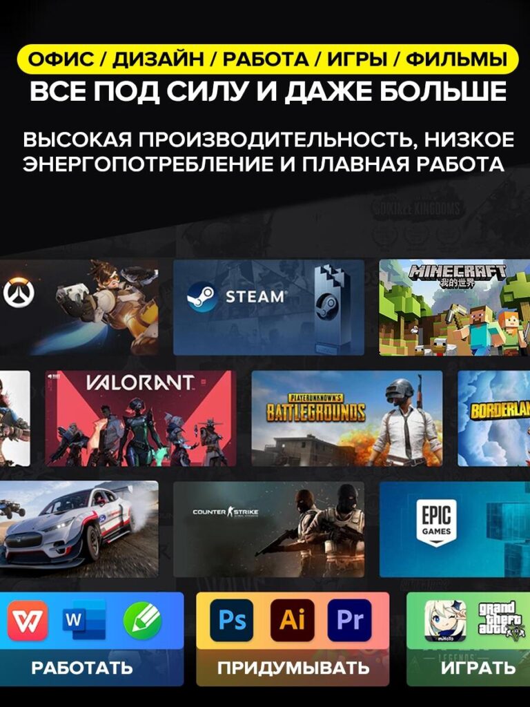
The final image brings everything together.
We visually map the laptop to multiple use cases:
- Office work
- Design and creative tools
- Casual gaming
- Movie watching
By showing familiar software and entertainment icons, we help users imagine themselves using the laptop. This visualization completes the buyer’s journey from information to emotional confirmation.
The dark background contrasts with the earlier blue images, creating a strong visual conclusion to the image sequence.
Why This Main Image Design Works on Ozon
This Ozon main image set succeeds because it follows three core principles:
- Information Density Without Chaos
Each image focuses on one key message, preventing overload. - Emotional and Rational Balance
We combine lifestyle visuals with technical clarity. - Platform-Specific Optimization
Every layout considers Ozon’s mobile-first browsing behavior.
Instead of relying on long text descriptions, this design allows images to sell the product visually.
Conclusion
This laptop Ozon main image design demonstrates how thoughtful visual strategy can transform technical specifications into a clear, engaging shopping experience. By guiding users step by step—from performance reassurance to real-world application—we help buyers make confident decisions without hesitation.
This is the design philosophy we apply across all our cross-border eCommerce projects. At AIRSANG, we specialize in creating high-conversion visual systems for platforms like Ozon, Amazon, and independent stores—turning product information into images that truly sell.


Design and build a WordPress website or corporate site with a full eCommerce system for you.
Price range: $200.00 through $2,500.00Custom requirements or special quotations
Original price was: $2.00.$1.00Current price is: $1.00. Main Image Design for Amazon Home Physiotherapy Device Explained
Introduction: Building a Trustworthy Image for Home Therapy Devices on Amazon When designing the main image for a home therapy device on Amazon, our primary...

Main Image Design for Amazon Lipstick Conversion
Introduction: Designing a Lipstick Main Image That Sells on Amazon When we design a Main image for an Amazon lipstick, our responsibility goes far beyond...

What Makes an Amazon Liquid Foundation Main Image Convert
Introduction Designing a Main image design for Amazon Liquid foundation is never just about making a product look beautiful. On Amazon, the main image and...

Designing an Effective Amazon Main Image for Filter Cartridges
Introduction Designing a Main image for Amazon is never just about making a product look attractive. It is about clarity, trust, and instant understanding—especially for...

Five Pet WordPress Themes Compared
Introduction Choosing the right pet-related WordPress theme is more than a design decision—it directly affects usability, scalability, and long-term business growth. Pet care and pet...

Building a Scalable WordPress Website for a Science-Driven Brand: The AminoUSA Project
Introduction In today’s digital landscape, a website is more than a place to list products. For science-driven brands operating in regulated or research-focused industries, a...

Building a Scalable Shopify Store for a Global Blade Brand: The CoolKatana Project
Introduction In cross-border eCommerce, a Shopify website is more than a storefront.For brands operating in niche, culture-driven categories, the website must do far more than...

Designing a High-Conversion Shopify Store for Pokémon Cards
Introduction In the world of collectible eCommerce, especially within the Pokémon Trading Card Game (TCG) market, a website must do more than simply list products....

High-Converting Shopify Design for a Custom Brick Brand
Introduction In today’s competitive eCommerce landscape, especially in the personalized gift and collectible space, a Shopify website must do far more than display products. It...

Shopify Website Design Case Study for a Premium Floral Brand
Introduction In today’s competitive eCommerce landscape, a Shopify website must do far more than display products. It needs to communicate brand value instantly, guide users...

Shopify Design Case Study: Retro Gaming Store
Introduction In a highly competitive eCommerce environment, visual clarity and emotional connection often determine whether a visitor becomes a customer. This is especially true in...

Shopify Design Case Study: Tactical Rescue Brand
Introduction A strong Shopify website does more than display products—it communicates purpose, builds trust, and guides users toward confident purchasing decisions. This is especially true...

Shopify Website Design Case Study for an Electric Bike Brand
Introduction In today’s competitive electric bike market, a Shopify website must do more than display products—it must tell a story, build trust, and guide users...

Scalable Shopify E-commerce for a Creative Brand
Introduction When creative brands grow, their websites often struggle to keep up. As product lines expand, content increases, and traffic rises, many visually driven brands...

Shopify Website Design Case Study for a Home Decor Brand
Introduction In the highly competitive home decor market, visual identity is no longer just about aesthetics—it directly influences trust, browsing behavior, and purchasing decisions. For...

Building a Scalable WordPress Subscription Website Case Study
Introduction For modern e-commerce brands, a website is no longer just a digital storefront. It is the engine that supports subscriptions, content storytelling, trust building,...

High-Conversion WordPress Design for Adult Brands
Introduction In highly competitive eCommerce markets, strong visuals alone are not enough. A successful WordPress website must guide visitors through a clear, intentional journey—one that...

Scalable WordPress Sex Doll E-commerce Website
Introduction Launching a high-performing cross-border eCommerce website is never just about putting products online.For brands operating in highly competitive and visually driven markets, the website...