


Introduction
When designing a main image set for a kitchen faucet on Ozon, our goal goes far beyond showing what the product looks like. We design visuals to answer questions before they are asked. Buyers on Ozon make decisions quickly, often scrolling on mobile devices, and they rely heavily on images to understand functionality, dimensions, and real-life usability.
This kitchen faucet project demonstrates how thoughtful main image design can transform a complex, feature-rich product into a clear, attractive, and confidence-building listing. Every image in this set plays a specific role: some communicate core functions, others clarify size and structure, and others show lifestyle use cases that help buyers imagine the faucet in their own kitchen.
Below, we break down each image one by one and explain why we designed it this way, how it supports conversion on Ozon, and how it aligns with buyer psychology.
| Deliver Time | Category | Application Platform |
| 7days | kitchen faucet | Ozon |
| Designers Involved | Cost | Effect |
| Lin Zhang | $100 | Sales revenue📈217% |
Image 1: Core Product Overview With Key Features
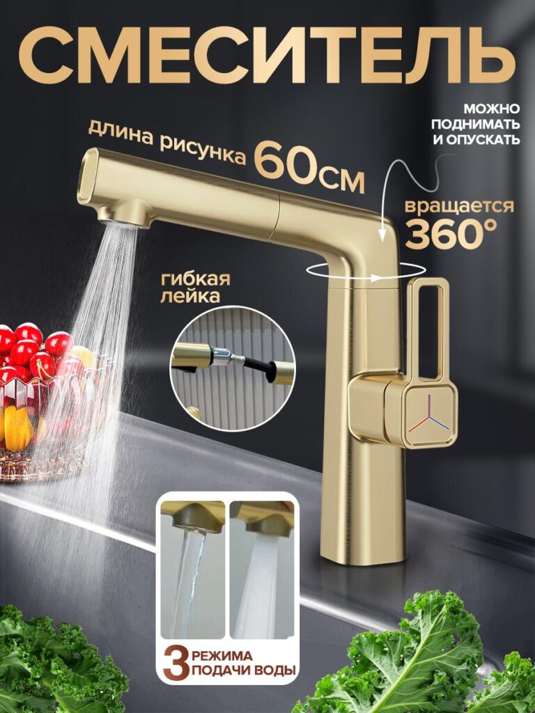
The first image establishes the product’s identity immediately. We centered the kitchen faucet in a clean, high-contrast environment so the silhouette is easy to recognize even on small screens. The faucet’s modern, angular shape becomes the visual anchor.
We highlighted several core features directly on the image:
- 60 cm spout reach
- 360° rotation
- Height adjustment
- Flexible spray head
- Three water output modes
We intentionally used short, bold text and clear directional arrows. On Ozon, buyers often skim images quickly, so we avoided long explanations. Instead, we focused on visual clarity and hierarchy. The faucet remains dominant, while the text supports it without overpowering the product.
The water flow washing fresh produce reinforces the kitchen context and immediately signals practical use. This image answers the buyer’s first question: What kind of faucet is this, and what makes it special?
Image 2: Color Variations and Style Adaptation
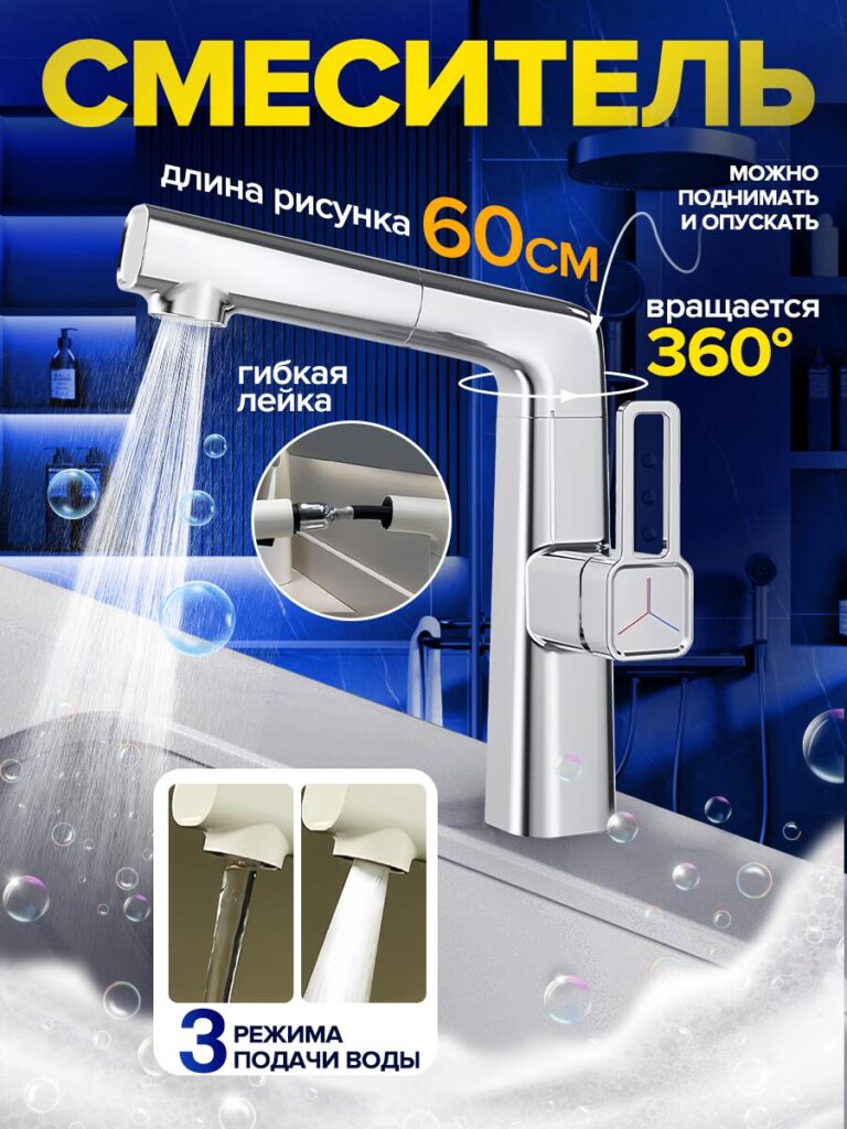
In the second image, we introduced a different color and background tone. This was a deliberate design choice to show how the same faucet adapts to different interior styles.
By changing the lighting and environment, we emphasize that this kitchen faucet is not limited to one aesthetic. Whether the kitchen is modern, cool-toned, or minimal, the faucet integrates naturally.
From a conversion standpoint, this image reduces uncertainty. Buyers often wonder whether a faucet will match their existing kitchen. Showing multiple visual moods helps them imagine the product in their own space without needing additional explanation.
Image 3: Warm Environment and Lifestyle Context
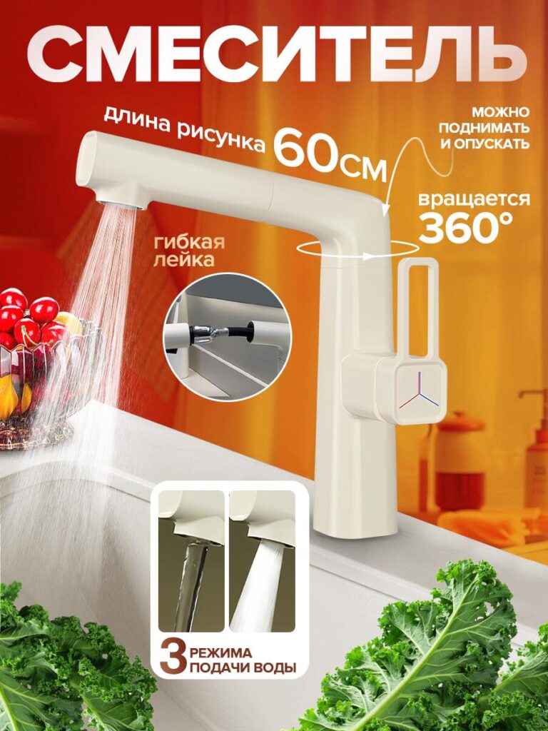
This image shifts the atmosphere to a warmer, more domestic setting. The faucet is shown in use again, washing fruits and vegetables, but this time with warmer lighting and a softer background.
Here, we focused on emotional connection. While the first images communicate specifications, this one communicates comfort and daily routine. The warm tones make the faucet feel inviting and reliable, not just functional.
On Ozon, lifestyle images like this help bridge the gap between product features and real-life usage. Buyers don’t just want a faucet; they want something that fits naturally into their daily cooking and cleaning habits.
Image 4: Three Water Modes Explained Visually
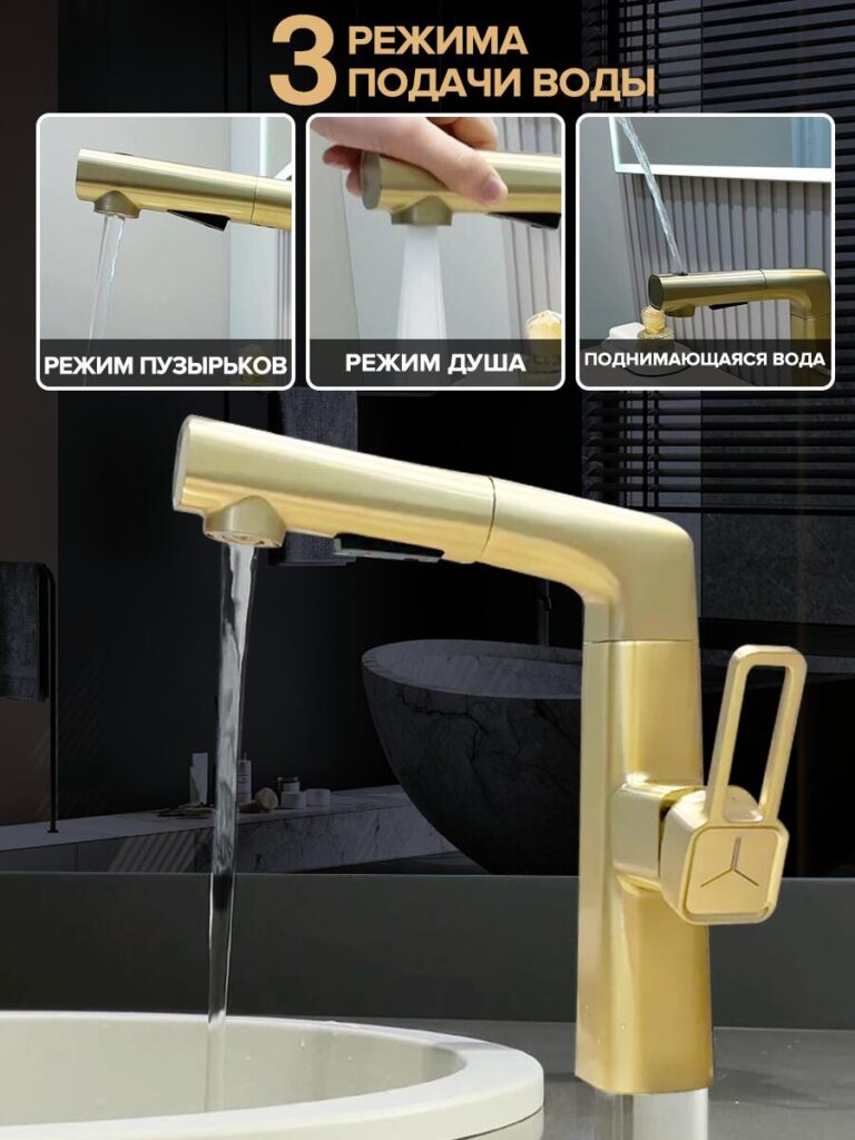
This image is dedicated entirely to functionality. We broke down the three water output modes using close-up shots:
- Bubble mode – gentle and splash-reducing
- Shower mode – wide coverage for rinsing
- Rising water mode – targeted flow for deep sinks
Instead of relying on text descriptions, we let the water flow visuals do most of the work. Buyers can immediately see the difference between each mode.
This approach reduces cognitive load. Rather than imagining how each mode works, buyers see it instantly. On platforms like Ozon, where technical explanations are often skimmed, visual proof is far more persuasive.
Image 5: Multifunctional Usage Scenarios
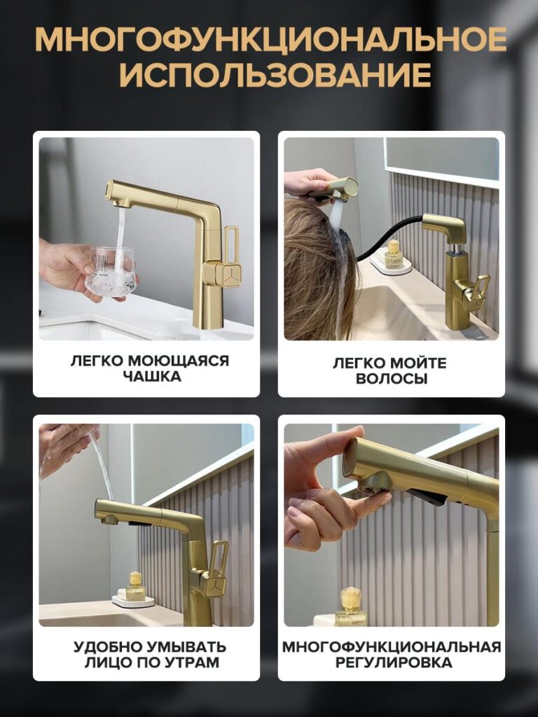
This image set focuses on versatility. We showed the faucet being used in several everyday situations:
- Filling a glass with water
- Washing hair at the sink
- Rinsing the face in the morning
- Adjusting the spray head with one hand
Each scene highlights a different advantage of the faucet’s flexible hose and adjustable height. We designed these visuals to expand the buyer’s perception of value.
Instead of seeing the faucet as a single-purpose kitchen tool, buyers begin to see it as a multifunctional fixture that simplifies daily tasks. This is especially effective for urban apartments and smaller kitchens, where flexibility matters.
Image 6: Dual Temperature Control Design
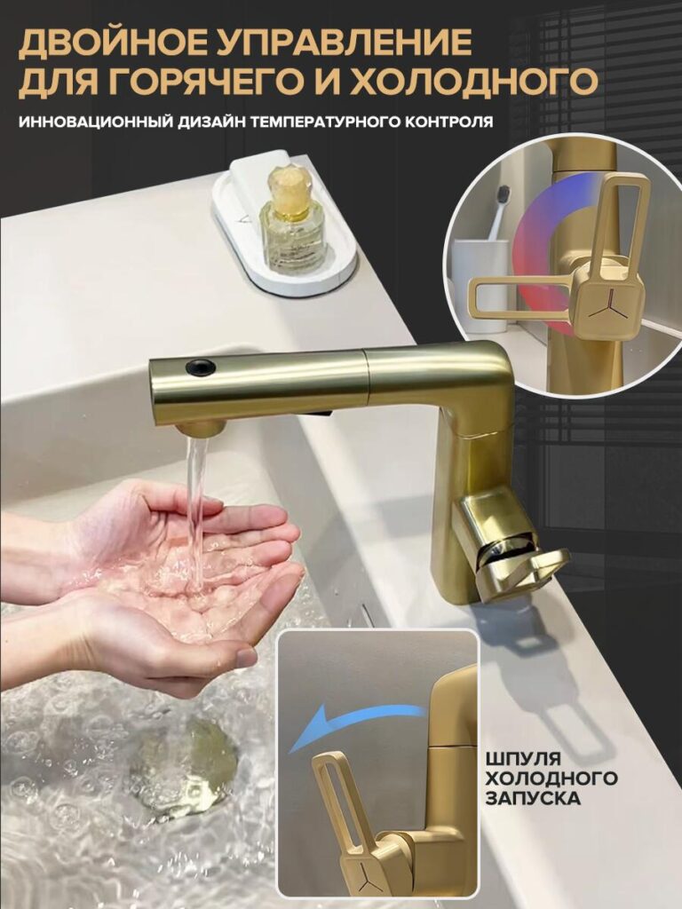
In this image, we focused on hot and cold water control. The faucet handle is shown clearly, with a visual indicator explaining temperature adjustment.
We used a clean close-up angle to avoid distractions. This image reassures buyers that the faucet is intuitive and easy to operate. No complicated mechanisms, no learning curve.
For many buyers, ease of use is just as important as aesthetics. This image answers another critical question: How easy is it to control water temperature?
Image 7: Size and Dimension Breakdown
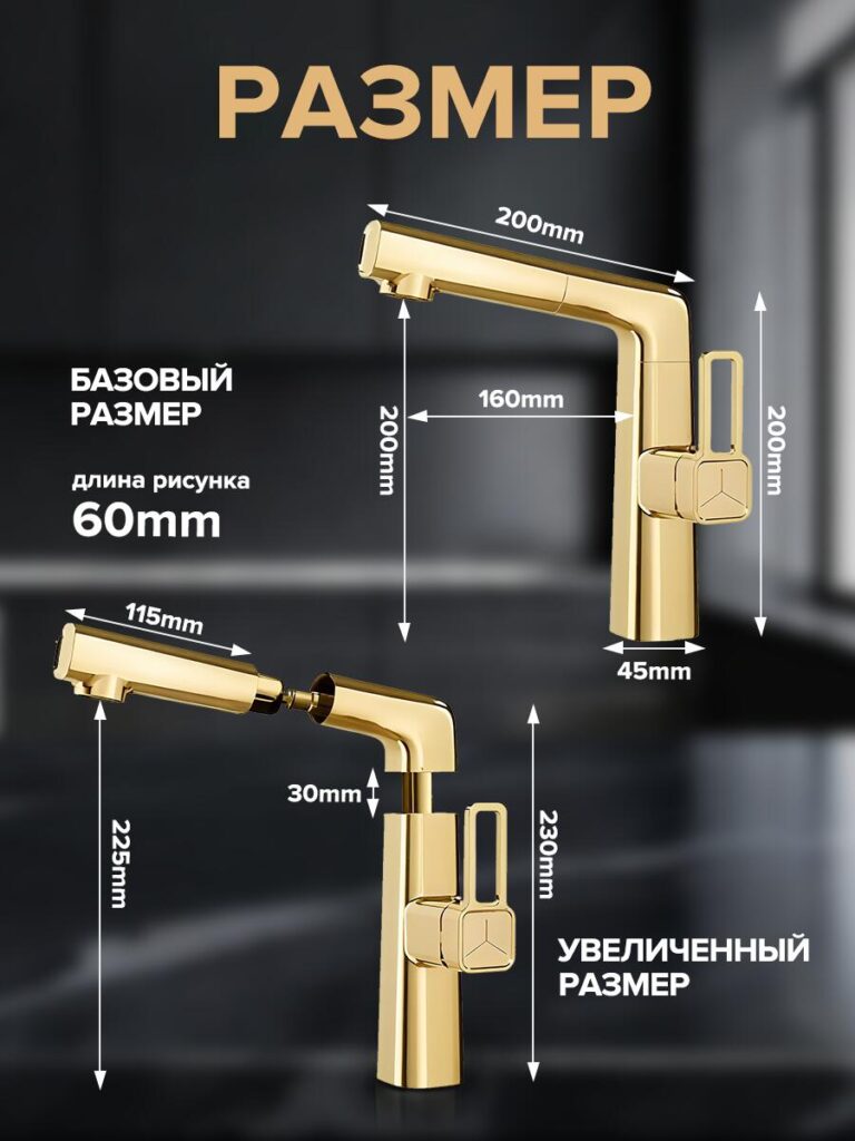
This is one of the most important images in the entire set.
We provided a detailed dimension diagram, showing:
- Total height
- Spout length
- Base width
- Extended and standard size options
We included both standard and enlarged configurations to help buyers choose the right version for their sink.
On Ozon, incorrect size expectations are a common cause of returns. By clearly labeling dimensions directly on the image, we reduce uncertainty and increase buyer confidence. This image is less emotional and more technical, but it plays a crucial role in conversion optimization.
Image 8: Material Strength and Weight
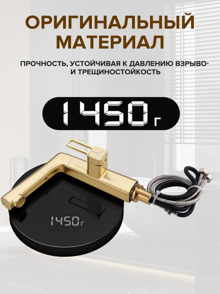
This image focuses on material quality. We highlighted the faucet’s weight (1450 g) and emphasized durability, pressure resistance, and crack resistance.
The visual of the faucet resting on a scale immediately communicates solidity. Heavier faucets are often associated with higher quality, and this image makes that point without relying on marketing claims.
This is particularly important for buyers comparing multiple similar listings. When features appear similar, perceived build quality often becomes the deciding factor.
Why This Main Image Strategy Works on Ozon
This kitchen faucet image set follows a deliberate structure:
- Attention – strong hero image with key features
- Understanding – functional breakdown and water modes
- Emotion – lifestyle and real-use scenarios
- Trust – dimensions, materials, and weight
- Reassurance – complete package presentation
Each image answers a specific buyer question. Together, they form a visual sales funnel that guides the buyer from curiosity to confidence.
Final Thoughts
Main image design is not decoration. It is communication.
For this kitchen faucet, we designed every image to reduce doubt, clarify value, and increase perceived quality within seconds. On a competitive platform like Ozon, this level of visual clarity can significantly improve click-through rate, time on listing, and conversion.
This is exactly the kind of strategic, conversion-driven design approach we apply to cross-border eCommerce projects at AIRSANG, helping brands stand out and sell more through smarter visual storytelling.
If you’re building or optimizing an Ozon listing and want your product images to work as hard as your marketing, this is the level of detail that makes true commercial impact.


Design and build a WordPress website or corporate site with a full eCommerce system for you.
Price range: $200.00 through $2,500.00Custom requirements or special quotations
Original price was: $2.00.$1.00Current price is: $1.00. Main Image Design for Amazon Home Physiotherapy Device Explained
Introduction: Building a Trustworthy Image for Home Therapy Devices on Amazon When designing the main image for a home therapy device on Amazon, our primary...

Main Image Design for Amazon Lipstick Conversion
Introduction: Designing a Lipstick Main Image That Sells on Amazon When we design a Main image for an Amazon lipstick, our responsibility goes far beyond...

What Makes an Amazon Liquid Foundation Main Image Convert
Introduction Designing a Main image design for Amazon Liquid foundation is never just about making a product look beautiful. On Amazon, the main image and...

Designing an Effective Amazon Main Image for Filter Cartridges
Introduction Designing a Main image for Amazon is never just about making a product look attractive. It is about clarity, trust, and instant understanding—especially for...

Five Pet WordPress Themes Compared
Introduction Choosing the right pet-related WordPress theme is more than a design decision—it directly affects usability, scalability, and long-term business growth. Pet care and pet...

Building a Scalable WordPress Website for a Science-Driven Brand: The AminoUSA Project
Introduction In today’s digital landscape, a website is more than a place to list products. For science-driven brands operating in regulated or research-focused industries, a...

Building a Scalable Shopify Store for a Global Blade Brand: The CoolKatana Project
Introduction In cross-border eCommerce, a Shopify website is more than a storefront.For brands operating in niche, culture-driven categories, the website must do far more than...

Designing a High-Conversion Shopify Store for Pokémon Cards
Introduction In the world of collectible eCommerce, especially within the Pokémon Trading Card Game (TCG) market, a website must do more than simply list products....

High-Converting Shopify Design for a Custom Brick Brand
Introduction In today’s competitive eCommerce landscape, especially in the personalized gift and collectible space, a Shopify website must do far more than display products. It...

Shopify Website Design Case Study for a Premium Floral Brand
Introduction In today’s competitive eCommerce landscape, a Shopify website must do far more than display products. It needs to communicate brand value instantly, guide users...

Shopify Design Case Study: Retro Gaming Store
Introduction In a highly competitive eCommerce environment, visual clarity and emotional connection often determine whether a visitor becomes a customer. This is especially true in...

Shopify Design Case Study: Tactical Rescue Brand
Introduction A strong Shopify website does more than display products—it communicates purpose, builds trust, and guides users toward confident purchasing decisions. This is especially true...

Shopify Website Design Case Study for an Electric Bike Brand
Introduction In today’s competitive electric bike market, a Shopify website must do more than display products—it must tell a story, build trust, and guide users...

Scalable Shopify E-commerce for a Creative Brand
Introduction When creative brands grow, their websites often struggle to keep up. As product lines expand, content increases, and traffic rises, many visually driven brands...

Shopify Website Design Case Study for a Home Decor Brand
Introduction In the highly competitive home decor market, visual identity is no longer just about aesthetics—it directly influences trust, browsing behavior, and purchasing decisions. For...

Building a Scalable WordPress Subscription Website Case Study
Introduction For modern e-commerce brands, a website is no longer just a digital storefront. It is the engine that supports subscriptions, content storytelling, trust building,...

High-Conversion WordPress Design for Adult Brands
Introduction In highly competitive eCommerce markets, strong visuals alone are not enough. A successful WordPress website must guide visitors through a clear, intentional journey—one that...

Scalable WordPress Sex Doll E-commerce Website
Introduction Launching a high-performing cross-border eCommerce website is never just about putting products online.For brands operating in highly competitive and visually driven markets, the website...