


Introduction
In highly competitive marketplaces like Ozon, a product’s main image is not just a visual—it is the primary sales tool. For Bluetooth speakers in particular, customers cannot physically experience sound quality, volume, or atmosphere before purchase. This means the main image must visually translate audio performance, usability, and emotional experience within seconds.
For this Bluetooth speaker project, our goal was to design a series of Ozon main images that clearly communicate powerful sound, immersive lighting, wide compatibility, and everyday practicality—while maintaining a premium, tech-forward aesthetic. Each image was carefully constructed to guide buyers through the product’s strengths step by step, reducing hesitation and increasing confidence.
Below, we break down each image and explain how every visual decision supports conversion, clarity, and platform compliance on Ozon.
| Deliver Time | Category | Application Platform |
| 8days | Bluetooth speaker | Ozon |
| Designers Involved | Cost | Effect |
| Lin Zhang | $100 | Sales revenue📈309% |
Image 1: Powerful Sound Visualization and Acoustic Structure
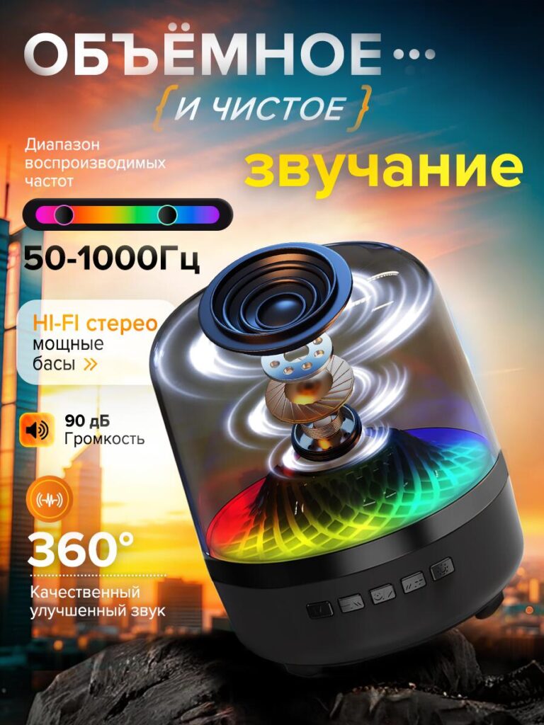
The first image focuses on the core value of any Bluetooth speaker: sound performance.
Instead of simply showing the exterior, we chose a semi-transparent, exploded visual structure. This design reveals the internal speaker driver, acoustic chamber, and layered components. By doing so, we visually prove sound quality rather than merely claiming it.
Key visual strategies in this image include:
- Exploded driver illustration to suggest engineering depth and audio precision
- 360° sound wave effects surrounding the speaker to communicate immersive audio
- Highlighted specifications such as frequency range (50–1000Hz), Hi-Fi stereo output, strong bass, and 90 dB volume
- Clean hierarchy of text and icons, ensuring readability even on smaller screens
This approach helps customers immediately understand that the speaker is not decorative—it is performance-driven. On Ozon, where users scroll quickly, this kind of visual proof creates instant credibility.
Image 2: Wide Compatibility and Simple Control
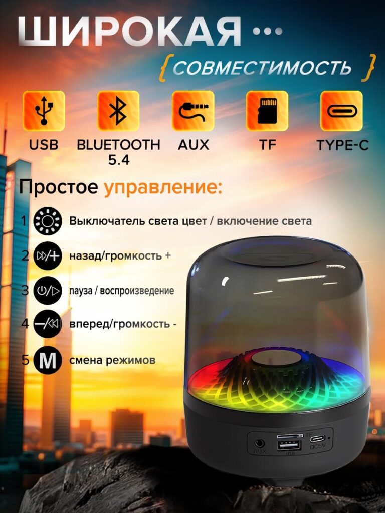
The second image shifts focus from sound quality to usability and compatibility, two major decision factors for everyday electronics buyers.
Here, we emphasize that the speaker works seamlessly across multiple input methods and devices. Icons are used to clearly represent:
- USB playback
- Bluetooth 5.4 connectivity
- AUX input
- TF (microSD) card support
- Type-C charging
Below the compatibility icons, we introduce a step-by-step control explanation. Each physical button on the speaker is matched with a simple function description—lighting control, volume adjustment, play/pause, track navigation, and mode switching.
This image is intentionally structured to reduce buyer anxiety. Many customers hesitate when they fear complicated controls or limited compatibility. By visually explaining everything in one frame, we remove uncertainty and make the product feel approachable, even for non-technical users.
Image 3: Stable Bluetooth Connection and Battery Performance
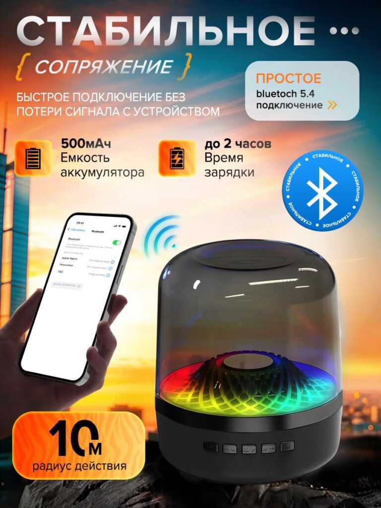
In the third image, the narrative moves toward reliability and daily usage performance.
Bluetooth stability is a common concern for wireless audio products. To address this, we visually connect the speaker with a smartphone interface, reinforcing fast pairing and stable signal transmission. The Bluetooth 5.4 icon is prominently displayed to signal modern, low-latency connectivity.
This image also highlights:
- 500mAh battery capacity, communicated with a bold battery icon
- Up to 2 hours charging time, reinforcing convenience
- 10-meter wireless range, visually reinforced with signal waves
Rather than overwhelming users with technical jargon, we rely on universally understood symbols and clean spacing. This makes the information accessible at a glance—perfect for Ozon’s mobile-first browsing behavior.
Image 4: Compatibility with Multiple Devices and Media Sources
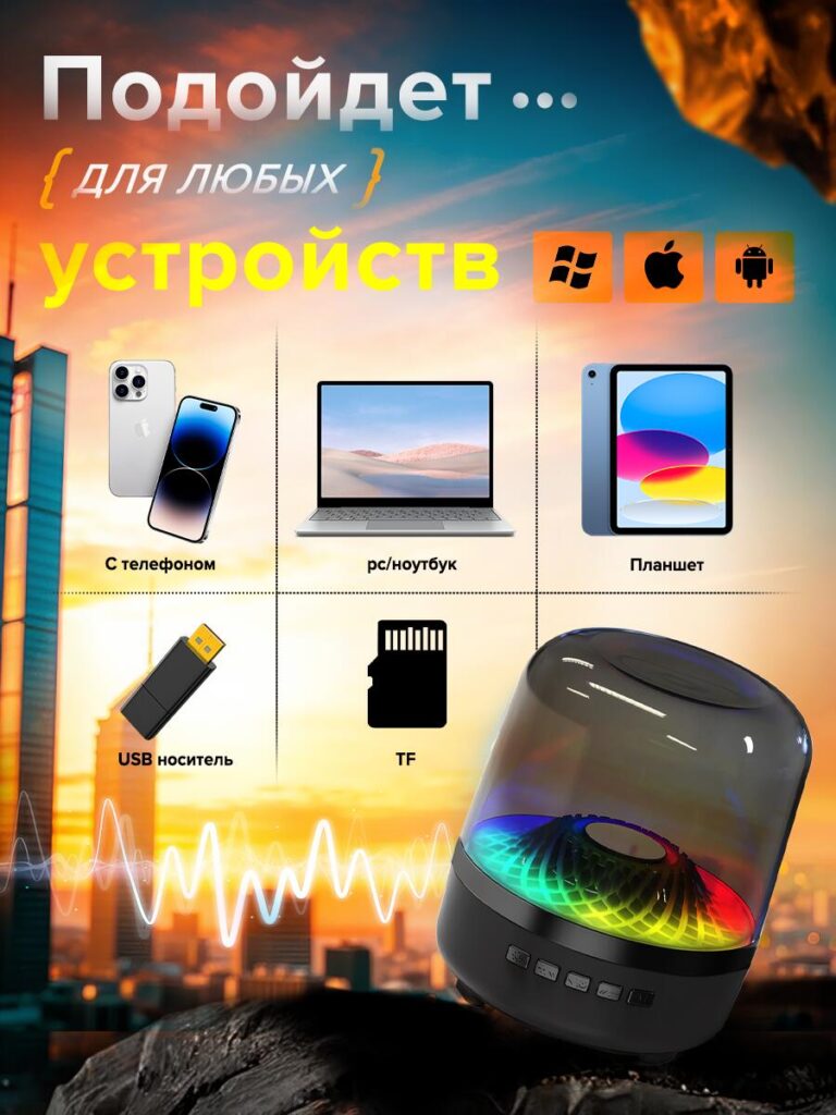
The fourth image expands on compatibility by showing real-world device scenarios.
Here, we visually demonstrate that the Bluetooth speaker works across:
- Smartphones
- PCs and laptops
- Tablets
- USB flash drives
- TF memory cards
Operating system icons (Windows, Apple, Android) are used to reinforce cross-platform support. This is especially important for marketplaces like Ozon, where users may own a wide range of devices and want reassurance before purchasing.
The composition is clean and symmetrical, allowing each device type to be instantly recognizable. This image reassures customers that no matter how they listen to music—wireless streaming or offline playback—the speaker fits seamlessly into their lifestyle.
Image 5: Full Package Contents and Gift-Ready Presentation
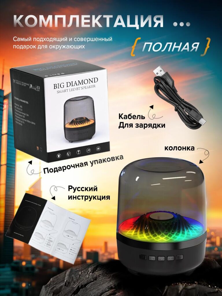
Trust increases when customers know exactly what they will receive. The fifth image is dedicated to the complete package contents.
We clearly display:
- The Bluetooth speaker
- Charging cable
- Gift-ready retail packaging
- Russian-language user manual
The inclusion of the original box is particularly important for gift buyers. By presenting the product as a ready-to-gift solution, this image expands the speaker’s appeal beyond personal use to birthdays, holidays, and casual gifting.
Clean callouts and directional markers ensure that every included item is easy to identify, preventing misunderstandings and reducing post-purchase dissatisfaction.
Image 6: Lifestyle Scenarios and Emotional Value
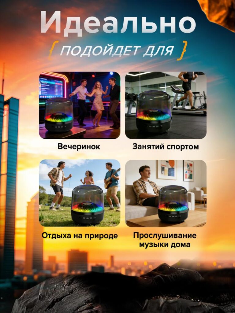
The final image shifts from specifications to emotion and lifestyle.
Instead of technical details, we show the speaker in real-life usage scenarios:
- Parties and social gatherings
- Fitness and workout sessions
- Outdoor relaxation and nature activities
- Home music listening
By placing the product into these environments, we help customers imagine themselves using it. The glowing LED lighting becomes a visual anchor, reinforcing the speaker’s atmosphere-enhancing role.
This image answers the unspoken question: “Is this speaker right for my life?”
The answer, visually, is yes.
Design Strategy Summary
Across all images, the design follows a clear conversion-driven structure:
- Performance first – Prove sound quality visually
- Usability second – Remove complexity and confusion
- Reliability third – Reinforce stability and battery life
- Compatibility fourth – Show flexibility across devices
- Trust fifth – Clarify package contents
- Emotion last – Inspire lifestyle connection
This sequence mirrors how buyers naturally evaluate products on Ozon, moving from logic to emotion before making a decision.
Conclusion
This Bluetooth speaker main image design for Ozon demonstrates how thoughtful visual storytelling can replace physical experience in online shopping. By translating sound, usability, and atmosphere into clear, structured visuals, we help customers understand the product faster and trust it more.
Every image plays a specific role in the buyer journey, working together as a cohesive system rather than isolated graphics. This approach not only improves clarity but also strengthens brand perception and conversion performance.
At AIRSANG, we specialize in designing marketplace visuals that don’t just look good—but sell with purpose, structure, and strategy.


Design and build a WordPress website or corporate site with a full eCommerce system for you.
Price range: $200.00 through $2,500.00Custom requirements or special quotations
Original price was: $2.00.$1.00Current price is: $1.00. Main Image Design for Amazon Home Physiotherapy Device Explained
Introduction: Building a Trustworthy Image for Home Therapy Devices on Amazon When designing the main image for a home therapy device on Amazon, our primary...

Main Image Design for Amazon Lipstick Conversion
Introduction: Designing a Lipstick Main Image That Sells on Amazon When we design a Main image for an Amazon lipstick, our responsibility goes far beyond...

What Makes an Amazon Liquid Foundation Main Image Convert
Introduction Designing a Main image design for Amazon Liquid foundation is never just about making a product look beautiful. On Amazon, the main image and...

Designing an Effective Amazon Main Image for Filter Cartridges
Introduction Designing a Main image for Amazon is never just about making a product look attractive. It is about clarity, trust, and instant understanding—especially for...

Five Pet WordPress Themes Compared
Introduction Choosing the right pet-related WordPress theme is more than a design decision—it directly affects usability, scalability, and long-term business growth. Pet care and pet...

Building a Scalable WordPress Website for a Science-Driven Brand: The AminoUSA Project
Introduction In today’s digital landscape, a website is more than a place to list products. For science-driven brands operating in regulated or research-focused industries, a...

Building a Scalable Shopify Store for a Global Blade Brand: The CoolKatana Project
Introduction In cross-border eCommerce, a Shopify website is more than a storefront.For brands operating in niche, culture-driven categories, the website must do far more than...

Designing a High-Conversion Shopify Store for Pokémon Cards
Introduction In the world of collectible eCommerce, especially within the Pokémon Trading Card Game (TCG) market, a website must do more than simply list products....

High-Converting Shopify Design for a Custom Brick Brand
Introduction In today’s competitive eCommerce landscape, especially in the personalized gift and collectible space, a Shopify website must do far more than display products. It...

Shopify Website Design Case Study for a Premium Floral Brand
Introduction In today’s competitive eCommerce landscape, a Shopify website must do far more than display products. It needs to communicate brand value instantly, guide users...

Shopify Design Case Study: Retro Gaming Store
Introduction In a highly competitive eCommerce environment, visual clarity and emotional connection often determine whether a visitor becomes a customer. This is especially true in...

Shopify Design Case Study: Tactical Rescue Brand
Introduction A strong Shopify website does more than display products—it communicates purpose, builds trust, and guides users toward confident purchasing decisions. This is especially true...

Shopify Website Design Case Study for an Electric Bike Brand
Introduction In today’s competitive electric bike market, a Shopify website must do more than display products—it must tell a story, build trust, and guide users...

Scalable Shopify E-commerce for a Creative Brand
Introduction When creative brands grow, their websites often struggle to keep up. As product lines expand, content increases, and traffic rises, many visually driven brands...

Shopify Website Design Case Study for a Home Decor Brand
Introduction In the highly competitive home decor market, visual identity is no longer just about aesthetics—it directly influences trust, browsing behavior, and purchasing decisions. For...

Building a Scalable WordPress Subscription Website Case Study
Introduction For modern e-commerce brands, a website is no longer just a digital storefront. It is the engine that supports subscriptions, content storytelling, trust building,...

High-Conversion WordPress Design for Adult Brands
Introduction In highly competitive eCommerce markets, strong visuals alone are not enough. A successful WordPress website must guide visitors through a clear, intentional journey—one that...

Scalable WordPress Sex Doll E-commerce Website
Introduction Launching a high-performing cross-border eCommerce website is never just about putting products online.For brands operating in highly competitive and visually driven markets, the website...