


Introduction
Designing a high-performing main image for Ozon is never about making something look “pretty” alone. It is about clarity, hierarchy, trust, and speed of understanding. When users scroll through Ozon listings, they decide in seconds which product deserves attention. For this Bluetooth headset project, our goal as designers was to translate technical advantages into instantly readable visual language — without overwhelming the buyer.
The uploaded image set shows a complete visual system built specifically for Ozon: from exploded-view technology breakdowns to lifestyle scenes, comparison charts, and packaging shots. Every frame serves a precise function in the conversion journey. Below, we explain each image from a designer’s perspective and why these decisions matter for Ozon performance.
| Deliver Time | Category | Application Platform |
| 7days | Bluetooth headsets | Ozon |
| Designers Involved | Cost | Effect |
| Nancy | $160 | Sales📈243% |
Image 1: Sound Focus & Acoustic Structure Visualization
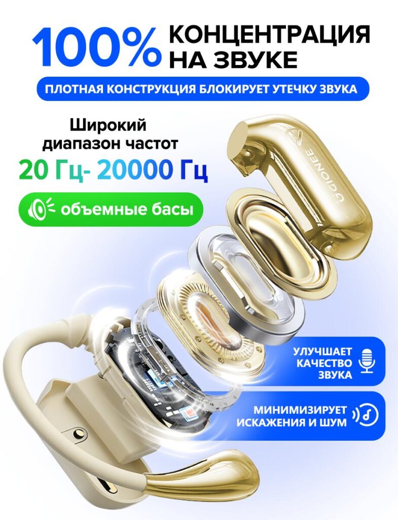
The first image leads with a bold promise: total concentration on sound. We deliberately placed the exploded internal structure of the Bluetooth headset front and center. This design choice immediately signals “technology inside,” which is crucial for electronics buyers on Ozon.
By visually separating the acoustic chamber, diaphragm, and electronic components, we allow users to see sound quality rather than just read about it. The frequency range (20 Hz–20,000 Hz) is highlighted because it is a universally recognized benchmark for audio performance. Large typography ensures readability on mobile devices, which dominate Ozon traffic.
The green and blue accents are not random — they are used to subconsciously associate bass depth (green) and clarity (blue). This color logic helps buyers intuitively understand the product’s sound profile without technical knowledge.
Image 2: Product Identity & Core Specifications
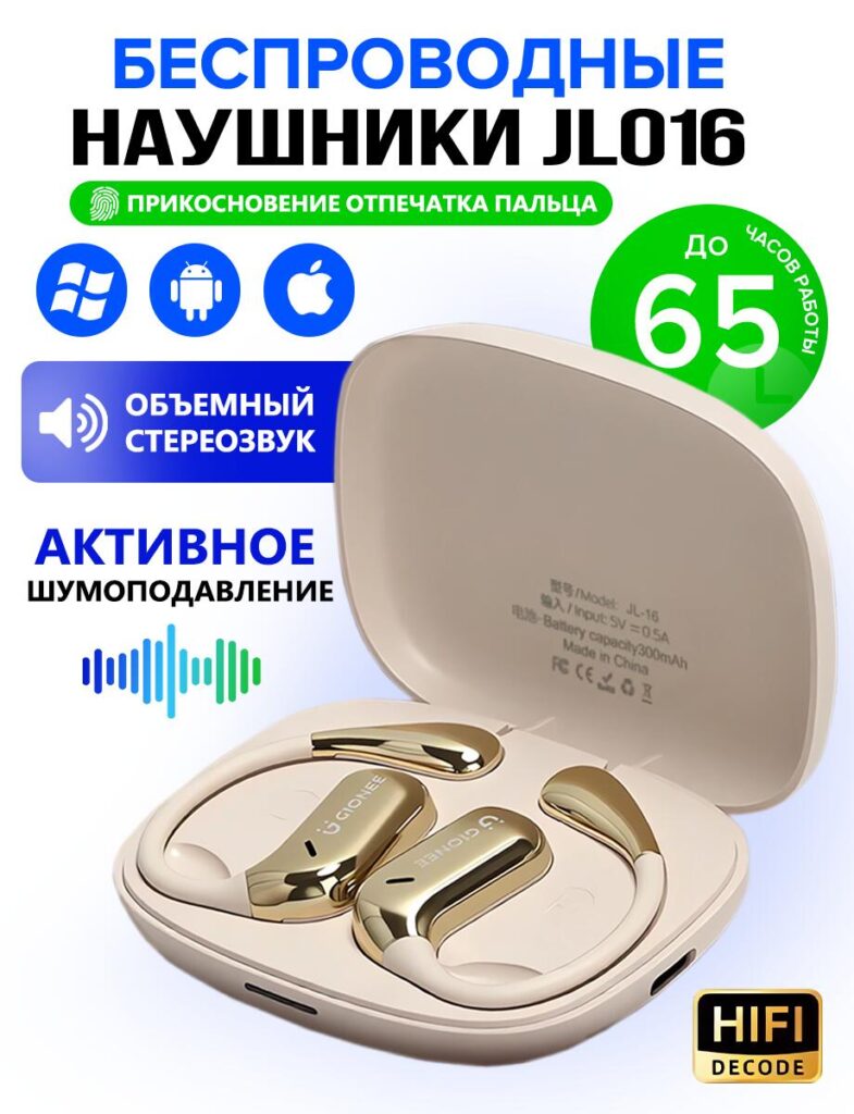
This image establishes the product as a wireless Bluetooth headset designed for daily use across platforms. Compatibility icons (Windows, Android, iOS) are positioned prominently to remove hesitation instantly. Ozon buyers value reassurance — this visual answers compatibility questions before they are asked.
We included touch control and extended battery life (up to 65 hours) as visual badges rather than paragraphs of text. On marketplaces like Ozon, icons outperform long descriptions because they reduce cognitive load. The charging case is shown open to communicate realism and transparency — buyers see exactly what they will receive.
Typography hierarchy here is essential: product name first, function second, benefits third. This mirrors how users scan marketplace images.
Image 3: Hi-Fi Sound Technology Breakdown
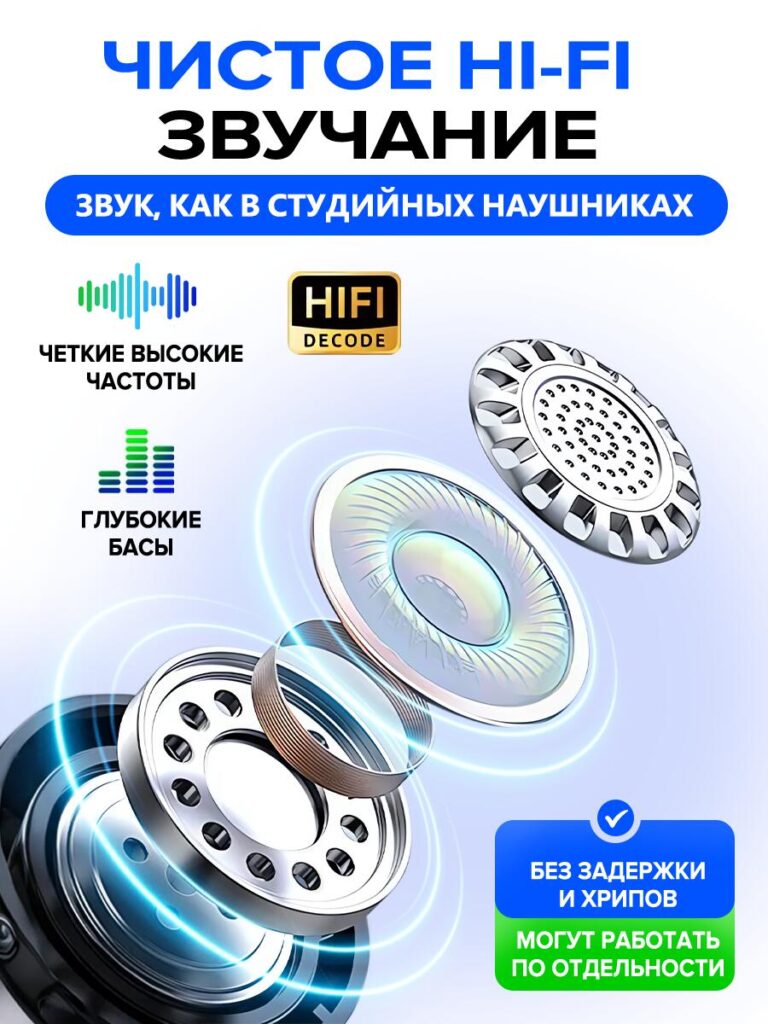
In this image, we leaned into technical credibility. The exploded speaker design is paired with clean, glowing rings to suggest energy flow and sound precision. This is especially important for convincing buyers that “Hi-Fi” is not just a marketing word.
High frequencies, deep bass, and low distortion are separated into individual visual elements. This modular structure mirrors the internal engineering and reinforces the idea of balance. The “no delay, no noise” message supports users who plan to use the headset for calls, videos, or gaming — a key Ozon buying motivation.
This image is intentionally more technical than emotional. It speaks to rational decision-making and product comparison.
Image 4: Connectivity & Daily Functionality
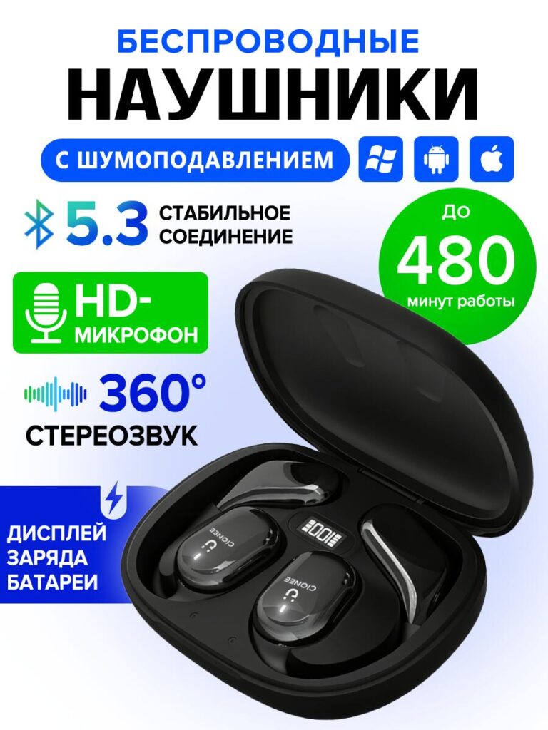
Bluetooth 5.3 is highlighted in this visual because connection stability is one of the most common buyer concerns. We used large numeric typography (“5.3”) to create instant recognition and authority.
Battery life is translated into minutes (480 minutes) rather than abstract hours. This was a conscious choice: concrete numbers feel more honest and measurable. The HD microphone icon reinforces call quality, which expands the product’s use cases beyond music.
The charging display on the case is clearly shown to differentiate this product from competitors that lack real-time battery indicators. On Ozon, visible differentiation directly impacts click-through rates.
Image 5: Packaging & What’s Included
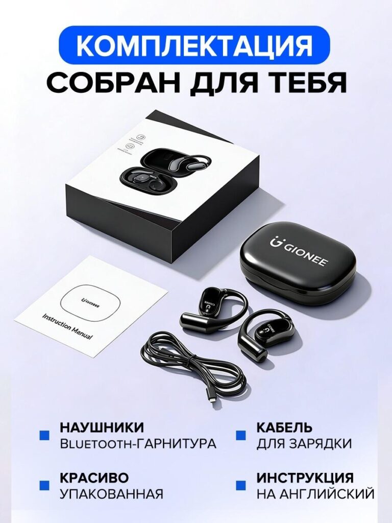
Trust is built when buyers know exactly what they are getting. This image answers that question clearly. We arranged the packaging, headset, charging cable, and instruction manual in a clean, minimalist layout.
The decision to show premium packaging is intentional. Ozon buyers often associate packaging quality with product reliability. The message here is simple: this is not a random factory product — it is thoughtfully prepared.
Clear labels eliminate ambiguity and reduce return risk, which is a critical factor for marketplace sellers.
Image 6: Comparison With Competitors
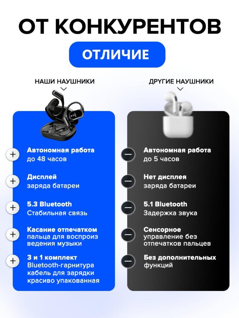
Comparison images are powerful on Ozon, but they must be handled carefully. We designed this layout to highlight advantages without appearing aggressive or misleading.
On the left, our headset’s strengths are clearly structured: longer battery life, Bluetooth 5.3, charging display, fingerprint touch control, and complete packaging. On the right, competitors are shown as lacking these features.
The visual contrast (blue vs. dark gray) helps users process information faster. This image is especially effective for buyers who are already comparing multiple listings and need a final nudge to decide.
Image 7: Lifestyle Fit & Stability in Use (Female Model)
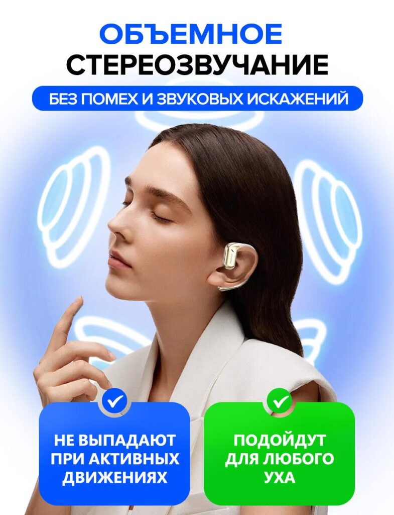
This lifestyle image introduces emotional reassurance. The headset is shown worn naturally, with visual sound waves reinforcing immersion. We intentionally avoided clutter to keep the focus on comfort and stability.
Text highlights that the headset does not fall out during active movement and fits different ear shapes. This addresses one of the most common objections for Bluetooth headsets.
Lifestyle imagery humanizes the product and helps buyers imagine ownership — a key conversion trigger.
Image 8: Ergonomic Design & Universal Fit (Male Model)
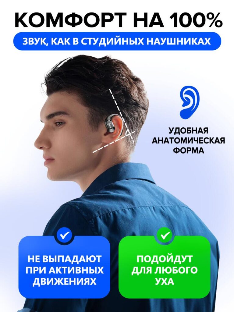
The final image reinforces ergonomics and long-term comfort. The anatomical outline visually explains how the headset aligns with the ear, making the benefit immediately understandable.
Repeating the “secure fit” and “universal ear compatibility” messages across different models strengthens trust through consistency. It shows that the product is suitable for a wide audience, not just a specific demographic.
This image closes the visual story by combining function, comfort, and confidence.
Design Strategy Summary
From a designer’s perspective, this Ozon main image set follows a deliberate structure:
- Attract attention with sound and technology.
- Build trust through specifications and transparency.
- Differentiate clearly from competitors.
- Remove objections with lifestyle and ergonomic proof.
- Reassure value with packaging and completeness.
Each image serves a unique role while maintaining consistent color language, typography, and visual rhythm. This consistency is critical for professional marketplace branding and long-term conversion performance.
Final Thoughts
Effective main image design for Ozon Bluetooth headsets is not about adding more text or effects — it is about strategic storytelling through visuals. By aligning technical information, emotional reassurance, and marketplace psychology, this design system turns features into confidence and confidence into sales.
If you are looking to create conversion-focused marketplace visuals that balance clarity, aesthetics, and performance, this is exactly the type of approach we develop at AIRSANG.


Design and build a WordPress website or corporate site with a full eCommerce system for you.
Price range: $200.00 through $2,500.00Custom requirements or special quotations
Original price was: $2.00.$1.00Current price is: $1.00. Main Image Design for Amazon Home Physiotherapy Device Explained
Introduction: Building a Trustworthy Image for Home Therapy Devices on Amazon When designing the main image for a home therapy device on Amazon, our primary...

Main Image Design for Amazon Lipstick Conversion
Introduction: Designing a Lipstick Main Image That Sells on Amazon When we design a Main image for an Amazon lipstick, our responsibility goes far beyond...

What Makes an Amazon Liquid Foundation Main Image Convert
Introduction Designing a Main image design for Amazon Liquid foundation is never just about making a product look beautiful. On Amazon, the main image and...

Designing an Effective Amazon Main Image for Filter Cartridges
Introduction Designing a Main image for Amazon is never just about making a product look attractive. It is about clarity, trust, and instant understanding—especially for...

Five Pet WordPress Themes Compared
Introduction Choosing the right pet-related WordPress theme is more than a design decision—it directly affects usability, scalability, and long-term business growth. Pet care and pet...

Building a Scalable WordPress Website for a Science-Driven Brand: The AminoUSA Project
Introduction In today’s digital landscape, a website is more than a place to list products. For science-driven brands operating in regulated or research-focused industries, a...

Building a Scalable Shopify Store for a Global Blade Brand: The CoolKatana Project
Introduction In cross-border eCommerce, a Shopify website is more than a storefront.For brands operating in niche, culture-driven categories, the website must do far more than...

Designing a High-Conversion Shopify Store for Pokémon Cards
Introduction In the world of collectible eCommerce, especially within the Pokémon Trading Card Game (TCG) market, a website must do more than simply list products....

High-Converting Shopify Design for a Custom Brick Brand
Introduction In today’s competitive eCommerce landscape, especially in the personalized gift and collectible space, a Shopify website must do far more than display products. It...

Shopify Website Design Case Study for a Premium Floral Brand
Introduction In today’s competitive eCommerce landscape, a Shopify website must do far more than display products. It needs to communicate brand value instantly, guide users...

Shopify Design Case Study: Retro Gaming Store
Introduction In a highly competitive eCommerce environment, visual clarity and emotional connection often determine whether a visitor becomes a customer. This is especially true in...

Shopify Design Case Study: Tactical Rescue Brand
Introduction A strong Shopify website does more than display products—it communicates purpose, builds trust, and guides users toward confident purchasing decisions. This is especially true...

Shopify Website Design Case Study for an Electric Bike Brand
Introduction In today’s competitive electric bike market, a Shopify website must do more than display products—it must tell a story, build trust, and guide users...

Scalable Shopify E-commerce for a Creative Brand
Introduction When creative brands grow, their websites often struggle to keep up. As product lines expand, content increases, and traffic rises, many visually driven brands...

Shopify Website Design Case Study for a Home Decor Brand
Introduction In the highly competitive home decor market, visual identity is no longer just about aesthetics—it directly influences trust, browsing behavior, and purchasing decisions. For...

Building a Scalable WordPress Subscription Website Case Study
Introduction For modern e-commerce brands, a website is no longer just a digital storefront. It is the engine that supports subscriptions, content storytelling, trust building,...

High-Conversion WordPress Design for Adult Brands
Introduction In highly competitive eCommerce markets, strong visuals alone are not enough. A successful WordPress website must guide visitors through a clear, intentional journey—one that...

Scalable WordPress Sex Doll E-commerce Website
Introduction Launching a high-performing cross-border eCommerce website is never just about putting products online.For brands operating in highly competitive and visually driven markets, the website...