


Introduction
In highly competitive DTC markets, product quality alone is no longer enough to win. Brands selling premium goods must communicate value instantly, visually, and emotionally—especially on their homepage. For Shopify stores operating in design-driven categories such as tech accessories, the website must do more than display products. It must build desire, reinforce credibility, and guide users smoothly toward conversion.
This case study explores how we designed the Shopify website for CarbonCase, a premium carbon fiber phone case brand. The project focused on elevating brand perception, clarifying product value, and creating a clean, high-performance shopping experience that aligns with the expectations of a global, design-conscious audience.
Rather than relying on technical complexity, our approach centered on strategic layout design, visual storytelling, and conversion-oriented UX decisions—proving that strong design alone can dramatically enhance a brand’s online performance.
| Deliver Time | Category | Application Platform |
| 17days | carboncase | Shopify |
| Designers Involved | Cost | Effect |
| Lin Zhang、Chris CAO | $1900 | Repurchase rate📈263% |
Project Background: Understanding the Brand and Market
CarbonCase operates in a niche where customers care deeply about materials, craftsmanship, and aesthetics. Carbon fiber products carry an inherent association with performance, precision, and modern engineering—values commonly found in automotive, aerospace, and high-end technology industries.
Before any design work began, we aligned on several core brand realities:
- The product is premium, not mass-market
- The visual language must communicate strength, precision, and exclusivity
- Customers expect a clean, fast, distraction-free experience
- The website must support impulse purchases during promotions without cheapening the brand
This understanding shaped every design decision that followed.
Design Goals and Objectives
Primary Design Objectives
Our Shopify design strategy focused on five clear goals:
- Create immediate visual impact above the fold
- Reinforce premium value through material-driven visuals
- Simplify navigation across product categories
- Design promotional messaging without harming brand perception
- Build trust and reduce hesitation before checkout
These goals guided both the homepage structure and the supporting sections throughout the site.
Our Design Process
Discovery and Visual Direction
We began by analyzing CarbonCase’s existing visual assets, product photography, and target audience behavior. Carbon fiber textures are visually rich but can easily overwhelm a page if misused. Our challenge was to let the material shine while keeping the interface minimal and readable.
We defined a visual direction based on:
- Dark, neutral backgrounds to emphasize texture
- High-contrast typography for clarity and impact
- Controlled use of accent colors to guide attention
- Clean spacing to reinforce a premium feel
This foundation ensured visual consistency across all pages.
Homepage Design Strategy
Hero Section: Leading With Value, Not Noise
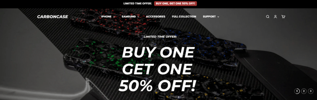
The homepage hero section plays a critical role in capturing attention within seconds. For CarbonCase, we designed the hero to deliver three messages instantly:
- What the product is
- Why it is premium
- Why the current offer matters
Large typography, bold promotional messaging, and immersive product imagery work together to create urgency without visual clutter. The background imagery highlights carbon fiber texture while maintaining enough contrast to keep text highly readable.
This balance ensures promotional messaging feels intentional—not aggressive.
Category Navigation as Visual Storytelling
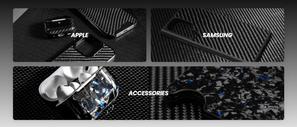
Rather than relying on text-heavy menus, we designed category blocks that function as both navigation and brand reinforcement.
Each category—Apple, Samsung, Accessories—uses:
- Full-bleed imagery
- Clear labels
- Consistent aspect ratios
This approach allows users to visually self-select their path while reinforcing product quality through imagery alone.
Featured Products Section
Designing for Scannability and Conversion
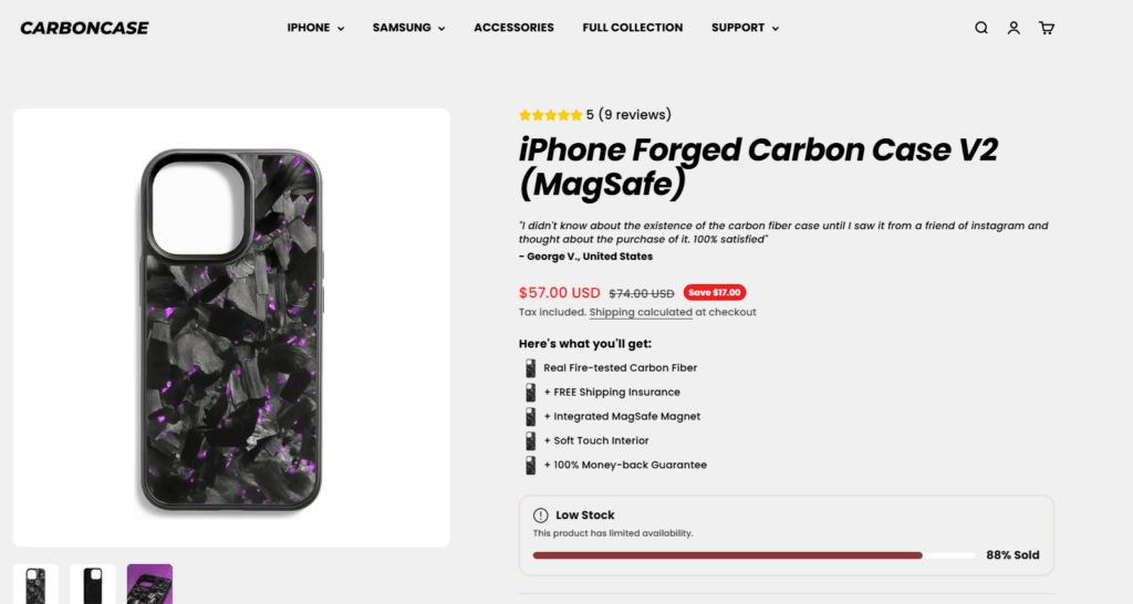
The featured products section prioritizes clarity and speed. Each product card presents only what matters most at the decision stage:
- Product image with material detail
- Clear pricing with visible discounts
- Minimal text hierarchy
- Strong visual alignment
We intentionally avoided overcrowding product cards with excessive icons or copy. The goal was to reduce cognitive load and make comparison effortless.
This design choice supports both desktop browsing and mobile shopping behavior, where users often make faster decisions.
Promotional Design Without Brand Dilution
Balancing Urgency and Premium Positioning
Running promotions is essential for DTC growth—but poor execution can damage brand perception. For CarbonCase, we designed promotional elements to feel integrated, not layered on top.
Key tactics included:
- Consistent typography between promotional and brand messaging
- Subtle badge designs instead of loud banners
- Clear hierarchy separating offers from product identity
The result is a promotional experience that drives action while maintaining a high-end feel.
Trust-Building Through Layout Design
Social Proof and Brand Credibility
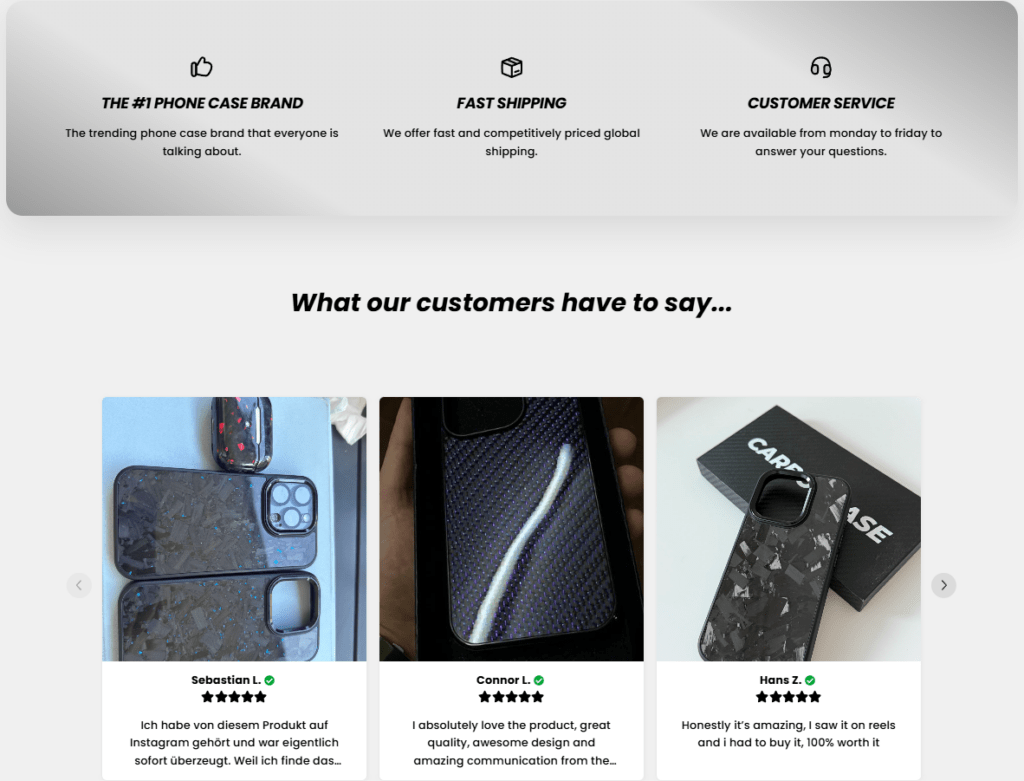
Rather than hiding reviews deep in product pages, we integrated customer feedback directly into the homepage flow.
The testimonial section uses:
- Real product photography from customers
- Short, readable quotes
- Clear star ratings
This placement reassures users after browsing products but before reaching the FAQ or footer—an ideal moment to reduce hesitation.
Service Highlights Section
We designed a compact service highlights block to address common buyer concerns quickly:
- Shipping reliability
- Customer support availability
- Brand credibility
Using icons and short copy, this section reinforces trust without interrupting the shopping experience.
FAQ Section as a Conversion Tool
Designing for Clarity, Not Overload
The FAQ section focuses on the most common purchase objections:
- Shipping destinations
- Delivery timeframes
- Material authenticity
We designed this section to be visually light and easy to scan, ensuring it supports decision-making rather than overwhelming users with information.
Challenges and Design Solutions
Challenge 1: Texture-Heavy Visuals
Carbon fiber textures can dominate a layout if used excessively.
Our solution:
We limited textured backgrounds to key visual moments and balanced them with neutral space to preserve readability and elegance.
Challenge 2: Promotion-Driven Traffic Spikes
Promotions bring high traffic but also higher bounce rates if messaging feels chaotic.
Our solution:
We embedded promotional messaging into the design system instead of treating it as an overlay, maintaining consistency and flow.
Challenge 3: Multiple Product Categories
Serving different device ecosystems risks fragmenting the experience.
Our solution:
We unified category design through consistent layouts, typography, and imagery—making the site feel cohesive regardless of product type.
Results and Impact
The final Shopify design delivered measurable improvements in brand clarity and user experience:
- Stronger first-impression impact
- Improved product discoverability
- Clearer promotional messaging
- Increased trust signals throughout the funnel
- A cohesive premium brand presentation
Most importantly, the site now communicates value before users read a single line of copy—allowing design to do the heavy lifting.
Conclusion
The CarbonCase project demonstrates how thoughtful Shopify design can elevate a product-driven brand without relying on complex development or technical features. By focusing on layout strategy, visual hierarchy, and user psychology, we transformed the website into a powerful sales and branding tool.
This project reflects the approach we take at AIRSANG—helping global brands translate product quality into digital experiences that convert. Our work centers on Shopify design, visual strategy, and conversion-focused layouts that support long-term growth without unnecessary complexity.
If you’re building or refining a Shopify store and want design that communicates value instantly, this is exactly the kind of work we specialize in.


Design and build a WordPress website or corporate site with a full eCommerce system for you.
Price range: $200.00 through $2,500.00Custom requirements or special quotations
Original price was: $2.00.$1.00Current price is: $1.00. Main Image Design for Amazon Home Physiotherapy Device Explained
Introduction: Building a Trustworthy Image for Home Therapy Devices on Amazon When designing the main image for a home therapy device on Amazon, our primary...

Main Image Design for Amazon Lipstick Conversion
Introduction: Designing a Lipstick Main Image That Sells on Amazon When we design a Main image for an Amazon lipstick, our responsibility goes far beyond...

What Makes an Amazon Liquid Foundation Main Image Convert
Introduction Designing a Main image design for Amazon Liquid foundation is never just about making a product look beautiful. On Amazon, the main image and...

Designing an Effective Amazon Main Image for Filter Cartridges
Introduction Designing a Main image for Amazon is never just about making a product look attractive. It is about clarity, trust, and instant understanding—especially for...

Five Pet WordPress Themes Compared
Introduction Choosing the right pet-related WordPress theme is more than a design decision—it directly affects usability, scalability, and long-term business growth. Pet care and pet...

Building a Scalable WordPress Website for a Science-Driven Brand: The AminoUSA Project
Introduction In today’s digital landscape, a website is more than a place to list products. For science-driven brands operating in regulated or research-focused industries, a...

Building a Scalable Shopify Store for a Global Blade Brand: The CoolKatana Project
Introduction In cross-border eCommerce, a Shopify website is more than a storefront.For brands operating in niche, culture-driven categories, the website must do far more than...

Designing a High-Conversion Shopify Store for Pokémon Cards
Introduction In the world of collectible eCommerce, especially within the Pokémon Trading Card Game (TCG) market, a website must do more than simply list products....

High-Converting Shopify Design for a Custom Brick Brand
Introduction In today’s competitive eCommerce landscape, especially in the personalized gift and collectible space, a Shopify website must do far more than display products. It...

Shopify Website Design Case Study for a Premium Floral Brand
Introduction In today’s competitive eCommerce landscape, a Shopify website must do far more than display products. It needs to communicate brand value instantly, guide users...

Shopify Design Case Study: Retro Gaming Store
Introduction In a highly competitive eCommerce environment, visual clarity and emotional connection often determine whether a visitor becomes a customer. This is especially true in...

Shopify Design Case Study: Tactical Rescue Brand
Introduction A strong Shopify website does more than display products—it communicates purpose, builds trust, and guides users toward confident purchasing decisions. This is especially true...

Shopify Website Design Case Study for an Electric Bike Brand
Introduction In today’s competitive electric bike market, a Shopify website must do more than display products—it must tell a story, build trust, and guide users...

Scalable Shopify E-commerce for a Creative Brand
Introduction When creative brands grow, their websites often struggle to keep up. As product lines expand, content increases, and traffic rises, many visually driven brands...

Shopify Website Design Case Study for a Home Decor Brand
Introduction In the highly competitive home decor market, visual identity is no longer just about aesthetics—it directly influences trust, browsing behavior, and purchasing decisions. For...

Building a Scalable WordPress Subscription Website Case Study
Introduction For modern e-commerce brands, a website is no longer just a digital storefront. It is the engine that supports subscriptions, content storytelling, trust building,...

High-Conversion WordPress Design for Adult Brands
Introduction In highly competitive eCommerce markets, strong visuals alone are not enough. A successful WordPress website must guide visitors through a clear, intentional journey—one that...

Scalable WordPress Sex Doll E-commerce Website
Introduction Launching a high-performing cross-border eCommerce website is never just about putting products online.For brands operating in highly competitive and visually driven markets, the website...