High-Converting Shopify Design for an E-Bike Brand
Introduction
In the highly competitive e-bike and electric mobility market, product quality alone is no longer enough. Customers expect clarity, trust, and confidence the moment they land on a website. For brands selling technical products like motors, batteries, conversion kits, and accessories, the challenge is even greater: how do you present complex information in a way that feels simple, intuitive, and approachable—without overwhelming the user?
This case study explores how we redesigned the Shopify storefront for Ebikeling, a well-established e-bike parts and accessories brand. The goal was not to change what they sell, but to elevate how their products and brand story are presented through thoughtful, strategy-driven page design.
Rather than focusing on code or backend development, this project centered entirely on visual hierarchy, layout planning, user experience flow, and conversion-oriented design decisions. The result is a Shopify experience that feels clearer, more professional, and more aligned with the expectations of modern e-commerce shoppers—especially those purchasing high-consideration technical products.
| Deliver Time | Category | Application Platform |
| 22days | e-bike | Shopify |
| Designers Involved | Cost | Effect |
| Lin Zhang | $2100 | Purchase rate📈297% |
Understanding the Brand and Its Market Position
Before designing any Shopify page, we always begin by understanding the brand’s role in its market.
A Specialized Brand in a Technical Category
Ebikeling serves a niche but fast-growing audience: riders who want to build, upgrade, or customize electric bikes. This audience ranges from first-time DIY builders to experienced enthusiasts and daily commuters. Their needs differ, but they all share a common expectation: they want to feel confident that they are choosing the right components.
From a design perspective, this means the website must do more than look good. It must:
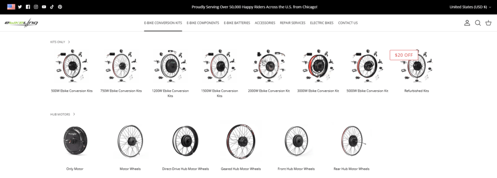
- Clearly differentiate product categories
- Communicate compatibility and use cases
- Reduce confusion around technical options
- Reinforce reliability and expertise
Why Design Matters More Than Ever in This Category
E-bike parts are not impulse purchases. Many products require careful comparison, understanding, and reassurance. Poor layout, cluttered product grids, or unclear messaging can easily lead to hesitation—or worse, abandonment.
Our task was to transform the Shopify storefront into a guidance-driven shopping experience, where design acts as a silent salesperson, helping users move forward with confidence.
Project Goals: What We Aimed to Achieve Through Design
Before entering the design phase, we defined clear objectives that guided every layout and visual decision.
Primary Design Goals
- Improve homepage clarity and first-impression impact
- Create a stronger visual hierarchy for complex product categories
- Make technical products feel more accessible through layout and structure
- Strengthen trust signals without overwhelming the user
- Optimize page flow to support browsing, comparison, and purchase intent
These goals shaped our entire design process—from homepage sections to collection layouts and supporting content blocks.
Our Shopify Design Process
1. Discovery and Visual Audit
We started with a full visual audit of the existing Shopify site. This included:
- Homepage structure and above-the-fold content
- Product category presentation
- Information density and spacing
- Visual consistency across sections
- Trust and credibility signals
Rather than asking “what features are missing,” we focused on how effectively the existing content was being communicated visually.
2. User Journey Mapping (Design-Only Perspective)
Without touching code or technical logic, we mapped the visual user journey:
- What does a first-time visitor see first?
- How quickly can they understand what the brand sells?
- Is it obvious where to start browsing?
- Do product sections feel overwhelming or approachable?
This allowed us to redesign page sections in a way that supports progressive disclosure—showing the right information at the right time.
Homepage Design Strategy
Establishing a Clear Visual Narrative
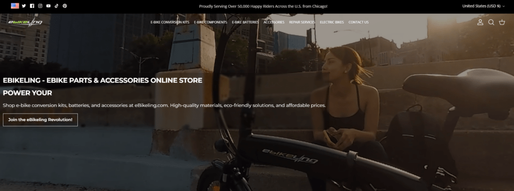
The homepage sets the tone for the entire Shopify experience. For Ebikeling, we designed the homepage to tell a simple story:
- What the brand offers
- Who it’s for
- Why it’s trustworthy
- How to start shopping
Hero Section: Confidence Over Hype
Instead of overly aggressive sales messaging, the hero section emphasizes:
- Real-world e-bike usage
- A clean, balanced layout
- Clear value propositions
We intentionally avoided clutter, allowing the hero visuals and headline hierarchy to create immediate clarity.
Structured Category Entry Points
Because Ebikeling offers a wide range of products, we introduced visually structured category blocks that guide users naturally:
- Conversion kits
- Motors and wheels
- Batteries
- Accessories
Each category block uses consistent spacing, visual cues, and typography to help users scan and decide quickly.
Designing for Complex Product Collections
Making Technical Products Feel Approachable
One of the biggest challenges was presenting technically complex products without overwhelming users. Our solution relied entirely on design structure, not technical explanations.
Visual Grouping and Spacing
We used:
- Clear grid systems
- Consistent product card layouts
- Strategic white space
This helps users visually separate products and reduces cognitive load.
Emphasizing Key Differentiators Visually
Rather than long paragraphs, we used:
- Short supporting labels
- Icon-style visual cues
- Hierarchical typography
These elements help users identify important differences at a glance.
Product Page Design Philosophy
Clarity First, Always
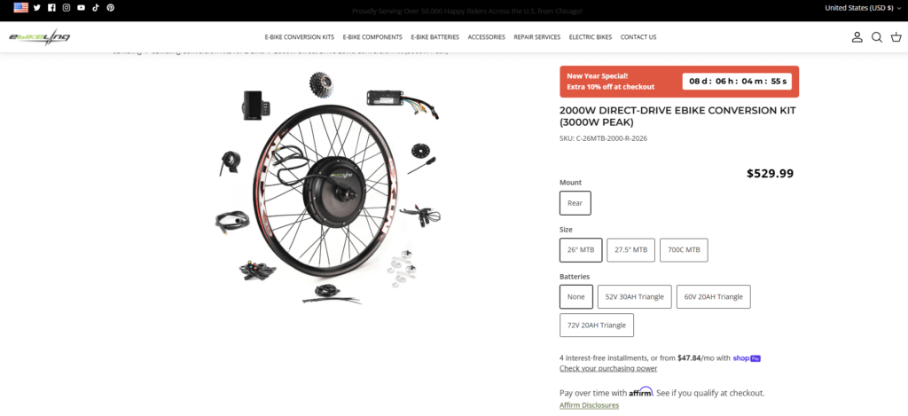
Product pages were designed to feel calm, organized, and trustworthy. We focused on:
- Clear visual separation between sections
- Predictable layout patterns
- Strong alignment between imagery and text
Supporting Decision-Making Through Layout
Without modifying technical specs or backend logic, we improved how information is visually consumed:
- Important details appear higher on the page
- Supporting content flows logically below
- Visual rhythm guides the eye downward
This approach helps users stay engaged longer and reduces friction in the decision-making process.
Building Trust Through Design
Visual Trust Signals
Trust is critical when selling e-bike components. We reinforced credibility using:
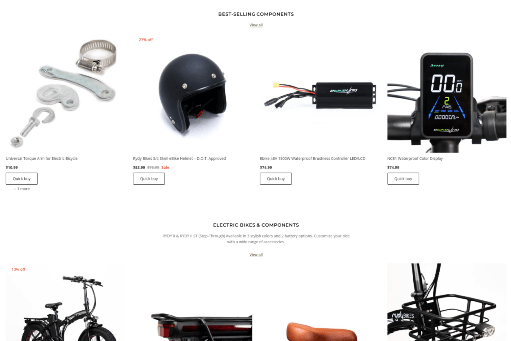
- Clean, professional typography
- Consistent visual language across pages
- Strategic placement of reviews and testimonials
- Real product imagery used thoughtfully
“Move Green” as a Design Anchor
The sustainability message plays an important role in the brand identity. We treated it as a visual anchor, not just a slogan—using spacing, contrast, and layout to give it presence without overpowering the shopping experience.
Challenges We Faced—and How Design Solved Them
Challenge 1: Information Density
Problem: Too many products and too much information can overwhelm users.
Design Solution:
We used layout hierarchy, spacing, and section breaks to control information flow—making pages feel lighter without removing content.
Challenge 2: Multiple User Types
Problem: Beginners and advanced users browse differently.
Design Solution:
We designed pages that support both scanning and deeper exploration, allowing users to engage at their own pace.
Challenge 3: Maintaining Brand Consistency Across Pages
Problem: Large Shopify stores can feel fragmented.
Design Solution:
We enforced consistent design patterns across homepage, collections, and product pages to create a unified experience.
Measuring Success Through Design Outcomes
Although we did not work on analytics or technical optimization, the design improvements delivered clear qualitative results:
- A more professional and trustworthy brand presence
- Improved content clarity and navigation flow
- Stronger visual alignment with the e-bike lifestyle
- A Shopify storefront that supports long-term scalability
Most importantly, the site now communicates expertise and reliability before a single word is read—which is the hallmark of effective e-commerce design.
Why Shopify Design Matters for Specialized E-Commerce Brands
This project reinforces an important lesson:
Good Shopify design is not decoration—it is strategy.
For technical and niche products, design must:
- Educate without lecturing
- Guide without overwhelming
- Build trust without shouting
When done correctly, design becomes the bridge between complex products and confident customers.
Conclusion: A Design-First Shopify Experience Built for Growth
The Ebikeling Shopify project demonstrates how thoughtful page design can transform a complex product catalog into a clear, engaging, and conversion-friendly experience—without touching code or development.
By focusing on visual hierarchy, layout logic, and user-centric design decisions, we helped elevate the brand’s online presence and create a shopping experience that supports both usability and trust.
This approach reflects the core philosophy of AIRSANG: helping global brands grow through strategic Shopify design, clear visual communication, and conversion-focused page experiences—without unnecessary technical complexity.
If you’re building or refining a Shopify store in a specialized or competitive market, investing in professional design is not optional—it’s essential.
Delivered Worldwide
AIRSANG delivers cost-effective website design, brand visual identity, and e-commerce solutions. From Shopify and WordPress to Amazon product images, we help global brands build, elevate, and grow their online business.
Design and build a WordPress website or corporate site with a full eCommerce system for you.
Custom requirements or special quotations

Main Image Design for Amazon Home Physiotherapy Device Explained
Main Image Design for Amazon Lipstick Conversion

What Makes an Amazon Liquid Foundation Main Image Convert

Designing an Effective Amazon Main Image for Filter Cartridges

Five Pet WordPress Themes Compared

Building a Scalable WordPress Website for a Science-Driven Brand: The AminoUSA Project

Building a Scalable Shopify Store for a Global Blade Brand: The CoolKatana Project
Designing a High-Conversion Shopify Store for Pokémon Cards
High-Converting Shopify Design for a Custom Brick Brand
Shopify Website Design Case Study for a Premium Floral Brand
Shopify Design Case Study: Retro Gaming Store
Shopify Design Case Study: Tactical Rescue Brand
Shopify Website Design Case Study for an Electric Bike Brand
Scalable Shopify E-commerce for a Creative Brand
Shopify Website Design Case Study for a Home Decor Brand
Building a Scalable WordPress Subscription Website Case Study
High-Conversion WordPress Design for Adult Brands
