


When we design a main image for Ozon, we do not simply place a product on a background. We build a visual argument. We analyze the marketplace environment, competitor thumbnails, buyer psychology, and mobile-first browsing behavior. For this Heat Dissipation Clip — a magnetic semiconductor cooling fan designed for smartphones and tablets — we structured every visual decision to increase click-through rate, communicate power instantly, and establish technical authority within milliseconds.
Ozon is a highly competitive marketplace. In categories like mobile accessories and gaming cooling devices, users scroll quickly. If the main image does not communicate performance immediately, the listing disappears into the noise. That is why we designed this Heat Dissipation Clip series with aggressive visual hierarchy, high-contrast color systems, and clear performance indicators.
Below, I will break down each image and explain why we made specific creative choices — from lighting and typography to composition and color psychology.
| Deliver Time | Category | Application Platform |
| 8days | Heat dissipation clip | Ozon |
| Designers Involved | Cost | Effect |
| Nancy、Peifon FU | $160 | Store traffic📈233% |
Image 1: Purple BlackShark Performance Concept – Speed & Power Emphasis
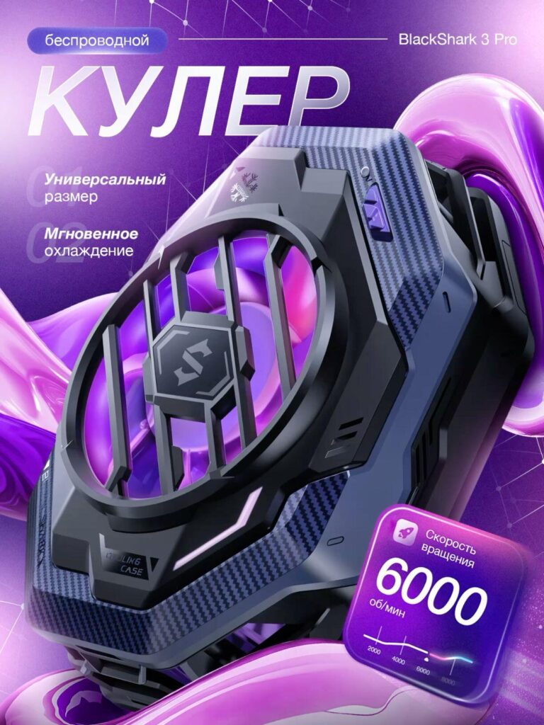
The first image presents the Heat Dissipation Clip in a futuristic purple environment. We chose a deep violet and neon gradient background to create a strong gaming atmosphere. Purple and magenta hues are widely associated with RGB gaming hardware and high-performance electronics. This instantly positions the product as a serious cooling solution rather than a basic accessory.
The product is displayed at a dramatic angle. Instead of a flat frontal shot, we tilted the device to show depth, structural thickness, and airflow vents. This reinforces durability and engineering complexity. On Ozon, technical products that look “mechanical” and robust often outperform overly minimal designs.
We highlighted:
- Wireless functionality
- Universal size
- Instant cooling
- 6000 RPM rotation speed
The 6000 RPM indicator is especially important. Numeric specifications increase buyer trust. We placed the speed inside a glowing digital card element, visually separating it from the background. This design technique improves scannability on mobile screens.
The airflow glow inside the fan is rendered in luminous purple to visually simulate cooling energy. Instead of explaining performance in long text, we let the lighting communicate airflow intensity.
This image is about power, speed, and authority.
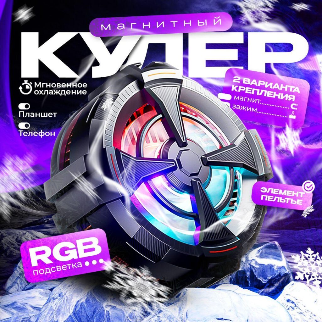
Image 2: Magnetic Cooling with Peltier Element – Technology Focus
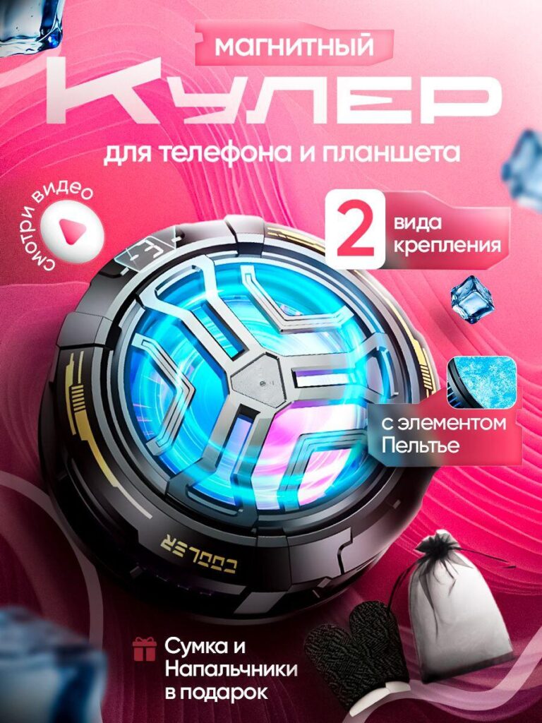
In the second image, we shifted toward a pink-red gradient environment to create visual contrast within the listing sequence. Ozon users often swipe through multiple images quickly, so color diversity across images prevents visual fatigue.
This image emphasizes:
- Magnetic mounting
- Two attachment options
- Peltier semiconductor element
- Bonus accessories (bag and finger sleeves)
We introduced the circular cooling surface as the focal point. The internal glow transitions between cyan and magenta to suggest thermoelectric transformation. The mention of the Peltier element is critical. Many competitors avoid explaining semiconductor cooling, but educated buyers search specifically for Peltier-based solutions.
We visually reinforced this by integrating ice textures and micro frost elements around the product. Instead of literal snow, we used subtle cooling metaphors to maintain a premium aesthetic.
The “2 types of mounting” message was placed in a bold, rectangular badge. Clear badges outperform long descriptions because they create structured information blocks.
Including the bonus gift accessories adds perceived value. On Ozon, value stacking increases conversion rate. We displayed them in a secondary corner area without distracting from the main product.
This image communicates technology credibility and purchase value.
Image 3: Blue Power Variant – 20W Strength & Immediate Cooling
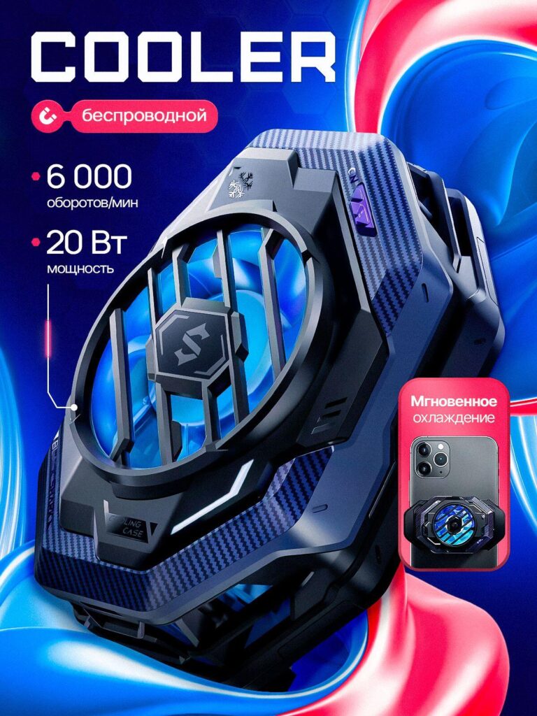
In this design, we pivoted toward a cooler blue-dominant color scheme. Blue communicates coldness naturally. When selling a cooling product, leveraging blue gradients improves subconscious association with temperature reduction.
This image highlights:
- 6000 RPM
- 20W power output
- Instant cooling performance
The typography “COOLER” in bold white block letters ensures immediate readability at thumbnail size. On Ozon, thumbnails can appear extremely small, so large sans-serif typography improves performance.
We rendered the fan interior with strong cyan lighting. The goal is to visually simulate cold airflow. We intentionally avoided warm tones in this design to make the product feel efficient and controlled.
We also included a small device application preview — showing the clip attached to a smartphone. Buyers need visual proof of real-world usage. Without context, accessories can feel abstract. Showing the mounted position increases purchase confidence.
This image focuses on specification clarity and application validation.
Image 4: RGB Variant – Gaming Aesthetic
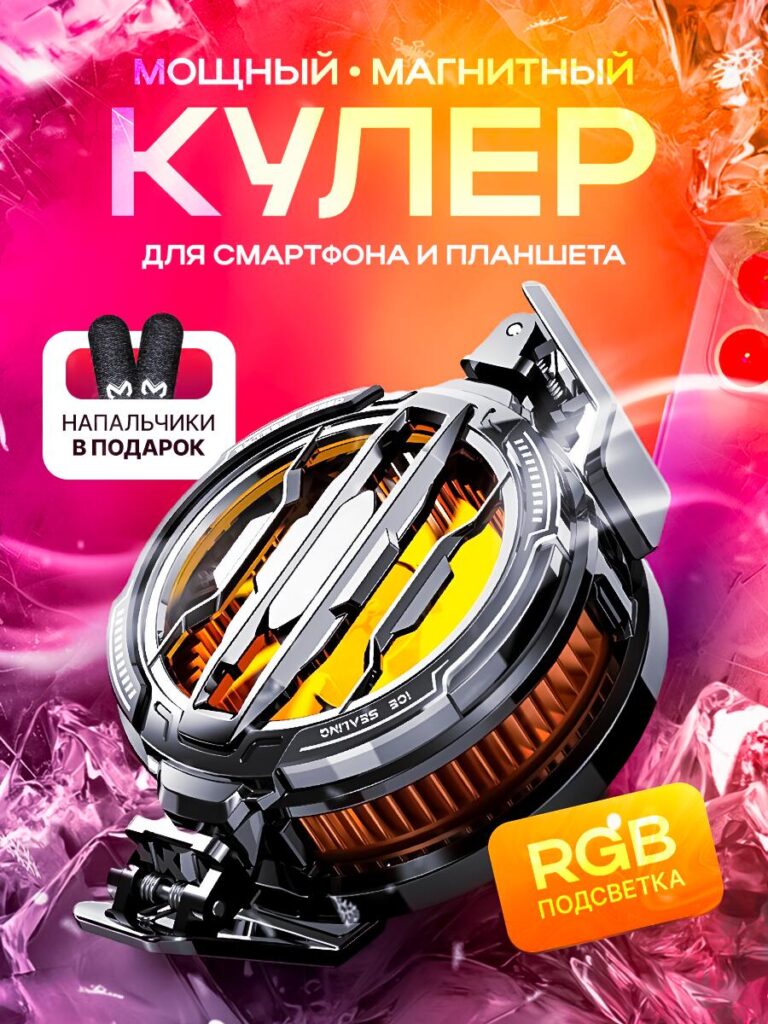
The fourth image shifts dramatically into an orange-pink and neon RGB theme. Here we targeted gaming users specifically. Many mobile gamers on Ozon search for RGB cooling clips, not just functional devices.
We introduced:
- RGB lighting
- Magnetic structure
- Strong industrial frame
- Free gaming finger sleeves
The RGB badge is bright and highly visible. RGB is a purchasing keyword. If the main image does not show lighting clearly, users may assume the product lacks customization.
We also exaggerated metallic reflections on the outer casing. The strong highlights and chrome-like details make the product appear premium and durable.
The background ice shards add motion and intensity. Instead of static composition, we introduced dynamic diagonal angles to create action.
This image speaks to competitive gamers who value aesthetics as much as cooling performance.
Image 5: High-Speed Silent Model – 25,000 RPM Emphasis
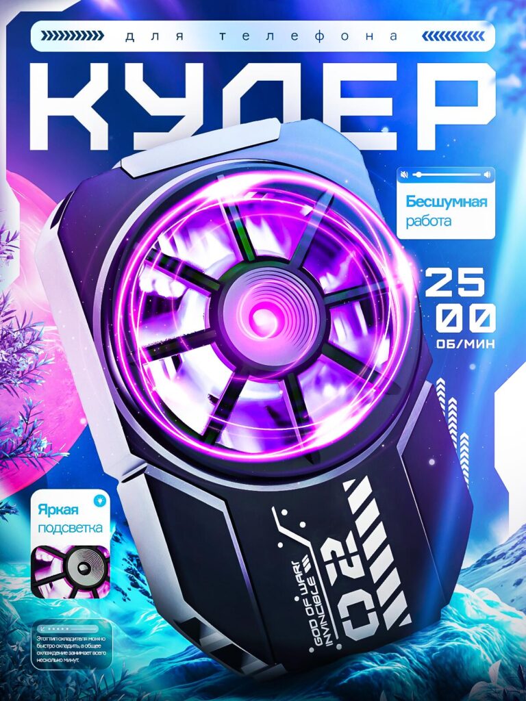
This design introduces a major speed differentiation: 25,000 RPM. That number is significantly higher than standard cooling clips, so we made it the hero element.
We switched to a deep blue and arctic theme. Snow textures and frosty particles communicate extreme cooling capacity.
Key features emphasized:
- Silent operation
- 25,000 RPM rotation
- Bright RGB lighting
The central fan glow is intense purple with motion blur effects. The blur suggests speed without using arrows or overly technical diagrams.
We also included a small inset showing lighting details. Micro-detail shots increase perceived product engineering complexity.
This image is built to attract buyers who compare specifications closely.
Image 6: Dual Mounting & Peltier Confirmation
In this variation, we focus on:
- Magnetic mounting
- Clamp mounting
- Instant cooling
- Peltier element
- RGB lighting
The design uses a high-contrast purple-black background to amplify neon internal glow. The two mounting methods are presented in a structured badge layout for clarity.
We rendered airflow streaks around the fan to simulate motion. These soft streaks guide the viewer’s eye toward the cooling center.
By repeating the Peltier highlight, we reinforce semiconductor credibility. Repetition across images increases information retention during browsing.
This design strengthens functional authority.
Image 7: Dual-Fan Semiconductor Advanced Model
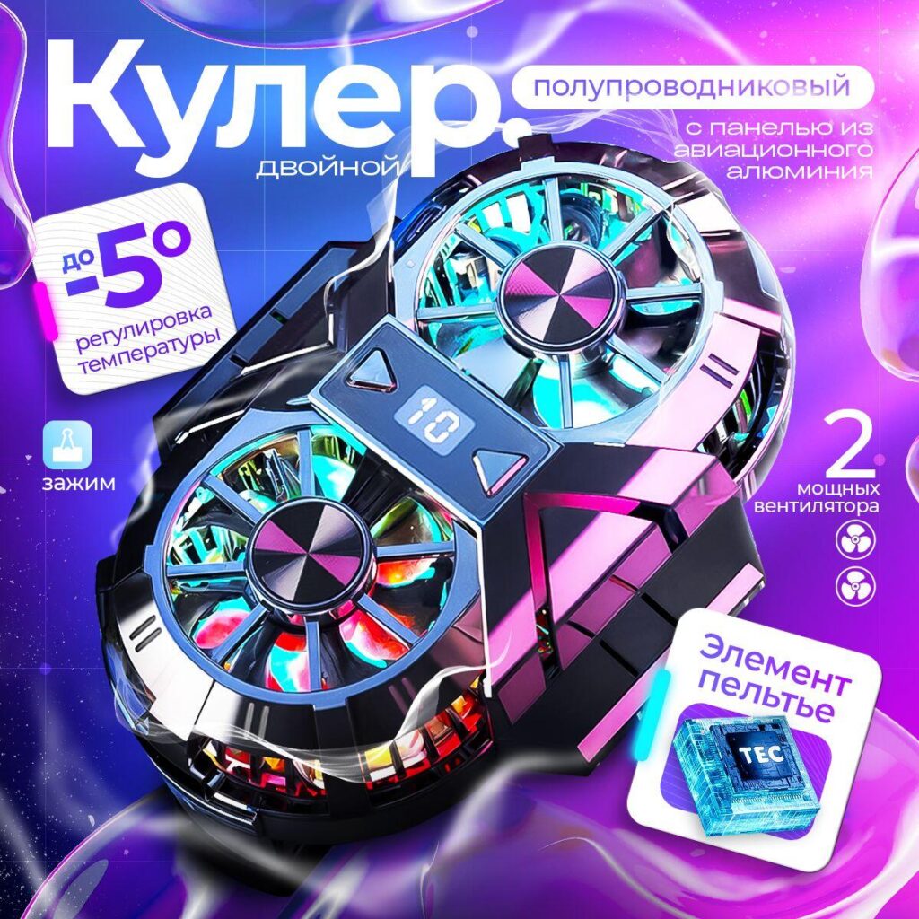
The final image showcases the advanced dual-fan version. This is visually the most complex model in the lineup.
We emphasized:
- Dual powerful fans
- Semiconductor cooling
- Aviation aluminum panel
- Temperature adjustment down to -5°C
- Digital temperature display
- Clamp mounting
The dual-fan symmetry creates strong visual balance. Symmetry subconsciously communicates stability and engineering precision.
We added a digital temperature display showing numeric values. Buyers trust visible metrics. Instead of abstract claims like “super cooling,” we show measurable performance.
The “-5°C” badge is tilted slightly for visual dynamism while still readable. Temperature reduction is the core purchase motivator, so it deserves a dedicated highlight zone.
The Peltier chip graphic reinforces internal structure transparency. Showing internal technology visually builds trust.
This image positions the product as a premium, high-end cooling system rather than a basic clip.
Strategic Design Principles We Applied
Across all images, we followed several conversion-driven principles:
- High Contrast Color Systems
Purple, blue, neon cyan, and RGB gradients dominate. These colors outperform neutral backgrounds in gaming accessory categories. - Bold Numeric Anchors
6000 RPM, 25,000 RPM, 20W, -5°C — numbers convert better than adjectives. - 3D Angled Product Presentation
We avoided flat layouts. Depth implies quality. - Information Segmentation
Each image focuses on one main idea. Overloading a single image reduces clarity. - Cooling Visual Metaphors
Ice textures, glow effects, airflow streaks — these create emotional reinforcement of performance. - Mobile-First Typography
Large fonts ensure readability at thumbnail scale. - Value Stacking
Bonus gifts increase perceived deal strength. - Technology Transparency
Highlighting Peltier semiconductor elements differentiates from basic fan-only competitors.
Why This Works on Ozon
Ozon users often browse through search results quickly. A strong main image must:
- Capture attention in under 1 second
- Communicate function instantly
- Build trust visually
- Differentiate from competitors
By creating multiple variations targeting different buyer motivations (gaming RGB, silent performance, dual-fan premium, wireless universal), we expand the product’s market reach within one listing.
Instead of generic white-background product photography, we built a controlled visual ecosystem around the Heat Dissipation Clip. Every image communicates performance, cooling authority, and technical strength.
This approach improves click-through rate and strengthens brand perception inside competitive electronics categories.
High-converting marketplace visuals require strategy, not decoration. When we design for Ozon, we engineer visual performance as carefully as the product itself.
At the end of the project, we integrated these visuals into a full marketplace optimization strategy under AIRSANG, ensuring not only strong creative execution but also positioning aligned with cross-border e-commerce growth and conversion-focused design principles.


Design and build a WordPress website or corporate site with a full eCommerce system for you.
Price range: $200.00 through $2,500.00custom-requirements-or-special-quotations
Original price was: $2.00.$1.00Current price is: $1.00. Main Image Design for Amazon Home Physiotherapy Device Explained
Introduction: Building a Trustworthy Image for Home Therapy Devices on Amazon When designing the main image for a home therapy device on Amazon, our primary...

Main Image Design for Amazon Lipstick Conversion
Introduction: Designing a Lipstick Main Image That Sells on Amazon When we design a Main image for an Amazon lipstick, our responsibility goes far beyond...

What Makes an Amazon Liquid Foundation Main Image Convert
Introduction Designing a Main image design for Amazon Liquid foundation is never just about making a product look beautiful. On Amazon, the main image and...

Designing an Effective Amazon Main Image for Filter Cartridges
Introduction Designing a Main image for Amazon is never just about making a product look attractive. It is about clarity, trust, and instant understanding—especially for...

Five Pet WordPress Themes Compared
Introduction Choosing the right pet-related WordPress theme is more than a design decision—it directly affects usability, scalability, and long-term business growth. Pet care and pet...

Building a Scalable WordPress Website for a Science-Driven Brand: The AminoUSA Project
Introduction In today’s digital landscape, a website is more than a place to list products. For science-driven brands operating in regulated or research-focused industries, a...

Building a Scalable Shopify Store for a Global Blade Brand: The CoolKatana Project
Introduction In cross-border eCommerce, a Shopify website is more than a storefront.For brands operating in niche, culture-driven categories, the website must do far more than...

Designing a High-Conversion Shopify Store for Pokémon Cards
Introduction In the world of collectible eCommerce, especially within the Pokémon Trading Card Game (TCG) market, a website must do more than simply list products....

High-Converting Shopify Design for a Custom Brick Brand
Introduction In today’s competitive eCommerce landscape, especially in the personalized gift and collectible space, a Shopify website must do far more than display products. It...

Shopify Website Design Case Study for a Premium Floral Brand
Introduction In today’s competitive eCommerce landscape, a Shopify website must do far more than display products. It needs to communicate brand value instantly, guide users...

Shopify Design Case Study: Retro Gaming Store
Introduction In a highly competitive eCommerce environment, visual clarity and emotional connection often determine whether a visitor becomes a customer. This is especially true in...

Shopify Design Case Study: Tactical Rescue Brand
Introduction A strong Shopify website does more than display products—it communicates purpose, builds trust, and guides users toward confident purchasing decisions. This is especially true...

Shopify Website Design Case Study for an Electric Bike Brand
Introduction In today’s competitive electric bike market, a Shopify website must do more than display products—it must tell a story, build trust, and guide users...

Scalable Shopify E-commerce for a Creative Brand
Introduction When creative brands grow, their websites often struggle to keep up. As product lines expand, content increases, and traffic rises, many visually driven brands...

Shopify Website Design Case Study for a Home Decor Brand
Introduction In the highly competitive home decor market, visual identity is no longer just about aesthetics—it directly influences trust, browsing behavior, and purchasing decisions. For...

Building a Scalable WordPress Subscription Website Case Study
Introduction For modern e-commerce brands, a website is no longer just a digital storefront. It is the engine that supports subscriptions, content storytelling, trust building,...

High-Conversion WordPress Design for Adult Brands
Introduction In highly competitive eCommerce markets, strong visuals alone are not enough. A successful WordPress website must guide visitors through a clear, intentional journey—one that...

Scalable WordPress Sex Doll E-commerce Website
Introduction Launching a high-performing cross-border eCommerce website is never just about putting products online.For brands operating in highly competitive and visually driven markets, the website...