


Introduction
On Ozon, the main image is not decoration—it is the first and most decisive sales tool.
When users scroll through crowded category pages, they do not read specifications or brand stories. They react to visual order, contrast, and clarity in less than one second. A well-designed main image must immediately communicate what the product is, who it is for, and why it deserves attention.
In this project, we created a gray-series main image system for multiple consumer products sold on Ozon, including home appliances, personal care devices, audio equipment, lighting, and household goods. Although the products differ, the design strategy remains consistent: neutral gray tones, high material realism, structured typography, and clear feature hierarchy—fully aligned with Ozon’s visual and behavioral standards.
This article breaks down our design logic image by image, explaining how each main image was built to increase clarity, trust, and click-through performance on Ozon.
| Deliver Time | Theme style | Application Platform |
| 7days | Gray series | Ozon |
| Designers Involved | Cost | Effect |
| Petter | $110 | Customer satisfaction rate📈355% |
1. Wet & Dry Cordless Vacuum Cleaner Main Image
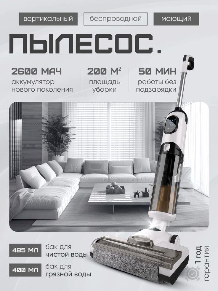
The first image presents a vertical cordless wet-and-dry vacuum cleaner designed for modern home cleaning.
Our primary goal here was to balance technical information with a calm lifestyle context.
We placed the product prominently in the foreground at a slight angle to show its full structure, while a neutral living room scene appears softly in the background. This immediately answers two key user questions: What does it look like? and Where is it used? Without overwhelming the viewer, the background reinforces daily use in a real home environment.
The gray color palette plays a crucial role. Instead of aggressive colors, we used layered grays to convey cleanliness, reliability, and premium positioning. The typography is bold but restrained, allowing key data points—battery capacity, cleaning area coverage, and operating time—to stand out clearly. These specifications are grouped logically, making them readable even on smaller screens.
For Ozon users, clarity equals trust. This image communicates performance at a glance while maintaining a calm, premium feel that fits the platform’s expectations for household appliances.
2. Hair and Beard Trimmer Main Image
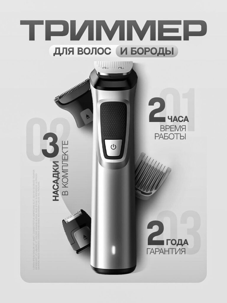
The trimmer image focuses on precision, masculinity, and product completeness.
Here, we designed the layout to feel compact and controlled—mirroring the purpose of the product itself.
The device sits centrally, vertically aligned, with interchangeable attachments positioned around it. This immediately signals versatility and value. Users can see, without reading long descriptions, that this is not a single-function tool but a complete grooming solution.
Gray tones dominate again, but with subtle contrast between matte and metallic finishes to highlight build quality. The lighting emphasizes edges and contours, reinforcing the feeling of solid engineering. We avoided lifestyle backgrounds here on purpose. For grooming tools on Ozon, users often prioritize function over emotion, so a clean studio background keeps attention on the product.
Key selling points—working time, number of attachments, and warranty—are placed close to the product body, reducing eye movement and improving information absorption. The result is a main image that feels professional, efficient, and trustworthy.
3. Wireless Headphones Main Image
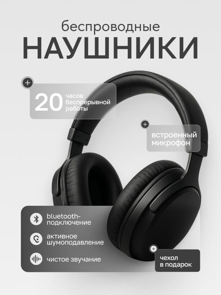
For the wireless headphones, our design objective shifted slightly toward comfort and experience, while still respecting Ozon’s need for clarity.
The headphones are shown at a three-quarter angle, allowing users to immediately understand ear cup size, padding thickness, and headband structure. These details are essential for buyers concerned about long-term comfort. We used soft shadows and smooth gradients to enhance depth without visual noise.
Feature callouts appear as floating gray panels. Instead of listing everything, we selected only the most decisive features: battery life, built-in microphone, noise cancellation, and sound clarity. This selective approach prevents cognitive overload and keeps the image readable at thumbnail size.
The gray series approach works particularly well here. Neutral tones allow the product shape to lead the composition, while subtle highlights guide the viewer’s eye naturally from top to bottom. The image communicates modernity, comfort, and reliability—exactly what Ozon headphone buyers expect.
4. Designer Floor Lamp Main Image
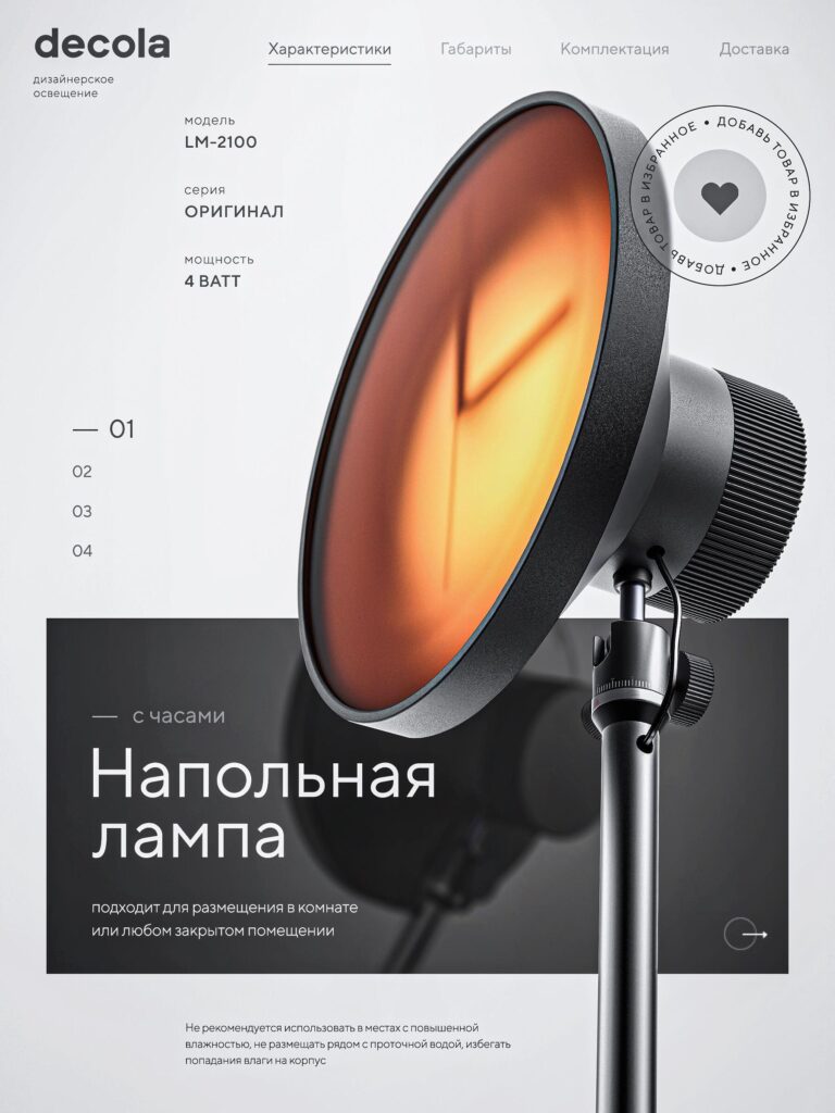
The floor lamp image required a more aesthetic-driven composition, as lighting products are purchased as much for atmosphere as for function.
We designed this main image with strong visual hierarchy. The lamp head dominates the frame, glowing softly to demonstrate light warmth and diffusion. The gray background remains minimal, allowing the warm light to create contrast without breaking the series consistency.
Typography stays refined and spacious, reinforcing the idea of designer lighting rather than mass-market hardware. Technical details such as wattage and model information are included, but they do not overpower the visual impression.
On Ozon, lighting products often struggle when images feel either too technical or too artistic. This design finds the middle ground: visually appealing, but still informative. The gray series styling elevates the product into a premium category while maintaining commercial clarity.
5. Portable Handheld Vacuum Cleaner Main Image
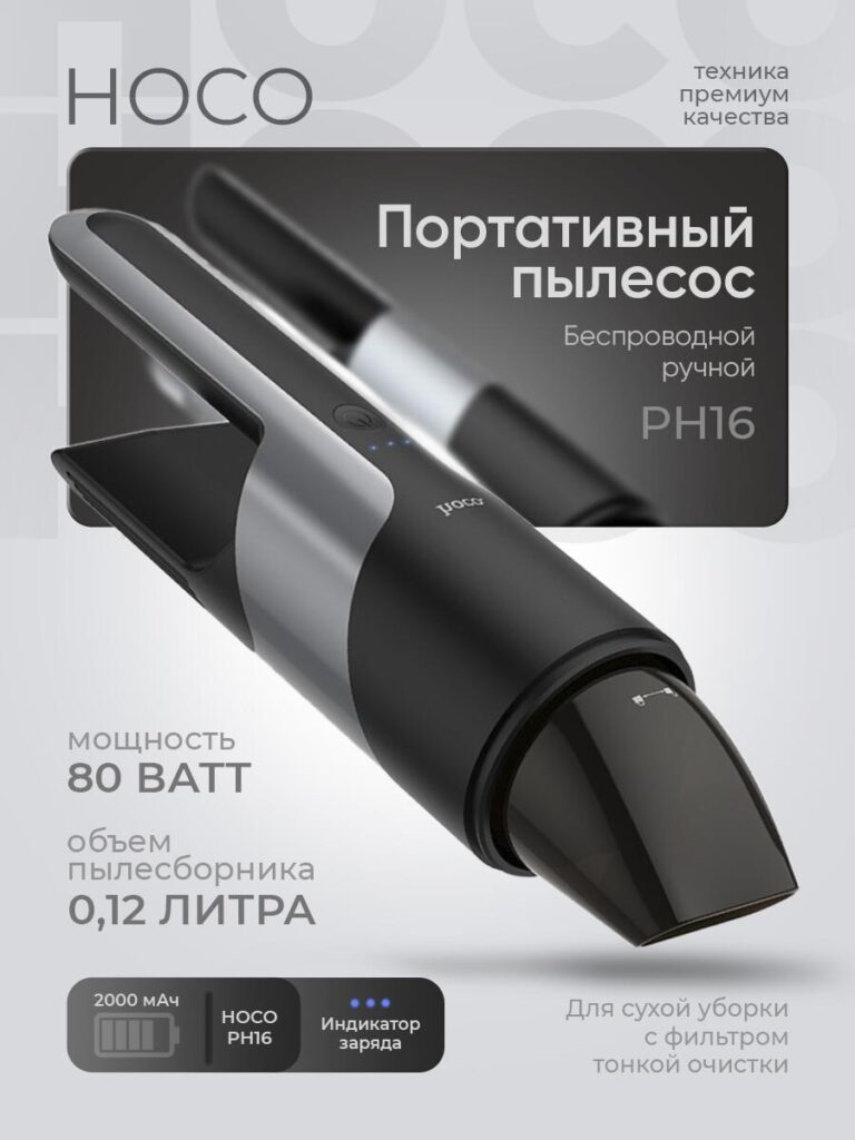
This image focuses on power, portability, and precision.
We angled the handheld vacuum to show both the nozzle and body length, instantly communicating size and handling. The gray color scheme reinforces the idea of durability and engineering quality. Unlike the larger vacuum cleaner image, this one uses a tighter composition to emphasize portability.
Key performance indicators—power output, dust container capacity, and battery status—are displayed in compact, clearly separated blocks. This layout mirrors how users scan product listings on Ozon: fast, fragmented, and goal-oriented.
By avoiding unnecessary decorative elements, we ensure the product feels practical and efficient. The image speaks directly to users looking for a reliable solution for cars, desks, and small spaces.
6. Stainless Steel Cutlery Set Main Image
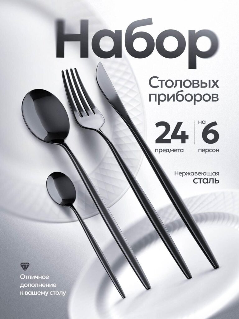
The final image presents a stainless steel cutlery set, where elegance and order are the primary selling points.
We arranged the utensils diagonally to create rhythm and balance, allowing each piece to be clearly visible. The reflective surfaces interact subtly with the gray background, showcasing material quality without harsh reflections.
Information is kept minimal: number of pieces, number of people served, and material type. This restraint is intentional. For tableware on Ozon, excessive text reduces perceived quality. Clean composition and material presentation do more persuasive work than long descriptions.
The gray series aesthetic elevates the product beyond basic utility, positioning it as a tasteful addition to a modern dining table.
Why the Gray Series Works on Ozon
Across all these products, the gray series main image system delivers three core advantages:
- Consistency across categories
Different products feel connected, professional, and brand-ready. - Improved readability on mobile
Neutral backgrounds and structured layouts ensure information remains legible at small sizes. - Higher perceived quality
Gray tones reduce visual noise and emphasize materials, form, and function.
Ozon rewards clarity. These designs reduce friction between search result and product page, helping users make faster decisions with more confidence.
Conclusion
Effective Ozon main image design is not about decoration—it is about visual decision-making. Each image in this gray series was designed to answer buyer questions instantly, reduce uncertainty, and position the product as reliable and well-made.
By combining neutral color systems, disciplined typography, and marketplace-specific logic, we help products stand out without shouting. This approach works across appliances, electronics, personal care, lighting, and home goods—proving that strong structure beats visual excess.
This is exactly the kind of design strategy we apply at AIRSANG when helping brands compete in global marketplaces through high-conversion visual systems.


Design and build a WordPress website or corporate site with a full eCommerce system for you.
Price range: $200.00 through $2,500.00custom-requirements-or-special-quotations
Original price was: $2.00.$1.00Current price is: $1.00. Main Image Design for Amazon Home Physiotherapy Device Explained
Introduction: Building a Trustworthy Image for Home Therapy Devices on Amazon When designing the main image for a home therapy device on Amazon, our primary...

Main Image Design for Amazon Lipstick Conversion
Introduction: Designing a Lipstick Main Image That Sells on Amazon When we design a Main image for an Amazon lipstick, our responsibility goes far beyond...

What Makes an Amazon Liquid Foundation Main Image Convert
Introduction Designing a Main image design for Amazon Liquid foundation is never just about making a product look beautiful. On Amazon, the main image and...

Designing an Effective Amazon Main Image for Filter Cartridges
Introduction Designing a Main image for Amazon is never just about making a product look attractive. It is about clarity, trust, and instant understanding—especially for...

Five Pet WordPress Themes Compared
Introduction Choosing the right pet-related WordPress theme is more than a design decision—it directly affects usability, scalability, and long-term business growth. Pet care and pet...

Building a Scalable WordPress Website for a Science-Driven Brand: The AminoUSA Project
Introduction In today’s digital landscape, a website is more than a place to list products. For science-driven brands operating in regulated or research-focused industries, a...

Building a Scalable Shopify Store for a Global Blade Brand: The CoolKatana Project
Introduction In cross-border eCommerce, a Shopify website is more than a storefront.For brands operating in niche, culture-driven categories, the website must do far more than...

Designing a High-Conversion Shopify Store for Pokémon Cards
Introduction In the world of collectible eCommerce, especially within the Pokémon Trading Card Game (TCG) market, a website must do more than simply list products....

High-Converting Shopify Design for a Custom Brick Brand
Introduction In today’s competitive eCommerce landscape, especially in the personalized gift and collectible space, a Shopify website must do far more than display products. It...

Shopify Website Design Case Study for a Premium Floral Brand
Introduction In today’s competitive eCommerce landscape, a Shopify website must do far more than display products. It needs to communicate brand value instantly, guide users...

Shopify Design Case Study: Retro Gaming Store
Introduction In a highly competitive eCommerce environment, visual clarity and emotional connection often determine whether a visitor becomes a customer. This is especially true in...

Shopify Design Case Study: Tactical Rescue Brand
Introduction A strong Shopify website does more than display products—it communicates purpose, builds trust, and guides users toward confident purchasing decisions. This is especially true...

Shopify Website Design Case Study for an Electric Bike Brand
Introduction In today’s competitive electric bike market, a Shopify website must do more than display products—it must tell a story, build trust, and guide users...

Scalable Shopify E-commerce for a Creative Brand
Introduction When creative brands grow, their websites often struggle to keep up. As product lines expand, content increases, and traffic rises, many visually driven brands...

Shopify Website Design Case Study for a Home Decor Brand
Introduction In the highly competitive home decor market, visual identity is no longer just about aesthetics—it directly influences trust, browsing behavior, and purchasing decisions. For...

Building a Scalable WordPress Subscription Website Case Study
Introduction For modern e-commerce brands, a website is no longer just a digital storefront. It is the engine that supports subscriptions, content storytelling, trust building,...

High-Conversion WordPress Design for Adult Brands
Introduction In highly competitive eCommerce markets, strong visuals alone are not enough. A successful WordPress website must guide visitors through a clear, intentional journey—one that...

Scalable WordPress Sex Doll E-commerce Website
Introduction Launching a high-performing cross-border eCommerce website is never just about putting products online.For brands operating in highly competitive and visually driven markets, the website...