Purple Ozon Main Image Design for High Conversion
When we design a main image for Ozon, we don’t start with decoration—we start with strategy. Ozon is a fast-scrolling marketplace where buyers make judgments in seconds. Our goal with this project was to create a purple-themed main image system that instantly communicates value, builds trust, and visually unifies multiple product categories under one strong, recognizable style.
In this project, we designed a series of Ozon main images covering a handheld gaming console, a smartwatch, a smart fan, and a desk lamp, all presented in a consistent purple visual language. Each image was built to work independently in search results, while also forming a cohesive brand-level visual identity when viewed as a collection.
Below, we explain our design logic image by image, from layout decisions to color psychology, typography hierarchy, and feature prioritization.
| Deliver Time | Theme style | Application Platform |
| 7days | Purple shades | Ozon |
| Designers Involved | Cost | Effect |
| Petter | $110 | Sales revenue📈302% |
Image 1: Performance-Focused Handheld Console Main Image
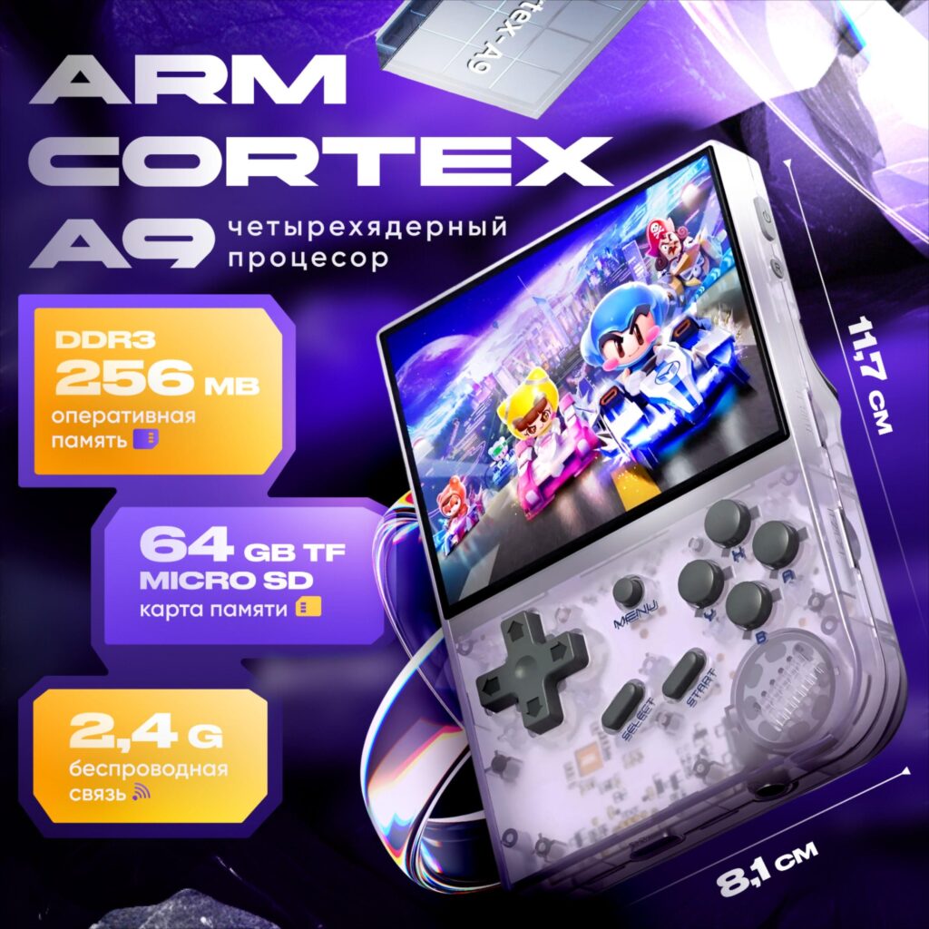
The first image introduces the handheld gaming console with a strong technology-driven composition. We positioned the device at a dynamic angle to immediately convey “gaming in motion,” rather than a static product shot.
Why we designed it this way:
- Processor as the hero message: We highlighted “ARM Cortex A7” prominently, because chipset information strongly influences purchase decisions for retro and handheld gaming buyers on Ozon.
- Purple gradient background: The deep purple backdrop reinforces a futuristic, premium feel while separating the product from competitors that often rely on plain white or black backgrounds.
- Feature blocks on the left: Memory, wireless capability, and storage information are grouped into modular cards. This allows users to scan specs without reading paragraphs.
- Visual balance: The console screen remains bright and colorful, contrasting sharply with the purple background to draw the eye directly to gameplay.
This image is designed to stop the scroll and immediately answer one question: Is this console powerful enough for me?
Image 2: Smartwatch Main Image Focused on Lifestyle and Compatibility
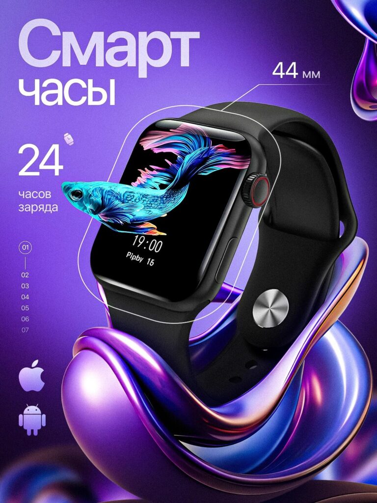
For the smartwatch, we shifted from performance to lifestyle storytelling. Wearable buyers on Ozon care about daily usability, battery life, and compatibility more than raw specifications.
Key design decisions:
- Floating product composition: We suspended the watch visually above a flowing purple form to suggest lightness and comfort.
- Screen content realism: The animated fish watch face creates emotional engagement and suggests display quality without listing technical jargon.
- Clear size annotation: The “44 mm” callout is subtle but precise, addressing a major concern for smartwatch buyers.
- Platform icons: Apple and Android icons instantly communicate compatibility without extra explanation.
The purple theme remains consistent, but here it feels softer and more lifestyle-oriented, proving that a single color system can adapt to different product categories.
Image 3: Smart Fan Main Image Emphasizing Quiet Power
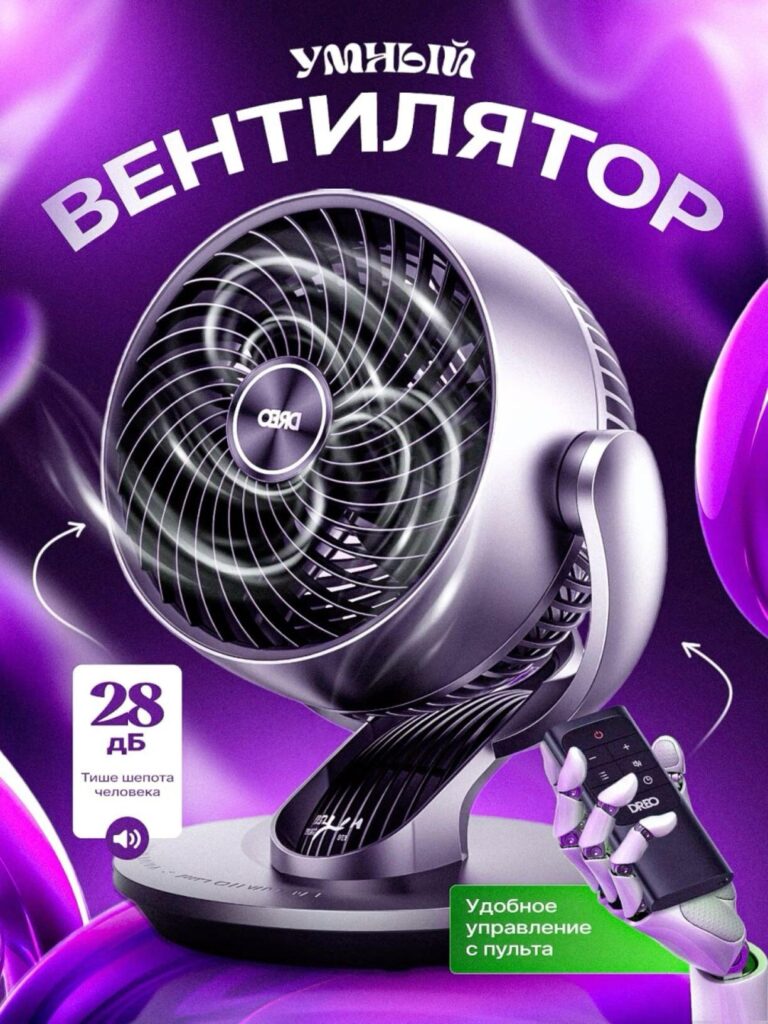
The smart fan image required a completely different emotional angle: quiet efficiency and intelligent control.
Design rationale:
- Circular airflow visualization: We emphasized airflow lines to show performance without overwhelming the image.
- Low-noise messaging: “28 dB” is presented clearly because silence is a key differentiator for home appliances.
- Remote control interaction: Including the remote in a robotic hand adds a subtle tech narrative, reinforcing “smart control” without clutter.
- Purple depth and lighting: The metallic fan body reflects purple highlights, helping it feel premium rather than industrial.
This image reassures buyers that the product is both powerful and unobtrusive—ideal for bedrooms or offices.
Image 4: Gaming Console Content Library Highlight Image
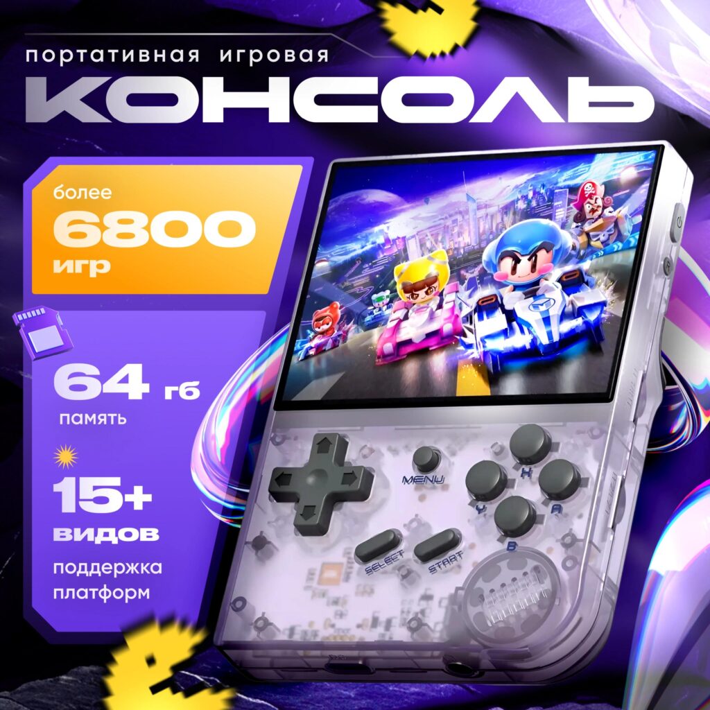
This image expands on the handheld console by focusing on content volume and versatility rather than hardware.
Why this image matters:
- “6800+ games” as the headline: Content quantity is a major conversion trigger in retro gaming.
- Platform support clarity: The “15+ supported platforms” badge reduces uncertainty and increases perceived value.
- Front-facing device orientation: Unlike the first console image, this one is more direct and approachable, reinforcing accessibility.
- Consistent purple branding: Even with playful pixel elements, the purple background keeps the image aligned with the overall visual system.
Together with the first console image, this creates a two-step persuasion flow: power first, content second.
Image 5: Smart Desk Lamp Main Image Highlighting Eye Protection
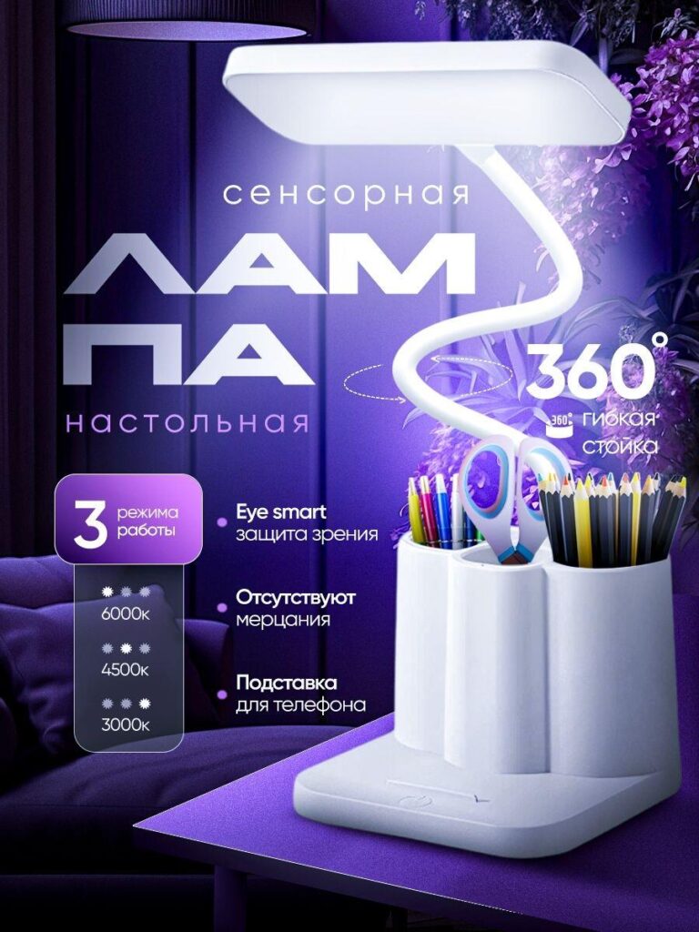
For the desk lamp, we moved toward comfort, safety, and modern home aesthetics.
Design logic:
- Soft purple lighting environment: This supports the “eye protection” narrative and avoids harsh contrasts.
- 360-degree flexibility visualization: The curved lamp stem is emphasized to show adjustability without technical diagrams.
- Color temperature icons: Presenting 3000K, 4500K, and 6000K visually makes the feature easy to understand.
- Multi-function base: Showing stationery storage and phone placement increases perceived utility.
This image speaks directly to parents, students, and home office users who prioritize eye comfort and organization.
Image 6: IPS Screen Close-Up for Visual Quality Proof
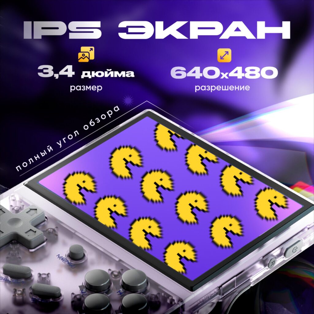
The final image zooms in on the handheld console’s IPS display, addressing buyers who care about screen quality.
Why we included this:
- Resolution clarity: “640×480” is displayed cleanly, without exaggeration.
- Viewing angle emphasis: The angled presentation visually reinforces the “full viewing angle” claim.
- Retro pixel graphics: These demonstrate color consistency and sharpness in a context that resonates with the target audience.
- Minimal distraction: This image is intentionally simpler, allowing the screen to speak for itself.
This image functions as technical reassurance after emotional engagement from earlier visuals.
Why a Purple-Themed Main Image Works on Ozon
Purple is not just an aesthetic choice—it’s a strategic one.
- High contrast in search results: Purple stands out against Ozon’s predominantly white interface.
- Cross-category consistency: From electronics to home products, purple adapts without losing identity.
- Premium perception: Purple subtly communicates innovation and quality without appearing aggressive.
By applying the same purple-themed visual system across all products, we created a recognizable design language that improves brand recall and professional credibility.
Final Thoughts: Designing for Conversion, Not Decoration
Every main image in this project was designed with conversion logic first. We prioritized clarity, hierarchy, and emotional resonance—because on Ozon, a main image must sell before the description is ever read.
We structured each image to answer a specific buyer question:
- Is it powerful?
- Is it compatible?
- Is it quiet?
- Is it versatile?
- Is it comfortable?
- Is the screen good?
When main images work together like this, they don’t just look good—they actively guide buyers toward a confident purchase decision.
If you’re looking to build high-impact Ozon visuals that balance aesthetics with strategy, this is exactly the design philosophy we apply at AIRSANG.
Delivered Worldwide
AIRSANG delivers cost-effective website design, brand visual identity, and e-commerce solutions. From Shopify and WordPress to Amazon product images, we help global brands build, elevate, and grow their online business.
Design and build a WordPress website or corporate site with a full eCommerce system for you.
Custom requirements or special quotations
Main Image Design for Amazon Home Physiotherapy Device Explained
Main Image Design for Amazon Lipstick Conversion
What Makes an Amazon Liquid Foundation Main Image Convert
Designing an Effective Amazon Main Image for Filter Cartridges

Five Pet WordPress Themes Compared

Building a Scalable WordPress Website for a Science-Driven Brand: The AminoUSA Project

Building a Scalable Shopify Store for a Global Blade Brand: The CoolKatana Project
Designing a High-Conversion Shopify Store for Pokémon Cards
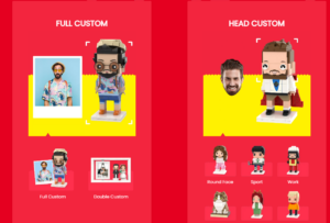
High-Converting Shopify Design for a Custom Brick Brand
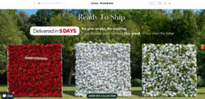
Shopify Website Design Case Study for a Premium Floral Brand
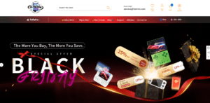
Shopify Design Case Study: Retro Gaming Store
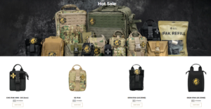
Shopify Design Case Study: Tactical Rescue Brand
Shopify Website Design Case Study for an Electric Bike Brand
Scalable Shopify E-commerce for a Creative Brand
Shopify Website Design Case Study for a Home Decor Brand
Building a Scalable WordPress Subscription Website Case Study
High-Conversion WordPress Design for Adult Brands


