


Introduction
In today’s competitive cross-border eCommerce landscape, strong visual identity and thoughtful page structure are no longer optional—they are essential. For niche brands selling collectibles, designer toys, and character-driven products, the website must do more than display items. It needs to immerse visitors, communicate value instantly, and turn curiosity into confident purchases.
This case study explores how we designed the Shopify website for KikaGoods, a fast-growing global brand focused on designer toys, blind boxes, and collectible figures. Rather than relying on aggressive discounts or technical complexity, the project centered on page design, visual storytelling, and conversion-oriented layout planning.
By aligning brand aesthetics with user behavior, we helped create a Shopify experience that feels playful, premium, and highly scannable—while remaining scalable for long-term growth.
| Deliver Time | Category | Application Platform |
| 19days | Collectible figure blind boxes | Shopify |
| Designers Involved | Cost | Effect |
| Nancy | $2300 | User repurchase rate📈235% |
Understanding the Brand and Market Context
A Brand Built on Emotion and Collectibility
KikaGoods operates in a highly visual, emotion-driven niche. Customers don’t just buy products—they buy characters, moods, and stories. Many items are purchased for collection, gifting, or display, which means emotional resonance matters as much as price or specs.
From the very beginning, our design goal was clear:
- Highlight the joy and personality of the products
- Make browsing feel like discovering a curated toy gallery
- Reduce friction for international shoppers
- Support frequent launches, limited editions, and collections
Why Shopify Was the Right Platform
Shopify provides a stable foundation for global eCommerce, but success depends heavily on how pages are designed, not which features are enabled.
Instead of focusing on backend functionality, we focused on:
- Homepage storytelling flow
- Collection-level visual hierarchy
- Product card consistency
- Promotional section clarity
- Mobile-first browsing behavior
Everything started with design strategy.
Our Design Objectives
Before touching any layouts, we defined clear objectives to guide every design decision.
Primary Goals
- Create a highly visual, brand-forward homepage
- Improve product discovery across large catalogs
- Make promotions easy to understand at a glance
- Balance playful aesthetics with shopping efficiency
- Support both impulse buys and collector behavior
Secondary Goals
- Maintain consistency across future campaigns
- Allow easy content updates without redesign
- Build trust with international audiences
- Encourage longer browsing sessions
These goals shaped the entire design process.
The Page Design Strategy
Homepage: Structuring First Impressions
Above-the-Fold Visual Impact
The homepage needed to communicate three things immediately:
- What the brand sells
- The emotional tone of the brand
- Why users should keep scrolling
We designed a large, colorful hero area that combines:
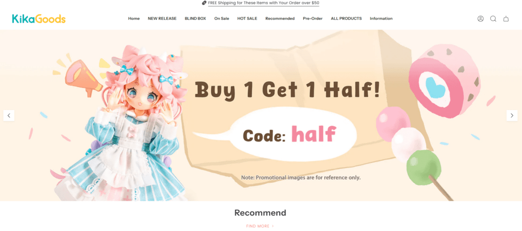
- Clear promotional messaging
- Soft, playful color palettes
- Product imagery that emphasizes texture and detail
Instead of overwhelming users, the hero section acts as a visual invitation.
Section-Based Storytelling
Rather than presenting products randomly, the homepage follows a modular storytelling structure:
- Recommended products
- New arrivals
- Buy-more-save-more sections
- Hot sales
- On-sale collections
- Curated recommendation blocks
Each section uses consistent spacing, typography, and image ratios, making the page easy to scan—even with a large amount of content.
Product Presentation Design
Designing for Collectibles, Not Commodities
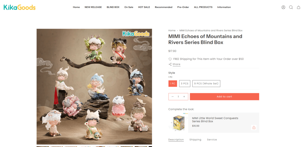
Designer toys require a different approach than standard retail products. We focused on presentation clarity and emotional context.
Product Card Design
Each product card was designed to:
- Showcase character details clearly
- Maintain consistent image proportions
- Highlight pricing and promotions without clutter
- Use subtle badges for “New,” “Hot,” or “Sale”
This consistency allows users to browse quickly without cognitive overload.
Visual Grouping and Collections
We grouped products not just by category, but by visual logic:
- Character themes
- Color palettes
- Limited collections
- Seasonal releases
This makes browsing feel intentional rather than transactional.
Promotional and Campaign Section Design
Making Promotions Feel Friendly, Not Aggressive
Many Shopify stores rely on heavy discount messaging that can cheapen the brand. For KikaGoods, we took a softer, design-led approach.
Campaign Sections
Promotions like:
- Free shipping thresholds
- Coupon codes
- Buy-one-get-one offers
- Lucky bags and blind boxes
were presented using illustrated graphics and friendly language rather than loud banners.
This approach preserves brand charm while still driving conversions.
Visual Hierarchy in Promotions
We used:
- Clear typography contrast
- Soft background colors
- Character illustrations instead of stock icons
This ensures promotions are noticeable without interrupting the shopping experience.
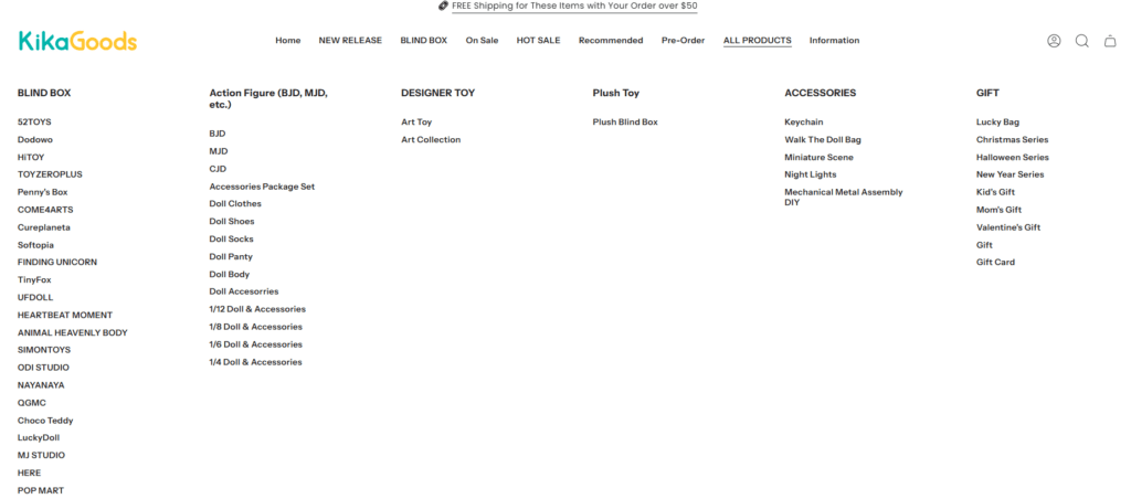
Navigation and Browsing Experience
Designing for Large Catalogs
KikaGoods offers a wide variety of SKUs. The challenge was to make exploration easy without overwhelming users.
Menu and Category Logic
We helped organize navigation around:
- Product types
- Collections
- Limited releases
- Special deals
The goal was to reduce the number of clicks needed to reach relevant products.
Scroll-Friendly Layouts
Instead of forcing users into multiple category pages, we designed long, scroll-friendly sections that encourage discovery—especially on mobile devices.
Mobile-First Page Design
Designing for How People Actually Shop
A significant portion of traffic comes from mobile users. Every section was designed with mobile behavior in mind.
Mobile Design Principles Applied
- Clear tap targets
- Stacked layouts for readability
- Lightweight visuals
- Short text blocks
- Consistent spacing
We avoided overly complex layouts that would break the browsing flow on smaller screens.
Visual Consistency and Brand Language
Building a Recognizable Design System
One of the biggest challenges with fast-growing brands is visual inconsistency over time. To prevent this, we established clear design rules:
- Consistent font usage
- Unified color logic
- Repeating layout patterns
- Predictable section spacing
This ensures that future updates remain visually aligned without requiring redesign.
Challenges and Design Solutions
Challenge 1: Large Product Volume
Problem: Hundreds of SKUs risked visual clutter.
Solution: Modular sections and strict product card rules kept layouts clean.
Challenge 2: Global Audience Trust
Problem: International customers need reassurance.
Solution: Clean layouts, clear pricing, and structured pages increased credibility.
Challenge 3: Balancing Fun and Usability
Problem: Overdesign could hurt usability.
Solution: We balanced playful visuals with strong layout discipline.
Results and Impact
After launching the redesigned Shopify pages, the brand achieved:
- Improved homepage engagement
- Longer average browsing sessions
- Clearer promotion communication
- Stronger brand perception
- A scalable design foundation for future growth
Most importantly, the website now reflects the joy and creativity of the products themselves.
Conclusion: Turning Design into a Growth Asset
This project demonstrates that great Shopify design is not about code or complexity—it’s about clarity, emotion, and structure.
By focusing on page design, visual hierarchy, and user experience, we helped transform KikaGoods’ Shopify store into a cohesive, high-impact digital storefront that supports both brand building and conversion.
At the end of the day, strong eCommerce growth starts with thoughtful design.
This is exactly the type of Shopify page design work we specialize in at AIRSANG—helping global brands translate their products, stories, and values into clear, conversion-focused visual experiences. If you’re looking to elevate your Shopify store through professional design strategy rather than technical complexity, our team is ready to help.


Design and build a WordPress website or corporate site with a full eCommerce system for you.
Price range: $200.00 through $2,500.00custom-requirements-or-special-quotations
Original price was: $2.00.$1.00Current price is: $1.00. Main Image Design for Amazon Home Physiotherapy Device Explained
Introduction: Building a Trustworthy Image for Home Therapy Devices on Amazon When designing the main image for a home therapy device on Amazon, our primary...

Main Image Design for Amazon Lipstick Conversion
Introduction: Designing a Lipstick Main Image That Sells on Amazon When we design a Main image for an Amazon lipstick, our responsibility goes far beyond...

What Makes an Amazon Liquid Foundation Main Image Convert
Introduction Designing a Main image design for Amazon Liquid foundation is never just about making a product look beautiful. On Amazon, the main image and...

Designing an Effective Amazon Main Image for Filter Cartridges
Introduction Designing a Main image for Amazon is never just about making a product look attractive. It is about clarity, trust, and instant understanding—especially for...

Five Pet WordPress Themes Compared
Introduction Choosing the right pet-related WordPress theme is more than a design decision—it directly affects usability, scalability, and long-term business growth. Pet care and pet...

Building a Scalable WordPress Website for a Science-Driven Brand: The AminoUSA Project
Introduction In today’s digital landscape, a website is more than a place to list products. For science-driven brands operating in regulated or research-focused industries, a...

Building a Scalable Shopify Store for a Global Blade Brand: The CoolKatana Project
Introduction In cross-border eCommerce, a Shopify website is more than a storefront.For brands operating in niche, culture-driven categories, the website must do far more than...

Designing a High-Conversion Shopify Store for Pokémon Cards
Introduction In the world of collectible eCommerce, especially within the Pokémon Trading Card Game (TCG) market, a website must do more than simply list products....

High-Converting Shopify Design for a Custom Brick Brand
Introduction In today’s competitive eCommerce landscape, especially in the personalized gift and collectible space, a Shopify website must do far more than display products. It...

Shopify Website Design Case Study for a Premium Floral Brand
Introduction In today’s competitive eCommerce landscape, a Shopify website must do far more than display products. It needs to communicate brand value instantly, guide users...

Shopify Design Case Study: Retro Gaming Store
Introduction In a highly competitive eCommerce environment, visual clarity and emotional connection often determine whether a visitor becomes a customer. This is especially true in...

Shopify Design Case Study: Tactical Rescue Brand
Introduction A strong Shopify website does more than display products—it communicates purpose, builds trust, and guides users toward confident purchasing decisions. This is especially true...

Shopify Website Design Case Study for an Electric Bike Brand
Introduction In today’s competitive electric bike market, a Shopify website must do more than display products—it must tell a story, build trust, and guide users...

Scalable Shopify E-commerce for a Creative Brand
Introduction When creative brands grow, their websites often struggle to keep up. As product lines expand, content increases, and traffic rises, many visually driven brands...

Shopify Website Design Case Study for a Home Decor Brand
Introduction In the highly competitive home decor market, visual identity is no longer just about aesthetics—it directly influences trust, browsing behavior, and purchasing decisions. For...

Building a Scalable WordPress Subscription Website Case Study
Introduction For modern e-commerce brands, a website is no longer just a digital storefront. It is the engine that supports subscriptions, content storytelling, trust building,...

High-Conversion WordPress Design for Adult Brands
Introduction In highly competitive eCommerce markets, strong visuals alone are not enough. A successful WordPress website must guide visitors through a clear, intentional journey—one that...

Scalable WordPress Sex Doll E-commerce Website
Introduction Launching a high-performing cross-border eCommerce website is never just about putting products online.For brands operating in highly competitive and visually driven markets, the website...