


Introduction
In highly competitive eCommerce markets, strong visuals alone are not enough. A successful WordPress website must guide visitors through a clear, intentional journey—one that builds trust, communicates value instantly, and reduces friction at every step. This becomes even more critical for brands operating in sensitive or highly regulated product categories, where user confidence and brand credibility directly influence conversion.
Joy Love Dolls is a premium adult lifestyle brand focused on realism, craftsmanship, and emotional connection. The challenge was not simply to display products, but to create a refined, trustworthy shopping experience that feels polished, discreet, and emotionally engaging—without overwhelming users or relying on aggressive tactics.
This case study explores how we approached the WordPress page design for Joy Love Dolls, focusing on structure, visual hierarchy, user flow, and brand storytelling. Rather than diving into technical development or code, this article highlights how strategic design decisions can transform a complex product catalog into a seamless, conversion-driven online experience.
| Deliver Time | Category | Application Platform |
| 25days | Sex doll | WordPress |
| Designers Involved | Cost | Effect |
| Lin Zhang | $2800 | Page views📈309% |
Understanding the Brand and Its Market Context
Before any layout decisions were made, we began by understanding the brand’s positioning and audience expectations.
Joy Love Dolls serves customers who prioritize:
- Product realism and quality
- Privacy, discretion, and trust
- Clear product differentiation
- A smooth, judgment-free shopping experience
Unlike mainstream fashion or consumer goods stores, adult lifestyle brands face unique UX challenges. Visitors often arrive with hesitation. If the site feels chaotic, overly aggressive, or unprofessional, users leave immediately.
Our design objective was to remove friction, replace uncertainty with clarity, and elevate the brand above low-trust competitors through clean WordPress design and intentional content structure.
Design Goals and Strategic Objectives
Core Design Goals
We defined four primary goals for the project:
- Establish Immediate Credibility
The homepage needed to communicate legitimacy, quality, and professionalism within seconds. - Simplify Product Discovery
With multiple collections and variations, navigation had to feel intuitive—not overwhelming. - Create Emotional Distance from “Adult Store” Stereotypes
The design had to feel modern and premium, avoiding visual clichés common in the category. - Support Conversion Without Pressure
Trust-based design would replace aggressive urgency tactics.
Our WordPress Page Design Process
Step 1: Information Architecture Planning
Before working on visuals, we mapped out how users should move through the site.
We asked:
- What does a first-time visitor need to see first?
- What information builds trust early?
- When should pricing and product details appear?
- How do we reduce decision fatigue?
This led to a clear hierarchy:
- Homepage → category confidence → product education → purchase reassurance
By defining this structure early, every design decision served a purpose.
Step 2: Homepage Design Strategy
Visual Hierarchy Above the Fold
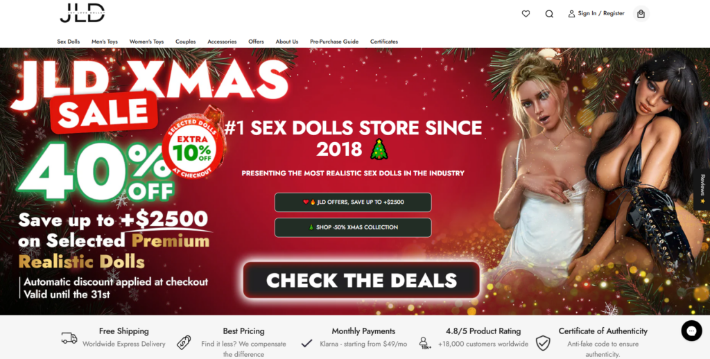
The homepage hero section plays a critical role in shaping perception. We avoided clutter and focused on:
- A strong headline emphasizing quality and realism
- Clean imagery with controlled contrast
- Clear call-to-action buttons without aggressive language
The goal was not to sell immediately, but to invite exploration.
Trust Signals Without Visual Noise
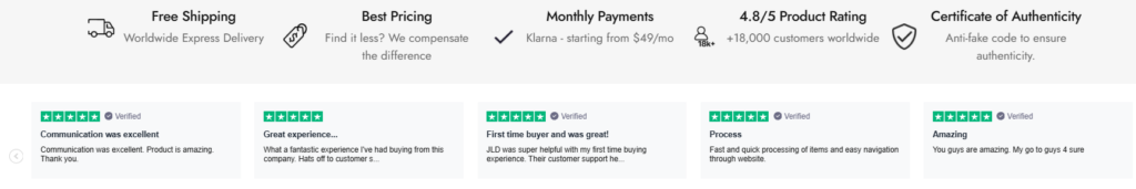
Rather than overwhelming users with badges or pop-ups, we integrated trust indicators naturally into the layout:
- Discreet guarantees
- Shipping reassurance
- Product quality messaging
This approach supports confidence without breaking immersion.
Step 3: Category Page Design for Clarity and Control
Category pages often determine whether users continue browsing or abandon the site.
Grid Layout and Visual Consistency
We designed product grids with:
- Consistent image ratios
- Predictable spacing
- Clear typography hierarchy
This allows users to scan quickly and compare products without cognitive strain.
Filtering Without Complexity
Instead of overloading filters, we prioritized the most important attributes. This reduces choice paralysis and helps users reach relevant products faster.
Step 4: Product Page Design That Educates and Reassures
Product pages are where hesitation peaks—especially for high-consideration items.
Structured Information Flow
Each product page follows a consistent reading order:
- Primary visual and product name
- Key differentiators and highlights
- Detailed descriptions and specifications
- Reassurance elements (shipping, privacy, support)
This structure mirrors how users naturally evaluate unfamiliar products.
Image-First Storytelling
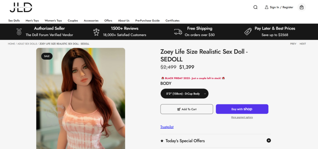
Imagery plays a central role in conveying realism and craftsmanship. We designed layouts that allow images to:
- Breathe visually
- Feel premium rather than sensational
- Support product understanding, not distract from it
Text complements visuals instead of competing with them.
Visual Language and Brand Tone
Color and Typography Choices
We selected a restrained color palette that supports:
- Emotional neutrality
- Brand maturity
- Long browsing sessions without fatigue
Typography prioritizes readability and confidence. Headlines communicate authority, while body text remains calm and informative.
Avoiding Visual Overstimulation
Many stores in this niche rely on excessive contrast and visual pressure. We deliberately took the opposite approach:
- Fewer accent colors
- More white space
- Balanced composition
This reinforces trust and keeps the focus on product quality.
Design Challenges and How We Solved Them
Challenge 1: Balancing Sensitivity and Transparency
Adult products require honesty, but too much explicitness can alienate users.
Our Solution:
We designed layouts that allow customers to explore details at their own pace. Information unfolds progressively, rather than appearing all at once.
Challenge 2: Large Product Range Without Overwhelm
With many similar products, differentiation becomes difficult.
Our Solution:
Clear visual grouping, consistent layout patterns, and concise highlights help users understand differences quickly without reading long descriptions.
Challenge 3: Building Trust Without Over-Explaining
Excessive reassurance can feel defensive.
Our Solution:
We embedded trust naturally into the design—through structure, tone, and clarity—rather than relying on repeated claims.
Results and Design Impact
After implementing the new WordPress page design, the site achieved:
- Improved visual consistency across all pages
- Clearer product discovery paths
- Stronger perceived brand credibility
- Reduced friction during browsing and decision-making
While performance metrics evolve over time, the immediate impact was a more confident, premium user experience aligned with long-term brand growth.
Why Design-First WordPress Strategy Matters
A WordPress store is not just a container for products—it is a brand experience.
When design leads the process:
- Users feel guided rather than pressured
- Products feel intentional rather than interchangeable
- Brands stand apart without competing on price alone
For sensitive or high-consideration categories, design is often the most powerful conversion tool available.
Conclusion
This project demonstrates how thoughtful WordPress page design can elevate a brand beyond its category norms. By focusing on structure, visual clarity, and user psychology, we helped Joy Love Dolls present its products with confidence, professionalism, and restraint—without relying on technical complexity or aggressive tactics.
At AIRSANG, we specialize in WordPress website design that balances aesthetics, usability, and conversion strategy. Our approach centers on clear structure, brand-aligned visuals, and scalable design systems that support long-term growth. If you’re looking to refine your WordPress presence through design-driven thinking, our team brings both creative clarity and commercial insight to every project.


Design and build a WordPress website or corporate site with a full eCommerce system for you.
Price range: $200.00 through $2,500.00Custom requirements or special quotations
Original price was: $2.00.$1.00Current price is: $1.00. Main Image Design for Amazon Home Physiotherapy Device Explained
Introduction: Building a Trustworthy Image for Home Therapy Devices on Amazon When designing the main image for a home therapy device on Amazon, our primary...

Main Image Design for Amazon Lipstick Conversion
Introduction: Designing a Lipstick Main Image That Sells on Amazon When we design a Main image for an Amazon lipstick, our responsibility goes far beyond...

What Makes an Amazon Liquid Foundation Main Image Convert
Introduction Designing a Main image design for Amazon Liquid foundation is never just about making a product look beautiful. On Amazon, the main image and...

Designing an Effective Amazon Main Image for Filter Cartridges
Introduction Designing a Main image for Amazon is never just about making a product look attractive. It is about clarity, trust, and instant understanding—especially for...

Five Pet WordPress Themes Compared
Introduction Choosing the right pet-related WordPress theme is more than a design decision—it directly affects usability, scalability, and long-term business growth. Pet care and pet...

Building a Scalable WordPress Website for a Science-Driven Brand: The AminoUSA Project
Introduction In today’s digital landscape, a website is more than a place to list products. For science-driven brands operating in regulated or research-focused industries, a...

Building a Scalable Shopify Store for a Global Blade Brand: The CoolKatana Project
Introduction In cross-border eCommerce, a Shopify website is more than a storefront.For brands operating in niche, culture-driven categories, the website must do far more than...

Designing a High-Conversion Shopify Store for Pokémon Cards
Introduction In the world of collectible eCommerce, especially within the Pokémon Trading Card Game (TCG) market, a website must do more than simply list products....

High-Converting Shopify Design for a Custom Brick Brand
Introduction In today’s competitive eCommerce landscape, especially in the personalized gift and collectible space, a Shopify website must do far more than display products. It...

Shopify Website Design Case Study for a Premium Floral Brand
Introduction In today’s competitive eCommerce landscape, a Shopify website must do far more than display products. It needs to communicate brand value instantly, guide users...

Shopify Design Case Study: Retro Gaming Store
Introduction In a highly competitive eCommerce environment, visual clarity and emotional connection often determine whether a visitor becomes a customer. This is especially true in...

Shopify Design Case Study: Tactical Rescue Brand
Introduction A strong Shopify website does more than display products—it communicates purpose, builds trust, and guides users toward confident purchasing decisions. This is especially true...

Shopify Website Design Case Study for an Electric Bike Brand
Introduction In today’s competitive electric bike market, a Shopify website must do more than display products—it must tell a story, build trust, and guide users...

Scalable Shopify E-commerce for a Creative Brand
Introduction When creative brands grow, their websites often struggle to keep up. As product lines expand, content increases, and traffic rises, many visually driven brands...

Shopify Website Design Case Study for a Home Decor Brand
Introduction In the highly competitive home decor market, visual identity is no longer just about aesthetics—it directly influences trust, browsing behavior, and purchasing decisions. For...

Building a Scalable WordPress Subscription Website Case Study
Introduction For modern e-commerce brands, a website is no longer just a digital storefront. It is the engine that supports subscriptions, content storytelling, trust building,...

Scalable WordPress Sex Doll E-commerce Website
Introduction Launching a high-performing cross-border eCommerce website is never just about putting products online.For brands operating in highly competitive and visually driven markets, the website...

Shopify Website Design for a Silicone Doll Brand
Introduction In highly competitive and visually sensitive eCommerce niches, website design is not just about aesthetics — it is about trust, clarity, emotional resonance, and...