


Introduction
In the highly competitive home decor market, visual identity is no longer just about aesthetics—it directly influences trust, browsing behavior, and purchasing decisions. For established lifestyle brands, a Shopify website must do more than display products. It needs to communicate atmosphere, guide users intuitively, and convert inspiration into action.
This case study explores how we supported the redesign and optimization of the Shopify storefront for Atmosphera, a well-known European home decor brand. Our role focused entirely on page design, visual structure, and user experience, helping the brand translate its offline identity and seasonal collections into a refined, conversion-oriented digital presence.
Rather than approaching this project as a technical rebuild, we treated it as a design system challenge—balancing brand warmth, commercial clarity, and scalable visual storytelling within Shopify’s framework.
| Deliver Time | Category | Application Platform |
| 24days | furniture | Shopify |
| Designers Involved | Cost | Effect |
| Lin Zhang、Peifon FU | $2700 | Sales revenue📈230% |
Understanding the Brand and Its Design DNA
A Lifestyle Brand Built on Atmosphere
Atmosphera operates in a category where emotional appeal is central. Customers don’t just buy furniture or decor items; they buy a mood, a lifestyle, and a sense of home. The brand’s offline identity emphasizes:
- Soft, neutral color palettes
- Seasonal storytelling (winter warmth, summer lightness, cozy interiors)
- Affordable design with an elevated feel
- A wide product catalog spanning rooms, styles, and price points
The challenge was translating this rich, tactile experience into a digital format that felt equally immersive—without overwhelming the user.
The Core Design Objective
From a design perspective, the primary goal was clear:
Create a Shopify homepage and supporting pages that feel calm, intuitive, and inspirational—while still driving product discovery and conversion.
This required careful control over layout density, visual rhythm, and hierarchy.
Design Challenges We Needed to Solve
1. Managing a Large Product Catalog Visually
With hundreds of SKUs across multiple categories, it was easy for the homepage to become cluttered. Too many brands fall into the trap of “showing everything at once,” which often leads to decision fatigue.
Design risk:
- Overloaded layouts
- Competing visual messages
- Weak product focus
2. Balancing Inspiration and Commerce
Atmosphera’s imagery is lifestyle-driven, but an e-commerce site must still guide users toward concrete actions.
Design tension:
- Editorial storytelling vs. commercial clarity
- Emotional visuals vs. functional navigation
3. Seasonal Campaigns Without Breaking Consistency
The brand regularly runs promotions and seasonal campaigns (e.g., Winter Days, discounts, collections). These needed to feel fresh—but never disconnected from the core brand identity.
Our Design-First Approach on Shopify
Design Before Layout, Strategy Before Sections
We began with a visual and structural audit, not a template swap. Before touching layouts, we asked:
- What does the brand want users to feel within the first 5 seconds?
- What is the ideal scrolling rhythm?
- Which elements should lead, and which should support?
This allowed us to design intentionally, rather than stacking Shopify sections without cohesion.
Homepage Design Strategy
Hero Section: Calm, Not Loud
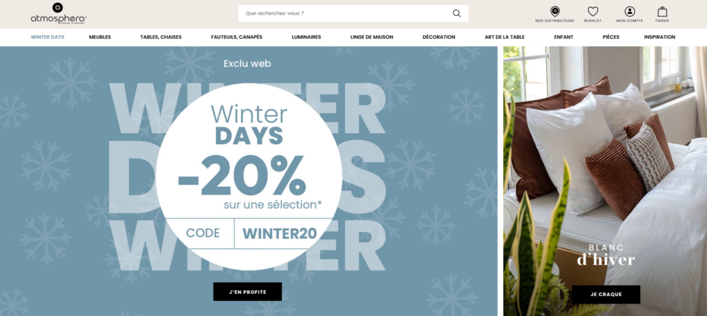
Instead of aggressive promotional banners, we designed the hero area to feel:
- Spacious
- Seasonal
- Emotionally aligned
The hero message communicates value without shouting. Typography remains soft and legible, while imagery sets the tone for the entire browsing experience.
Design principles applied:
- One clear message per screen
- Controlled contrast
- Minimal call-to-action buttons
Product Highlights: Curated, Not Crowded
Rather than flooding the homepage with products, we curated specific selections:
- Featured promotions
- Bestsellers
- Seasonal picks
Each product block follows a consistent visual system:
- Balanced spacing
- Predictable card structure
- Clear price and rating visibility
This approach helps users scan quickly while still feeling guided.
Lifestyle Banners as Visual Breathing Points
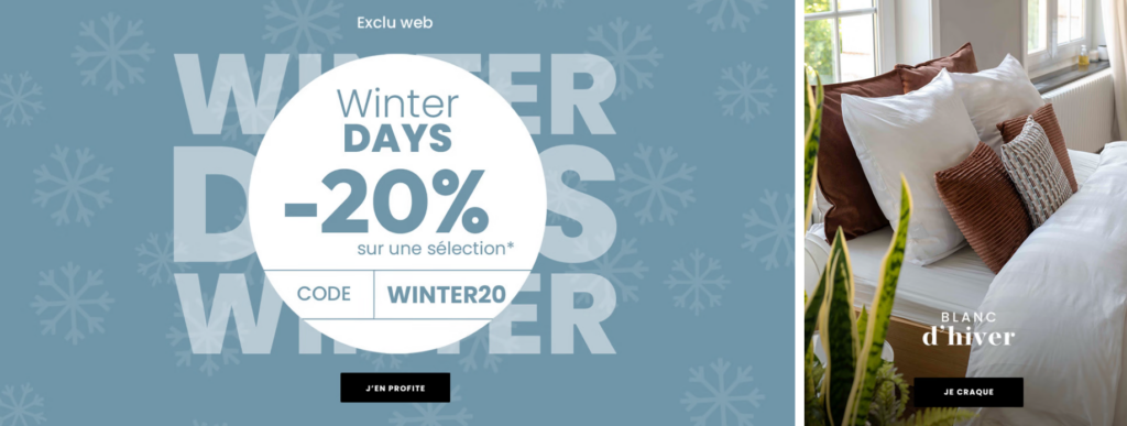
Large lifestyle sections were intentionally placed between product-heavy areas. These sections serve two purposes:
- Reinforce brand atmosphere
- Reset visual fatigue during scrolling
They also subtly guide users toward category exploration rather than immediate checkout pressure.
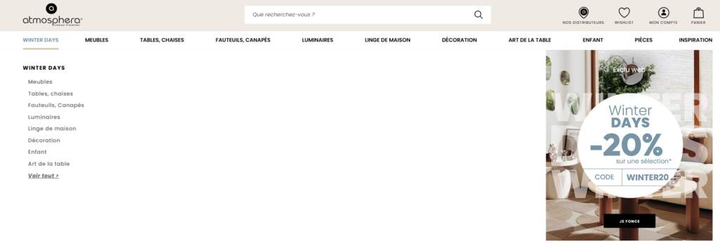
Category & Collection Page Design
Designing for Exploration
Category pages were treated as discovery spaces, not just product grids.
Key design considerations:
- Clear category naming
- Strong hero imagery per category
- Consistent filtering UI placement
By keeping layouts predictable, users feel confident exploring deeper into the catalog.
Visual Consistency Across Rooms and Themes
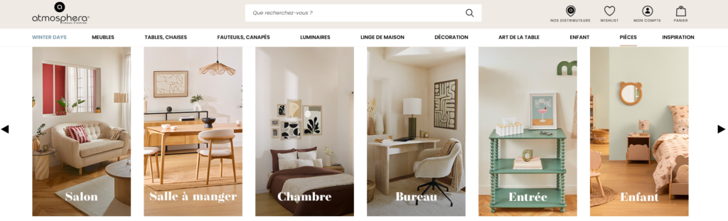
Atmosphera’s catalog spans living rooms, bedrooms, dining spaces, children’s rooms, and more. We unified these through:
- Consistent grid logic
- Repeating typographic styles
- Unified spacing rules
This ensures that even when styles change, the site experience feels cohesive.
Visual Hierarchy and UX Flow
Designing for Scrolling Behavior
Modern Shopify users scroll quickly. Our design accounted for this by:
- Using strong section headers
- Creating visual anchors every screen
- Alternating light and textured backgrounds
This creates a natural scroll rhythm that encourages longer sessions.
Clear CTA Without Aggression
Calls to action were intentionally subtle:
- “Shop Now”
- “Discover”
- “Explore the Collection”
These CTAs support browsing behavior rather than interrupt it.
Supporting Trust Through Design Details
Micro-UX Elements That Matter
Small design choices help build trust:
- Consistent iconography
- Clear delivery and return messaging
- Visual reassurance near product sections
These elements reduce friction without adding noise.
Brand Credibility Through Restraint
We avoided over-design. No unnecessary animations, no excessive badges. The confidence comes from clarity, not decoration.
Design System Thinking for Scalability
A Flexible Framework, Not a One-Off Page
One of the most important outcomes of this project was creating a repeatable design logic. The brand can now:
- Launch new collections easily
- Swap seasonal visuals without redesigning layouts
- Maintain consistency across campaigns
This design scalability is essential for long-term Shopify growth.
Results and Impact
A More Focused User Experience
After implementing the new design approach, the site achieved:
- Clearer product discovery paths
- Stronger brand storytelling
- Improved visual coherence across pages
While metrics evolve over time, the immediate impact was evident in:
- Longer browsing sessions
- Reduced visual clutter
- Stronger alignment between brand image and online experience
Why This Design Approach Works for Shopify Brands
This project demonstrates a key truth:
Strong Shopify performance starts with thoughtful design—not more features.
By focusing on:
- Visual hierarchy
- Emotional consistency
- User-centered layout decisions
brands can elevate their storefront without touching complex development or custom code.
Conclusion
Designing a successful Shopify website is not about following trends or adding more sections. It’s about understanding the brand, respecting the user’s attention, and creating a visual system that supports both storytelling and sales.
This project shows how a calm, intentional design approach can transform a large home decor catalog into a seamless, engaging shopping experience—one that feels inspiring, trustworthy, and easy to navigate.
At the end of the day, this is exactly the kind of Shopify design work we focus on at AIRSANG: helping brands translate their identity into high-performing, design-led storefronts that scale gracefully over time.
If you’re looking to refine your Shopify website through strategic page design, visual structure, and user experience—not heavy development—this is the approach we believe in.


Design and build a WordPress website or corporate site with a full eCommerce system for you.
Price range: $200.00 through $2,500.00Custom requirements or special quotations
Original price was: $2.00.$1.00Current price is: $1.00. Main Image Design for Amazon Home Physiotherapy Device Explained
Introduction: Building a Trustworthy Image for Home Therapy Devices on Amazon When designing the main image for a home therapy device on Amazon, our primary...

Main Image Design for Amazon Lipstick Conversion
Introduction: Designing a Lipstick Main Image That Sells on Amazon When we design a Main image for an Amazon lipstick, our responsibility goes far beyond...

What Makes an Amazon Liquid Foundation Main Image Convert
Introduction Designing a Main image design for Amazon Liquid foundation is never just about making a product look beautiful. On Amazon, the main image and...

Designing an Effective Amazon Main Image for Filter Cartridges
Introduction Designing a Main image for Amazon is never just about making a product look attractive. It is about clarity, trust, and instant understanding—especially for...

Five Pet WordPress Themes Compared
Introduction Choosing the right pet-related WordPress theme is more than a design decision—it directly affects usability, scalability, and long-term business growth. Pet care and pet...

Building a Scalable WordPress Website for a Science-Driven Brand: The AminoUSA Project
Introduction In today’s digital landscape, a website is more than a place to list products. For science-driven brands operating in regulated or research-focused industries, a...

Building a Scalable Shopify Store for a Global Blade Brand: The CoolKatana Project
Introduction In cross-border eCommerce, a Shopify website is more than a storefront.For brands operating in niche, culture-driven categories, the website must do far more than...

Designing a High-Conversion Shopify Store for Pokémon Cards
Introduction In the world of collectible eCommerce, especially within the Pokémon Trading Card Game (TCG) market, a website must do more than simply list products....

High-Converting Shopify Design for a Custom Brick Brand
Introduction In today’s competitive eCommerce landscape, especially in the personalized gift and collectible space, a Shopify website must do far more than display products. It...

Shopify Website Design Case Study for a Premium Floral Brand
Introduction In today’s competitive eCommerce landscape, a Shopify website must do far more than display products. It needs to communicate brand value instantly, guide users...

Shopify Design Case Study: Retro Gaming Store
Introduction In a highly competitive eCommerce environment, visual clarity and emotional connection often determine whether a visitor becomes a customer. This is especially true in...

Shopify Design Case Study: Tactical Rescue Brand
Introduction A strong Shopify website does more than display products—it communicates purpose, builds trust, and guides users toward confident purchasing decisions. This is especially true...

Shopify Website Design Case Study for an Electric Bike Brand
Introduction In today’s competitive electric bike market, a Shopify website must do more than display products—it must tell a story, build trust, and guide users...

Scalable Shopify E-commerce for a Creative Brand
Introduction When creative brands grow, their websites often struggle to keep up. As product lines expand, content increases, and traffic rises, many visually driven brands...

Building a Scalable WordPress Subscription Website Case Study
Introduction For modern e-commerce brands, a website is no longer just a digital storefront. It is the engine that supports subscriptions, content storytelling, trust building,...

High-Conversion WordPress Design for Adult Brands
Introduction In highly competitive eCommerce markets, strong visuals alone are not enough. A successful WordPress website must guide visitors through a clear, intentional journey—one that...

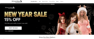
Scalable WordPress Sex Doll E-commerce Website
Introduction Launching a high-performing cross-border eCommerce website is never just about putting products online.For brands operating in highly competitive and visually driven markets, the website...
Shopify Website Design for a Silicone Doll Brand
Introduction In highly competitive and visually sensitive eCommerce niches, website design is not just about aesthetics — it is about trust, clarity, emotional resonance, and...