Can overly complicated homepage navigation make it harder for customers to find products? Yes, but the problem is not a fixed number of menu items. It is whether customers can understand categories based on their tasks, find the next step, and reliably reach their destination on a phone. Putting every product, industry, news item, and company detail in the top-level navigation may appear comprehensive, but it can force visitors to understand your internal organization before they know your brand. This article offers a testable way to organize navigation for independent websites with multiple product lines, export-oriented B2B websites, and brand websites. It focuses on product discovery. For the relationship between homepage content and inquiries, first read about B2B homepages and inquiry paths .
How to Tell When Navigation Is Too Complicated
Attention above the fold is limited. Visitors usually arrive with a specific question: find a product, compare ranges, check suitability, or contact sales. If top-level menu labels use internal terminology, several entries lead to the same products, or every hover opens columns of dense text, customers have to guess where to start. Bounce rate alone cannot establish that this hesitation is happening. More reliable evidence includes user testing, menu click paths, site search terms, and repeated customer feedback about being unable to find something.
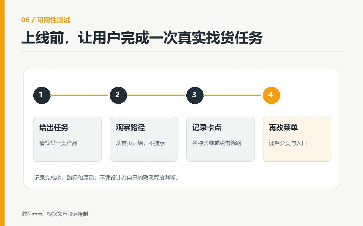
Start with three target tasks, such as finding protective products by application, looking up parts by model, or finding replacement accessories. Ask someone unfamiliar with the website to begin on the homepage without guidance. Record their first menu choice, backtracking, use of search, and completion time. If several participants hesitate at the same category name, examine naming and hierarchy before adding animation or enlarging the menu. Baymard Institute research on main navigation and product categories emphasizes that navigation should give users a reasonable expectation of the product range and that category organization affects product exploration.
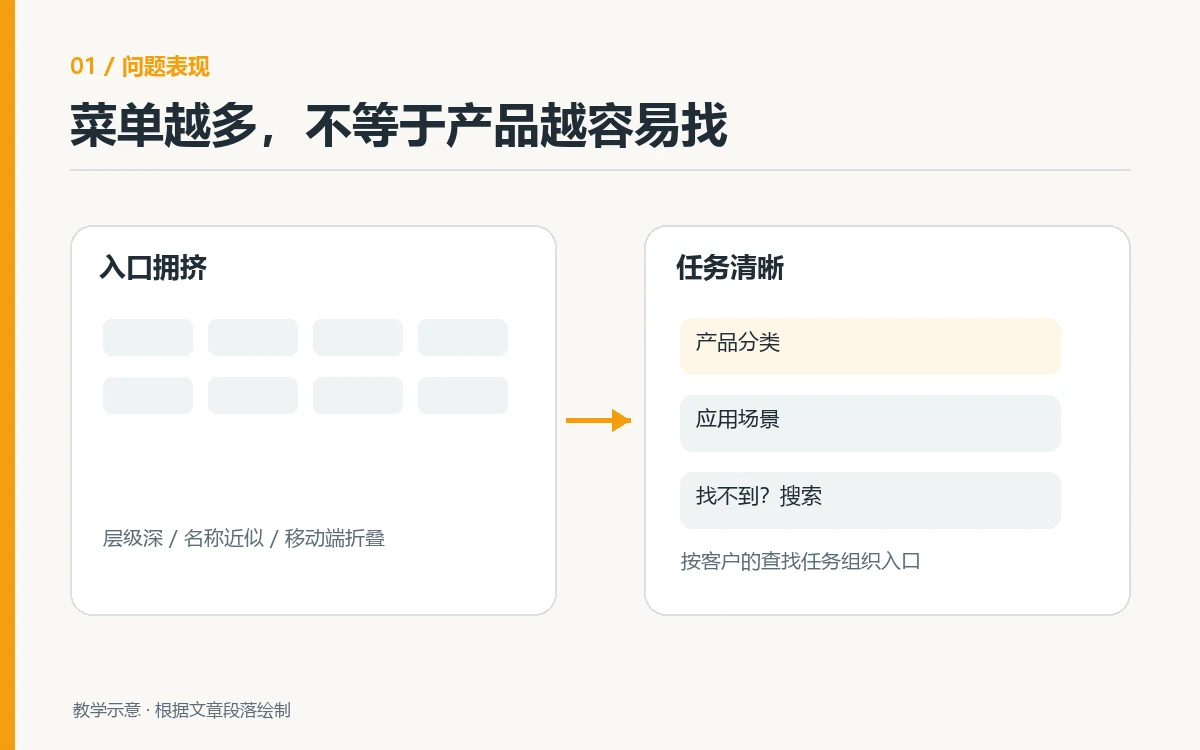
Group by Customer Tasks Before Choosing Menu Levels
Top-Level Menus Answer Where to Start
Top-level navigation does not need to list every page. Product websites can reserve prominent entries for Products, Solutions or Applications, Case Studies or Resources, About Us, and Contact. Actual labels should reflect the business and its users’ language: an industrial parts website might benefit from Find by Equipment Model, while a home furnishings brand might use Shop by Room. First-time visitors should be able to predict what a click will show. Avoid abstract terms such as Capability Center or Ecosystem Matrix that require explanation. Nielsen Norman Group’s menu design checklist also evaluates understandable labels and quick scanning.
Use a real product list for card sorting when deciding top-level entries. Ask target customers to group items in ways that make sense to them and compare their labels. Do not simply copy your organizational chart into navigation. On a furniture website, some people look for sofas, tables and chairs, or lighting, while others browse by living room or bedroom. Both approaches can complement each other, but avoid mixing many overlapping labels at the same level. An existing home furnishings catalog case study shows how room themes can connect to a furniture catalog. It is a design example, not a model every website should copy.
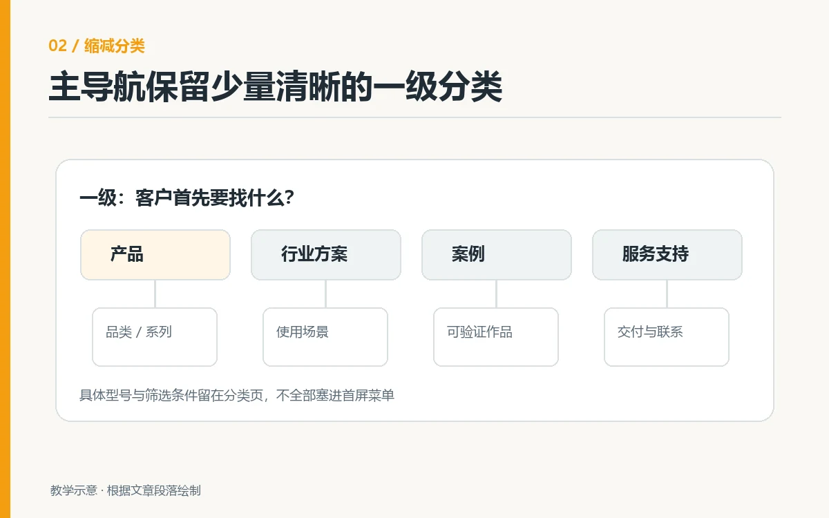
Submenus Provide a Predictable Next Step
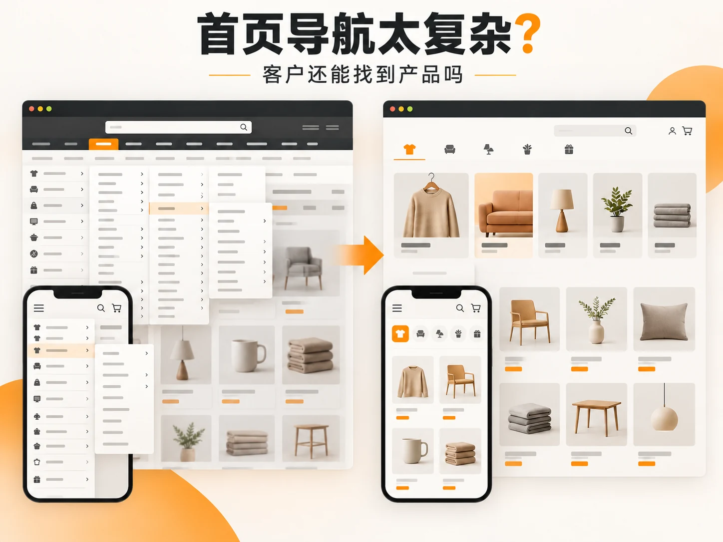
When an entry contains too many products, divide its submenu using one consistent dimension, such as product type, application, material, or model. Do not unexpectedly mix event news, a message from the general manager, and specific SKUs in the same column. After opening Products, users can scan recognizable items more easily under headings such as By Application and By Product Type than in an ungrouped list. If two category names are easily confused, add a brief explanation or use familiar product terms instead of relying on icons to communicate meaning.
For B2B purchasing, both models and applications may matter. Keep both entry points if needed, but lead them to a catalog with cross-filtering rather than maintaining two inconsistent sets of product pages. See the industrial parts case study on application categories and model verification to understand this need for two browsing paths.
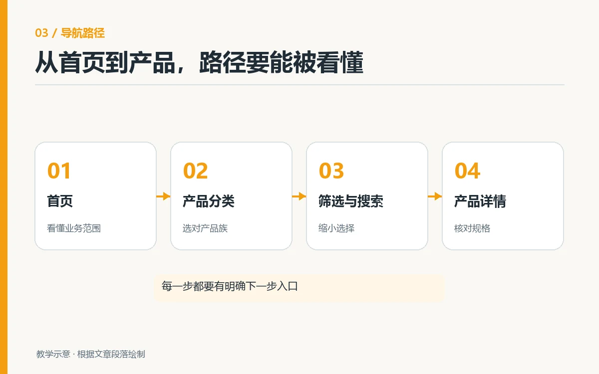
Check Desktop and Mobile Separately
Desktop layouts have room for grouped menus, but mega menus should not obscure the page, trigger accidentally on hover, or make pointer movement difficult. Menus should not disappear when users move from a main entry to a submenu. Touchscreen laptops must also work without relying exclusively on hover. Focus indicators must be visible, and keyboard users must be able to enter, navigate, and exit menus. Collapsed items still need clear link destinations; they should not become unlabeled decorative icons.
On mobile, avoid simply shrinking the desktop mega menu. Small screens show fewer items at once, and deeper hierarchies make returning and finding your location harder. Start with a few clear top-level categories and reveal subcategories on tap. Keep a visible return path and current section name. On product pages, check that users can easily reopen category navigation. The mobile illustration is a teaching example, not a screenshot of a real client project. Before launch, manually complete all three target tasks at common phone widths and on touch devices.
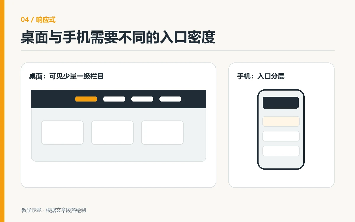
How Navigation, Site Search, and Breadcrumbs Work Together
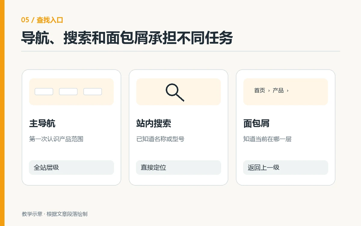
Navigation supports exploration, search serves people who already know a name or model, and breadcrumbs help visitors understand their position in the catalog. They do not replace one another. If users must remember a SKU to find a product, improve the categories. If a large catalog returns no search results for models or alternate names, menus alone cannot solve the problem. Repeated site search terms often reveal user language missing from the menu. Search entry points should be consistent on the homepage and product pages, and results should distinguish products, articles, and no-result states.
Breadcrumb labels should match catalog names. Avoid calling a menu Industrial Materials and then showing Product Category Three in the breadcrumb. A product used in several applications does not need duplicate content just to support breadcrumbs. Choose a primary path and provide links to other relevant applications within the page. Breadcrumbs do not replace the browser’s Back button, and page hierarchy should not become a maze.
What to Change First: Prioritize User Tasks
The following table is an editorial diagnostic tool. Its priorities are methodological suggestions, not fixed conversion-rate findings from any industry. Base actual changes on site click data and visitor testing records.
| Observed Situation | Potential User Difficulty | First Change to Make |
|---|---|---|
| Similar top-level labels | Cannot predict which entry to click | Merge duplicate entries and use familiar labels |
| Too many ungrouped submenu items | Hard to scan; products are easy to miss | Group by one dimension and add short category descriptions |
| Repeated backtracking on mobile | Current level or return path is unclear | Show the current section and a Back button, and shorten common paths |
| Search returns no results for synonyms | Users know the product but cannot find its page | Add synonyms, alternate names, and cross-links in the catalog |
Begin with the most obvious obstacle in the most frequent task. Rename one confusing group of entries, adjust one catalog level, and then verify mobile behavior and search results. Change only a few key structures at a time so you can identify what helped. If the product catalog itself is disorganized, clean up product data first. Even an attractive menu will otherwise lead users to the wrong pages.
How to Verify That Customers Can Find Products Before Launch
Ask target users to find a specific product from the homepage, find a series they can request a quote for by application, and return from a product page to its parent category. Record success, entry points used, pauses, and search use. Test on both desktop and mobile. If a visitor does not recognize an industry abbreviation, record the words they actually use. Qualitative observation explains more than menu click counts alone: many clicks can indicate either active exploration or getting lost. Do not claim that a button increased inquiries without a comparison.
After the redesign, repeat the same three tasks and compare whether the paths are clearer. Check that important category pages remain accessible through internal links and that old catalog URLs redirect correctly. Navigation changes also affect crawling paths and page discovery, so review sitemaps, major category page titles, and unreachable pages. If a homepage redesign is also planned, evaluate navigation testing alongside brand design from the homepage to product pages , but record their acceptance criteria separately.
Conclusion: Judge Navigation by Product-Finding Tasks
Overly complicated homepage navigation can slow down customers looking for products. Unclear category names, confusing hierarchies, difficult mobile backtracking, and missing search all increase decision effort. The solution is not to mechanically reduce the menu to a particular number. Identify the most common customer tasks, organize entry points in language they understand, provide a predictable catalog structure, and test it on both desktop and mobile. Record successful paths, hesitation points, and products users could not find so the redesign has concrete acceptance criteria.