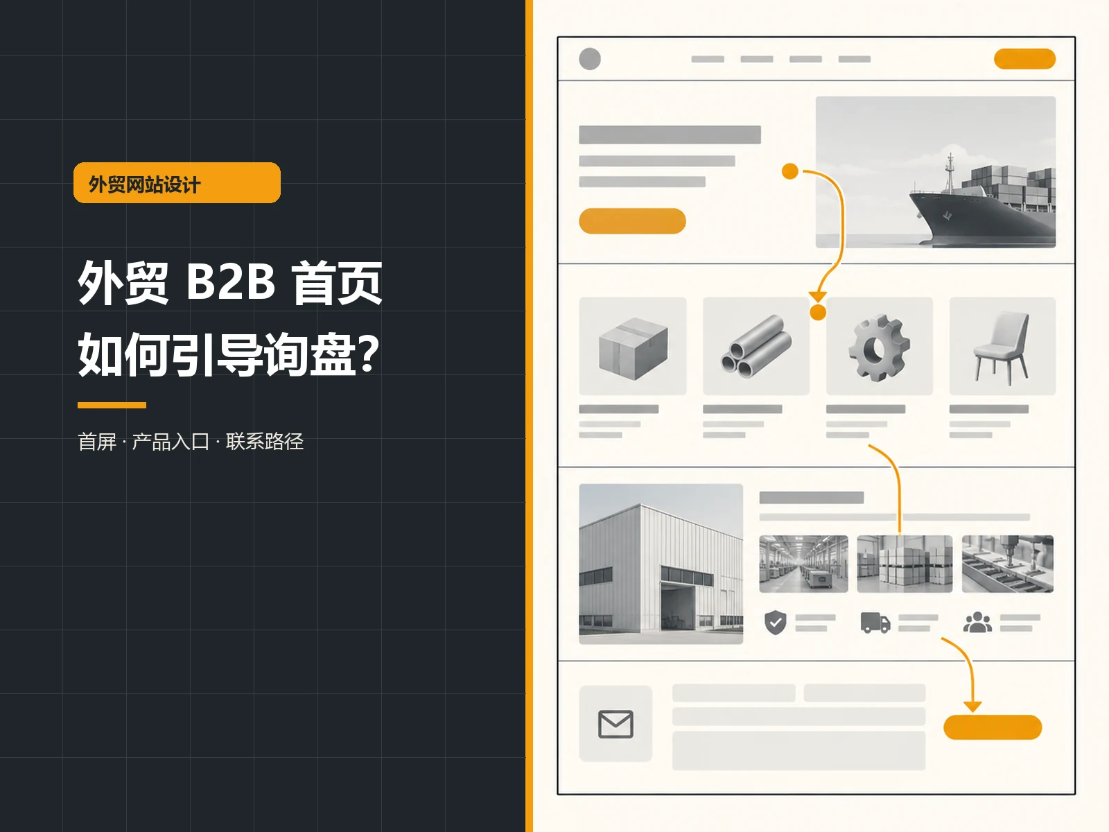
The primary problem to be solved on the homepage of the foreign trade B2B official website is not to put all the company’s information on the first screen, but to allow buyers to judge: what do you supply, whether it can meet my purchasing conditions, why it is worthy of further understanding, and where to click next. An effective home page is usually like a clear purchasing navigation: first talk about the objects and capabilities, then give access to products and applications, then show verifiable evidence, and place the inquiry path where readers need to take action. The following structure is an editorial suggestion, not a formula guaranteed to increase customer inquiries; it should be adjusted according to industry, product and procurement process.
Answer “Who are you and what can you solve for whom” first on the first screen
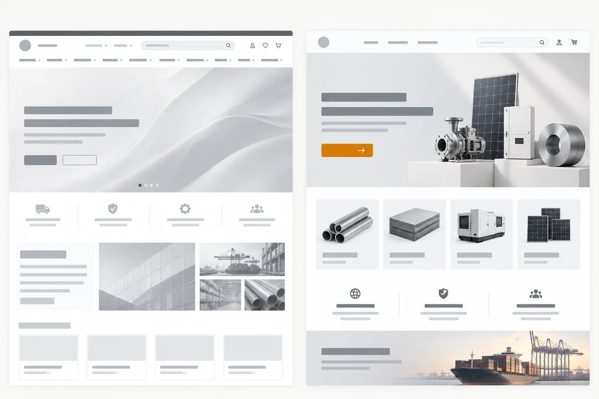
Buyers may go directly to the homepage from the search results, or they may be sent a link by the salesperson. It is best for the above-the-fold title to include the product category, service recipients, and main value, rather than just a general slogan such as “Innovation leads the future.” Subtitles may supplement capacity range, materials, processes or delivery markets, but must be facts that the business can substantiate. The main button leads to the product catalog, solution or inquiry entry, and the button copy should explain what will happen after clicking.
The above-the-fold image should also serve positioning. If industrial parts are supplied, real product applications or authorized production scenes are often better at helping to identify the business than irrelevant city skylines; if the company provides customized production, a diagram of the process from drawings to finished products may be more explanatory. Nielsen Norman Group’s homepage design principles Emphasize clearly communicating the purpose of the site, using relevant images, and making navigation easy to discover. It is a general UX guide, not a conversion rate proof for a certain foreign trade website.
Product entry should be organized according to purchasing tasks
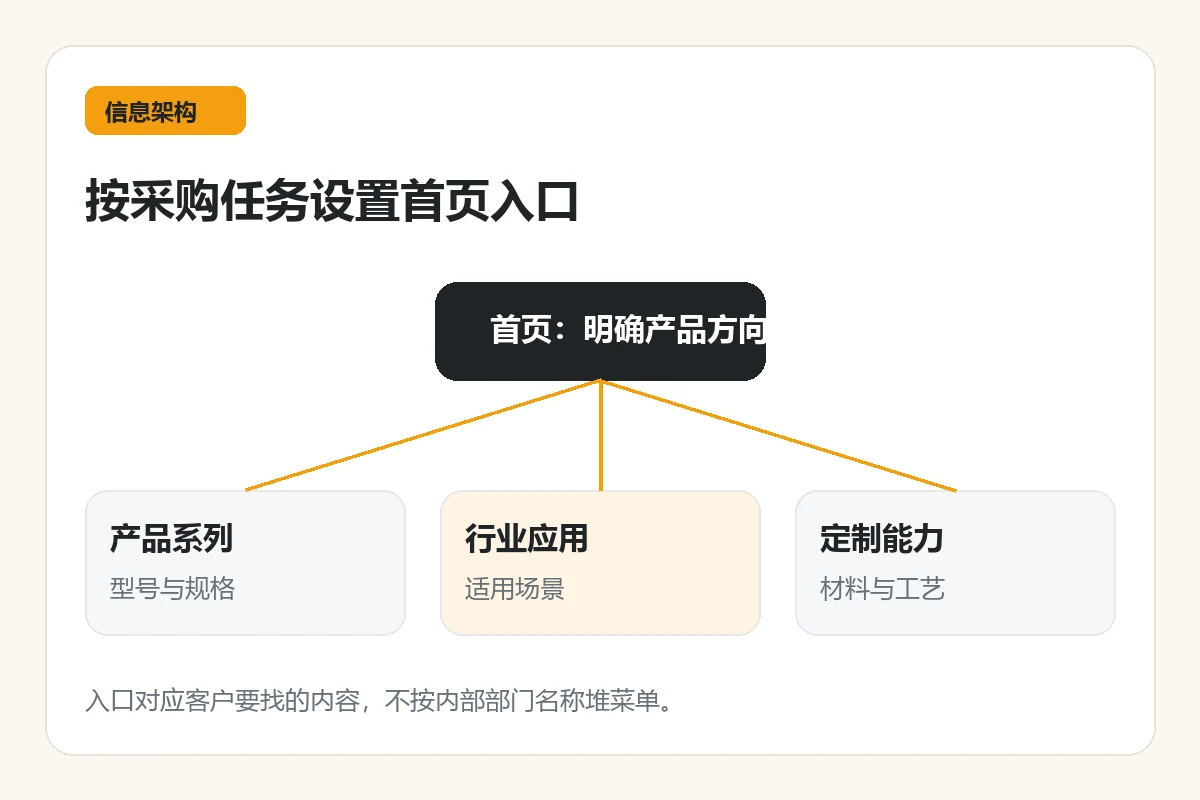
Don’t name your homepage navigation just by internal departments. Buyers are more likely to be looking for product type, industry application, material process, specification range or customization capabilities. Using the most common tasks as entry points reduces the time spent guessing between “About Us” and “Product Center.” For example, standard product companies can give priority to displaying product series and key parameters, while custom manufacturing companies may need to “submit drawings”, “select materials”, “view process capabilities” and other entrances. Specific tags should come from real customer questions rather than copying peer menus.
Each product card should at least have a clearly visible name, purpose, and next step link. The homepage doesn’t have to be filled with all SKUs; its job is to send people to a catalog or product detail page where they can filter, compare, and view specifications. If the company serves both dealers and terminal buyers, it can consider clearly dividing the traffic in the navigation or the next section of the first screen, but do not require users to answer a lengthy questionnaire before they can browse basic information.
Turn “credible” into inspectable evidence
“Professional”, “high quality” and “global leading” are not enough to help buyers verify supply capabilities. Authorized factories, equipment, testing processes, product specifications, application cases and real certifications can be displayed, but each item should be able to be clicked to see instructions or original certificates. Unauthorized customer logos, untraceable certificate images, or unconfirmed “countries served” numbers should not appear just to fill the space. If the information has not yet been made public, you can specify what samples, drawings or test documents can be provided during the communication stage.
The evidence should be close to the claim it supports. When introducing material consistency, include testing or quality control data; when introducing customization capabilities, disclose the process flow and project boundaries; when introducing export experience, explain the service market and the applicable scope of compliance documents. This way the reader can move from statement to verification. Cases can illustrate project challenges, resolution processes, and actual deliverables, but client names, photos, and results data must be authorized and documented.
A table to check whether the home page module has completed the task
The module sequence below is an editable wireframe and is not required for every company to copy. Use “Procurement Questions” to decide whether you want this module first, and then decide on page evidence and link targets. The differences between standard products and customized products should also be compared within the same caliber.
| module | What does the buyer need to confirm? | Exhibitable Evidence and Access | Common misunderstandings |
|---|---|---|---|
| Above the fold positioning | Do you supply the categories I need? | Clarify the title, related product images, and product catalog entry | only abstract slogans |
| Products/Programs | What are the specifications or customization range? | Series, applications, materials and details links | Only product photos |
| Proof of ability | Can it be delivered as requested? | Verifiable equipment, process or quality information | Unsourced numbers and certifications |
| Inquiry path | How to send purchasing requirements | Clarify the contact button and required information | Only vague Contact Us remain |
This table is a design checking tool for this article, not actual measured data from peers. Delivery markets, FAQs, or resource downloads can be added during actual production, but each additional module should answer a clear question and have relevant next steps. It is not the original sin that the homepage is too long; it is the actual reading difficulty that readers cannot find the catalog and inquiry entrance.
Standard products and customized products: How are the homepage paths different?
Standard product catalog type
Buyers often want to quickly confirm models, specifications, inventory or delivery conditions. The homepage allows them to first select a series or application, then enter a filterable list, and finally view product details and inquiry methods. If the price is not public, it should also be made clear whether bulk inquiries are available and what specifications and quantity information is required. Don’t hide important parameters in download-only images; the basic information should be readable on the web page.
Customized production type
Buyers are more concerned about whether they can process certain materials, sizes, precision or complex processes. The home page should show the boundaries of capabilities and explain the steps from submitting drawings, assessing feasibility, proofing to confirming orders. The “process” here must be consistent with the company’s real services, and it cannot be assumed that every factory provides design or sample services. The action portal can be called “Submit Requirements” or “Consultation Process” and inform visitors what materials to prepare; when sensitive drawings are involved, uploading and communication arrangements should also be explained.
Both paths can coexist, but the entrance labels must be clear. Don’t write “View spot specifications” and “Upload drawings for customization” as the same “Learn more” in order to pursue a unified vision. Readers know what to expect on the next page, so they have a reason to keep browsing.
The inquiry button should point to an action that can be completed
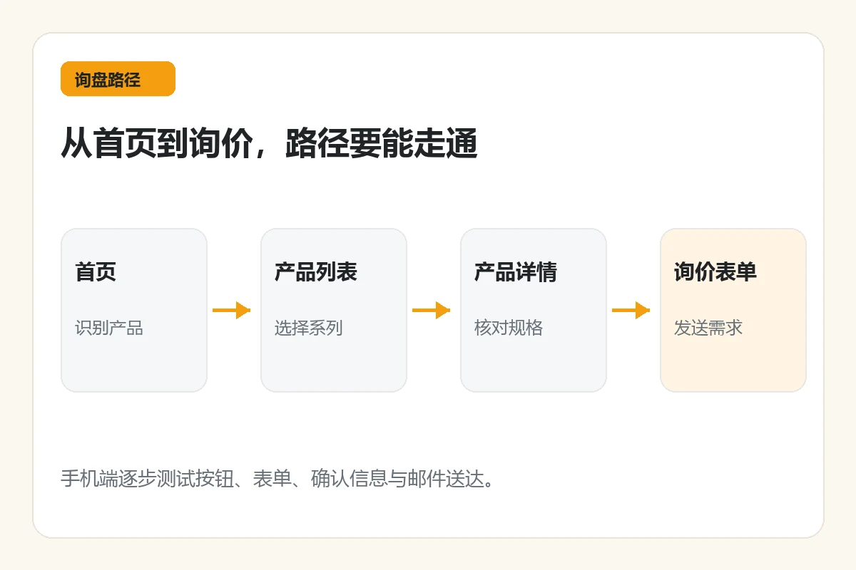
The homepage can provide contact entrances on the first screen, product area and at the end of the article, but these buttons should point to the same set of clear processes to avoid one jumping to the email, one opening a chat, and another going to a blank form. Explain to users the product models, quantities, target markets, drawings or delivery dates that need to be provided, and allow those who cannot determine all conditions to ask questions first. The homepage is only responsible for people finding the correct entrance; product details, form fields, background records and email delivery are the next stage. Relevant operational inspections can be further read Improve Website Inquiries: Product Pages, Forms, and Email Delivery 。
You should also test each path: whether you can click on the product series from the homepage to get to the correct list; whether you can return or continue to inquire from the product detail page; whether the form can be completely filled in after entering from the mobile phone; whether the confirmation information after submission is clear. Recording the actual obstacles and then changing the copy or layout is more reliable than increasing the number of buttons based on feeling. If the company does not yet have a CRM, it should at least confirm who will send the customer inquiry and who will handle it during what working hours; do not promise an unguaranteed response time on the page.
The mobile version and loading experience should also be checked
Many teams only review the homepage on a large screen, but narrow screens may fold key entrances, squeeze product card text together, or push tables and images off the screen. During the review, use a real mobile phone or a suitable mobile testing tool to check section by section: whether the title is complete, whether the buttons are easy to click, whether the product can be found in the navigation, and whether the contact form is blocked. Product photos should be clear, but basic loading experience should not be sacrificed for high-resolution footage.
Once the page is live, you can continue to tweak the module using real visitor questions and website behavior. If users often ask about a certain specification, consider adding a reminder to the homepage entrance or product list; if inquiries often lack key information, add a preparation list next to the CTA. Don’t regard a revision as the permanently correct homepage structure, and don’t directly claim that layout changes are the reason for the increase in customer inquiries.
Conclusion: Let buyers find the answer step by step
The design of the foreign trade B2B homepage focuses on clear positioning, stratification by procurement tasks, demonstrating verifiable capabilities, and bringing readers to the appropriate product or inquiry page. For standard products, we give priority to letting people find the series and parameters, and for customized products, we give priority to clarifying the boundaries of capabilities and the method of submitting requirements. The module table in this article can be used as a revision checklist, but it should be adjusted based on the company’s real information and procurement questions. If you plan to redo the homepage, you can first sort out the product catalog, frequently asked questions about purchasing, and publicly available supporting materials, and then refer to Website design services , please AIRSANG conduct a home page information structure diagnosis; whether it can bring more customer inquiries should be verified with real data after going online.