
Website design considerations begin not with choosing a premium-looking style, but with ensuring users can understand the business, find products, assess credibility, and submit an inquiry without obstacles. An attractive homepage may still hide key specifications on category pages or push the contact button off a mobile screen. Acceptance checks should cover multiple pages and real tasks, rather than approving launch from a homepage screenshot alone. This article gives teams building or redesigning an export website a practical review route. All wireframes and before-and-after suggestions below are educational illustrations, not evidence of a completed AIRSANG client project.
Define user tasks before deciding on visual design
Before drawing pages, define three specific tasks: how long a first-time buyer takes to understand what you sell; whether someone with a known model can find specifications and compatibility information; and whether someone ready to contact you knows what to submit next. Timing here means an internal test record, not a promise that every user will finish within a fixed number of seconds. If distributors and end consumers are both audiences, identify separate entry points rather than forcing different buying journeys into one navigation path.
Map tasks to the homepage, categories, products, and contact page. The homepage establishes positioning and routes; categories narrow choices; products answer suitability and trust questions; contact pages reduce communication effort. Designers use this to organize hierarchy, while business owners verify the wording. Google’s SEO Starter Guide emphasizes helping users understand and navigate content. We translate that into design checks, not a claim that a particular layout guarantees rankings.
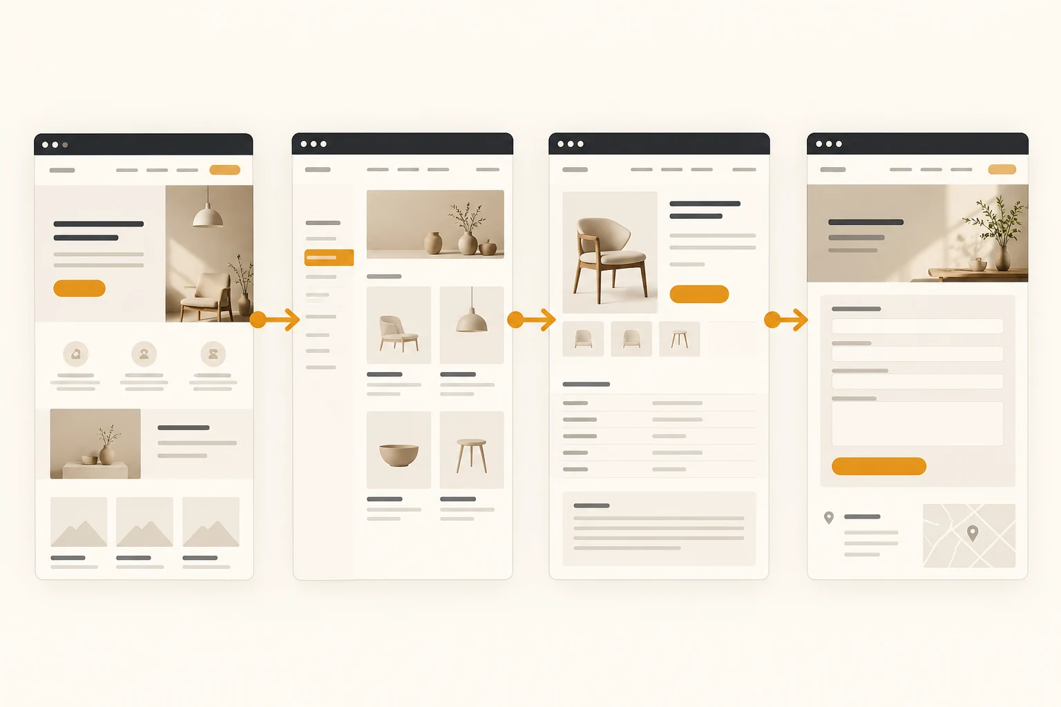
If your team has not settled its brand expression, first read brand identity design methods for independent websites to clarify the value proposition and visual tone. This article then explains how that information works across pages.
Homepage: explain the audience, value, and next step above the fold
The main heading answers What is this? Supporting text answers Who is it for?
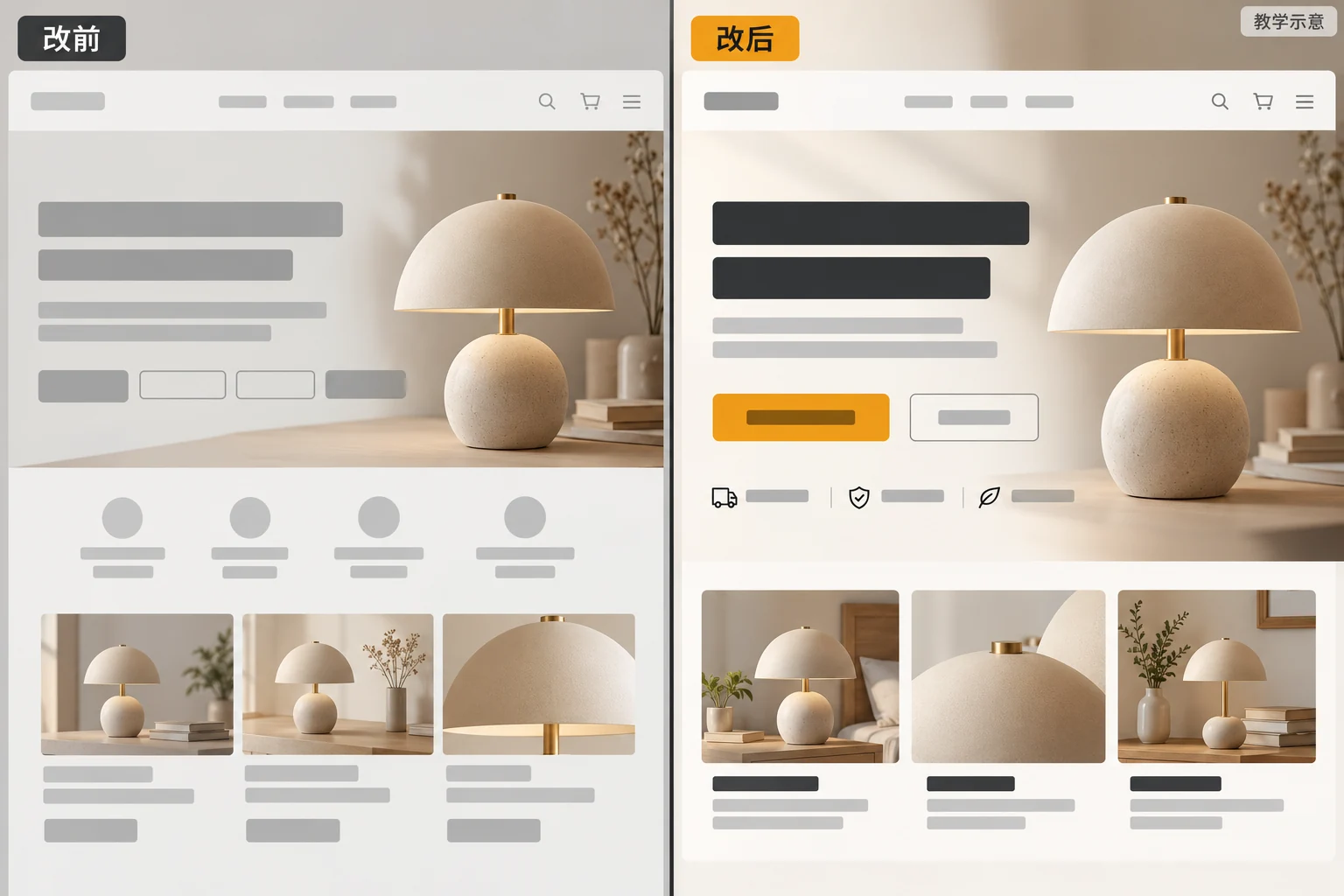
Use business-specific language in the main heading, avoiding generic phrases such as Innovative solutions that do not identify the industry. Supporting copy can explain product scope, audiences, or delivery regions, but exclude unverified certifications, lead times, and market coverage. The main visual should show a product use case, a real service process, or a clear educational illustration. Abstract decoration cannot replace essential information. A quick glance should reveal whether the next step is browsing categories, downloading materials, or contacting the team.
Give the primary button a clear task
Match the main action to the content. New visitors may need View product categories; visitors with specifications may need Submit requirements. Button wording should describe the result of clicking, rather than labeling every card Learn more. Secondary buttons can exist without competing equally for attention. If multiple business areas must appear, group them by user task before choosing card quantity and order, rather than putting everything into a carousel.
Homepage navigation is a separate issue. If category levels are excessive, consult the homepage navigation complexity checklist and test actual product-finding tasks rather than deleting menus based solely on appearance.
Categories and products: build information that supports comparison
A category is more than a row of attractive thumbnails. For products requiring careful selection, cards should distinguish at least series, uses, key specifications, or intended users. Filters should match real customer questions. If buyers first ask about dimensions, materials, or certifications, New and Popular should not be the only filters. Results, empty states, and sorting labels also need clear copy. This structure depends on complete product data; do not conceal missing data behind polished mockups.
Product information usually follows this order: identify the product, assess fit, understand differences, inspect details, and take the next step. Organize images, specifications, delivery information, and inquiries around that journey. Group complex technical data for scanning instead of packing every field into one long image. If inventory or pricing is not synchronized live, state its scope and update time. Mark unverifiable information as awaiting confirmation instead of inventing numbers in a mockup.
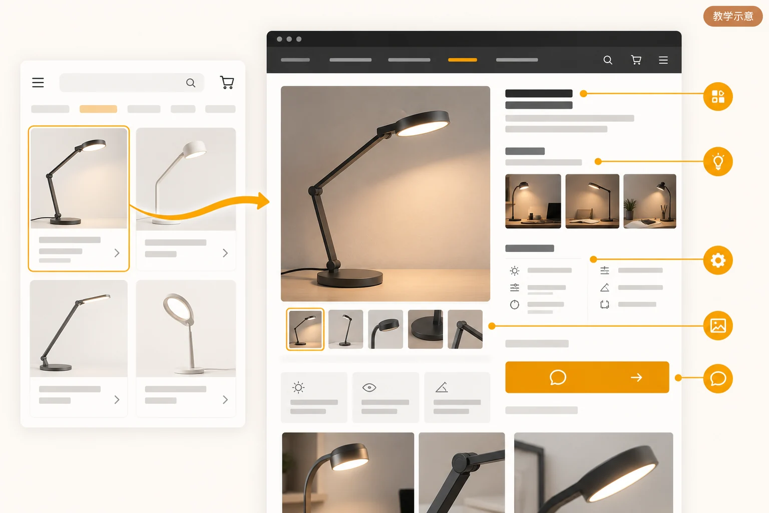
Consistency across pages matters too. Use the same specification names on category cards, product details, and inquiry forms. Explain terms such as MOQ or minimum order quantity on first use. Google’s navigation and internal-link guidance supports discoverability, but card density and visual sequence still depend on your products and user testing.
Layout and typography: help readers quickly find decision evidence
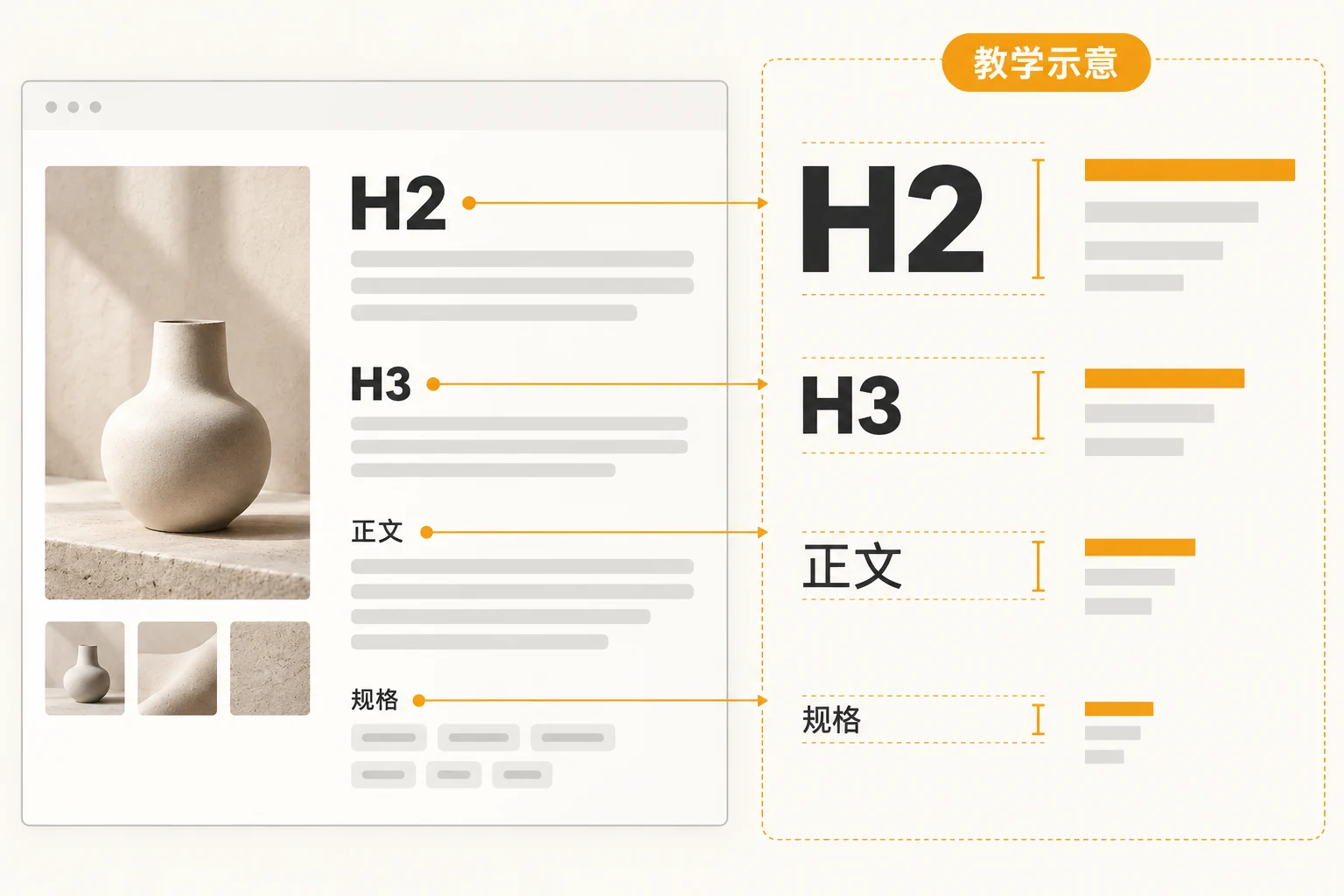
Consistent typography does not mean every passage is the same size. Headings convey hierarchy, body text supports continuous reading, and labels provide secondary information. Do not rely on tiny pale-gray text as the only sign of refinement. Purchasing conditions, specification limits, and delivery coverage are decision-making content and must be readable. Check paragraph width, line spacing, and whitespace across languages and devices. Mixed Chinese, English, and numbers can cause button wrapping and broken units that static mockups do not reveal.
W3C WAI’s page structure tutorial explains that sensible page regions and heading levels support navigation and understanding. Review both visual hierarchy and actual HTML headings. Text that looks like a subheading but is only a bold paragraph may not be recognized as a section by assistive technology. This is an accessibility and maintainability check, not a claim that one heading tag solves all accessibility issues.
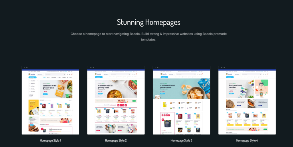
When choosing a template, inspect component constraints rather than only its homepage screenshot. The website design template selection guide helps compare editable areas, structural fit, and maintenance. Here we focus on checking the actual pages after selection.
Mobile design reorders tasks rather than shrinking desktop layouts
A phone’s first screen may hold only a heading, part of an image, and one action. Check that the most important information remains first, filters are findable, specification tables readable, and the on-screen keyboard does not cover the next step. Inspect tablets separately: three desktop columns can become two cramped columns, affecting navigation and text length simultaneously.
Do not rely on fixed-width screenshots. Narrow the browser and enlarge text to check for clipped sentences, overlapping buttons, or whole-page horizontal scrolling. W3C’s explanation of Reflow provides the background for assessing content rearrangement. Local elements requiring two-dimensional presentation, such as data tables, may scroll horizontally, but the entire page should not drift sideways. The design should tell developers which blocks wrap first and which reorder at each breakpoint.
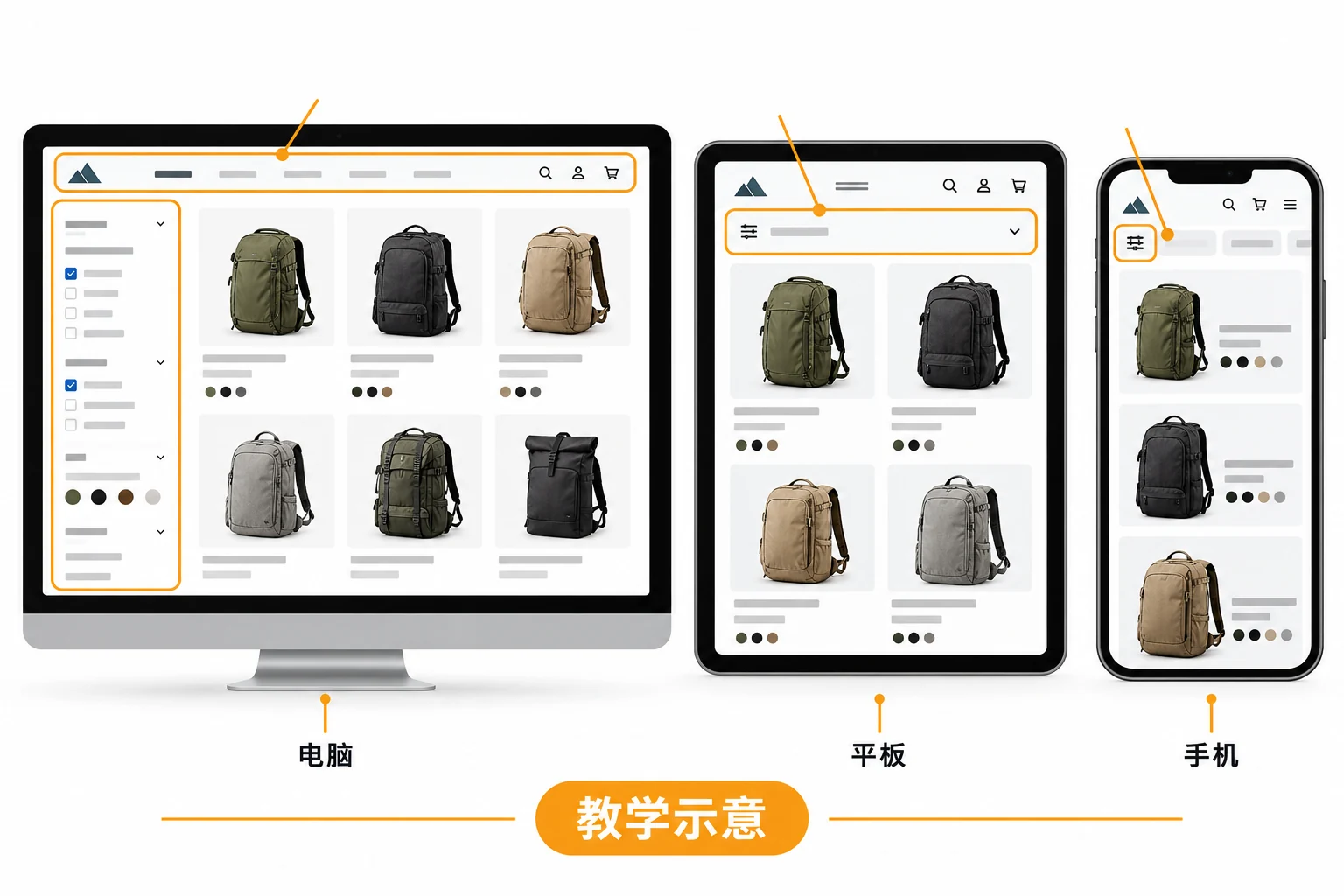
Test touch interaction, keyboard navigation, and form labels too. W3C WAI’s labeling tutorial recommends identifiable labels for input controls. Placeholders cannot replace field names because they disappear after typing. Errors should identify the problem and explain the correction. The shortest inquiry form is not necessarily best: collect the information needed to start communication, leaving other details for follow-up.
Compare visual appeal and usability with one acceptance table
Both statements can be true in a review: the mockup looks more sophisticated, and users cannot find things. Instead of debating preferences, test both proposals against the same tasks. The table is a teaching framework, not a standard industry score or real client test results. Add your actual test records, devices, and responsible people to each row.
| Task | What visual-only reviews may miss | Suggested task-based acceptance check |
|---|---|---|
| Understand the business | Attractive hero image, but unclear target audience | Ask a first-time visitor to describe the products, audience, and next step |
| Find a product | Neat cards, but missing essential filters | Complete a search by model or application |
| Check suitability | Clear product images, but hard-to-scan specifications and limits | Identify conditions, differences, and the inquiry entry point |
| Complete an inquiry | Prominent button, but unclear form fields | Fill it out on a phone and check error feedback |
Designers can own hierarchy and state designs, business staff the accuracy of product information, developers interaction and responsive implementation, and reviewers task-completion records. Keeping an attractive module or removing a decorative image then has a reason that can be discussed rather than merely a personal preference.
Walk through multiple pages before launch
Use real content, then test unusual states
Populate pages with realistically long names, specifications, and image ratios. Test an extra-long heading, a product without stock information, and filters returning no results. Check layout stability in each case. For multilingual pages, replacing Chinese with English is not enough: review navigation width, number formats, delivery-region wording, and link destinations page by page. Do not present unpublished translations or unconfirmed market promises as existing capabilities.
Turn the checks into handover materials
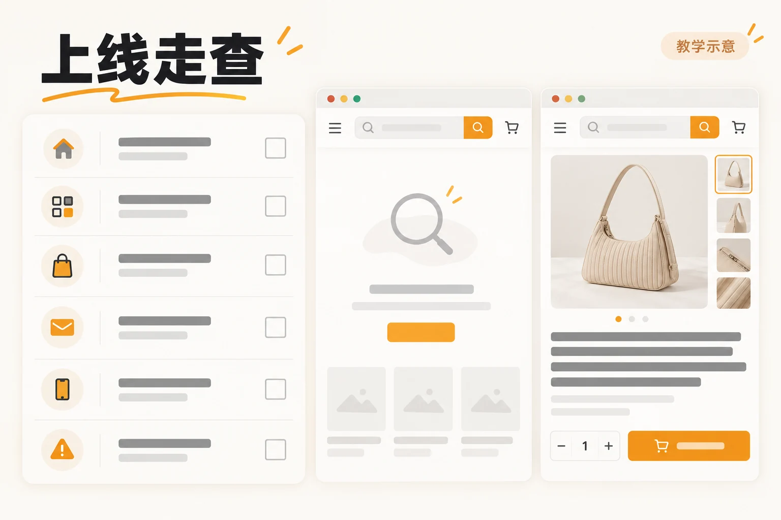
Keep a page inventory, core tasks, desktop/tablet/phone layouts, important component states, actual content sources, and unresolved issues. A design walkthrough is not a one-time acceptance screenshot. After launch, use real inquiry feedback, internal searches, and FAQs to update priorities, but mark items Awaiting observation when no data exists. If still preparing a proposal, include these checks in the website design proposal requirements checklist so design and development share the same scope.
Conclusion: make tasks achievable before refining expression
Website design checks form a sequence: define tasks, allocate information across homepage, categories, products, and contact pages, align headings, specifications, actions, and structure, then walk through the site on phone, tablet, and desktop. Visual choices should support understanding, comparison, and inquiries rather than make visitors guess. Before redesigning, choose the most important product-finding or inquiry journey, ask an unfamiliar person to complete it, and record where they get stuck. Give that evidence to design and development to decide the next changes.