









Project overview
In GOODA FRICTION’s WordPress website, we organize pages around “Application Classification and Part Model Check”. We explain the application range of friction plates next to the product combination diagram, so that buyers can first understand the product direction, and then enter the machinery type and specific model. Through dark blue titles, orange highlights, white background industrial product images and compact information groups, the brand theme, specific content and follow-up communication are arranged at different levels, allowing visitors to continue to understand the project along a clear path.
| Services | Industry | Platform |
| WordPress website design and construction | Machinery manufacturing | WordPress |
| Project requirements | target market | design style |
| Application classification and part model check | Based on the current display language and business scope of the customer’s website | Dark blue title, orange emphasis, industrial product diagram and compact information group on white background |
| Project quotation | Delivery content | Delivery time |
| ¥5,700 | Home page, product categories, product details, contact page and responsive page design | 13 days |
design challenge
We need to give the brand expression and specific information of the industrial friction pad website their own place. Focusing on application classification and part model verification, the page should not only explain the content direction, but also allow visitors to find the next step. We arranged the overall theme, subdivided content and communication areas in layers to prevent different tasks from being crowded on the same screen.
Design strategy: application classification and part model verification
Explain the topic first, then go into the specific content
We explain the application range of friction plates next to the product combination diagram, so that buyers can first understand the product direction, and then enter the machinery type and specific model. The home page organizes precision manufacturing, quality control, OEM/ODM and supply services into icon groups, followed by mechanical application categories; we allow capability descriptions and product entrances to occupy one layer each.
Connect pages with fonts, colors, and white space
Roboto and Montserrat in page styles provide the font basis for titles and text; we establish hierarchy through font size, font weight and paragraph width. Dark blue titles, orange highlights, industrial product images on a white background, and compact information groups run throughout the main page, with wide spacing between columns, and the same information group connecting images and descriptions with a tighter distance.
Make the entrance close to the current reading task
We have arranged the table of contents, detailed instructions and contact entries in their own page context. When browsing, scroll through the page to expand the content section by section, and navigation links connect different pages; the entry copy and location jointly explain the next step, keeping reading and operation connected.
Home page: Application classification and part model check
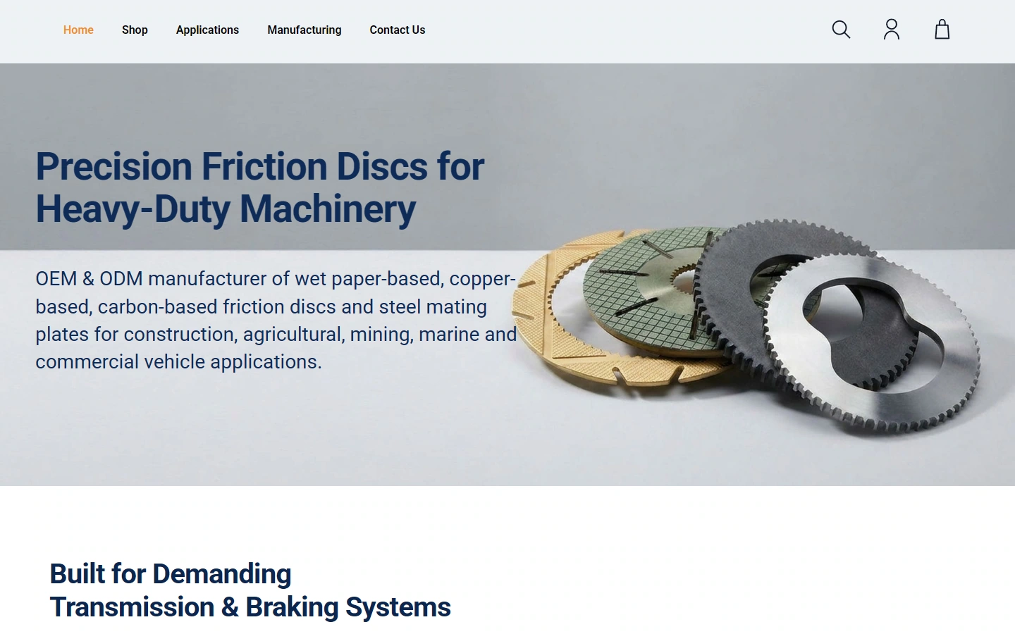
We explain the application range of friction plates next to the product combination diagram, so that buyers can first understand the product direction, and then enter the machinery type and specific model.
This screen establishes identification with a dark blue title, orange accents, industrial product images on a white background, and compact information groups. Thematic text is kept adjacent to the main entrance, and pictures, titles, and supplementary descriptions are separated by scale and spacing to keep the first layer of information focused.
Home page content: Organize different topics separately
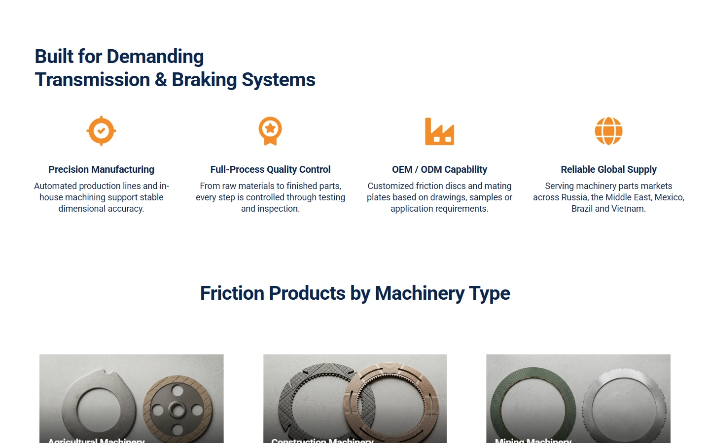
Our homepage organizes precision manufacturing, quality control, OEM/ODM and supply services into icon groups, followed by mechanical application categories; we allow capability descriptions and product entrances to occupy one layer each.
We use module boundaries and image and text alignment to establish a reading order: the content within the group is kept compact, and pauses are maintained between groups to make the direction of column switching and continued browsing clear and discernible.
Product Classification: Establish a clear comparative order for the catalog
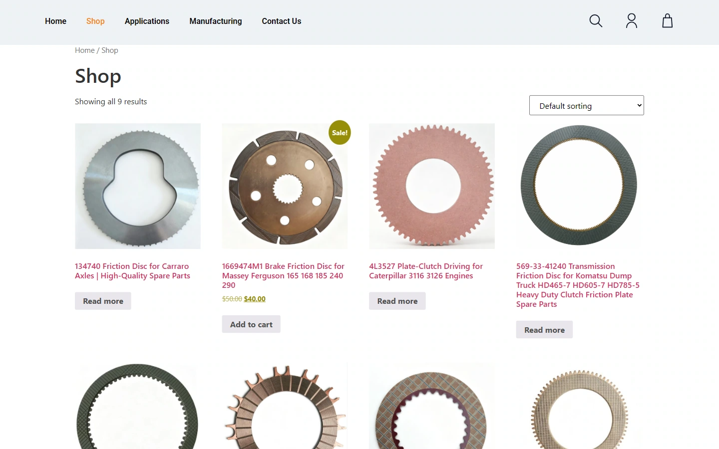
Our catalog uses a uniform white background grid to present friction plates with different tooth shapes, openings and materials. The names and operation entrances remain in fixed positions to reduce reading jumps caused by differences in product appearance.
This page follows the dark blue title, orange emphasis, industrial product image on a white background, and compact information grouping. We use the difference in word weight between the title and the main text to indicate the priority, connect the same group of information with an alignment relationship, and distinguish different tasks through white space to maintain visual continuity across pages.
Product Details: Keep images adjacent to product information
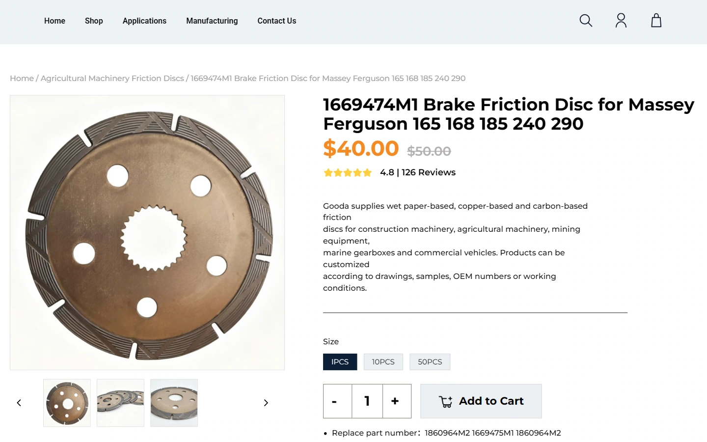
The large picture of our friction plate is juxtaposed with the model, price and specification options. The key numbers are in orange; the relevant fields are close to the operation area to facilitate verification of the identity of the parts.
This page follows the dark blue title, orange emphasis, industrial product image on a white background, and compact information grouping. We use the difference in word weight between the title and the main text to indicate the priority, connect the same group of information with an alignment relationship, and distinguish different tasks through white space to maintain visual continuity across pages.
Details: Continue the checking sequence of single product information
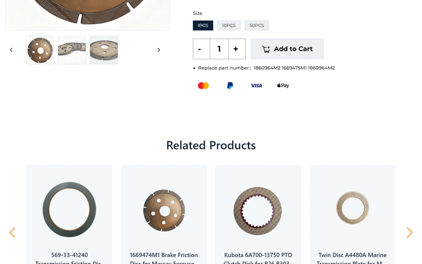
We keep product descriptions, supplementary images, and related content continuing along the page. The information in the current screen is organized around the same product, and the main information and auxiliary content are distinguished by their respective areas.
Longer descriptions are grouped using subtitles and paragraph spacing, with space for images and text; the same text level connects the product information above, so that reading downwards does not have to readjust to another layout.
Contact page: Give communication information a clear place
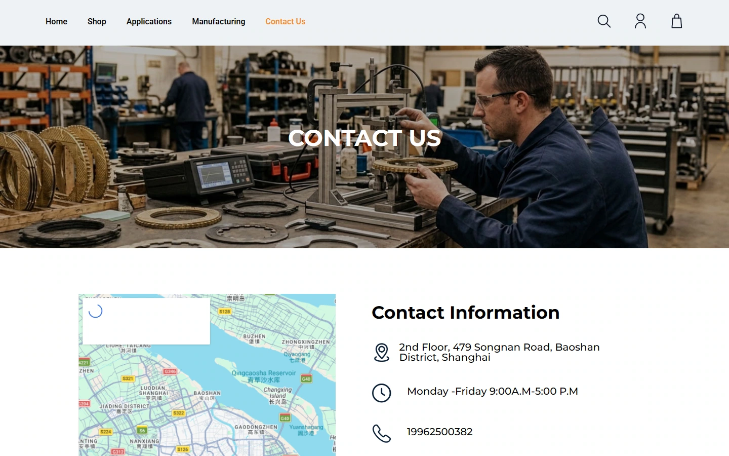
Our contact page uses the factory scene as the title background, and the map and contact information are presented side by side below; the factory context and the actual communication entrance are connected on the same page.
This page follows the dark blue title, orange emphasis, industrial product image on a white background, and compact information grouping. We use the difference in word weight between the title and the main text to indicate the priority, connect the same group of information with an alignment relationship, and distinguish different tasks through white space to maintain visual continuity across pages.
Mobile homepage: reallocate space according to narrow screen
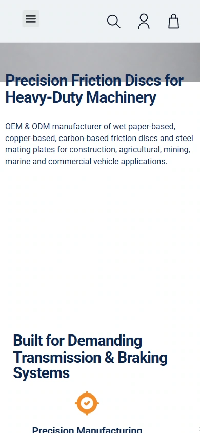
On mobile, we expand the images, titles, and descriptions on the homepage to the currently available width. The image retains the brand identity and the actual content of the corresponding page, and is arranged vertically so that each set of information has an independent reading area.
We maintain hierarchy through title wrapping, image scale, and white space between groups, so that the main content is seen first, and subsequent instructions appear in order; the top navigation is transformed into an entry form suitable for narrow screens, continuing the color and text language of the desktop.
Mobile phone product details: reallocate space according to narrow screen
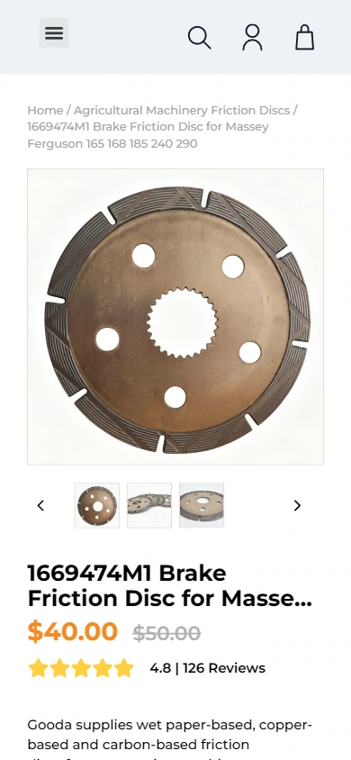
On mobile, we expand the images, titles, and descriptions in product details to the currently available width. The image retains the brand identity and the actual content of the corresponding page, and is arranged vertically so that each set of information has an independent reading area.
We maintain hierarchy through title wrapping, image scale, and white space between groups, so that the main content is seen first, and subsequent instructions appear in order; the top navigation is transformed into an entry form suitable for narrow screens, continuing the color and text language of the desktop.
Design summary: Let different pages unfold around the same path
In GOODA FRICTION’s website, we use application classification and part model verification as clues for content organization, using dark blue titles, orange highlights, white background industrial product diagrams and compact information groups to connect different pages. The home page establishes direction, the inner pages carry specific information, and the mobile layout continues to retain the same reading level, allowing brand identification and business content to remain consistent.
Plan a clear WordPress website for your brand
You can provide us with your existing website address, brand materials and required page range, and together we can sort out the content, visuals and functions suitable for your business.