Introduction
In today’s competitive health and wellness market, a brand’s website must do more than showcase products—it must communicate trust, clarity, and scientific credibility while delivering a seamless shopping experience. For supplement brands like Sports Research, design plays a critical role in translating product efficacy into user confidence.
This project focused on crafting a Shopify storefront that balances clean aesthetics with conversion-driven structure. By aligning visual storytelling with user intent, we transformed the browsing journey into a guided path toward purchase, ensuring that every design decision contributes to clarity, engagement, and long-term brand trust.
| Deliver Time | Category | Application Platform |
| 25days | Dietary Supplements | shopify |
| Designers Involved | Cost | Effect |
| Nancy | $2600 | Turnover📈215% |
Understanding the Brand and Its Market Position
Before diving into layout and visuals, we began by analyzing the brand’s positioning within the supplement industry.
A Brand Built on Trust and Science
Sports Research emphasizes:
- Scientifically backed ingredients
- Transparent sourcing
- Performance-driven results
These pillars required a design language that feels:
- Clean and clinical, but not cold
- Professional, yet approachable
- Informative without overwhelming
Target Audience Insights
The core audience includes:
- Fitness enthusiasts
- Health-conscious consumers
- Individuals seeking preventative wellness
These users typically:
- Compare multiple products
- Look for proof (certifications, reviews)
- Prefer quick access to key benefits
Design Goal: Reduce friction and increase confidence through clarity-first design.
Homepage Design Strategy
The homepage acts as the brand’s first impression and must immediately communicate value.
Hero Section: Instant Credibility and Clarity
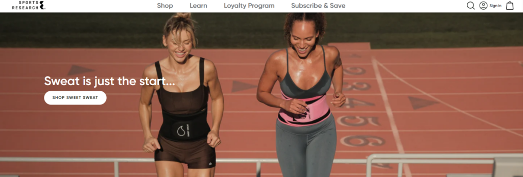
We designed a hero area that:
- Highlights flagship products
- Uses lifestyle-driven imagery (fitness, vitality, daily routines)
- Includes concise benefit-focused messaging
Instead of overwhelming users with dense text, the hero focuses on:
- One key message
- One primary CTA
- Strong visual hierarchy
Product Categorization for Fast Navigation
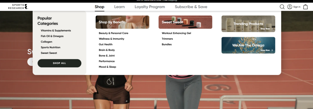
To improve usability, we structured product categories into:
- Vitamins & Supplements
- Collagen Products
- Sports Nutrition
Each category is presented with:
- Clear icons or imagery
- Short descriptors
- Quick-access links
This allows users to immediately identify where they belong.
Trust Signals Integrated Early

Rather than hiding credibility elements deeper in the site, we placed them prominently:
- Certifications (non-GMO, third-party tested)
- Customer reviews
- Brand claims (e.g., quality sourcing)
These elements reduce hesitation within the first few seconds.
Product Page Design: Turning Information into Conversion
Product pages are where design directly impacts sales performance.
Structuring Information for Scannability
We organized product pages into clear sections:
- Key benefits (top-level highlights)
- Ingredients breakdown
- Usage instructions
- Customer reviews
This layered approach allows users to:
- Quickly scan
- Dive deeper when needed
Visual Hierarchy and Content Balance
Instead of long paragraphs, we used:
- Bullet points
- Icons
- Section dividers
This improves readability and keeps users engaged.
Lifestyle Imagery for Emotional Connection
We incorporated imagery that shows:
- Real-life usage scenarios
- Active lifestyles
- Wellness routines
This bridges the gap between product features and real-world benefits.
Design System and Visual Language
Consistency across the site is essential for brand recognition and usability.
Color Strategy
We used a palette that reflects:
- Health (greens, neutrals)
- Energy (accent tones)
- Cleanliness (white space dominance)
The goal was to:
- Maintain a clinical feel
- Avoid looking sterile or overly technical
Typography Choices
Typography was selected to:
- Ensure readability across devices
- Support hierarchy (headlines vs body text)
- Reinforce professionalism
We avoided overly decorative fonts to maintain clarity.
Iconography and Micro-Visuals
Custom icons were used to represent:
- Benefits
- Certifications
- Product features
These small details:
- Improve comprehension
- Add visual rhythm
- Reduce reliance on text
Designing for Conversion: UX Principles Applied
Clear Call-to-Action Placement
We ensured that CTAs are:
- Visible above the fold
- Repeated at logical intervals
- Consistent in style
This guides users naturally toward purchase.
Reducing Cognitive Load
To simplify decision-making:
- We minimized unnecessary elements
- Grouped related information
- Used whitespace strategically
Mobile-First Considerations
Given that a large portion of traffic comes from mobile:
- Layouts were optimized for vertical scrolling
- Buttons were sized for touch interaction
- Content blocks were simplified
Our Design Process
A structured process ensures consistent and high-quality outcomes.
Discovery and Research
We started by:
- Analyzing competitors
- Reviewing existing brand assets
- Identifying user pain points
Wireframing and Structure Planning
Before visual design, we mapped:
- Page hierarchy
- Content flow
- User journey
This ensures that design decisions are intentional.
Visual Design Execution
We translated strategy into visuals by:
- Creating cohesive layouts
- Applying consistent branding
- Balancing aesthetics with usability
Iteration and Refinement
Design is never one-and-done. We:
- Tested layouts
- Adjusted based on usability insights
- Refined visual hierarchy
Challenges and Solutions
Challenge 1: Balancing Science and Simplicity
Problem: Too much technical information can overwhelm users.
Solution:
We simplified content into digestible sections while preserving credibility.
Challenge 2: Standing Out in a Competitive Market
Problem: Many supplement websites look similar.
Solution:
We introduced:
- Strong visual storytelling
- Clear brand differentiation
- Consistent design language
Challenge 3: Improving User Trust Quickly
Problem: Users hesitate without proof.
Solution:
We integrated trust signals early and consistently across pages.
Results and Impact
The redesigned Shopify storefront delivers:
Improved User Engagement
- Clear navigation reduces bounce rates
- Structured content increases time on site
Higher Conversion Potential
- Simplified product pages improve decision-making
- Strategic CTA placement drives action
Stronger Brand Identity
- Consistent visuals reinforce recognition
- Professional design builds credibility
Extending Design Beyond the Homepage
While the homepage sets the tone, we ensured consistency across:
Collection Pages
- Clean grids
- Filter-friendly layouts
- Quick product comparisons
About Page
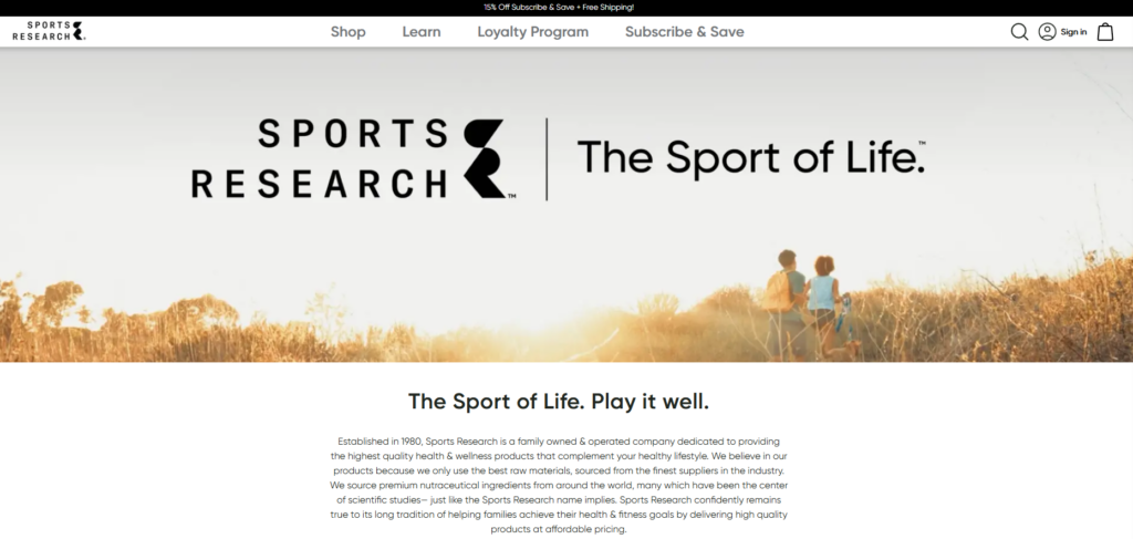
- Brand story presentation
- Mission and values
- Emotional connection with users
Blog and Educational Content

Educational content is key in the supplement industry. We designed:
- Readable article layouts
- Clear sectioning
- Visual aids for better understanding
Why Design Matters for Shopify Supplement Brands
In the health and wellness space, design is not just about aesthetics—it directly impacts trust and conversions.
A well-designed Shopify store:
- Communicates credibility instantly
- Simplifies complex information
- Guides users toward confident purchases
Without strong design, even the best products can struggle to convert.
Conclusion
Designing a high-performing Shopify supplement website requires a deep understanding of both user psychology and brand positioning. By focusing on clarity, trust, and usability, we transformed the Sports Research storefront into a conversion-driven experience that aligns with modern consumer expectations.
At AIRSANG, we specialize in crafting Shopify design experiences that go beyond visuals. We build strategic, user-focused storefronts that help brands stand out, communicate effectively, and convert consistently in competitive global markets.