Focusing on fish oil nutritional supplements, we hierarchically organize the packaging identification and ingredient information into a set of English product images. The entire set of works adopts the visual language of cream gold, dark brown titles, and neat information cards. Through the division of labor in different pictures, the product appearance, local information, and usage scenarios are gradually presented.
| Services | Industry | Platform |
|---|---|---|
| Amazon primary and secondary product images design | Medicine and health care | Amazon |
| Project requirements | target market | design style |
| Packaging identification and ingredient information hierarchy | English content display | Cream gold, dark brown title, neat information card |
| Project quotation | Delivery content | Delivery time |
| ¥500 | 7 product primary and secondary product images | 4 days |
Design Challenge: Let different information have its place
Nutritional supplement images include packaging, ingredient text, information tables, and character themes, with high content density. We focus on sorting out the visual hierarchy and use clear partitions to carry different types of information, so that readers can distinguish product identification, label content and life scenes.
Our design strategy
The cream gold color echoes the bottle and capsule, and the dark brown title maintains text contrast.
The packaging, ingredient description, label table and character themes are separated, so there is no need for one picture to carry all the content.
Brand Overview: Bottle and Capsule Establishing Identity
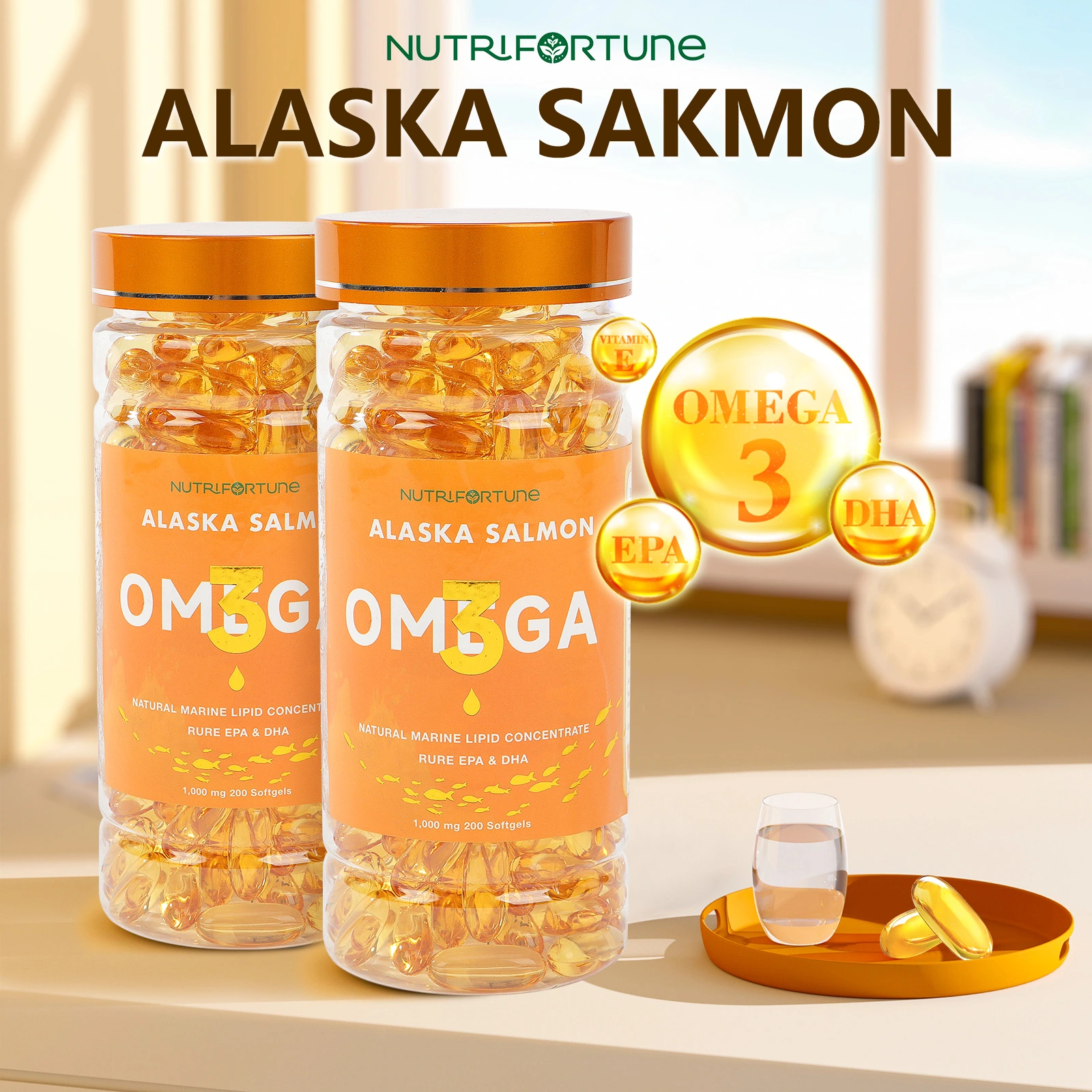
We placed the two bottle packaging in the foreground, complementing the theme with a golden capsule graphic and a circular information area. The cream base reduces background interference, and the dark brown title, gold products and light base form a clear hierarchy.
Component representation: Spread annotations around a single subject
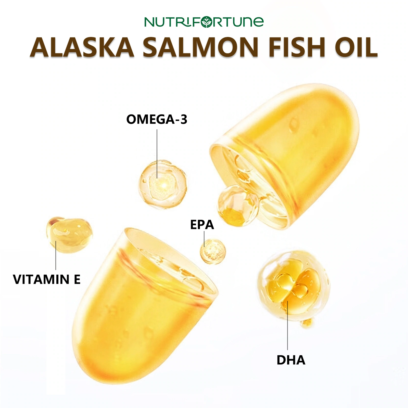
We used the layering of transparent capsules to illustrate the theme of ingredients, with each lead extending in different directions. The explanatory text is left outside the main body, and the graphics and labels can correspond one-to-one to avoid lines crossing.
Label information: Use tables to manage dense text
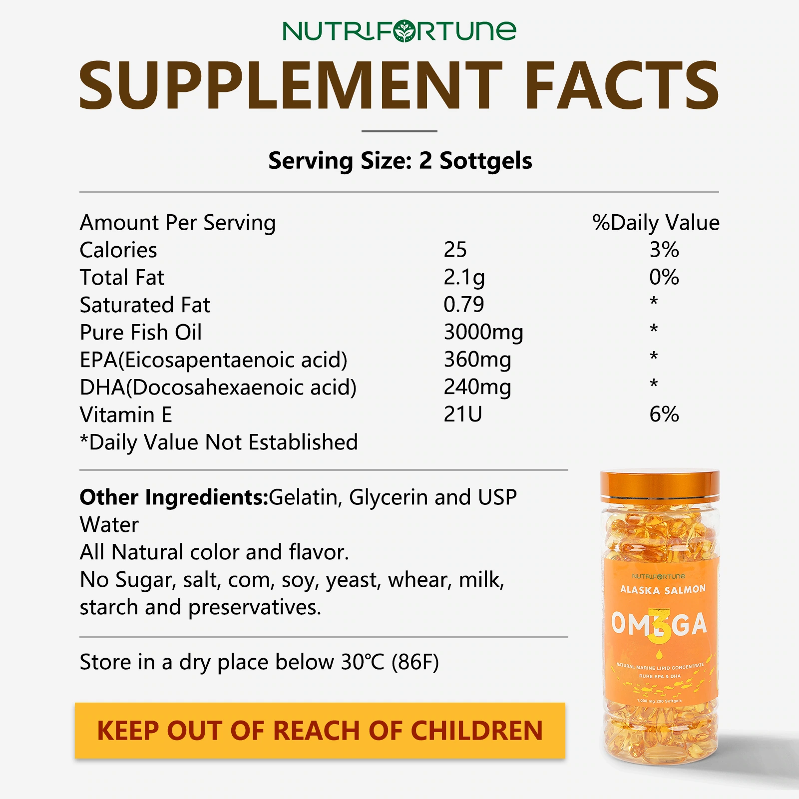
We use the information table as the main body of the picture, and the bottle thumbnail and bottom text tape as auxiliary. Table lines, line spacing, and word weight work together to organize the reading hierarchy so that dense content still has clear boundaries.
Instructions for use layout: characters and packaging are layered on top and bottom
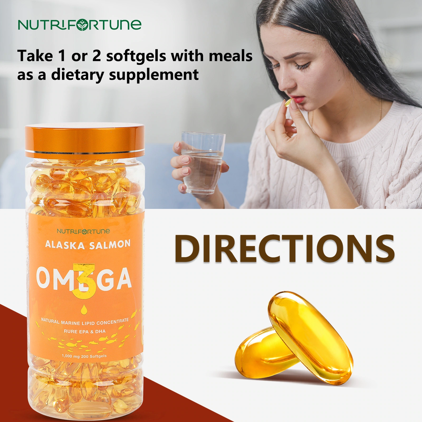
We put the characters and cups on the upper level, the packaging and capsules on the lower level, and the instructions in the clean area between the two. The upper and lower layers make life photos and label information clear, and the picture does not rely on a lot of decoration.
Life situations: photos and three texts
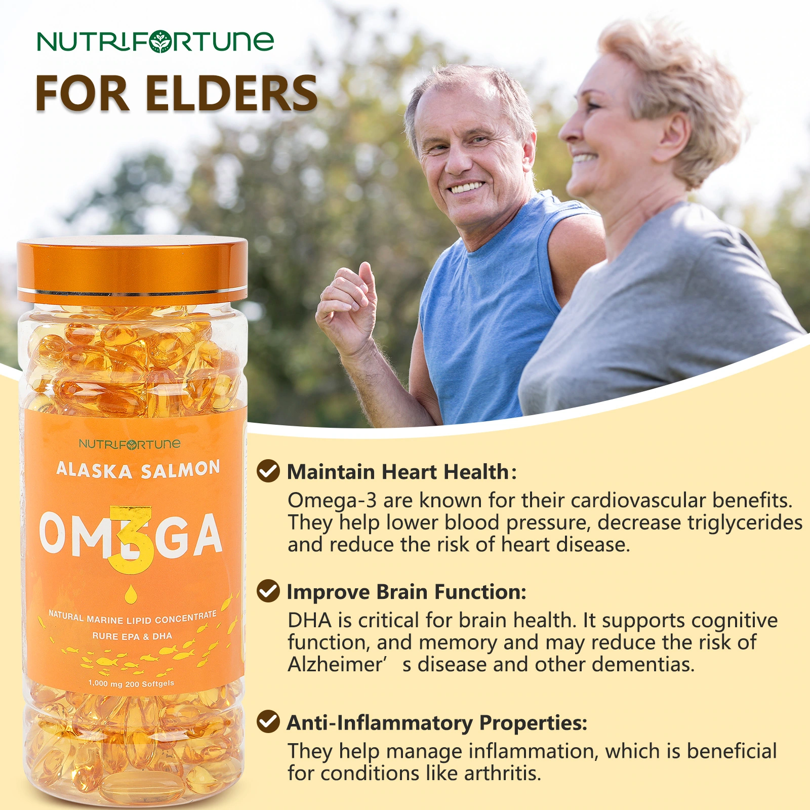
We used photos of people walking outdoors to create life situations. The bottle was placed on the side, and three pieces of text formed an independent information column. Photos and text maintain borders, and larger line spacing helps readers browse item by item.
Character card: Unify the information location of four photos
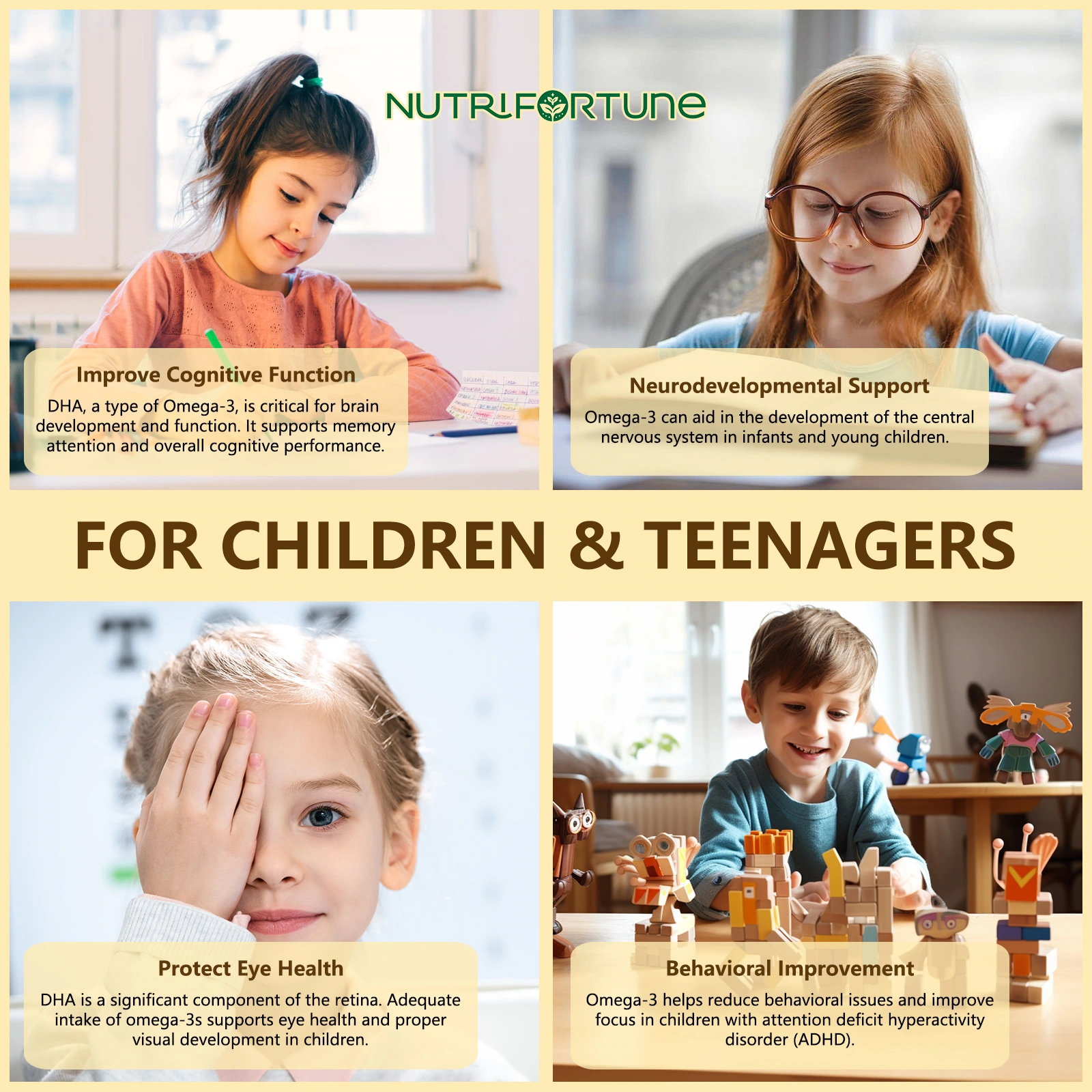
We divided the photos from different events into four cards, leaving short text in their respective areas. Photo proportions and card margins remain consistent, and rich scenes are organized through a common frame.
Multi-character theme: use card grid to wrap up information
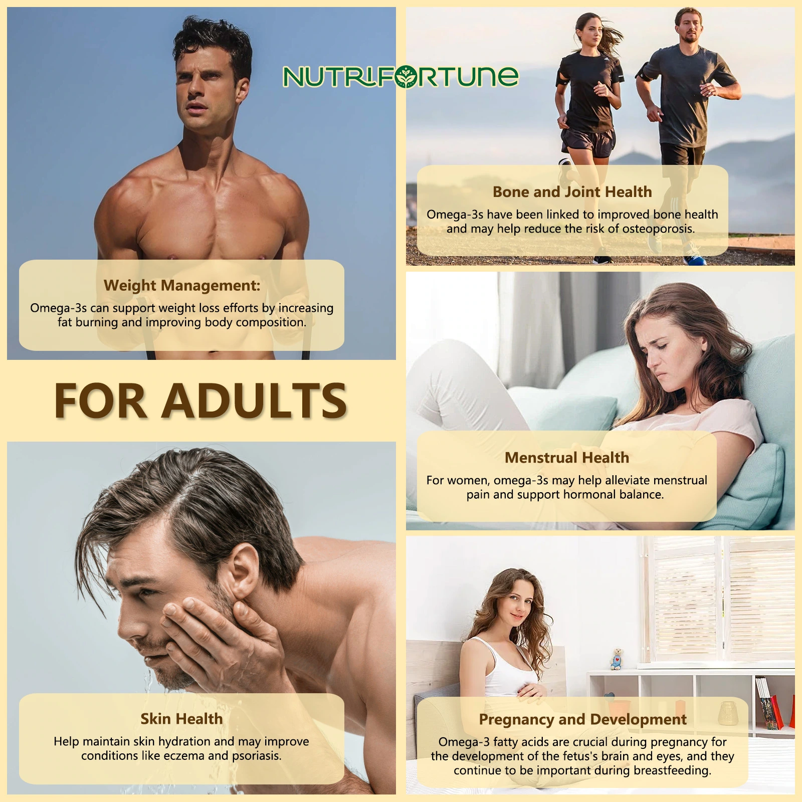
We arrange the five character themes into clear card areas, and keep each space independently blank. The common title hierarchy and golden embellishments continue the style of the entire package, allowing multiple sets of photos to have a unified reading rhythm.
Deliver and design value
This set of works contains a total of 7 product pictures. We arranged the responsibilities of different images around the packaging identification and ingredient information levels, maintaining visual consistency across the entire set with cream gold, dark brown titles, and neat information cards. From overall identification to partial explanation, the pictures complement each other, allowing readers to find information based on their own concerns.
Develop a clear visual expression for your products
You can provide us with existing product information, physical photos and key points to be displayed. We will combine the product structure, style differences and usage scenarios to plan image content and layout suitable for Amazon product display.