


Introdução
A successful digital movie website must do more than display posters. It must create an atmosphere, guide attention, reduce browsing pressure, and help users move from curiosity to action with very little friction. When we study the Movies Anywhere home experience, we can see a carefully organized design system that combines entertainment branding, content discovery, promotional messaging, and user-friendly navigation into one continuous browsing journey.
From a designer’s perspective, the website works because it understands how people explore movies online. Users do not always arrive with a specific title in mind. Sometimes they want new releases. Sometimes they want deals. Sometimes they want stories that match a personal interest, a cultural moment, a genre preference, or a favorite franchise. The design responds to these different motivations by building a page that feels cinematic, familiar, and easy to scan.
We designed this type of experience around one core principle: the interface should feel like an entertainment destination before it feels like a product catalog. The dark background, colorful artwork, rounded cards, horizontal rows, editorial labels, ranking numbers, franchise tiles, and illustrated genre cards all support that goal. Every section has a clear role. The hero builds emotion. The release and deal rows support shopping decisions. The curated story rows create depth. The trending area adds urgency. The collection blocks build brand recognition. The genre cards make navigation visual and immediate.
This article explains why each design decision works and how the overall layout creates a smooth digital movie browsing experience.
| Prazo de entrega | Categoria | Tipo de site |
| 15days | Movie | Customized Website |
| Designers envolvidos | Custo | Efeito |
| Nancy | $1700 | Sales📈297% |
A Cinematic Hero Section That Sets the Mood
Why We Start With Brand Recognition
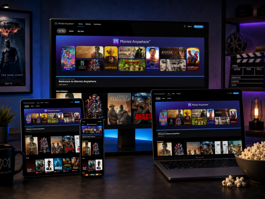
The first image shows the Movies Anywhere logo centered above a wide arrangement of movie artwork. As designers, we use this opening layout to establish trust and brand identity before asking users to browse. The logo sits in a clean, high-visibility position, which helps users immediately understand where they are. This is important because entertainment platforms often compete for attention, and users need instant confirmation that they have landed in a polished, reliable digital movie environment.
The logo placement also gives the hero area a premium feeling. Instead of hiding the brand in a small corner, the design gives it space to breathe. This decision makes the page feel less like a standard e-commerce grid and more like a branded entertainment hub. The logo becomes the anchor, while the movie visuals below create emotional energy.
Why the Dark Gradient Background Works
The deep blue and purple gradient creates a theater-like atmosphere. This color direction immediately reminds users of the feeling of watching a movie in a dark room, where the screen becomes the brightest and most important visual element. We use this approach because movie artwork naturally contains many colors, faces, titles, and dramatic compositions. A dark background allows those posters to stand forward without visual conflict.
The gradient also adds depth. A flat black background can feel simple and functional, but a blue-purple gradient feels more immersive and digital. It gives the hero section a modern streaming-platform personality while still keeping the focus on the films. The color palette feels energetic, but not chaotic. It supports the artwork rather than competing with it.
Why We Use Mixed Poster Sizes
The hero layout does not arrange every movie tile in the same size. Some posters appear tall, some appear wide, and some stack together in smaller blocks. This creates movement across the screen. As designers, we use this mixed composition to avoid a static catalog feeling. A perfectly equal grid would feel organized, but it would not feel cinematic. By varying the card sizes, the interface creates rhythm and encourages the eye to travel from left to right.
This design also communicates variety. Users can instantly sense that the platform contains animated movies, action titles, superhero films, dramas, and major franchises. The layout does not need a long explanation because the artwork does the storytelling. The composition says, “There is a large library here, and it has many moods.”
Why Rounded Cards Make the Interface Feel Softer
The movie tiles use rounded corners, which gives the design a modern, approachable feel. Sharp corners often create a more rigid, technical look. Rounded corners feel more comfortable and familiar, especially in streaming and entertainment interfaces. They also help separate each poster from the dark background without requiring heavy borders.
This subtle shape choice matters because the website must appeal to a broad audience. The platform is not only for serious film collectors. It also serves families, casual viewers, action fans, animation fans, and people looking for deals. A softer card shape makes the interface feel easy and welcoming.
New Releases and Deals: Designing for Two User Intentions
Why We Separate Fresh Content From Promotional Content
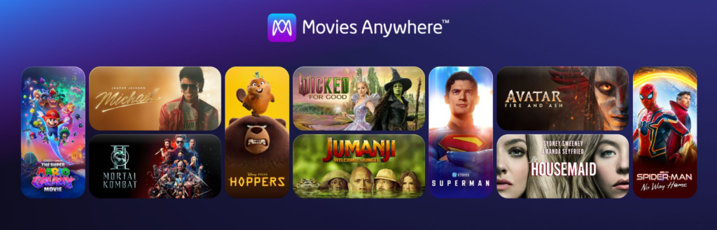
The second image shows two key rows: “New Releases” and “Deals.” This structure works because it recognizes two very different browsing behaviors. Some users want the newest titles first. They care about what has recently arrived and what feels current. Other users want value. They may not have a specific movie in mind, but a low price or special offer can motivate them to explore.
As designers, we separate these rows instead of mixing everything together. This keeps the user experience clear. “New Releases” answers the question, “What is new?” “Deals” answers the question, “What can I get for a good price?” Each row has a direct purpose, which reduces decision-making confusion.
Why the Poster Grid Stays Simple
The New Releases section uses large poster cards in a clean horizontal row. This is a practical and effective design decision. Movie posters are already rich visual assets, so the interface does not need extra decoration. The dark background, consistent spacing, and strong poster scale are enough.
We keep the layout simple because users make quick decisions when scanning entertainment content. They look for familiar faces, recognizable titles, strong colors, and genre clues. A busy interface would slow that process. By giving each poster enough space, the design allows the artwork to perform its natural marketing role.
Why “See All” Supports Exploration Without Pressure
The small “See All” link on the right side gives users a clear path to deeper browsing. We keep this element visible but not dominant. If the button were too large, it would compete with the posters. If it were hidden, users might miss the opportunity to explore the full category.
This is an example of quiet navigation. The design gives users control without shouting. It says, “You can continue browsing here, or you can open the full list.” This supports a relaxed entertainment experience.
Why the Deals Row Uses Stronger Commercial Signals
The Deals section introduces sale labels, prices, and a “$5 and Under” promotional card. This row needs stronger commercial cues because the user’s motivation changes. In New Releases, the artwork and title freshness are the main attraction. In Deals, price becomes part of the decision.
We use red sale tags because they create quick contrast against the dark background and instantly signal a discount. The small price text under the posters gives users useful information without turning the section into a heavy product listing. The “$5 and Under” card works as a promotional anchor. It breaks the rhythm of the posters and makes the deal category feel easier to understand at a glance.
Why This Section Balances Entertainment and Shopping
A movie platform must avoid feeling too transactional. Users want to browse entertainment, not feel like they are walking through a discount bin. The design solves this by keeping the cinematic poster format while adding just enough purchase context. The result feels like a curated entertainment shelf with value signals built in.
This balance is important for conversion. Users stay emotionally connected to the movies while also seeing reasons to act. The design does not force a sale; it invites discovery.
Celebrating LGBTQ+ Stories and Music Biopics: Designing Editorial Curation
Why Curated Rows Add Meaning
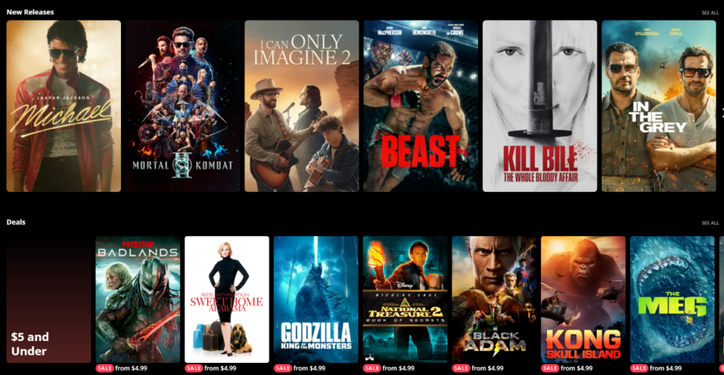
The third image introduces “Celebrating LGBTQ+ Stories” and “Music Biopics.” These rows are important because they show that the platform is not only organizing content by release date or price. It is also organizing content by meaning, culture, and emotional interest.
As designers, we use curated rows to make the page feel more human. A digital movie library can easily become overwhelming if every row simply shows more titles. Editorial categories give the experience a point of view. They help users discover films through identity, theme, lifestyle, and storytelling purpose.
Why “Celebrating LGBTQ+ Stories” Builds Inclusivity
Placing a row like “Celebrating LGBTQ+ Stories” gives the page a broader cultural voice. It tells users that the platform values diverse stories and wants to make them visible. This is not just a content decision; it is also a design decision. The row label gives the section context, while the posters give it emotional variety.
The design remains consistent with the rest of the page, using the same horizontal carousel structure and dark background. This consistency matters because the section should feel fully integrated into the platform, not added as an afterthought. It belongs within the same browsing experience as new releases, deals, action titles, and collections.
Why Poster Diversity Matters in This Row
The posters in this row show different visual tones: illustration, comedy, drama, documentary, romance, and character-focused imagery. This variety supports the idea that LGBTQ+ stories are not one genre or one mood. They can be funny, serious, intimate, stylish, personal, or historical.
As designers, we want this range to appear visually clear. The horizontal row allows different story types to sit side by side. Users can scan the posters and quickly understand that the category has depth. The design communicates inclusivity not only through the section title, but also through variety.
Why Music Biopics Create a Smooth Transition
Below the LGBTQ+ stories row, the Music Biopics section shifts the emotional focus from identity-centered storytelling to artist-centered storytelling. This is a smart content flow. Both rows are about people, culture, and real or inspired lives. They feel connected, even though they serve different audience interests.
From a layout perspective, this keeps the page from feeling random. The user moves from one curated story category to another, which creates a stronger editorial rhythm. Music biopics also bring visually powerful poster language: performers, stage lighting, instruments, portraits, and bold typography. These images work well in a dark cinematic interface.
Why Curated Rows Increase Time on Page
Curated content helps users browse longer because it gives them new reasons to continue. A user who does not care about deals may still care about music stories. A user who does not know what to watch may respond to a theme. A user who recognizes a musician may click because the poster feels familiar.
This is why editorial design matters. It transforms a page from a simple list into a guided journey. The user feels that the platform is recommending meaningful paths, not just displaying inventory.
Martial Arts and Trending: Creating Energy and Urgency
Why Genre Rows Need Strong Visual Personality
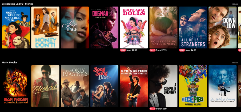
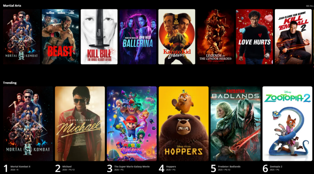
The fourth image shows a “Martial Arts” row followed by a “Trending” row. The Martial Arts section uses intense, action-driven poster artwork. As designers, we keep this row simple because the genre itself carries strong visual energy. Fight poses, bold typography, dramatic lighting, and high-contrast poster art communicate the category instantly.
The section title gives users a clear label, while the posters provide emotional confirmation. This is how effective genre design should work. Users do not need to read long descriptions. They can understand the category in seconds.
Why Horizontal Carousels Fit Genre Browsing
A horizontal carousel works especially well for genre browsing because users often want to compare similar titles quickly. They may not know exactly which martial arts movie they want, but they know the mood they are looking for. The row format lets them scan options without leaving the page.
This pattern also matches user expectations from streaming platforms. Familiar interaction patterns reduce learning time. Users already understand that they can browse sideways, open a title, or use “See All” for more. Good design does not always need to invent a new behavior. Often, it succeeds by refining a familiar one.
Why Trending Uses a Different Visual System
The Trending row changes the layout by adding ranking numbers and metadata beneath each poster. This is a deliberate shift. Trending content is not just about category browsing; it is about social momentum. Users want to know what is popular, what others are watching, or what is gaining attention.
Large numbers create instant hierarchy. They make the row feel more current and competitive. The design turns a normal movie shelf into a ranked experience. This encourages users to compare titles and pay attention to position. A movie ranked number one feels different from a movie simply placed first in a regular carousel.
Why Metadata Adds Confidence
The Trending row includes extra information such as title, release year, and rating. This small amount of metadata helps users make better decisions without overwhelming them. In a ranked row, users may want more context because popularity alone is not enough. They may ask, “Is this new?” “Is it family-friendly?” “Is it for adults?” “Is this the latest version?”
By placing this information below the poster, the design keeps the artwork dominant while still giving practical details. This is a strong example of visual hierarchy. The poster attracts attention first. The number creates urgency second. The metadata supports the decision third.
Why Trending Helps the Page Feel Alive
A homepage should not feel frozen. It should feel active and updated. Trending sections help create that sense of movement. Even if a user has visited before, the ranking format suggests that the page reflects what is currently important.
This creates a reason to return. Users may come back to see what moved up, what became popular, or what new title entered the ranking. From a design strategy perspective, Trending is not only a content section. It is a retention tool.
Popular Movie Collections and Animated Collections: Designing Around Brand Recognition
Why Collections Reduce Search Effort
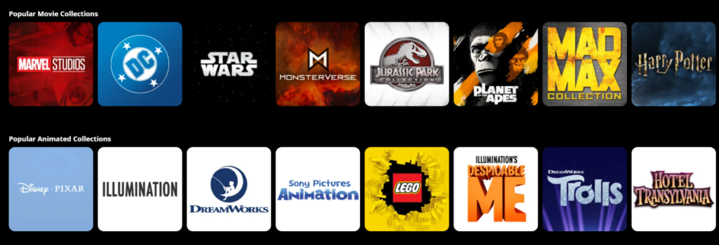
The fifth image shows “Popular Movie Collections” and “Popular Animated Collections.” Instead of individual movie posters, these sections use franchise and studio-style tiles. This is a smart shift because collections serve a different purpose. Users are not choosing one movie yet. They are choosing a familiar universe, studio, or content family.
As designers, we use collection tiles to reduce search effort. If a user loves Marvel, DC, Star Wars, Jurassic Park, Mad Max, Harry Potter, Disney Pixar, Illumination, or DreamWorks, they do not need to search title by title. A collection tile gives them a shortcut into a larger group of related movies.
Why Logos Work Better Than Posters Here
For collections, logos often work better than movie posters because the goal is recognition at the franchise level. A Marvel Studios tile communicates a world of titles faster than one individual Marvel poster. A Disney Pixar tile suggests a wide family-friendly catalog rather than one specific film.
This is why the design uses clean, logo-centered cards. The visual language becomes more brand-focused and less story-specific. Users can quickly scan the row and identify the collections they already know and trust.
Why the Grid Feels More Structured
The collection tiles are evenly sized and consistently spaced. This makes the section feel more stable and organized than the hero or poster rows. That change is useful. The hero needs excitement. The poster rows need browsing rhythm. The collection rows need clarity.
A more structured layout helps users compare brands quickly. Each tile has the same visual weight, so no collection feels accidentally more important than another unless the artwork itself creates that effect. This supports a clean browsing experience.
Why Animated Collections Need Their Own Row
Separating Popular Animated Collections from general movie collections is a strong usability decision. Animation often attracts specific audiences: families, children, animation fans, and viewers looking for lighter entertainment. By creating a dedicated row, the platform makes this audience path easier.
This separation also prevents animation brands from getting lost among blockbuster franchises. Disney Pixar, Illumination, DreamWorks, LEGO, Despicable Me, Trolls, and Hotel Transylvania all have strong audience recognition. Giving them their own space increases clarity and helps users find family-friendly or animated content faster.
Why This Section Supports Long-Term Browsing
Collections are powerful because they create deeper browsing paths. A user might open one collection and then explore multiple titles inside it. This increases engagement and helps the platform present its library in a more organized way.
From a design perspective, this section works like a map. It helps users move from broad interest to specific title selection. That is one of the most important roles of a homepage: it should not only show content, but also guide users into the right content path.
Genres: Turning Navigation Into a Visual Experience
Why Genre Cards Are More Effective Than Plain Links
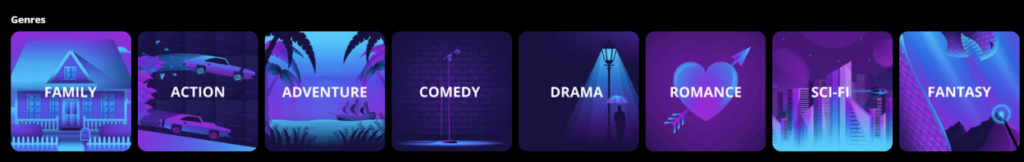
The final uploaded image shows the Genres section with illustrated cards for Family, Action, Adventure, Comedy, Drama, Romance, Sci-Fi, and Fantasy. This design choice turns basic navigation into a visual experience. Instead of listing genre names as plain text, the interface gives each genre its own mood, color, and illustration.
As designers, we use this approach because genres are emotional categories. “Action” is not just a word; it suggests speed, tension, movement, and impact. “Romance” suggests warmth, emotion, and connection. “Sci-Fi” suggests technology, imagination, and futuristic worlds. Illustrated cards communicate these feelings faster than text alone.
Why the Purple-Blue Palette Creates Consistency
The genre cards use a strong purple-blue visual system. This keeps the section connected to the broader Movies Anywhere design language. Even though each card has its own illustration, the shared color direction prevents the row from feeling messy.
Consistency is essential in a homepage with many types of content. The page already includes movie posters, sale labels, logos, numbers, and metadata. If the genre section used too many unrelated colors, it could feel visually noisy. The unified palette keeps everything polished.
Why Bold Typography Improves Scan Speed
Each genre card uses bold, centered text. This supports quick reading. Users should not have to work hard to identify a category. The illustration creates mood, but the label must remain clear. Strong typography ensures that the card works as a navigation tool, not only as decoration.
The text also sits on top of the illustration in a way that feels direct and confident. This makes each card feel clickable. The design tells users, “This is a path you can take.”
Why Rounded Cards Keep the Experience Friendly
Like the movie posters and collection tiles, the genre cards use rounded corners. This creates visual continuity across the page. Even though the content type changes from posters to logos to illustrations, the shape language remains consistent.
Rounded cards also make the genre row feel approachable. Genre navigation can sometimes feel like a filter system, but here it feels like an invitation. Users are not sorting data; they are choosing a mood.
Why Genres Complete the Homepage Journey
The Genres section works well near the bottom of the experience because it gives users a final broad navigation option. After seeing featured titles, new releases, deals, curated stories, trending rankings, and collections, users may still want to browse by mood. Genres provide that next step.
This section also helps users who did not find a specific title above. Instead of reaching a dead end, they can continue exploring through a category that matches their interest. That makes the homepage feel complete.
The Overall Design System Behind the Experience
A Dark Interface That Keeps Attention on Content
Across all sections, the dark background creates a consistent cinematic foundation. This is one of the strongest design choices on the page. It keeps the interface from competing with the movie artwork and helps every poster, logo, and illustrated tile feel more vivid.
Dark interfaces work especially well for entertainment because they mirror the environment of watching a screen. They also help reduce visual fatigue when users browse image-heavy content. The page contains many posters and cards, but the dark background gives the eye a stable resting space.
Horizontal Rows That Match User Behavior
The website relies heavily on horizontal rows. This structure works because entertainment browsing is often exploratory. Users want to scan, pause, compare, and continue. Rows allow the page to organize a large library into digestible sections.
Each row has a clear label, which helps users understand the logic behind the content. New releases, deals, curated stories, music biopics, martial arts, trending titles, collections, animated collections, and genres each answer a different user need. This prevents the page from becoming one endless wall of posters.
Visual Hierarchy That Guides Without Overexplaining
The page uses visual hierarchy carefully. Large hero artwork builds the first impression. Section titles create organization. Posters dominate movie rows. Sale labels highlight value. Ranking numbers create urgency. Logos support collection recognition. Genre cards turn navigation into mood-based discovery.
This hierarchy allows users to understand the page without reading long instructions. Good interface design should feel self-explanatory. Every element should show users what it does through placement, size, contrast, and context.
Familiar Patterns With Branded Personality
The design uses familiar streaming and digital library patterns, but it still feels branded through its color system, spacing, tile style, and content organization. This balance matters. If the interface were too unfamiliar, users would need time to learn it. If it were too generic, it would not feel memorable.
Movies Anywhere benefits from a design that feels immediately usable while still carrying its own visual identity. The gradient hero, dark browsing environment, rounded cards, and curated rows all help create that identity.
Why This Design Works for Conversion
It Helps Users Find a Starting Point
One of the biggest challenges in movie browsing is choice overload. A platform may have many titles, but too many options can make users hesitate. This homepage solves that by offering many starting points. Users can begin with new releases, deals, identity-focused stories, music films, martial arts, trending titles, franchises, animation, or genres.
Each path feels clear. This helps users move forward instead of feeling stuck.
It Combines Emotion With Practical Information
The design does not rely only on beauty. It also includes practical decision-making elements: section labels, prices, sale badges, rankings, release years, ratings, collection names, and genre names. These details help users understand what they are seeing and why it matters.
At the same time, the page never becomes too text-heavy. The emotional power still comes from the artwork. This balance is essential for entertainment commerce.
It Builds Trust Through Organization
A well-organized homepage makes a platform feel more trustworthy. When users see clear categories, consistent spacing, recognizable labels, and polished visuals, they feel that the experience has been carefully built. This trust can influence whether they continue browsing, sign in, redeem a movie, or explore their own library.
Design is not only decoration. It is a trust signal. A clean, confident interface tells users that the platform understands their needs.
Conclusão
O Movies Anywhere home page works because it combines cinematic emotion with structured discovery. The hero section builds an immersive first impression through brand placement, rich gradients, and dynamic poster composition. The New Releases and Deals rows address two major user intentions: freshness and value. The curated story sections add cultural meaning and editorial depth. The Martial Arts and Trending rows create energy, momentum, and popularity signals. The collection areas use brand recognition to simplify discovery, while the genre cards turn basic navigation into an engaging visual shortcut.
As designers, we see this page as a strong example of how an entertainment website can guide users without overwhelming them. It uses dark space, vivid artwork, clear hierarchy, consistent card styling, and carefully separated content paths to make browsing feel natural. Every section has a purpose, and every purpose supports a smoother journey from interest to engagement.
For brands that want to build a stronger independent website experience, this kind of design thinking is valuable. A great website should not simply display content or products. It should create mood, guide decisions, build trust, and make every next step feel easy. This is exactly the kind of strategic visual direction AIRSANG can help clients create for cross-border business, entertainment platforms, and conversion-focused website design.

Conceber e construir um sítio Web WordPress ou um sítio empresarial com um sistema de comércio eletrónico completo para si.
Faixa de preço: $200.00 a $2,500.00custom-requirements-or-special-quotations
O preço original era: $2.00.$1.00O preço atual é: $1.00. Explicação do design da imagem principal para o dispositivo de fisioterapia doméstica da Amazon
Introdução: Construindo uma imagem confiável para dispositivos de terapia doméstica na Amazon Ao projetar a imagem principal de um dispositivo de terapia doméstica na Amazon, nosso principal...
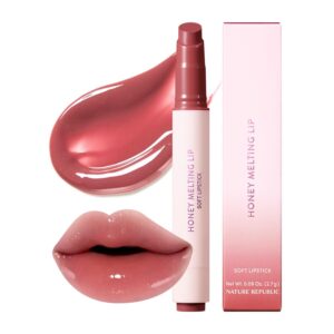
Design da imagem principal para conversão de batom da Amazon
Introdução: Conceber uma imagem principal de batom que vende na Amazon Quando concebemos uma imagem principal para um batom da Amazon, a nossa responsabilidade vai muito além...

Como os hackers roubam e-mails de administradores do WordPress (e como impedi-los)
Vamos começar com uma verdade incómoda: o seu e-mail de administrador do WordPress é provavelmente muito mais público do que pensa e os hackers? Eles adoram isso. Para eles, o seu...
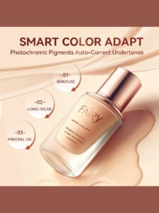
O que faz uma base líquida da Amazon converter a imagem principal?
Introdução: Criar uma imagem principal para a base líquida da Amazon não se resume apenas a deixar o produto bonito. Na Amazon, a imagem principal e...
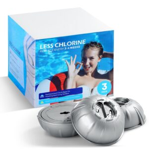
Como projetar uma imagem principal eficaz para cartuchos de filtro Amazon
Introdução: Criar uma imagem principal para a Amazon nunca se resume apenas a tornar um produto atraente. Trata-se de clareza, confiança e compreensão imediata — especialmente para...
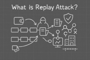
Ataques de repetição no WordPress: ameaça real ou mito exagerado?
Vamos esclarecer uma coisa primeiro. Ataques de repetição não parecem assustadores. Eles não quebram senhas. Eles não injetam código malicioso com texto verde de hacker voando por toda parte. Eles são sorrateiros...

Como duplicar páginas do WordPress sem danificar nada
Vamos ser sinceros. Às vezes você não quer criar uma página nova. Você só quer a mesma página… mas um pouco diferente. Mesmo layout. Mesmos blocos. Mesmas configurações. Porque….
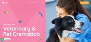
Comparativo de cinco temas WordPress para animais de estimação
Introdução Escolher o tema WordPress certo para o seu negócio de animais de estimação é mais do que uma decisão de design — afeta diretamente a usabilidade, a escalabilidade e o crescimento a longo prazo. Cuidados com animais de estimação e...
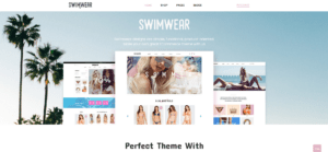
Comparando cinco temas de e-commerce de moda praia
Introdução: Escolher o tema certo para uma loja independente de moda praia ou lingerie não é apenas uma decisão visual — afeta diretamente as taxas de conversão, a escalabilidade e o sucesso a longo prazo...
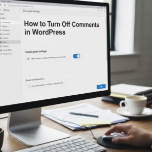
Como desativar os comentários no WordPress (sem enlouquecer)
Vamos falar sobre os comentários do WordPress. Em teoria, os comentários são ótimos. Eles incentivam a discussão, constroem comunidade e dão vida ao seu site. Na prática? Muitas vezes, eles atraem...

Criando um site WordPress escalável para uma marca voltada para a ciência: o projeto AminoUSA
Introdução No cenário digital atual, um website é mais do que um lugar para listar produtos. Para marcas com foco em ciência que atuam em setores regulamentados ou voltados para pesquisa, um...
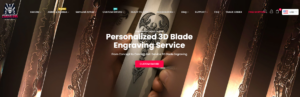
Construindo uma loja Shopify escalável para uma marca global de lâminas: O Projeto CoolKatana
Introdução No comércio eletrônico internacional, um site Shopify é muito mais do que uma vitrine. Para marcas que atuam em nichos de mercado e categorias culturais específicas, o site precisa fazer muito mais do que...
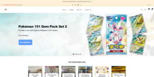
Criando uma loja Shopify de alta conversão para cartas Pokémon.
Introdução No mundo do comércio eletrônico de itens colecionáveis, especialmente no mercado do Pokémon Trading Card Game (TCG), um site precisa fazer mais do que simplesmente listar produtos...
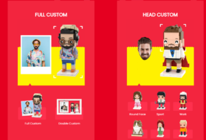
Design Shopify de alta conversão para uma marca de tijolos personalizada.
Introdução No cenário competitivo do comércio eletrônico atual, especialmente no segmento de presentes personalizados e itens colecionáveis, um site Shopify precisa fazer muito mais do que simplesmente exibir produtos. Ele...
Como entrar em contato com o suporte da Shopify: um guia simples e sem complicações.
Gerir uma loja Shopify deve ser uma experiência empolgante, não confusa. Quando surgem dúvidas ou problemas que atrapalham o seu trabalho, a Shopify oferece diversas opções de suporte, dependendo da situação.
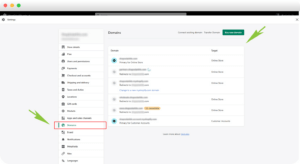
Como desativar uma loja Shopify: um guia claro e prático
Desativar uma loja Shopify não é complicado, mas acarreta consequências que muitos lojistas ignoram. Este guia explica o processo de forma simples e didática...
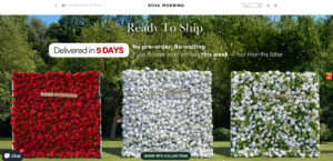
Estudo de caso de design de website Shopify para uma marca de flores premium
Introdução No cenário competitivo do comércio eletrônico atual, um site Shopify precisa fazer muito mais do que exibir produtos. Ele precisa comunicar o valor da marca instantaneamente, guiar os usuários...
Estudo de Caso de Design da Shopify: Loja de Jogos Retrô
Introdução Em um ambiente de comércio eletrônico altamente competitivo, a clareza visual e a conexão emocional muitas vezes determinam se um visitante se torna um cliente. Isso é especialmente verdadeiro em...