


Nenhum produto no carrinho.

Anime merchandise is an emotional purchase as much as a practical one. Fans do not visit a store like Crunchyroll Store just to browse products. They arrive with anticipation, curiosity, and a strong connection to the worlds, characters, and series they love. That means the website experience cannot feel generic. It needs to feel energetic, curated, and instantly relevant while still making shopping easy.
For this project, our design goal was to create a storefront experience inspired by the visual merchandising strength of Crunchyroll Store while shaping it into a conversion-focused independent site experience. We approached the page as a brand environment, not just a product catalog. Every section needed to balance excitement with clarity, promotional energy with visual hierarchy, and fandom culture with retail discipline.
Rather than focusing on technical development, this article explains the design thinking behind the page: how we structured the user journey, how we translated a content-heavy anime retail model into a clean visual system, what challenges we faced, and how our design process helped create a page that feels immersive, organized, and ready to sell.
The reference direction came from a highly visual anime merchandise store environment. The page had to support a wide variety of content types, including:
The challenge was not simply to make the page colorful or entertaining. The challenge was to design a page that could hold a large volume of information without overwhelming the user.
The client wanted a page design that could do five things well:
Users needed to understand within seconds that the store offered more than one type of anime merchandise.
Discount banners had to stand out, but the overall store still needed to feel premium and trustworthy.
Anime shoppers often enter through series loyalty, not product type. The design had to support both behaviors.
The page needed the energy of anime culture without becoming chaotic.
Collectors and fans return often. The design had to encourage exploration beyond a single purchase session.
We defined the project as a visual commerce problem.
The store needed to feel like a destination, not a listing page. That meant we focused on emotional engagement, category navigation, campaign storytelling, and retail clarity all at once. Our objective was to create a page that could attract first-time visitors, reassure them quickly, and move them toward high-interest collections, promotional offers, and licensed merchandise.
We did not treat the homepage as a static billboard. We treated it as a guided experience with clear stages:
That sequence shaped every design decision we made.
Before designing, we studied how anime fans shop and how entertainment merchandise differs from standard ecommerce behavior.
Anime retail customers usually shop in one of three modes:
The collector mindset
These users look for figures, limited editions, exclusives, and display-worthy items.
The fan loyalty mindset
These users shop by series first. They care less about the product type and more about the franchise universe.
The gift or casual browsing mindset
These shoppers need faster orientation, stronger guidance, and clearer category cues.
Our page design had to serve all three audiences without splitting the experience into disconnected paths.
Anime commerce uses bold imagery, recognizable characters, and campaign-driven excitement. But if every section competes for attention, nothing wins. We mapped out where high-intensity visuals should appear and where the layout should calm down.
This helped us establish a rhythm:
That rhythm became essential to the overall usability of the page.
A large anime store can easily feel crowded. We solved that by building a clear hierarchy around user intent.
The first screen needed to answer three questions immediately:
We designed the top section to combine navigation, promotional urgency, and a visual hero with clear shopping direction. Instead of relying on text-heavy explanations, we let bold campaign graphics and concise messaging create immediate momentum.
The visual strategy here was simple: one strong promotional focus, one clean action path, and one clear sense of category identity.
Once the hero had done its job, the page needed to shift from campaign mode into browsing mode. This is where many stores lose structure. They introduce too many equal-weight sections, and the user no longer knows what matters most.
We avoided that by designing discovery layers.
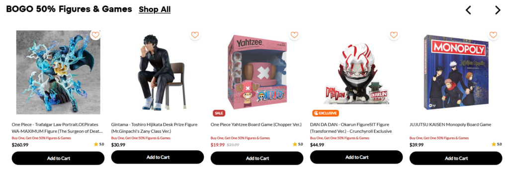
We placed deal-driven product groupings early to convert price-sensitive visitors while interest was still high.
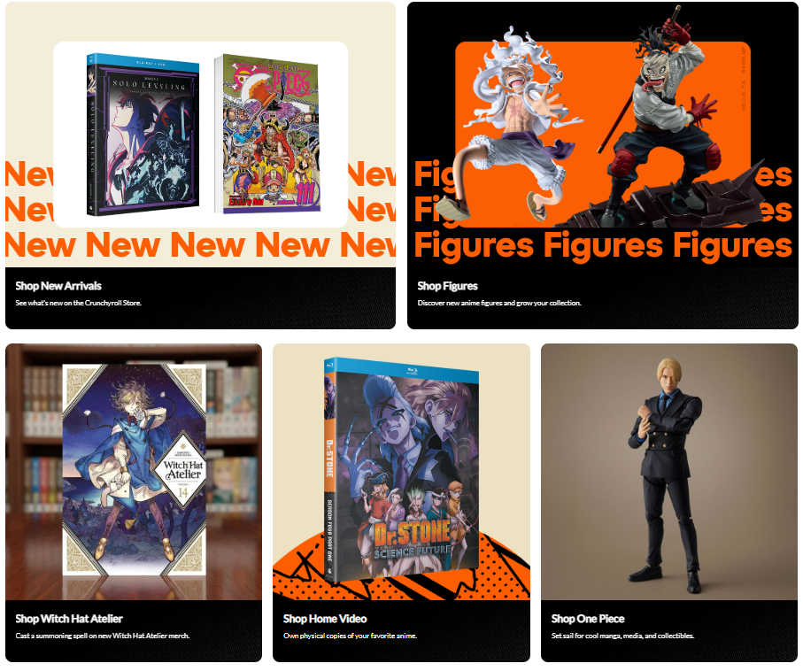
We used larger visual blocks for major merchandise families like manga, figures, and home video. These sections functioned like storefront departments.
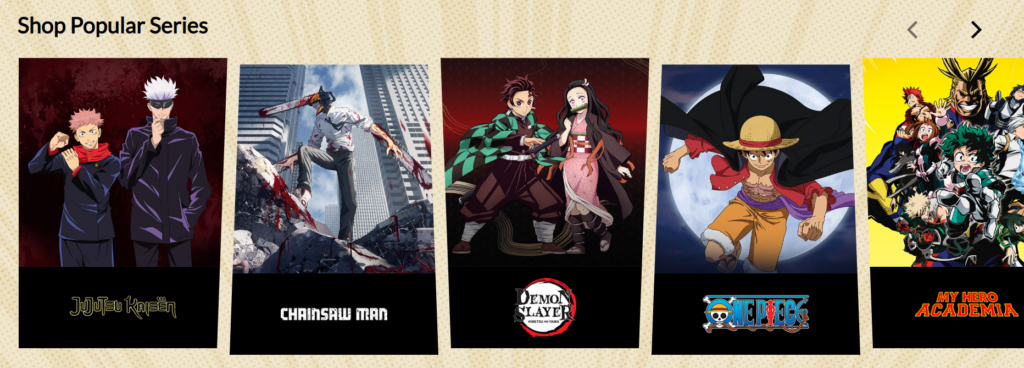
Because anime fans often identify with a title before a category, we included brand-style entry points by franchise.
After excitement and discovery, we shifted into reassurance. This helped the page feel complete rather than purely promotional.
This structure kept the page moving in a logical direction.
Anime visuals are naturally expressive, colorful, and character-driven. The risk is that the page becomes noisy. Our job as designers was to manage intensity.
We did that through contrast and containment.
Bright orange promotional accents, strong black anchors, and lighter neutral areas created separation between sections. This allowed colorful product imagery to stand out without making the entire page feel visually overloaded.
We also made sure that highly saturated areas had breathing room. Large campaign banners worked because surrounding sections gave them space. Product cards remained readable because the layout framed them consistently.
One of the smartest things a content-heavy retail page can do is repeat structure even when the content changes. We used repetition intentionally across:
This gave the page a dependable visual rhythm. Users could move quickly because they did not need to relearn the interface in every section.
Series identity is one of the most powerful conversion drivers in anime retail. We treated franchise browsing as a visual branding system rather than a simple logo strip.
Each series needed to feel recognizable at a glance. That meant prioritizing clean presentation, adequate contrast, and enough visual isolation for each title mark or artwork to register quickly. This was important not only for returning fans but also for users who skim rapidly across the page.
Most homepage visitors do not read from top to bottom. They scan. We designed accordingly.
Instead of packing each section with explanation, we used:
This reduced friction and helped users identify a path within seconds.
Every homepage block had a job. We never added a section just because it looked good in a retail layout.
Por exemplo:
Their role was urgency and seasonal relevance.
Their role was quick engagement and action.
Their role was navigation and merchandising.
Their role was emotional relevance and fandom-led entry.
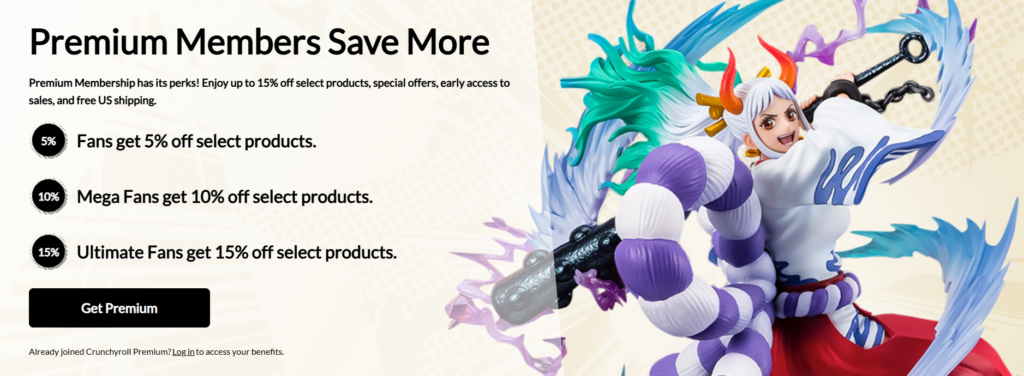
Their role was value reinforcement and retention.
Their role was community connection and lifestyle credibility.
This role-based design process made the page more intentional and more effective.
Anime retail pages often have a lot happening at the same time: promotions, collectibles, new arrivals, franchise tiles, exclusive items, social content, membership offers, and informational messaging.
If we gave every section the same visual intensity, the page would feel exhausting.
We assigned different levels of emphasis to different sections. Some areas were designed to shout. Others were designed to guide. Others were designed to reassure. This created a pace that felt more controlled and premium.
The store needed to feel fun, but not disorganized. It needed to feel branded, but not theatrical. It needed to feel immersive, but still easy to shop.
We treated entertainment as a visual layer and commerce as the structural layer. The visuals created desire. The layout created clarity. This distinction helped us keep the page engaging without sacrificing usability.
A manga shopper, a figure collector, and a casual anime fan do not browse in the same way.
We built multiple entry points into the same page. Users could enter through promotions, merchandise type, series identity, or premium membership messaging. The page did not force one browsing pattern. It supported several.
Discount-heavy pages can easily start to feel low value. That would have hurt the perceived quality of the merchandise.
We balanced promotional messaging with cleaner section design, consistent visual standards, and trust signals such as official licensing, secure shopping, and member benefits. This helped preserve credibility while still supporting campaign-driven sales.
Our work aimed to improve the overall shopping experience in measurable, design-led ways.
The page communicates purpose quickly. Users understand what the store sells, what is currently featured, and where they can go next.
The content now follows a logical progression instead of feeling like disconnected promotional blocks. That improves both usability and depth of visit.
Even in a highly promotional retail setting, the store feels curated and intentional. That matters for collectibles, licensed goods, and fandom-based purchasing.
Because the design system is structured, the page can support seasonal swaps, franchise campaigns, new launches, and featured collections without losing coherence.
The page does more than display products. It creates a branded shopping environment that reflects the energy of anime culture while maintaining retail clarity.
This project reflects a larger truth about independent ecommerce design: people do not convert because a site contains enough products. They convert because the experience makes those products feel relevant, trustworthy, and exciting.
For brands in entertainment, fandom, collectibles, lifestyle, and culture-driven retail, good design is not decoration. It is strategy. It shapes discovery. It reduces friction. It increases perceived value. It builds loyalty.
That is especially important for independent websites, where the page needs to do more than list inventory. It needs to communicate identity, guide the shopper, and support long-term brand growth.
A strong independent storefront should answer all of these questions clearly:
When design answers those questions well, the site becomes far more effective.
We approach every store design project with the same mindset: the homepage is not just a layout exercise. It is a brand and conversion system.
Our process typically includes:
We define how the brand should feel before we define how the sections should look.
We shape the page around attention, discovery, trust, and action.
We design for product storytelling, category clarity, and campaign flexibility.
We help users move naturally from interest to engagement to purchase intent.
We make sure the store feels cohesive from the first banner to the final footer.
This is why our design work fits independent brands so well. We do not treat websites as generic templates. We design them as sales environments built around the way real customers browse.
Designing a storefront inspired by the strengths of Crunchyroll Store required more than colorful visuals and product placement. It required a clear point of view on how fans shop, how brands communicate through layout, and how a homepage can support both excitement and conversion at the same time.
By organizing the experience around hierarchy, emotional relevance, franchise recognition, visual rhythm, and trust-building, we created a page design that feels energetic without losing control. The result is a stronger independent store experience: one that can showcase promotions, support discovery, and help the brand feel more memorable in a competitive market.
This is the kind of work we focus on at AIRSANG. We help brands shape independent ecommerce experiences through strategic website design, visual storytelling, and conversion-aware page planning. If your brand needs a storefront that looks sharper, feels clearer, and aligns design with business goals, AIRSANG is built to help.


