


Nenhum produto no carrinho.

A jewelry website has to do more than display products. It must create desire, build trust, guide discovery, and make every piece feel easy to understand before the customer adds it to the cart. For a brand like SHASHI, the website design direction needs to feel refined, feminine, modern, and commercially clear at the same time.
SHASHI presents itself as a global jewelry brand built around the belief that “luxury should be enjoyed by all,” with a classic yet current identity created by women and for women. This positioning shapes the entire visual direction of the website: clean spacing, soft lifestyle imagery, elegant product presentation, and a shopping journey that feels simple rather than overwhelming.
In this project-style article, we look at how we approached the page design of a Shopify jewelry website inspired by shopshashi.com. The focus is not only on the homepage, although the homepage plays a major role. We also consider the collection pages, product pages, navigation, mobile experience, and visual storytelling system that support the full shopping journey.
| Prazo de entrega | Categoria | Plataforma de Aplicação |
| 16days | Jewelry | shopify |
| Designers envolvidos | Custo | Efeito |
| Nancy | $1500 | Sales📈214% |
The website is a Shopify jewelry store focused on delicate, modern accessories such as earrings, bracelets, necklaces, and rings. Its product structure is clear, with major categories including New Arrivals, Shop All, Earrings, Bracelets, Necklaces, and Rings.
This type of website requires a design system that balances editorial beauty with eCommerce clarity. Jewelry products are usually small, detailed, and emotionally driven. Customers need strong product images, clean browsing, visible pricing, simple category paths, and enough visual atmosphere to connect with the brand.
Our design goal was to create a Shopify page experience that feels premium but not distant. Many jewelry websites make one of two mistakes: they either look too basic and lose the feeling of luxury, or they look too editorial and make shopping difficult. For this project, the goal was to combine both sides.
We wanted the site to feel:
The design needed to support the soft luxury feeling of the jewelry.
Customers should understand where to click, what to browse, and how to shop within seconds.
The layout, typography, imagery, and spacing should reflect a modern women-focused jewelry brand.
Every page should guide visitors from brand impression to product discovery and purchase intent.
Before designing any Shopify page, we first study the brand’s tone. SHASHI is not positioned as a heavy luxury brand with a cold, exclusive feeling. It presents luxury as approachable, wearable, and current. That means the website should not feel dark, overly dramatic, or visually complicated.
Instead, the design direction should feel light, clean, and editorial. White space becomes important. Product photography becomes the hero. The interface should stay quiet so the jewelry can stand out.
The likely customer is someone who appreciates delicate jewelry, everyday styling, and modern pieces that can be worn across different occasions. This customer does not want to struggle through a complicated website. She wants to browse quickly, compare styles easily, and feel confident that the brand is stylish and trustworthy.
That user behavior shaped our design approach. We kept the visual structure simple, made categories easy to scan, and used product grids to create a smooth shopping rhythm.
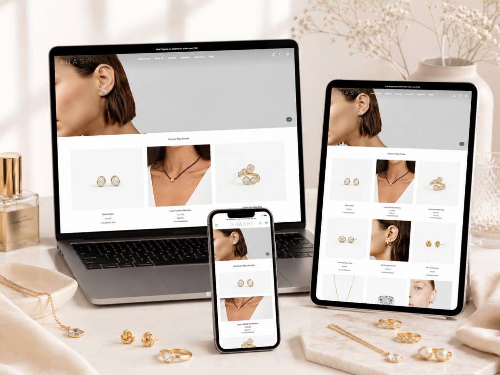
The homepage is the most important storytelling page of the website. It must immediately communicate the brand’s aesthetic while also leading users into shopping. For a jewelry brand, the first screen should not feel crowded. It should create a mood.
A large lifestyle hero image works well because jewelry often sells through styling context. Instead of only showing isolated product shots, the homepage can show how the pieces look when worn. This helps customers imagine the jewelry as part of their daily look.
The homepage hero should use a clean, elegant image with a soft fashion editorial feeling. The model, styling, lighting, and jewelry details should work together to express the brand before the customer reads anything.
The hero section should include:
The headline should be simple and refined.
The subtext can explain the collection or brand feeling.
A button such as “Shop New Arrivals” or “Explore Jewelry” keeps the design commercial.
The key is restraint. The hero should not use too much text, too many buttons, or strong visual effects. Jewelry websites benefit from calm confidence.
The header should feel refined and functional. On shopshashi.com, the main navigation includes direct shopping categories such as New Arrivals, Shop All, Earrings, Bracelets, Necklaces, and Rings. This structure is practical because it reflects how customers naturally browse jewelry.
For our page design, we would keep this direct category logic. Jewelry shoppers often enter with a product type in mind. A clean navigation system shortens the distance between interest and action.
A strong jewelry Shopify header should include:
The logo should stay centered or clearly visible, depending on the layout.
The category labels should be short and easy to scan.
Search is important for customers who already know what they want.
Account access supports returning customers.
The cart should always remain easy to find.
A simple announcement bar can support conversion without interrupting the luxury feeling. SHASHI uses free shipping messaging for domestic orders over a certain value.
For design, the announcement bar should stay narrow, clean, and readable. It should not look like a loud discount banner. Luxury-inspired design needs promotional information, but it should appear controlled and tasteful.
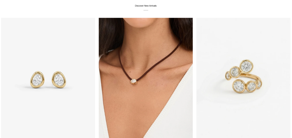
After the hero section, the homepage should quickly guide users into product discovery. A jewelry homepage should not stay too abstract for too long. Customers need to see products early.
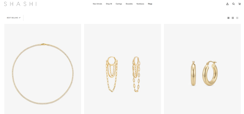
A featured product grid works well because it gives visitors a quick sense of price range, product style, color options, and best-selling categories. The SHASHI product listings show clear product names, prices, color options, and add-to-cart behavior across collection pages.
Product cards should be simple and consistent. For a jewelry store, product cards should avoid excessive borders, heavy shadows, or busy badges unless absolutely necessary.
A strong product card includes:
The image should have enough space around the jewelry.
The name should be readable and not visually overpower the image.
The price should be easy to identify.
Color labels such as Gold, Silver, White Gold, Pearl, or Multi can help customers compare quickly.
This supports faster shopping, especially for simple products.
White space is one of the most important design tools in a jewelry Shopify website. It makes small products feel more valuable. It also reduces visual noise and helps customers focus on the details.
Instead of filling every area with banners, icons, or long text blocks, the homepage should use spacing to create rhythm. This makes the website feel premium and easier to browse.
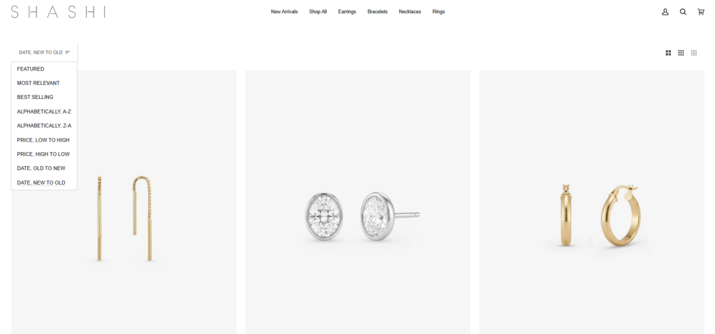
Collection pages are where customers start comparing products. For SHASHI, major collections include product categories like Earrings, Bracelets, Necklaces, Rings, New Arrivals, and Shop All.
The collection page design needs to be clear, fast to scan, and visually consistent. The customer should understand the category immediately and then move into browsing without friction.
A strong collection page should include:
The title should be clean and direct.
A short line can support SEO and brand tone without crowding the page.
Product grid
The grid should be balanced and consistent across desktop and mobile.
Filters or sorting
For larger catalogs, filters can help customers narrow by product type, color, price, or availability.
Jewelry product grids should feel elegant rather than dense. On desktop, a three-column or four-column layout can work depending on image quality and product count. On mobile, a two-column grid often balances product visibility and browsing speed.
The product image ratio should stay consistent. When image ratios vary too much, the page feels messy and less premium. Consistency builds trust.
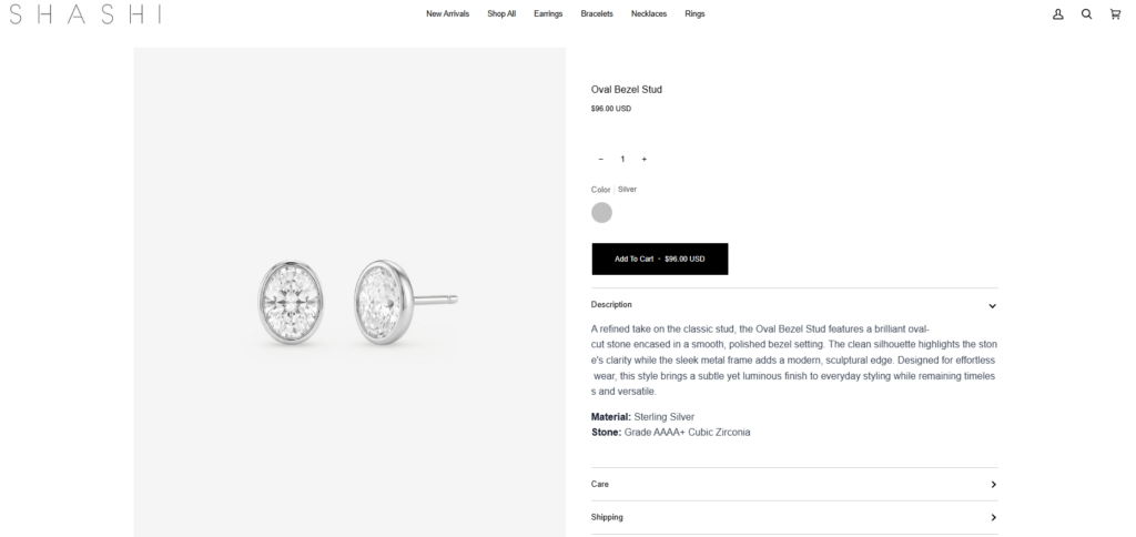
The product page is where design must become more persuasive. Customers already clicked because they liked a product. Now the page needs to answer their questions, reinforce value, and make the purchase action obvious.
For jewelry, the product page should focus on image clarity, product detail, sizing, material information, shipping expectations, and emotional appeal.
The product image area should be large enough to show small details. Jewelry shoppers care about shape, shine, finish, color, and scale. A product page should include multiple views whenever possible, including close-up images and lifestyle images.
The layout should allow customers to move through product images easily. On desktop, a large image area on the left and product information on the right usually works well. On mobile, images should appear first, followed by product details and the add-to-cart area.
The product information should be structured clearly:
Product name
The name should appear at the top and feel refined.
Preço
The price should be visible and easy to find.
Variants should be simple to select.
The quantity selector should be clean and minimal.
The button should have strong contrast but still match the brand.
The description should explain materials, styling, and wearability.
Some SHASHI listings show sold-out status, which is common for fashion and jewelry collections.
From a design perspective, sold-out products should not create confusion. The status should be visible, but the page can still support interest through waitlist messaging, related products, or alternative recommendations.
We began with a brand review. We studied the visual tone, product categories, target audience, and the current customer journey. We also reviewed fashion and jewelry Shopify websites to understand how premium brands organize products and guide users.
The goal was not to copy another website. The goal was to understand the design language that works in this category: minimal layouts, strong photography, refined typography, calm color palettes, and clear eCommerce structure.
Next, we mapped the website pages from homepage to collection and product pages. A beautiful homepage alone is not enough. The full journey matters.
We planned the major page roles:
Build the brand impression and direct users into shopping.
Help customers browse by product type.
Support evaluation and purchase.
Keep checkout intent clear.
Build trust around shipping, returns, and service expectations.
SHASHI’s shipping page, for example, provides delivery options, delivery timing, and shipping cost information. Clear service pages help reduce uncertainty during the buying process.
The visual direction focused on clean luxury. We used white space, balanced product grids, soft lifestyle visuals, and typography that feels elegant without becoming hard to read.
We avoided heavy decorative elements because jewelry already provides visual detail. The interface should support the product, not compete with it.
We planned the homepage in a simple sequence:
Quick trust or shipping message.
Clean navigation and shopping icons.
Large lifestyle image with refined CTA.
Immediate product discovery.
Clear shopping section.
Short emotional message about the brand.
Encourage deeper browsing.
Capture customer interest.
Provide navigation, policies, and contact paths.
This structure keeps the homepage both beautiful and practical.
Mobile design is especially important for fashion and jewelry Shopify stores. Many users discover products through social media and land on the website from a phone.
For mobile, we focused on:
The first screen should load the brand mood quickly.
Categories should be easy to open and tap.
Buttons, variant selectors, and cart actions should be comfortable.
Images should not become too small or cropped awkwardly.
The mobile grid should feel clean and easy to scroll.
Jewelry is small and detail-heavy. If the design uses poor spacing or weak imagery, products can look less valuable than they are.
We used a clean visual system with strong image priority. Product cards stay minimal, spacing remains generous, and page sections avoid visual clutter. This helps each piece feel considered and desirable.
Some fashion websites focus too much on storytelling and make shopping hard. Others focus only on product grids and lose brand emotion.
We created a homepage structure that starts with brand mood but quickly leads into product discovery. This balance helps the website feel stylish while still supporting sales.
A jewelry store can have many similar products. Without clear categories, customers may feel lost.
We used straightforward category labels and a simple header structure. Categories such as Earrings, Bracelets, Necklaces, and Rings match natural shopping behavior and make the browsing path easier.
New customers need brand trust. Returning customers may want quick access to new arrivals or specific products.
We made the homepage useful for both groups. The hero builds brand feeling, while product sections and direct navigation help returning customers move faster.
The design gives the jewelry brand a refined digital identity. Clean spacing, elegant imagery, and consistent product presentation make the website feel more professional and trustworthy.
Clear categories and product grids help customers explore more items. This matters for jewelry because customers often compare several pieces before choosing.
A beautiful website should also help customers take action. Clear CTAs, readable product information, visible prices, and simple cart access all support conversion.
When the homepage, collection pages, and product pages follow the same design language, the website feels more reliable. Consistency helps customers feel comfortable moving through the store.
A mobile-first layout helps customers browse from social traffic, ads, email campaigns, and organic search. Clean mobile design can make a major difference in how long visitors stay on the site.
The final design direction creates a Shopify jewelry website that feels elegant, modern, and easy to shop. The homepage builds a soft luxury mood through lifestyle imagery and refined spacing. The collection pages support product discovery with clean grids and direct category paths. The product pages focus on product detail, purchase confidence, and simple interaction.
This approach avoids unnecessary complexity. It does not depend on heavy technical explanations or advanced custom development. Instead, it focuses on what matters most for a jewelry Shopify brand: visual storytelling, customer trust, product clarity, mobile usability, and a smooth shopping journey.
A Shopify jewelry website needs more than a beautiful homepage. It needs a complete design system that connects brand identity, product presentation, navigation, mobile browsing, and conversion-focused page structure. For a brand like SHASHI, the best design direction is clean, feminine, refined, and easy to shop.
Through this type of Shopify design work, we help brands present products with stronger visual value while keeping the shopping experience simple and persuasive. If you want to build or redesign a Shopify store with a polished, conversion-focused visual direction, this is exactly where AIRSANG brings value.


