


Nenhum produto no carrinho.

When we design a main image for Ozon, we never treat it as a simple product photo. We treat it as a strategic conversion tool. Every element—composition, typography, color contrast, feature hierarchy, and background environment—must work together to increase click-through rate, reduce hesitation, and communicate value within seconds.
For this air pump project, our goal was clear: present the product as powerful, versatile, reliable, and modern, while aligning with Ozon’s marketplace browsing behavior. Russian consumers often compare specifications quickly, so we structured each visual to prioritize clarity, performance indicators, and trust signals.
Below is a full breakdown of each main image and how we designed it to win attention and drive conversions.
| Prazo de entrega | Categoria | Plataforma de Aplicação |
| 9 dias | air pump | Ozônio |
| Designers envolvidos | Custo | Efeito |
| Lin Zhang | $150 | Store traffic📈209% |
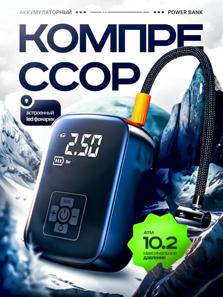
In the first image, we placed the air pump in a dramatic mountain environment. This was intentional.
Instead of showing it in a flat studio background, we positioned the product among snowy peaks to communicate endurance and reliability. Cold, high-altitude landscapes visually imply toughness. For a portable compressor, that message matters: customers associate harsh environments with durability.
We enlarged the digital display to make the pressure reading instantly readable. The number “2.50” on the screen becomes a visual anchor. Buyers do not need to zoom to understand the functionality.
We also highlighted:
The bold, oversized “КОМПРЕССОР” headline dominates the upper space. On Ozon, large typography increases visibility in thumbnail view. When customers scroll quickly, strong contrast between dark blue letters and a light background ensures the product category is immediately recognizable.
The green badge showing “10.2” creates urgency and breaks the color palette strategically. That pop of neon green draws the eye toward the performance specification.
This image establishes power and capability within three seconds.
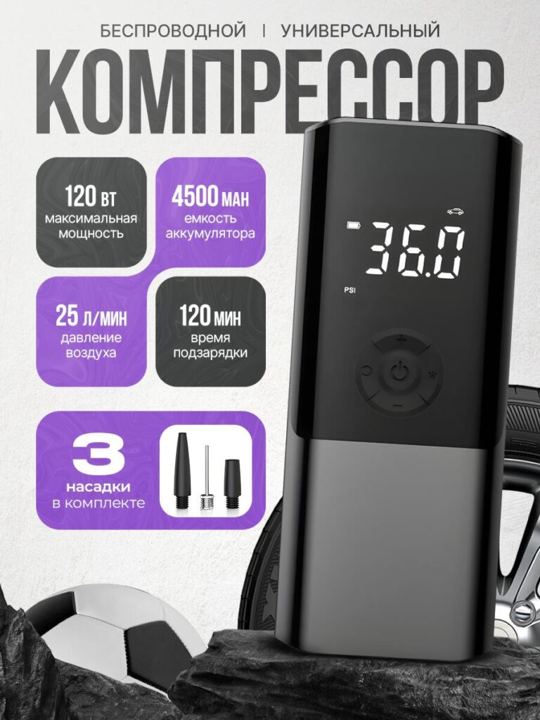
The second image shifts from emotional storytelling to rational persuasion.
Here, we focused on structured specification blocks:
Instead of listing specs in plain text, we organized them in rounded square modules. This creates visual rhythm and helps buyers scan information quickly.
The purple gradient blocks contrast against the neutral background. We use color coding intentionally: purple implies technology and modern electronics, reinforcing that this air pump is more than a mechanical tool—it’s a smart device.
The product is positioned vertically on the right side, creating a strong asymmetrical layout. This composition guides the viewer’s eye from specs to product, naturally linking features to the device itself.
The accessories image (three nozzles) increases perceived completeness. When customers see included attachments clearly displayed, return rates decrease because expectations are clear.
This image converts comparison-driven buyers.
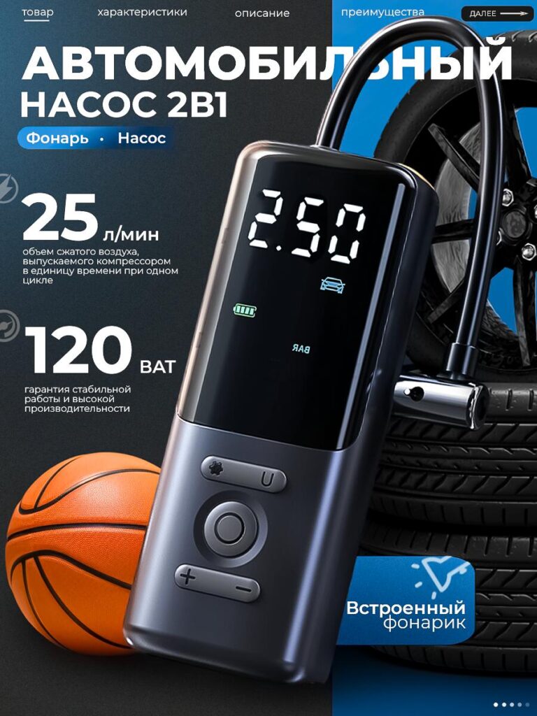
In the third visual, we moved into contextual demonstration.
We positioned the pump near a car tire and a basketball. This communicates multi-scenario usage:
We emphasized “25 L/min” and “120W” again but in a more dynamic layout. Repetition is intentional in marketplace design. When customers scroll through multiple images, repeating core performance metrics reinforces memory retention.
The dark blue background paired with automotive elements signals professional-grade equipment. The LED flashlight callout appears again, now shown as a practical roadside feature.
This image answers the buyer’s question: “Can I use it for my car?” The answer is visual and immediate.
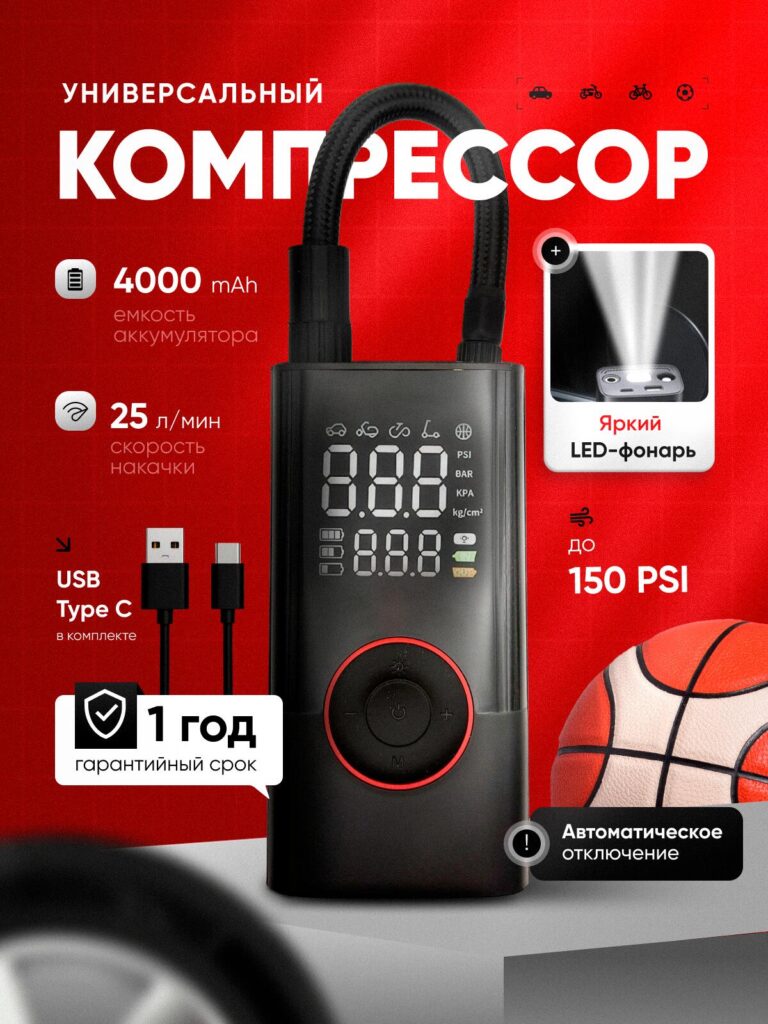
The fourth image uses a bold red background.
Red signals urgency, strength, and performance. In Ozon’s search results, red thumbnails often stand out among neutral competitors.
Here we highlight:
We integrated a close-up of the LED flashlight beam to visually demonstrate brightness instead of merely stating it.
The circular control ring with red illumination emphasizes modern interface design. By zooming slightly closer to the control panel, we enhance the perception of build quality.
This image is designed to outperform competitors in scroll-based browsing.
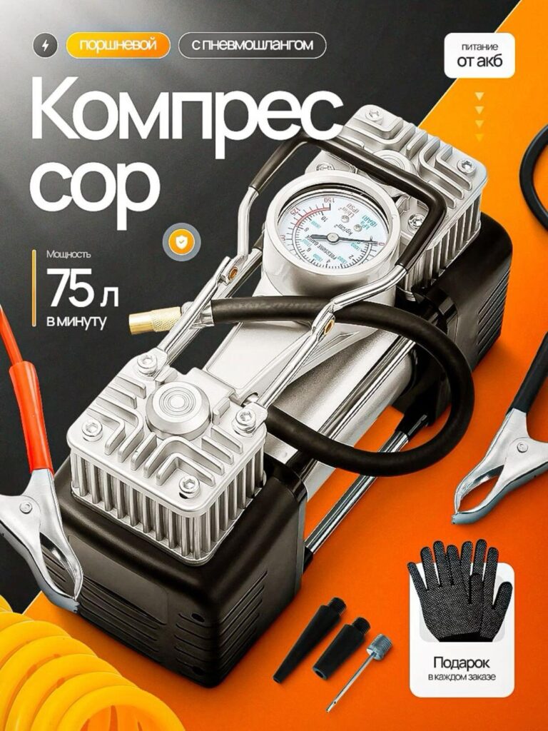
Not all customers want portability; some want raw power.
In this image, we introduced a dual-piston compressor model with visible mechanical components. Exposed metal, gauges, and clamps communicate industrial strength.
Destacamos:
The orange-and-black color scheme reinforces hardware aesthetics. Unlike the sleek digital model, this design speaks to practical, tool-focused buyers.
Showing the analog pressure gauge increases trust. Mechanical measurement feels reliable and transparent.
This visual targets users searching for workshop-level performance.
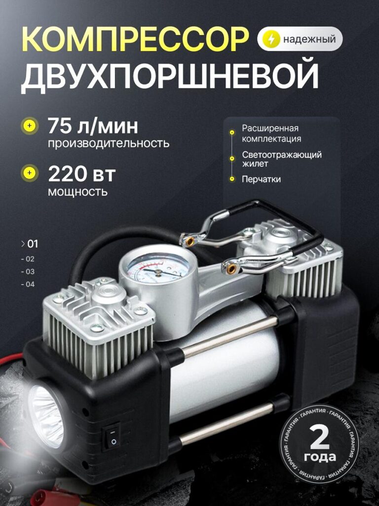
The sixth image refines the heavy-duty message.
We present:
The lighting highlights metallic details, emphasizing durability and quality materials. The dark background creates depth and contrast, ensuring the product stands out clearly in thumbnail view.
We structured the typography vertically on the left to keep the product unobstructed.
This image increases perceived value by showcasing extended warranty and additional safety accessories.
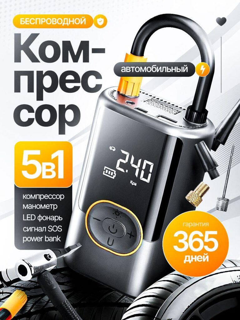
In the final image, we return to the compact, digital model but reposition it as a multifunction solution.
We clearly list:
The “5 in 1” badge is large and bold. Buyers respond strongly to bundled functionality. When they see multiple benefits in one device, perceived value rises instantly.
The yellow accents suggest energy and activity. The clean white background increases readability.
We also show additional nozzles and car tire context to reinforce versatility.
This final visual closes the persuasion loop by summarizing value.
Across all images, we consistently applied five marketplace principles:
Key numbers are always large and high-contrast:
Numbers convert faster than descriptive paragraphs.
We show tires, balls, flashlights, and accessories clearly. Ambiguity increases return rates. Clarity reduces them.
We organize data in structured shapes for fast scanning. Ozon buyers compare quickly.
Red = power
Purple = technology
Blue = reliability
Yellow = energy
Green badge = emphasis
Color psychology guides attention.
Every composition works at small size. Strong contrast and large typography ensure legibility.
Ozon shoppers behave similarly to Amazon users: they compare visually first, then read specs. If your main image fails to communicate power and versatility instantly, you lose clicks.
We structured this air pump listing to:
Each image serves a role in the sales journey:
Together, they form a cohesive visual sales system.
Projetando um Ozônio main image requires more than clean product photography. It demands understanding platform behavior, buyer psychology, and competitive positioning.
For this air pump project, we created a complete visual ecosystem—one that communicates strength, versatility, reliability, and modern functionality at every scroll level.
When visuals reduce friction and increase clarity, conversion becomes natural.
At the end of the day, strategic marketplace design is not decoration—it is measurable performance. That is exactly the approach we apply at AIRSANG.


