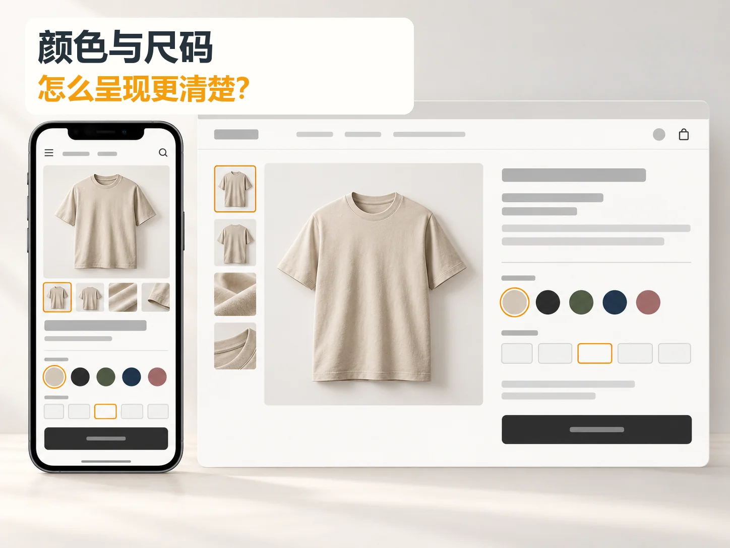
How can colors and sizes be presented more clearly for products with multiple variants? The answer is not squeezing more little boxes onto the page. Help customers complete four tasks in order: understand available colors, find the right size, confirm that the combination is purchasable, and verify the item added to the cart. Color and size need separate explanations but must resolve into a clear selected-product state. The apparel-store examples below are educational illustrations. Actual colors, inventory, and measurements must come from the merchant’s real product records.
Separate the customer’s selection tasks first
A shopper seeing a top in a listing has already broadly accepted its style. On the detail page, they need to check whether the color reflects the real item, the size fits, and the combination is available. Scattering colors, sizes, stock, and size charts across screens causes repeated scrolling. A single Specifications dropdown hides the available choices until opened. Establish information order before deciding between swatches, text buttons, and dropdowns.
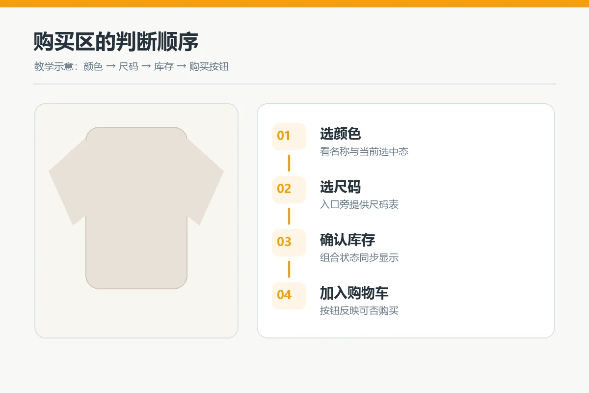
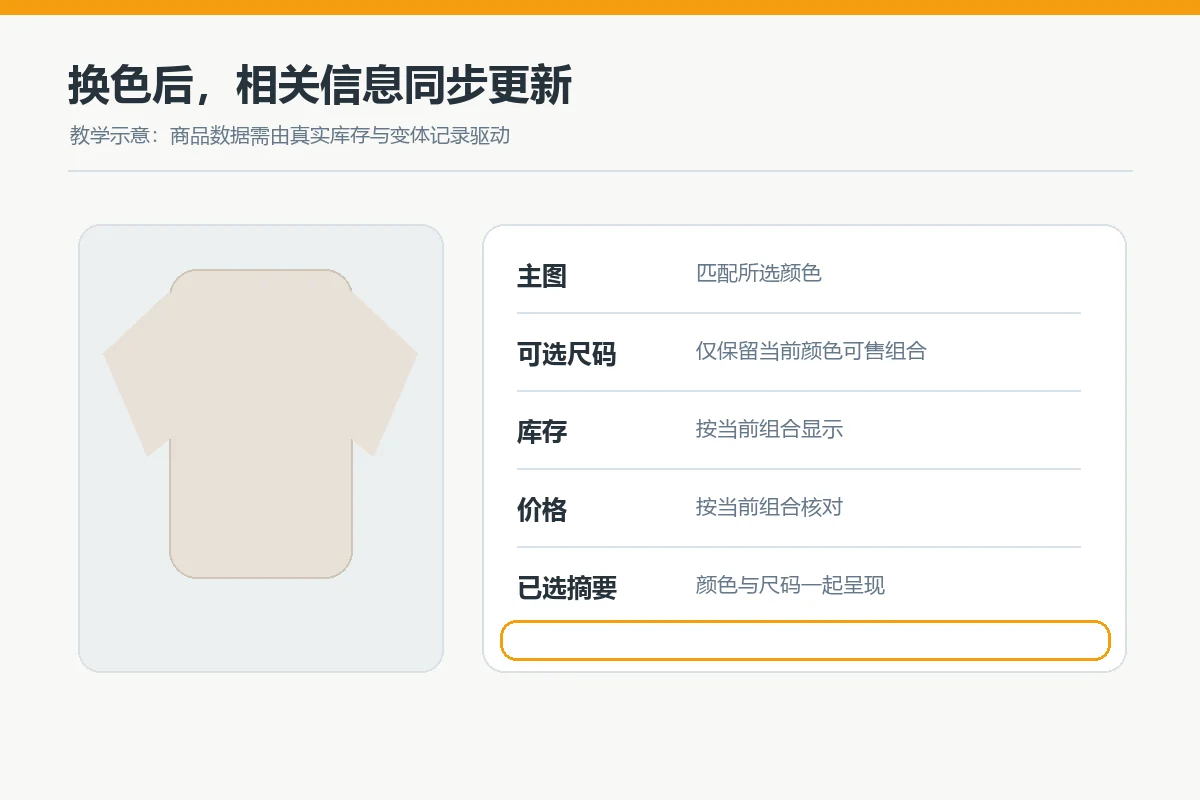
Arrange the purchase area as Color name and swatches → Size buttons and guide → Selected combination’s price and stock → Purchase button. Keep the main image nearby and update it for the selected color. If no matching product photograph exists, clearly identify the color shown rather than implying that the image follows every selection. For a sitewide hierarchy review, consult the cross-page website acceptance checklist from homepage to mobile .
Color and size answer different questions
Color answers What appearance will I receive? Size answers Will it fit? Colors need names, distinguishable samples, and a clear relationship to the main image. Sizes need consistent labels, measurement instructions, and relevant fit guidance. Do not interchange Navy, Dark blue, and Deep navy for the same product, or show M on the page while the chart uses only numeric codes. For multiple markets, identify the sizing system; do not guarantee unverified conversions.
Color: show a name and selection feedback beside the swatch
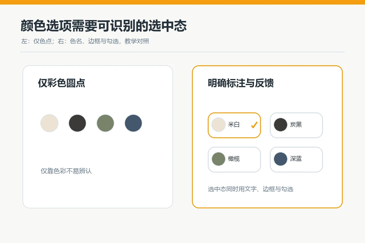
Apparel and home-product colors often need quick scanning, making swatches or detail thumbnails clearer than long dropdowns. Color alone cannot reliably distinguish selected and unselected states for every customer. W3C’s guidance against using color alone to convey information supports adding text, shapes, or other indicators. Show the current color name beside or above the swatches and add a distinct border, checkmark, or Selected label. Pale swatches need boundaries, and dark swatches must remain distinguishable on dim screens.
If photos and swatches differ, check color values, retouching, and lighting first, then explain that screen appearance may differ from the physical item. A disclaimer does not replace accurate photos. For mixed materials or patterns, use detail thumbnails and zoomable real photographs. Do not create a seemingly photographic composite for an unphotographed variant unless clearly labeled as a design illustration.
For Shopify, the official help documentation explains that color category metafields can connect to variant options and appear as swatches, but the theme must support the feature. Frontend behavior varies by theme. For WooCommerce, the official variable-product documentation explains color and size attributes and variant-specific images, prices, and stock. Swatch styling still depends on the theme or extension. Verify product records and theme support before proposing the interface.
Size: keep selection controls close to measurement guidance
Unlike color, a size symbol cannot establish fit. Clothing pages can show common size buttons beside an opening View size chart link, adding How to measure for complex categories. The chart must identify units, measurement locations, and whether values are flat garment measurements or recommended body measurements. Do not mix both in an unlabeled column. Footwear, pet apparel, and home textiles need different measurements, not a copied generic clothing template.
Opening a size chart should not take shoppers away and lose their chosen color. Use an inline expansion or dialog that returns them to the selection position when closed. Headers and units must remain readable on phones. Place evidence-based stretch, loose-fit, or narrow-fit guidance beside the size entry point. Model wears M alone rarely replaces model height, sample-garment size, and actual measurements.
Keep unavailable sizes visible without making them look orderable. Use disabled styling and Sold out text. Label restock notifications separately and explain that they are not immediate purchases. If availability differs by color, update size availability immediately after a color change rather than revealing an unavailable combination only after the purchase button is pressed.

Combine both options into a purchase path that can be verified
Color and size form a backend combination, so echo it in the interface: Selected: Navy / M. If a selected size is invalid for a new color, explicitly request reselection rather than silently substituting another size. Update changing price, stock, and images together in the same visible area. Shopify’s variant guidance uses color-size combinations, while WooCommerce associates each combination with price, inventory, and images. The displayed selection must therefore match the actual backend variant.
Buttons can be easier to scan for a few options; grouped selectors may save space when choices or sizing systems are numerous. No control works universally across industries. Compare designs using the same product, phone width, and tasks to see whether customers find the intended combination without guessing. The following table supports design decisions; it is not measured conversion data.
| Presentation | More suitable when | Required supporting information |
|---|---|---|
| Color swatches / thumbnails | Colors or textures need quick comparison | Names, selection marks, matching images |
| Text size buttons | Few visible options need side-by-side comparison | Size chart, units, out-of-stock status |
| Grouped dropdowns | Many options or limited page space | Clear field labels and current-selection summary |
The table’s suitability judgments are educational. Decide using product count, buyer language, actual stock, and mobile testing. When many combinations are unavailable, correcting data and rules can prevent more selection errors than changing controls. For product explanations, also consult FAQ placement on product and dedicated pages to put sizing, materials, and return questions where shoppers need them.
Mobile design must do more than shrink the desktop layout
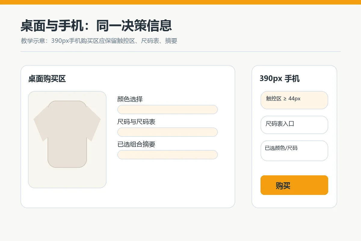
Images, specifications, and purchase buttons often span several phone screens. Important states must remain recoverable while scrolling. A sticky purchase bar should at least show the selected combination or provide a return to selectors. Do not keep Add to cart visible while hiding the size. Long swatch rows should wrap or offer an obvious expansion; avoid half-visible options without a scrolling cue.
Touch targets need usable space and labels clearly associated with their options. W3C’s target-size explanation encourages larger interactive areas. This article applies the principle of sufficiently large targets with space between neighboring controls; specific compliance depends on the project’s WCAG level and actual tests. Small color dots need particular attention: the visual dot may be small, but its clickable area must remain easy to reach.
Mobile charts must preserve units and row-column relationships. Wide tables may scroll locally without causing whole-page horizontal overflow. Dialogs need a clear close action and tested focus entry and return. Customers can then continue their original color and size choices rather than start again.
Accept real tasks before launch, not just static designs
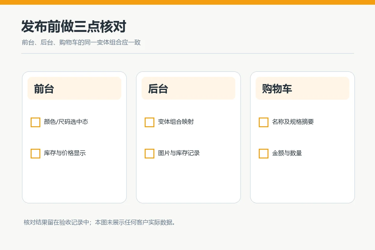
Choose three real edge cases: many colors with few sizes, many sizes with few colors, and unavailable combinations. Ask someone outside the design team to find a specified color and size, confirm availability, and add it to the cart on phone and desktop. Record repeated scrolling, mistaken availability, and whether specifications can be verified in the cart. Do not assume a conversion-lift percentage; use observed sessions and site data to plan changes.
Then check backend variants against frontend names, prices, stock, images, and cart line items. Multilingual sites must translate color names and size units, not only headings. The same SKU sold through multiple channels may face different image and copy restrictions; your site’s swatch design is not proof of marketplace compliance. Separate data errors from interface misunderstandings to identify whether records or layout need correction.
Finally test keyboard selection, focus indicators, readable selected states, stock messages that do not rely only on gray, and horizontal scrolling at common phone widths. Mockups cannot prove interaction works; retest actual published pages. To review the route from homepage to product, combine this with the homepage navigation and product category checklist to ensure customers find the correct product before reaching its detail page.
Conclusion: give every selection step a clear answer
To clarify colors and sizes, provide named colors with recognizable selected states, place sizes beside measurement evidence, and echo the matching image, stock, price, and cart information. Test the same buying task on desktop and mobile, with immediate feedback for stock and option changes. Start with one commercially important product with many variants, then extend verified rules to similar products rather than changing every product page at once.