


การแนะนำ
Creating a successful ช็อปฟี่ store is not only about selling products. It is about building an experience that emotionally connects with visitors, guides them naturally through the website, and turns curiosity into trust.
For collectible and designer toy brands, this challenge becomes even more important. The audience is highly visual, emotionally driven, and deeply connected to aesthetics, community culture, and product presentation. A generic storefront cannot create the excitement or emotional engagement these customers expect.
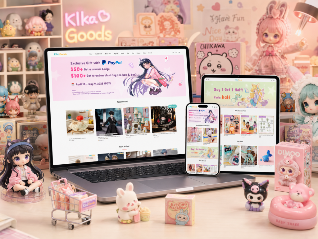
When working on the design direction for คิก้ากู๊ดส์, the goal was to create a Shopify shopping experience that felt immersive, playful, premium, and easy to explore. Instead of relying on aggressive sales tactics or cluttered layouts, the website needed to guide visitors through collections naturally while reinforcing the personality of the brand.
This project focused heavily on visual storytelling, homepage structure, collection organization, product discovery, and overall user experience design. Every section was carefully planned to help the brand feel more memorable while improving the shopping journey across desktop and mobile devices.
In this article, we will break down how the Shopify design process was approached, the challenges we faced, the methods used to improve the experience, and how the final result aligned with modern eCommerce design expectations.
| ระยะเวลาจัดส่ง | หมวดหมู่ | แพลตฟอร์มแอปพลิเคชัน |
| 17 วัน | Decorative Figurines | shopify |
| นักออกแบบที่เกี่ยวข้อง | ค่าใช้จ่าย | ผล |
| แนนซี่ | $1700 | Sales📈244% |
Understanding the Brand Direction
Before designing any Shopify store, the first step is understanding the brand itself.
For this project, the visual identity already carried a strong personality. The products featured collectible toys, blind boxes, designer figures, and anime-inspired merchandise. These products naturally appeal to audiences who enjoy creativity, discovery, and visual excitement.
Because of this, the website could not feel overly corporate or minimal in a cold way. At the same time, it also needed enough structure and organization to avoid becoming visually overwhelming.
The challenge was finding the balance between:
- Playful visual energy
- Premium product presentation
- Clear shopping navigation
- Strong mobile usability
- High visual engagement
- Easy product discovery
This balance became the foundation for the entire Shopify design strategy.
The Main Goals of the Website Design
สร้างความประทับใจแรกพบที่แข็งแกร่ง
The homepage needed to instantly communicate the brand personality.
For highly visual eCommerce brands, users often decide within seconds whether the website feels trustworthy and interesting. Because of this, the opening visual experience became one of the most important parts of the project.
The design needed to:
- Immediately showcase featured collections
- Highlight promotional campaigns naturally
- Introduce the visual tone of the brand
- Encourage users to continue scrolling
- Reduce visual confusion
Instead of overcrowding the homepage with too many competing sections, the structure focused on rhythm and visual flow.
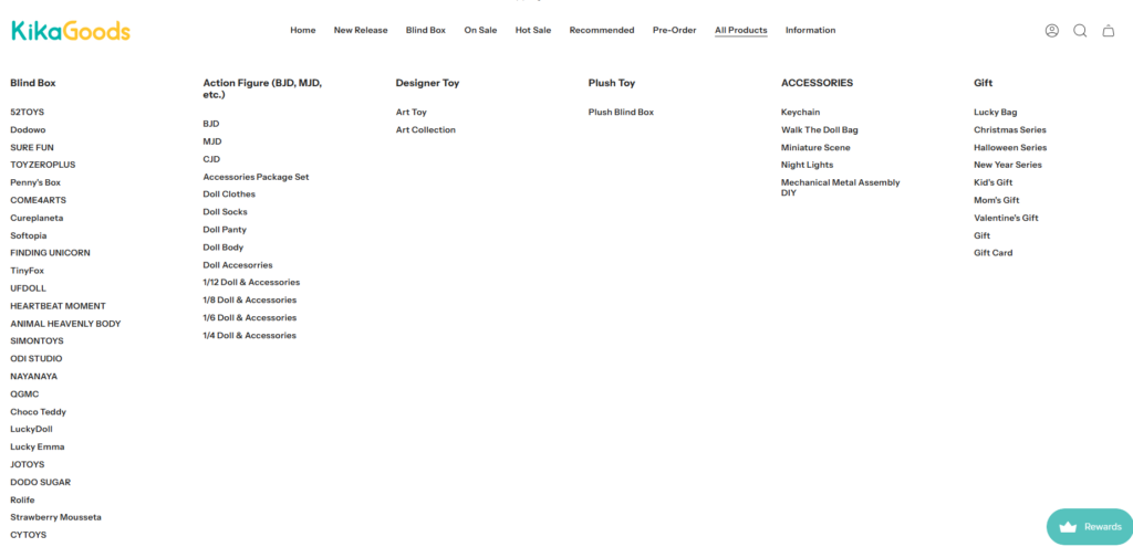
การปรับปรุงการค้นหาผลิตภัณฑ์
One of the biggest challenges for collectible-focused Shopify stores is organization.
Large product catalogs can quickly feel chaotic if the customer cannot easily browse categories, themes, or product styles.
To solve this, the design direction emphasized:
- Clear collection segmentation
- Easy-to-understand navigation
- Visual category banners
- Consistent product grid spacing
- Cleaner filtering experiences
- Simplified browsing behavior
This helped customers move through the website more naturally without feeling overwhelmed.
Building an Experience That Feels Fun
A collectible store should feel exciting.
Customers browsing these products are not simply buying necessities. They are exploring hobbies, interests, aesthetics, and emotional purchases.
Because of this, the website experience needed moments of visual excitement throughout the shopping journey.
The Shopify design approach focused on:
- Large lifestyle visuals
- Bright promotional graphics
- Character-driven imagery
- Layered homepage sections
- Dynamic collection presentations
- Interactive visual hierarchy
These details helped the website feel energetic without sacrificing usability.
The Homepage Design Strategy
Designing the Hero Banner Experience
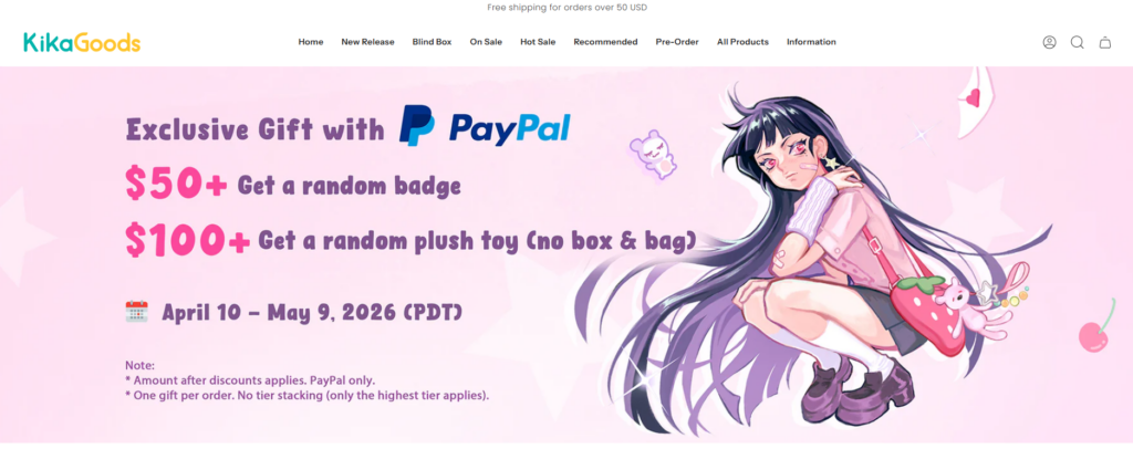
The homepage banner became the emotional entry point of the website.
Instead of creating a static and overly simple opening section, the visual direction focused on energy, color, and promotional clarity.
The hero section was designed to achieve several goals at once:
Highlight Key Campaigns
Large campaign visuals helped showcase:
- สินค้าใหม่
- คอลเลกชันมีจำนวนจำกัด
- Seasonal launches
- Exclusive products
- Featured collaborations
This allowed visitors to immediately understand what was important on the website.
Encourage Scrolling Behavior
The homepage layout intentionally guided the eye downward.
Spacing, visual layering, banners, and product previews were arranged in a way that encouraged users to continue exploring instead of bouncing after viewing the first screen.
This approach helped improve the browsing experience naturally.
Balance Visual Energy With Clarity
Many collectible stores make the mistake of becoming visually overloaded.
Too many colors, banners, animations, and products can quickly make a website feel chaotic.
For this Shopify design, the visual hierarchy remained controlled through:
- ระยะห่างที่สม่ำเสมอ
- Structured layouts
- Controlled typography
- Clean section transitions
- Organized content blocks
This balance helped maintain excitement while preserving usability.
Collection Page Design Approach
Making Large Product Catalogs Easier to Browse
Collection pages play a critical role in Shopify user experience.
For this project, collection pages needed to feel:
- Organized
- Visually appealing
- Fast to scan
- Easy to compare
- Comfortable on mobile
The product grids were designed with strong consistency in:
- Image ratio
- Spacing
- Product card structure
- ลำดับชั้นของการจัดวางตัวอักษร
- Hover interactions
This consistency helped improve the overall browsing rhythm.
Creating Clear Collection Segmentation
Rather than allowing all products to blend together, the website introduced stronger category identity.
Different collections used:
- Distinct banners
- Visual grouping
- Promotional callouts
- Featured product highlights
- Themed layouts
This helped customers understand product categories more quickly while creating a more curated shopping experience.
Improving Mobile Shopping Experience
A large percentage of Shopify traffic now comes from mobile devices.
Because of this, mobile responsiveness became a major design priority throughout the project.
The mobile collection experience focused on:
- Comfortable spacing
- Simplified navigation
- Faster visual scanning
- Touch-friendly layouts
- Cleaner product stacking
The goal was making browsing feel smooth without overwhelming smaller screens.
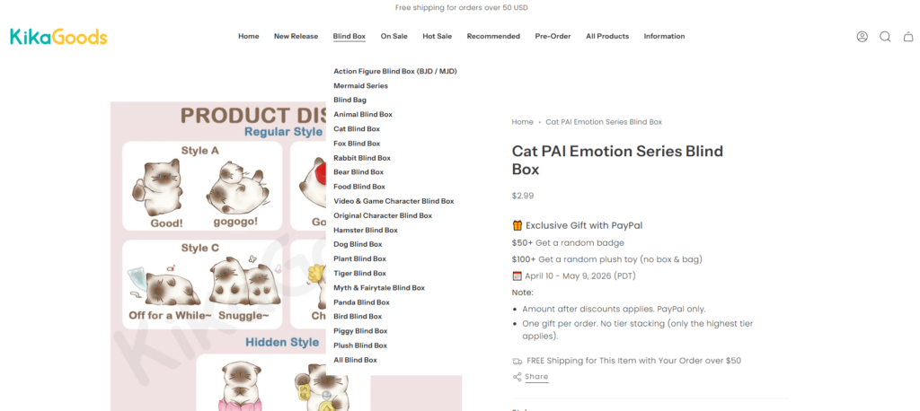
ปรัชญาการออกแบบหน้ารายละเอียดสินค้า
Building Trust Through Cleaner Layouts
Product pages are where browsing turns into purchasing decisions.
For this reason, product page clarity became extremely important.
Instead of overcrowding the layout with excessive distractions, the product page structure focused on:
- Clear product imagery
- Organized information hierarchy
- Easy-to-read descriptions
- Visible purchasing actions
- Comfortable spacing
This helped users focus on the products themselves.
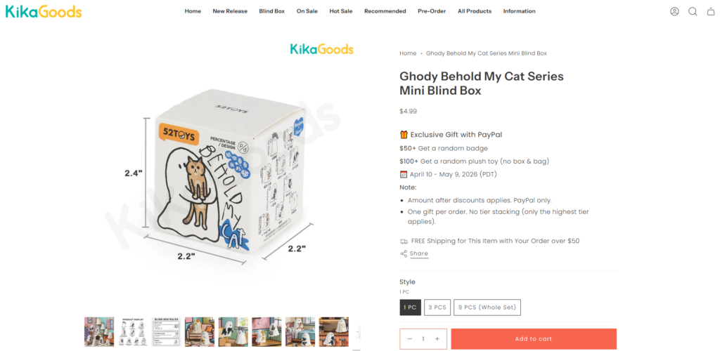
Enhancing Product Visual Presentation
Collectible products rely heavily on presentation quality.
The design direction emphasized:
- Large product imagery
- Detailed close-up visuals
- Strong thumbnail organization
- Lifestyle product context
- Clean gallery transitions
This approach helped products feel more premium while giving shoppers more confidence.
Supporting Emotional Purchasing Behavior
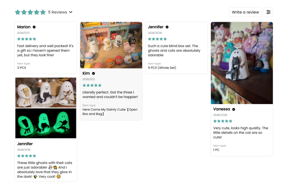
Many collectible purchases are emotional rather than purely practical.
Because of this, the product pages also needed to support excitement and anticipation.
The design helped accomplish this through:
- Limited-release presentation styles
- Featured badges
- Collection storytelling
- Related product recommendations
- Visually engaging layouts
These details helped reinforce the feeling of exclusivity and discovery.
Navigation and User Experience Improvements
Simplifying the Header Structure
The website navigation needed to remain easy to understand despite having many categories and product types.
The header experience focused on:
- Clear menu hierarchy
- Search accessibility
- Streamlined category grouping
- Improved mobile menu usability
This helped users find products more quickly while reducing friction.
Making Search Feel More Useful
Search is especially important for collectible-focused stores because customers often browse for specific characters, themes, or product lines.
The search experience was designed to feel:
- Fast
- Visible
- Easy to access
- Consistent across devices
This improved overall usability and helped customers reach products more efficiently.
Visual Design Decisions
Using Color Strategically
The visual direction avoided making every section compete aggressively for attention.
Instead, colors were used strategically to:
- Highlight campaigns
- Separate sections
- Guide visual attention
- Support product imagery
- Reinforce branding
This approach created a more comfortable browsing experience.
Typography and Readability
Typography played an important role throughout the Shopify design process.
The website needed fonts that felt:
- Modern
- Playful
- Easy to read
- Suitable for product-heavy layouts
Typography hierarchy helped visitors quickly identify:
- Promotions
- Product names
- Collection titles
- Navigation elements
- Shopping actions
This improved both aesthetics and usability.
Challenges During the Design Process
Managing Large Amounts of Visual Content
One major challenge was balancing visual excitement with organization.
Because collectible stores naturally contain:
- Bright imagery
- Character visuals
- ป้ายโฆษณาประชาสัมพันธ์
- Multiple collections
- Frequent launches
…the risk of visual overload was high.
The solution focused on:
- Better spacing systems
- Cleaner layout rhythm
- Controlled visual hierarchy
- Simpler content segmentation
This helped maintain clarity while preserving the brand personality.
Maintaining Consistency Across Pages
Another challenge involved keeping the experience visually consistent across:
- Homepage sections
- หน้าคอลเลกชัน
- Product pages
- ป้ายโฆษณาประชาสัมพันธ์
- Mobile layouts
Consistency became essential for making the website feel more premium and trustworthy.
To solve this, the design system maintained:
- Unified spacing
- Consistent typography
- Structured content hierarchy
- Repeating visual patterns
- Stable product presentation rules
The Final Result
The final Shopify website experience achieved several important outcomes.
The new design helped create:
- Stronger visual identity
- Better browsing flow
- Improved product presentation
- Cleaner collection organization
- More engaging homepage interactions
- การใช้งานบนมือถือที่ดีขึ้น
- More immersive shopping experiences
Most importantly, the website now feels aligned with the emotional expectations of collectible-focused audiences.
Instead of functioning only as a product catalog, the Shopify store became a branded experience that encourages exploration, discovery, and engagement.
Why Design Matters in Shopify eCommerce
Modern Shopify stores compete heavily on experience.
Customers no longer judge websites only by product quality. They also evaluate:
- การนำเสนอแบรนด์
- Visual storytelling
- Ease of browsing
- ประสบการณ์บนมือถือ
- Shopping comfort
- Emotional engagement
This is especially true for visually driven industries like collectibles, fashion, lifestyle products, and designer merchandise.
A strong Shopify design can:
- Increase browsing time
- Improve product discovery
- Strengthen brand perception
- Support customer trust
- Encourage repeat visits
- Create a more memorable experience
That is why thoughtful design strategy matters far beyond aesthetics alone.
บทสรุป
การออกแบบ ช็อปฟี่ experience for a collectible-focused brand requires more than attractive visuals. It requires understanding how customers browse, what emotionally engages them, and how visual storytelling can support purchasing behavior naturally.
For this project, every section was carefully structured to balance creativity, usability, and product presentation. From the homepage flow to collection organization and product page clarity, the goal remained consistent: create a shopping experience that feels immersive, exciting, and easy to explore.
At the end of the process, the website became more than just an online store. It became a visual experience that reflects the brand personality while supporting long-term eCommerce growth.
This type of strategic Shopify design approach is exactly what AIRSANG focuses on — helping brands create visually engaging, conversion-friendly online stores that feel modern, memorable, and professionally crafted.


ออกแบบและสร้างเว็บไซต์ WordPress หรือเว็บไซต์องค์กรพร้อมระบบอีคอมเมิร์ซครบวงจรสำหรับคุณ.
ช่วงราคา: $200.00 ถึง $2,500.00ข้อกำหนดเฉพาะหรือใบเสนอราคาพิเศษ
ราคาเดิมคือ: $2.00.$1.00ราคาปัจจุบันคือ: $1.00. ภาพหลักสำหรับการออกแบบอุปกรณ์กายภาพบำบัดที่บ้านของ Amazon (อธิบายรายละเอียด)
บทนำ: การสร้างภาพลักษณ์ที่น่าเชื่อถือสำหรับอุปกรณ์บำบัดที่บ้านบน Amazon เมื่อออกแบบภาพหลักสำหรับอุปกรณ์บำบัดที่บ้านบน Amazon สิ่งสำคัญอันดับแรกของเราคือ...

ภาพหลักสำหรับการแปลงลิปสติกเป็นสินค้าสำหรับ Amazon
บทนำ: การออกแบบภาพหลักลิปสติกที่ขายได้บน Amazon เมื่อเราออกแบบภาพหลักสำหรับลิปสติกบน Amazon ความรับผิดชอบของเราไม่ได้จำกัดอยู่แค่...

แฮกเกอร์ขโมยอีเมลผู้ดูแลระบบ WordPress ได้อย่างไร (และวิธีป้องกัน)
มาเริ่มกันด้วยความจริงที่ไม่น่าสบายใจ: อีเมลแอดมิน WordPress ของคุณอาจเปิดเผยต่อสาธารณะมากกว่าที่คุณคิด และแฮกเกอร์? พวกเขาชอบมาก สำหรับพวกเขา...

อะไรทำให้รองพื้นชนิดเหลวของ Amazon (ภาพหลัก) ขายดี?
บทนำ การออกแบบภาพหลักสำหรับรองพื้นชนิดเหลวบน Amazon ไม่ใช่แค่การทำให้ผลิตภัณฑ์ดูสวยงามเท่านั้น บน Amazon ภาพหลักและ...

การออกแบบภาพหลัก Amazon ที่มีประสิทธิภาพสำหรับตลับกรอง
บทนำ การออกแบบภาพหลักสำหรับ Amazon ไม่ใช่แค่การทำให้สินค้าดูน่าดึงดูดเท่านั้น แต่ยังเกี่ยวกับความชัดเจน ความน่าเชื่อถือ และความเข้าใจได้ในทันที โดยเฉพาะอย่างยิ่งสำหรับ...

การโจมตีแบบ Replay Attack บน WordPress: ภัยคุกคามจริงหรือแค่เรื่องที่ถูกพูดเกินจริง?
ก่อนอื่นขอชี้แจงให้ชัดเจนก่อน การโจมตีแบบ Replay Attack นั้นดูไม่น่ากลัว มันไม่ได้ทำลายรหัสผ่าน มันไม่ได้แทรกโค้ดที่เป็นอันตรายพร้อมข้อความแฮ็กเกอร์สีเขียวกระจัดกระจายไปทั่ว มันแนบเนียนกว่า...

วิธีคัดลอกหน้าเว็บ WordPress โดยไม่ทำให้ระบบเสียหาย
ยอมรับกันเถอะ บางครั้งคุณอาจไม่อยากสร้างหน้าเว็บใหม่ คุณแค่อยากได้หน้าเว็บเดิม...แต่แตกต่างไปเล็กน้อย รูปแบบเหมือนเดิม บล็อกเหมือนเดิม การตั้งค่าเหมือนเดิม เพราะ...

เปรียบเทียบธีม WordPress สำหรับสัตว์เลี้ยง 5 แบบ
บทนำ การเลือกธีม WordPress ที่เหมาะสมสำหรับธุรกิจเกี่ยวกับสัตว์เลี้ยงนั้นไม่ใช่แค่เรื่องของการออกแบบเท่านั้น แต่ยังส่งผลโดยตรงต่อการใช้งาน ความสามารถในการขยายขนาด และการเติบโตของธุรกิจในระยะยาว การดูแลสัตว์เลี้ยงและ...

เปรียบเทียบธีมอีคอมเมิร์ซชุดว่ายน้ำ 5 แบบ
บทนำ การเลือกธีมที่เหมาะสมสำหรับร้านค้าอิสระที่จำหน่ายชุดว่ายน้ำหรือชุดชั้นในนั้นไม่ใช่แค่การตัดสินใจด้านภาพลักษณ์เท่านั้น แต่ยังส่งผลโดยตรงต่ออัตราการเปลี่ยนลูกค้าให้เป็นผู้ซื้อ ความสามารถในการขยายธุรกิจ และความยั่งยืนในระยะยาว...

วิธีปิดการแสดงความคิดเห็นใน WordPress (โดยไม่ต้องเสียสติ)
มาพูดถึงระบบแสดงความคิดเห็นของ WordPress กันดีกว่า ในทางทฤษฎีแล้ว ความคิดเห็นนั้นยอดเยี่ยมมาก มันช่วยกระตุ้นการสนทนา สร้างชุมชน และทำให้เว็บไซต์ของคุณดูมีชีวิตชีวา แต่ในความเป็นจริงแล้ว มันมักจะเป็นเหมือนแม่เหล็กดึงดูด...

การสร้างเว็บไซต์ WordPress ที่ปรับขนาดได้สำหรับแบรนด์ที่ขับเคลื่อนด้วยวิทยาศาสตร์: โครงการ AminoUSA
บทนำ ในยุคดิจิทัลปัจจุบัน เว็บไซต์เป็นมากกว่าแค่สถานที่สำหรับแสดงรายการสินค้า สำหรับแบรนด์ที่ขับเคลื่อนด้วยวิทยาศาสตร์ซึ่งดำเนินงานในอุตสาหกรรมที่มีการควบคุมหรือเน้นการวิจัย...

สร้างร้านค้า Shopify ที่ปรับขนาดได้สำหรับแบรนด์ใบมีดระดับโลก: โครงการ CoolKatana
บทนำ ในธุรกิจอีคอมเมิร์ซข้ามพรมแดน เว็บไซต์ Shopify เป็นมากกว่าแค่หน้าร้าน สำหรับแบรนด์ที่ดำเนินธุรกิจในกลุ่มเฉพาะหรือกลุ่มที่ขับเคลื่อนด้วยวัฒนธรรม เว็บไซต์ต้องทำมากกว่านั้น...

การออกแบบร้านค้า Shopify ที่มีอัตราการแปลงสูงสำหรับขายการ์ดโปเกมอน
บทนำ ในโลกของอีคอมเมิร์ซสินค้าสะสม โดยเฉพาะอย่างยิ่งในตลาดเกมการ์ดโปเกมอน (TCG) เว็บไซต์จะต้องทำมากกว่าแค่แสดงรายการสินค้า...

ดีไซน์ Shopify ที่เพิ่มยอดขายสำหรับแบรนด์อิฐสั่งทำพิเศษ
บทนำ ในสภาพแวดล้อมการแข่งขันอีคอมเมิร์ซในปัจจุบัน โดยเฉพาะอย่างยิ่งในตลาดของขวัญส่วนบุคคลและของสะสม เว็บไซต์ Shopify ต้องทำมากกว่าแค่แสดงสินค้า...

วิธีติดต่อฝ่ายสนับสนุนของ Shopify: คู่มือที่ง่ายและไม่ยุ่งยาก
การบริหารร้านค้า Shopify ควรเป็นเรื่องที่น่าตื่นเต้น ไม่ใช่เรื่องที่ทำให้สับสน เมื่อมีคำถามหรือปัญหาเกิดขึ้น Shopify มีช่องทางการสนับสนุนหลายช่องทาง ขึ้นอยู่กับสถานการณ์...

วิธีปิดใช้งานร้านค้า Shopify: คู่มือที่ชัดเจนและใช้งานได้จริง
การปิดใช้งานร้านค้า Shopify นั้นไม่ซับซ้อน แต่ก็มีผลกระทบหลายอย่างที่ผู้ขายหลายรายมองข้ามไป คู่มือนี้จะอธิบายขั้นตอนอย่างละเอียดและเข้าใจง่าย...

กรณีศึกษาการออกแบบเว็บไซต์ Shopify สำหรับแบรนด์ดอกไม้ระดับพรีเมียม
บทนำ ในสภาพแวดล้อมการแข่งขันอีคอมเมิร์ซในปัจจุบัน เว็บไซต์ Shopify ต้องทำมากกว่าแค่แสดงสินค้า มันต้องสื่อสารคุณค่าของแบรนด์ได้ทันที และแนะนำผู้ใช้...

กรณีศึกษาการออกแบบร้านค้า Shopify: ร้านค้าเกมย้อนยุค
บทนำ ในสภาพแวดล้อมอีคอมเมิร์ซที่มีการแข่งขันสูง ความชัดเจนทางด้านภาพและการเชื่อมโยงทางอารมณ์มักเป็นตัวกำหนดว่าผู้เยี่ยมชมจะกลายเป็นลูกค้าหรือไม่ โดยเฉพาะอย่างยิ่งใน...