


Введение
Creating a successful Shopify store is not only about selling products. It is about building an experience that emotionally connects with visitors, guides them naturally through the website, and turns curiosity into trust.
For collectible and designer toy brands, this challenge becomes even more important. The audience is highly visual, emotionally driven, and deeply connected to aesthetics, community culture, and product presentation. A generic storefront cannot create the excitement or emotional engagement these customers expect.
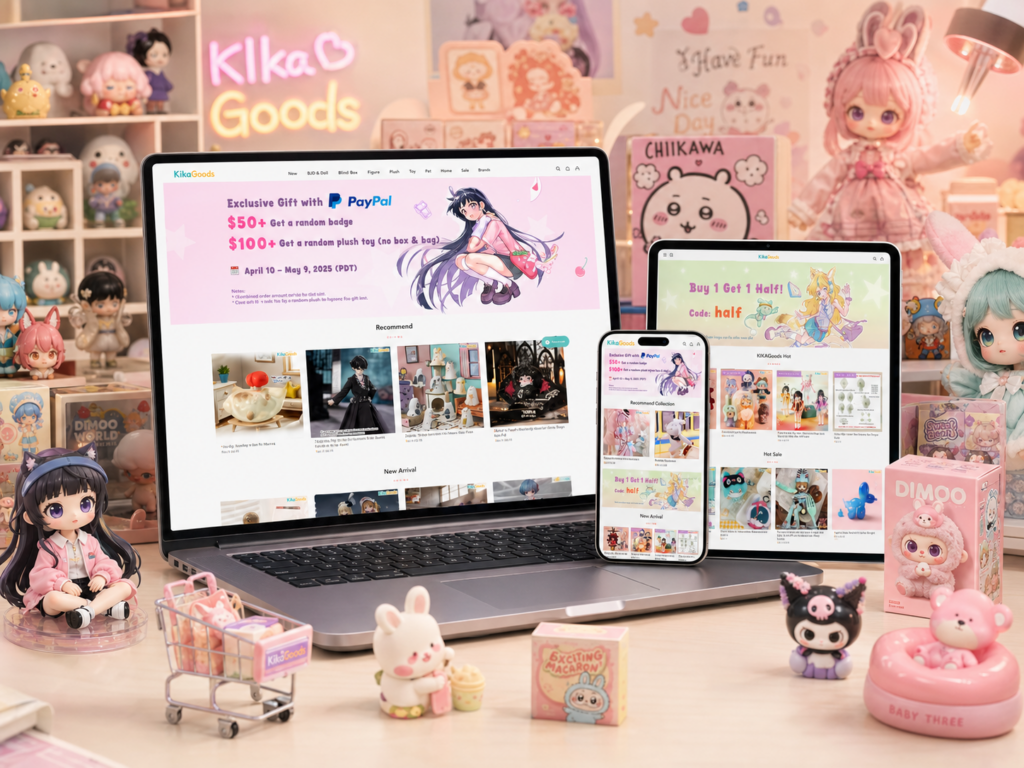
When working on the design direction for KikaGoods, the goal was to create a Shopify shopping experience that felt immersive, playful, premium, and easy to explore. Instead of relying on aggressive sales tactics or cluttered layouts, the website needed to guide visitors through collections naturally while reinforcing the personality of the brand.
This project focused heavily on visual storytelling, homepage structure, collection organization, product discovery, and overall user experience design. Every section was carefully planned to help the brand feel more memorable while improving the shopping journey across desktop and mobile devices.
In this article, we will break down how the Shopify design process was approached, the challenges we faced, the methods used to improve the experience, and how the final result aligned with modern eCommerce design expectations.
| Срок доставки | Категория | Платформа приложений |
| 17 дней | Decorative Figurines | shopify |
| Участники проекта (дизайнеры) | Расходы | Эффект |
| Нэнси | $1700 | Sales📈244% |
Understanding the Brand Direction
Before designing any Shopify store, the first step is understanding the brand itself.
For this project, the visual identity already carried a strong personality. The products featured collectible toys, blind boxes, designer figures, and anime-inspired merchandise. These products naturally appeal to audiences who enjoy creativity, discovery, and visual excitement.
Because of this, the website could not feel overly corporate or minimal in a cold way. At the same time, it also needed enough structure and organization to avoid becoming visually overwhelming.
The challenge was finding the balance between:
- Playful visual energy
- Premium product presentation
- Clear shopping navigation
- Высокий уровень удобства использования на мобильных устройствах.
- High visual engagement
- Easy product discovery
This balance became the foundation for the entire Shopify design strategy.
The Main Goals of the Website Design
Создание сильного первого впечатления
The homepage needed to instantly communicate the brand personality.
For highly visual eCommerce brands, users often decide within seconds whether the website feels trustworthy and interesting. Because of this, the opening visual experience became one of the most important parts of the project.
The design needed to:
- Immediately showcase featured collections
- Highlight promotional campaigns naturally
- Introduce the visual tone of the brand
- Encourage users to continue scrolling
- Reduce visual confusion
Instead of overcrowding the homepage with too many competing sections, the structure focused on rhythm and visual flow.
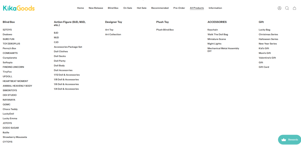
Improving Product Discovery
One of the biggest challenges for collectible-focused Shopify stores is organization.
Large product catalogs can quickly feel chaotic if the customer cannot easily browse categories, themes, or product styles.
To solve this, the design direction emphasized:
- Clear collection segmentation
- Easy-to-understand navigation
- Visual category banners
- Consistent product grid spacing
- Cleaner filtering experiences
- Simplified browsing behavior
This helped customers move through the website more naturally without feeling overwhelmed.
Building an Experience That Feels Fun
A collectible store should feel exciting.
Customers browsing these products are not simply buying necessities. They are exploring hobbies, interests, aesthetics, and emotional purchases.
Because of this, the website experience needed moments of visual excitement throughout the shopping journey.
The Shopify design approach focused on:
- Large lifestyle visuals
- Bright promotional graphics
- Character-driven imagery
- Layered homepage sections
- Dynamic collection presentations
- Interactive visual hierarchy
These details helped the website feel energetic without sacrificing usability.
The Homepage Design Strategy
Designing the Hero Banner Experience
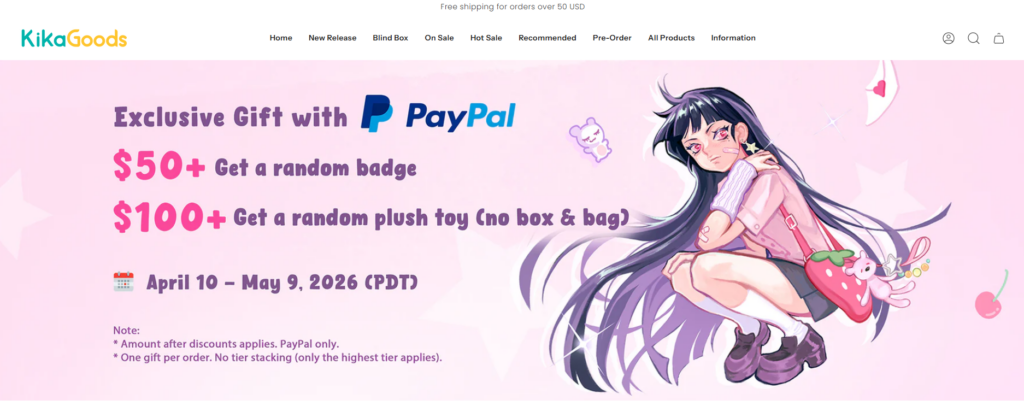
The homepage banner became the emotional entry point of the website.
Instead of creating a static and overly simple opening section, the visual direction focused on energy, color, and promotional clarity.
The hero section was designed to achieve several goals at once:
Highlight Key Campaigns
Large campaign visuals helped showcase:
- Новые поступления
- Ограниченные коллекции
- Seasonal launches
- Exclusive products
- Featured collaborations
This allowed visitors to immediately understand what was important on the website.
Encourage Scrolling Behavior
The homepage layout intentionally guided the eye downward.
Spacing, visual layering, banners, and product previews were arranged in a way that encouraged users to continue exploring instead of bouncing after viewing the first screen.
This approach helped improve the browsing experience naturally.
Balance Visual Energy With Clarity
Many collectible stores make the mistake of becoming visually overloaded.
Too many colors, banners, animations, and products can quickly make a website feel chaotic.
For this Shopify design, the visual hierarchy remained controlled through:
- Равномерное расстояние
- Structured layouts
- Controlled typography
- Clean section transitions
- Organized content blocks
This balance helped maintain excitement while preserving usability.
Collection Page Design Approach
Making Large Product Catalogs Easier to Browse
Collection pages play a critical role in Shopify user experience.
For this project, collection pages needed to feel:
- Organized
- Visually appealing
- Fast to scan
- Easy to compare
- Comfortable on mobile
The product grids were designed with strong consistency in:
- Image ratio
- Spacing
- Product card structure
- Иерархия типографики
- Hover interactions
This consistency helped improve the overall browsing rhythm.
Creating Clear Collection Segmentation
Rather than allowing all products to blend together, the website introduced stronger category identity.
Different collections used:
- Distinct banners
- Visual grouping
- Promotional callouts
- Featured product highlights
- Themed layouts
This helped customers understand product categories more quickly while creating a more curated shopping experience.
Improving Mobile Shopping Experience
A large percentage of Shopify traffic now comes from mobile devices.
Because of this, mobile responsiveness became a major design priority throughout the project.
The mobile collection experience focused on:
- Comfortable spacing
- Simplified navigation
- Faster visual scanning
- Удобный для сенсорных экранов интерфейс
- Cleaner product stacking
The goal was making browsing feel smooth without overwhelming smaller screens.
Философия дизайна страницы товара
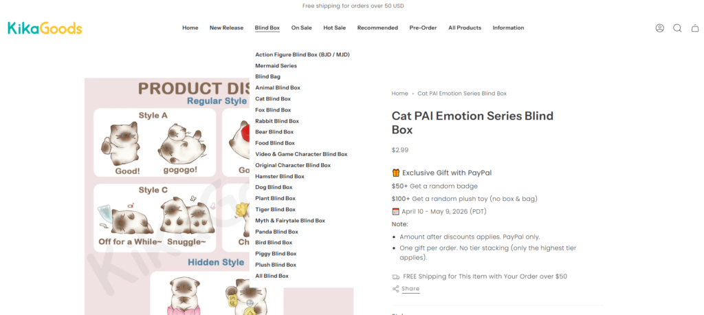
Building Trust Through Cleaner Layouts
Product pages are where browsing turns into purchasing decisions.
For this reason, product page clarity became extremely important.
Instead of overcrowding the layout with excessive distractions, the product page structure focused on:
- Clear product imagery
- Organized information hierarchy
- Easy-to-read descriptions
- Visible purchasing actions
- Comfortable spacing
This helped users focus on the products themselves.
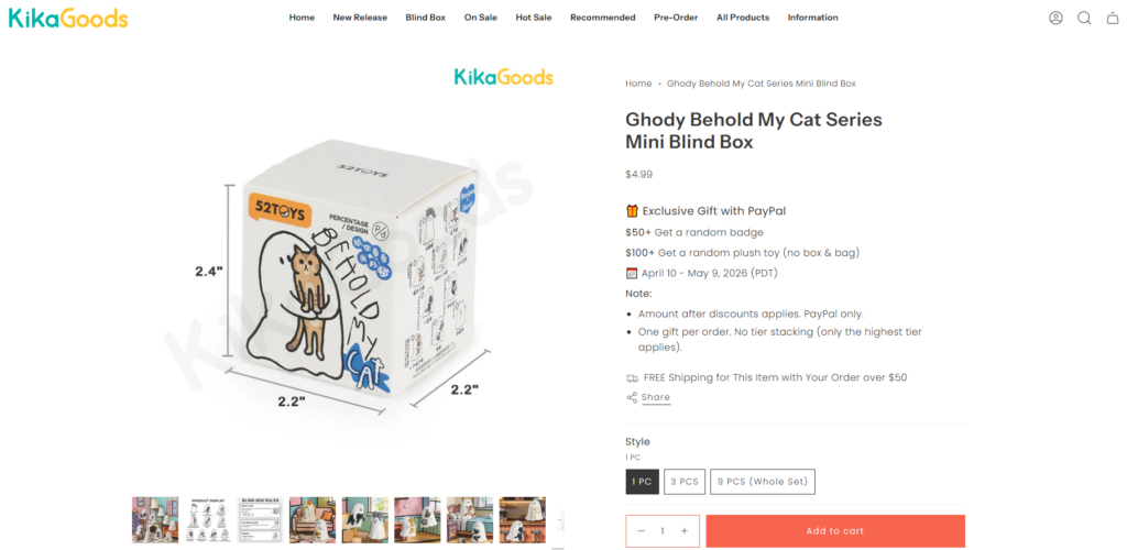
Enhancing Product Visual Presentation
Collectible products rely heavily on presentation quality.
The design direction emphasized:
- Large product imagery
- Detailed close-up visuals
- Strong thumbnail organization
- Lifestyle product context
- Clean gallery transitions
This approach helped products feel more premium while giving shoppers more confidence.
Supporting Emotional Purchasing Behavior
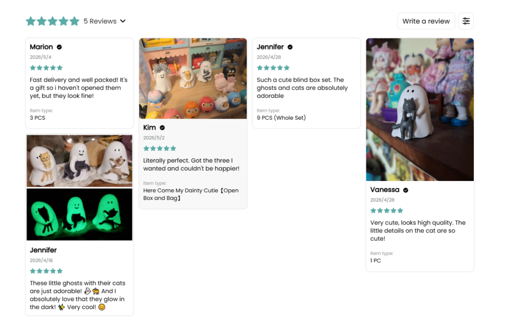
Many collectible purchases are emotional rather than purely practical.
Because of this, the product pages also needed to support excitement and anticipation.
The design helped accomplish this through:
- Limited-release presentation styles
- Featured badges
- Collection storytelling
- Related product recommendations
- Visually engaging layouts
These details helped reinforce the feeling of exclusivity and discovery.
Navigation and User Experience Improvements
Simplifying the Header Structure
The website navigation needed to remain easy to understand despite having many categories and product types.
The header experience focused on:
- Clear menu hierarchy
- Search accessibility
- Streamlined category grouping
- Improved mobile menu usability
This helped users find products more quickly while reducing friction.
Making Search Feel More Useful
Search is especially important for collectible-focused stores because customers often browse for specific characters, themes, or product lines.
The search experience was designed to feel:
- Fast
- Visible
- Easy to access
- Consistent across devices
This improved overall usability and helped customers reach products more efficiently.
Visual Design Decisions
Using Color Strategically
The visual direction avoided making every section compete aggressively for attention.
Instead, colors were used strategically to:
- Highlight campaigns
- Separate sections
- Guide visual attention
- Support product imagery
- Reinforce branding
This approach created a more comfortable browsing experience.
Typography and Readability
Typography played an important role throughout the Shopify design process.
The website needed fonts that felt:
- Modern
- Playful
- Easy to read
- Suitable for product-heavy layouts
Typography hierarchy helped visitors quickly identify:
- Promotions
- Product names
- Collection titles
- Navigation elements
- Shopping actions
This improved both aesthetics and usability.
Challenges During the Design Process
Managing Large Amounts of Visual Content
One major challenge was balancing visual excitement with organization.
Because collectible stores naturally contain:
- Bright imagery
- Character visuals
- Рекламные баннеры
- Multiple collections
- Frequent launches
…the risk of visual overload was high.
The solution focused on:
- Better spacing systems
- Cleaner layout rhythm
- Controlled visual hierarchy
- Simpler content segmentation
This helped maintain clarity while preserving the brand personality.
Обеспечение единообразия на всех страницах
Another challenge involved keeping the experience visually consistent across:
- Homepage sections
- Страницы коллекции
- Страницы товаров
- Рекламные баннеры
- Mobile layouts
Consistency became essential for making the website feel more premium and trustworthy.
To solve this, the design system maintained:
- Unified spacing
- Consistent typography
- Structured content hierarchy
- Repeating visual patterns
- Stable product presentation rules
The Final Result
The final Shopify website experience achieved several important outcomes.
The new design helped create:
- Stronger visual identity
- Better browsing flow
- Improved product presentation
- Cleaner collection organization
- More engaging homepage interactions
- Улучшена юзабилитиность для мобильных устройств.
- More immersive shopping experiences
Most importantly, the website now feels aligned with the emotional expectations of collectible-focused audiences.
Instead of functioning only as a product catalog, the Shopify store became a branded experience that encourages exploration, discovery, and engagement.
Why Design Matters in Shopify eCommerce
Modern Shopify stores compete heavily on experience.
Customers no longer judge websites only by product quality. They also evaluate:
- Презентация бренда
- Visual storytelling
- Ease of browsing
- Мобильный опыт
- Shopping comfort
- Emotional engagement
This is especially true for visually driven industries like collectibles, fashion, lifestyle products, and designer merchandise.
A strong Shopify design can:
- Increase browsing time
- Improve product discovery
- Strengthen brand perception
- Support customer trust
- Encourage repeat visits
- Create a more memorable experience
That is why thoughtful design strategy matters far beyond aesthetics alone.
Заключение
Разработка Shopify experience for a collectible-focused brand requires more than attractive visuals. It requires understanding how customers browse, what emotionally engages them, and how visual storytelling can support purchasing behavior naturally.
For this project, every section was carefully structured to balance creativity, usability, and product presentation. From the homepage flow to collection organization and product page clarity, the goal remained consistent: create a shopping experience that feels immersive, exciting, and easy to explore.
At the end of the process, the website became more than just an online store. It became a visual experience that reflects the brand personality while supporting long-term eCommerce growth.
This type of strategic Shopify design approach is exactly what АИРСАНГ focuses on — helping brands create visually engaging, conversion-friendly online stores that feel modern, memorable, and professionally crafted.


Спроектируем и создадим для вас WordPress-сайт или корпоративный сайт с полной системой электронной коммерции.
Ценовой диапазон: от $200.00 до $2,500.00Нестандартные требования или специальные предложения
Первоначальная цена составляла: $2.00.$1.00Текущая цена: $1.00. Дизайн главного изображения для домашнего физиотерапевтического устройства Amazon: пояснения.
Введение: Создание достоверного изображения для домашних терапевтических приборов на Amazon При разработке главного изображения для домашнего терапевтического прибора на Amazon мы в первую очередь...

Дизайн основного изображения для конвертации помады на Amazon.
Введение: Разработка главного образа помады, которая продается на Amazon Когда мы разрабатываем главный образ для помады Amazon, наша ответственность выходит далеко за рамки...

Как хакеры крадут электронные письма администраторов WordPress (и как им это предотвратить)
Начнем с неприятной истины: ваша электронная почта администратора WordPress, вероятно, гораздо более публична, чем вы думаете. А хакеры? Им это нравится. Для них ваш...

Что делает основное изображение жидкой тональной основы Amazon конвертируемым?
Введение. Разработка дизайна основного изображения для жидкой тональной основы на Amazon — это не просто создание красивого внешнего вида продукта. На Amazon основное изображение и...

Разработка эффективного основного изображения Amazon для фильтрующих картриджей
Введение. Разработка основного изображения для Amazon — это не просто создание привлекательного внешнего вида товара. Речь идёт о ясности, доверии и мгновенном понимании, особенно для...

Повторные атаки на WordPress: реальная угроза или преувеличенный миф?
Давайте сначала кое-что проясним. Атаки повторного воспроизведения не выглядят страшно. Они не взламывают пароли. Они не внедряют вредоносный код с зелёным хакерским текстом, разлетающимся повсюду. Они действуют коварно...

Как скопировать страницы WordPress, ничего не сломав
Давайте посмотрим правде в глаза. Иногда вам не хочется создавать новую страницу. Вам нужна та же самая страница… но немного другая. Тот же макет. Те же блоки. Те же настройки. Потому что….

Сравнение пяти тем WordPress для сайтов о домашних животных
Введение. Выбор подходящей темы WordPress для сайтов, посвященных домашним животным, — это не просто решение, связанное с дизайном; оно напрямую влияет на удобство использования, масштабируемость и долгосрочный рост бизнеса. Уход за домашними животными и...

Сравнение пяти тем оформления для интернет-магазинов купальников
Введение. Выбор правильной тематики для независимого магазина купальников или нижнего белья — это не просто визуальное решение, оно напрямую влияет на коэффициент конверсии, масштабируемость и долгосрочную перспективу...

Как отключить комментарии в WordPress (не сойдя с ума)
Давайте поговорим о комментариях в WordPress. В теории комментарии — это здорово. Они стимулируют дискуссии. Они создают сообщество. Они делают ваш сайт “живым”. А на практике? Зачастую они притягивают...

Создание масштабируемого веб-сайта на WordPress для научно-ориентированного бренда: проект AminoUSA
Введение. В современном цифровом пространстве веб-сайт — это больше, чем просто место для размещения информации о товарах. Для научно-ориентированных брендов, работающих в регулируемых или научно-исследовательских отраслях, это….

Создание масштабируемого магазина Shopify для глобального бренда ножей: проект CoolKatana
Введение. В трансграничной электронной коммерции веб-сайт Shopify — это больше, чем просто витрина магазина. Для брендов, работающих в нишевых, ориентированных на культуру категориях, веб-сайт должен делать гораздо больше, чем...

Разработка высокоэффективного магазина Shopify для карточек Pokémon.
Введение. В мире электронной коммерции коллекционных товаров, особенно на рынке коллекционных карточных игр Pokémon, веб-сайт должен делать больше, чем просто перечислять товары...

Высокоэффективный дизайн Shopify для индивидуального бренда стационарной торговой точки.
Введение. В условиях современной конкурентной среды электронной коммерции, особенно в сегменте персонализированных подарков и коллекционных товаров, веб-сайт на платформе Shopify должен делать гораздо больше, чем просто отображать товары. Он...

Как связаться со службой поддержки Shopify: простое и понятное руководство
Управление магазином Shopify должно приносить удовольствие, а не путаницу. Когда возникают вопросы или проблемы замедляют вашу работу, Shopify предлагает несколько вариантов поддержки в зависимости от ситуации...

Как деактивировать магазин Shopify: понятное и практичное руководство
Деактивация магазина Shopify — несложная процедура, но она влечет за собой последствия, которые многие продавцы упускают из виду. В этом руководстве процесс описан простым и понятным языком...

Пример разработки веб-сайта на платформе Shopify для премиального цветочного бренда.
Введение. В условиях современной конкурентной среды электронной коммерции веб-сайт на платформе Shopify должен делать гораздо больше, чем просто отображать товары. Он должен мгновенно передавать ценность бренда, направлять пользователей...

Пример проекта дизайна на Shopify: магазин ретро-игр
Введение. В условиях высокой конкуренции в сфере электронной коммерции визуальная ясность и эмоциональная связь часто определяют, станет ли посетитель клиентом. Это особенно актуально в...