


Introdução
In the competitive world of mobile accessories, a website must do more than simply display products—it must communicate brand identity, highlight product value, and create a seamless shopping experience. For brands selling premium items such as carbon fiber phone cases, design plays a crucial role in conveying quality, durability, and innovation.
O Shopify store for CarbonCase was designed with these goals in mind. The objective was to create a visually striking storefront that reflects the sleek, high-performance nature of carbon fiber products while maintaining a clean and intuitive user journey.
In this project, our role focused entirely on Shopify website design—structuring the layout, creating visual hierarchy, organizing product presentation, and crafting an interface that encourages exploration and conversion. By aligning design decisions with brand positioning and user behavior, we helped transform the site into a modern, high-impact ecommerce experience.
This article explains the design strategy behind the CarbonCase Shopify website, including the design process, the challenges we faced, the solutions we implemented, and the final results.
| Prazo de entrega | Categoria | Plataforma de Aplicação |
| 11days | Carbon Fiber Cases | shopify |
| Designers envolvidos | Custo | Efeito |
| Lin Zhang | $310 | Store Entry Rate📈247% |
Compreendendo a marca e os objetivos do projeto
Before starting the design process, it was essential to understand the brand’s identity and the audience it targets.
CarbonCase sells premium carbon fiber phone cases and accessories. Carbon fiber is commonly associated with performance, engineering, durability, and luxury, often seen in industries such as automotive, aerospace, and high-end technology products. The website design needed to visually communicate these qualities from the moment a visitor lands on the homepage.
Key Goals of the Project
The project focused on several core objectives:
- Establish a premium brand image
- Showcase the unique carbon fiber aesthetic
- Create a clear product browsing structure
- Build strong visual trust signals
- Improve the overall shopping experience
- Ensure the site feels modern and professional
From a design perspective, the challenge was to balance visual impact and usability. A visually heavy design could distract from product discovery, while a minimal layout might fail to express the premium nature of the products.
Our task was to find the right balance.
Nossa abordagem de design para Shopify
Designing a successful ecommerce site requires more than arranging sections on a page. It involves understanding how users browse products, what builds trust, and how visual hierarchy influences purchasing decisions.
Our Shopify design approach focused on four principles:
1. Visual Hierarchy
A well-structured hierarchy helps visitors quickly understand:
- what the brand sells
- what products are available
- where to go next
We carefully structured the homepage so that users naturally move from brand introduction → product categories → featured products → trust elements → social proof.
2. Product-Focused Layout
Since the product itself is visually distinctive, the design prioritizes large product visuals and clean backgrounds. This ensures the carbon fiber textures and patterns stand out.
3. Minimal Distractions
Premium products benefit from clean layouts and controlled color palettes. We avoided unnecessary elements and focused attention on the products.
4. Brand Consistency
Every visual element—from colors to spacing—was designed to reinforce the brand’s identity.
The Design Process
Research and Inspiration
The first step involved studying:
- premium phone accessory brands
- luxury tech ecommerce sites
- modern Shopify storefront design trends
We analyzed how leading brands use:
- high-contrast product photography
- minimal color palettes
- bold hero sections
- strong visual storytelling
This research helped establish a design direction that would align with the CarbonCase brand.
Creating the Homepage Structure
The homepage plays the most critical role in an ecommerce website. It must immediately communicate the brand value and guide visitors toward products.
We structured the homepage into several strategic sections.
Design da Seção Hero

The hero section introduces the brand with a bold visual statement.
As principais escolhas de design incluíram:
- large product imagery
- dark, high-contrast background
- minimal text overlay
- clear navigation access
The carbon fiber textures and colorful forged patterns immediately capture attention. This approach helps communicate the premium material quality without requiring lengthy descriptions.
Category Navigation

After the hero section, visitors are guided into product categories.
We designed a visual category grid that allows users to explore products based on their device type:
- Apple
- Samsung
- Acessórios
This layout serves two important purposes:
- It simplifies product discovery.
- It visually showcases the product range.
Instead of overwhelming users with too many options, the design encourages intuitive browsing.
Featured Products Layout
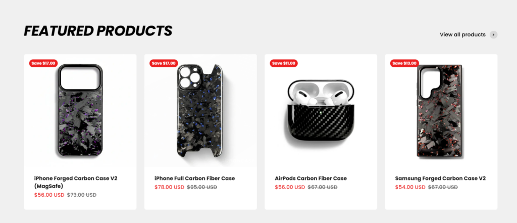
The featured products section highlights best-selling items.
From a design standpoint, we focused on:
- clean product cards
- clear product imagery
- visible pricing
- simple discount indicators
Spacing and alignment were carefully optimized to create a balanced product grid that feels organized and professional.
This section helps customers quickly identify popular items and encourages engagement.
Trust-Building Section

Trust elements are critical in ecommerce design.
We included a section that highlights key selling points such as:
- brand popularity
- fast shipping
- responsive customer support
Visually, this section uses simple icons and short descriptions, which makes the information easy to scan.
The goal is to reassure customers and reduce purchase hesitation.
Customer Review Showcase
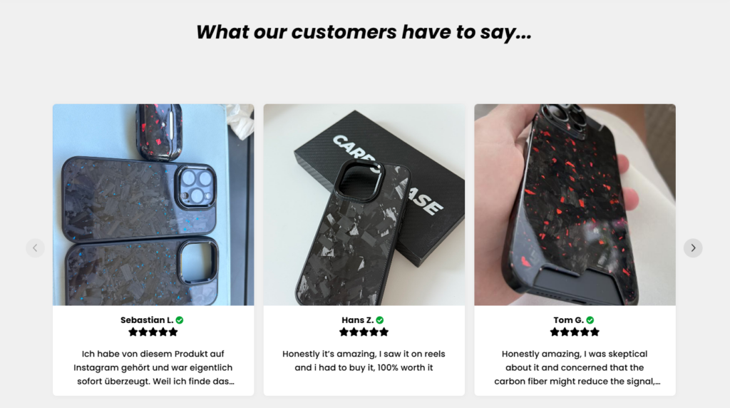
User-generated content is one of the strongest forms of social proof.
To reinforce product credibility, we created a customer review carousel that displays:
- real product images
- customer names
- short testimonials
This section adds authenticity to the website and visually demonstrates how the products look in real-world usage.
FAQ Section
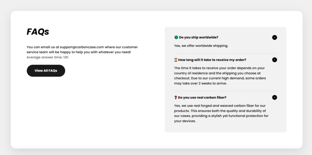
The FAQ section addresses common questions customers may have, such as:
- shipping availability
- delivery timelines
- product materials
From a design perspective, the accordion layout keeps the page clean while still making information accessible.
This reduces friction during the buying process.
Design Challenges We Faced
Even a well-defined project presents challenges. In this case, several design considerations required careful attention.
Balancing Visual Impact and Simplicity
Carbon fiber patterns are visually rich. If used excessively, they could make the page feel cluttered.
We solved this by:
- using neutral backgrounds
- limiting textures to product imagery
- maintaining generous white space
This allowed the products to remain the focal point.
Maintaining Brand Consistency
CarbonCase features multiple color variations of forged carbon patterns.
To maintain visual consistency across the site, we used a neutral color palette for the interface:
- black
- dark gray
- white
This ensures that colorful product textures stand out without overwhelming the design.
Ensuring Clear Navigation
Visitors should be able to reach products within seconds.
To achieve this, we:
- simplified the navigation structure
- emphasized category entry points
- used clear visual grouping
The result is a browsing experience that feels intuitive.
Nossas Soluções de Design
To address the challenges above, we implemented several design solutions.
A Strong Visual Identity
The design emphasizes bold imagery and minimal text. This reflects the premium nature of the products and aligns with the expectations of modern ecommerce shoppers.
Product-Centered Design
Instead of overloading the homepage with marketing text, we allowed product visuals to tell the story.
This approach:
- improves product appeal
- shortens decision time
- increases browsing engagement
Clean and Modern Layout
The design prioritizes spacing, alignment, and simplicity.
This makes the site feel:
- modern
- trustworthy
- easy to navigate
These qualities are essential for high-end ecommerce brands.
The Results of the Design
After implementing the final Shopify design structure, the website achieved several key outcomes.
A Clear Brand Identity
The site now visually communicates the strength and sophistication associated with carbon fiber products.
Improved Product Presentation
Products are displayed in a way that highlights their textures, finishes, and craftsmanship.
This enhances perceived product value.
A Streamlined User Journey
Visitors can easily move through the site:
Homepage → Category → Product → Purchase
Reducing friction improves overall usability.
Stronger Customer Trust
With trust badges, customer reviews, and clear structure, the website feels more credible and professional.
Why Design Matters in Shopify Ecommerce
A successful Shopify store depends heavily on design.
Strong design can:
- improve brand perception
- guide user behavior
- highlight product quality
- increase customer confidence
For premium products especially, the website often serves as the first impression of the brand. A thoughtful design strategy ensures that impression is positive.
Conclusão
Projetando o CarbonCase Shopify website required a balance of aesthetics, usability, and brand storytelling. By focusing on clear visual hierarchy, product-centered layouts, and trust-building elements, we created a modern storefront that effectively showcases carbon fiber phone cases and accessories.
The project demonstrates how strategic Shopify design can elevate an ecommerce brand and improve the overall shopping experience.
Em AIRSANG, we specialize in Shopify website design for ecommerce brands, helping businesses create visually compelling storefronts that highlight their products and strengthen brand identity. Our focus is on thoughtful design, clear user journeys, and modern ecommerce presentation that supports long-term brand growth.


Conceber e construir um sítio Web WordPress ou um sítio empresarial com um sistema de comércio eletrónico completo para si.
Faixa de preço: $200.00 a $2,500.00custom-requirements-or-special-quotations
O preço original era: $2.00.$1.00O preço atual é: $1.00. Explicação do design da imagem principal para o dispositivo de fisioterapia doméstica da Amazon
Introdução: Construindo uma imagem confiável para dispositivos de terapia doméstica na Amazon Ao projetar a imagem principal de um dispositivo de terapia doméstica na Amazon, nosso principal...

Design da imagem principal para conversão de batom da Amazon
Introdução: Conceber uma imagem principal de batom que vende na Amazon Quando concebemos uma imagem principal para um batom da Amazon, a nossa responsabilidade vai muito além...

Como os hackers roubam e-mails de administradores do WordPress (e como impedi-los)
Vamos começar com uma verdade incómoda: o seu e-mail de administrador do WordPress é provavelmente muito mais público do que pensa e os hackers? Eles adoram isso. Para eles, o seu...

O que faz uma base líquida da Amazon converter a imagem principal?
Introdução: Criar uma imagem principal para a base líquida da Amazon não se resume apenas a deixar o produto bonito. Na Amazon, a imagem principal e...

Como projetar uma imagem principal eficaz para cartuchos de filtro Amazon
Introdução: Criar uma imagem principal para a Amazon nunca se resume apenas a tornar um produto atraente. Trata-se de clareza, confiança e compreensão imediata — especialmente para...

Ataques de repetição no WordPress: ameaça real ou mito exagerado?
Vamos esclarecer uma coisa primeiro. Ataques de repetição não parecem assustadores. Eles não quebram senhas. Eles não injetam código malicioso com texto verde de hacker voando por toda parte. Eles são sorrateiros...

Como duplicar páginas do WordPress sem danificar nada
Vamos ser sinceros. Às vezes você não quer criar uma página nova. Você só quer a mesma página… mas um pouco diferente. Mesmo layout. Mesmos blocos. Mesmas configurações. Porque….

Comparativo de cinco temas WordPress para animais de estimação
Introdução Escolher o tema WordPress certo para o seu negócio de animais de estimação é mais do que uma decisão de design — afeta diretamente a usabilidade, a escalabilidade e o crescimento a longo prazo. Cuidados com animais de estimação e...

Comparando cinco temas de e-commerce de moda praia
Introdução: Escolher o tema certo para uma loja independente de moda praia ou lingerie não é apenas uma decisão visual — afeta diretamente as taxas de conversão, a escalabilidade e o sucesso a longo prazo...

Como desativar os comentários no WordPress (sem enlouquecer)
Vamos falar sobre os comentários do WordPress. Em teoria, os comentários são ótimos. Eles incentivam a discussão, constroem comunidade e dão vida ao seu site. Na prática? Muitas vezes, eles atraem...

Criando um site WordPress escalável para uma marca voltada para a ciência: o projeto AminoUSA
Introdução No cenário digital atual, um website é mais do que um lugar para listar produtos. Para marcas com foco em ciência que atuam em setores regulamentados ou voltados para pesquisa, um...

Construindo uma loja Shopify escalável para uma marca global de lâminas: O Projeto CoolKatana
Introdução No comércio eletrônico internacional, um site Shopify é muito mais do que uma vitrine. Para marcas que atuam em nichos de mercado e categorias culturais específicas, o site precisa fazer muito mais do que...

Criando uma loja Shopify de alta conversão para cartas Pokémon.
Introdução No mundo do comércio eletrônico de itens colecionáveis, especialmente no mercado do Pokémon Trading Card Game (TCG), um site precisa fazer mais do que simplesmente listar produtos...

Design Shopify de alta conversão para uma marca de tijolos personalizada.
Introdução No cenário competitivo do comércio eletrônico atual, especialmente no segmento de presentes personalizados e itens colecionáveis, um site Shopify precisa fazer muito mais do que simplesmente exibir produtos. Ele...

Como entrar em contato com o suporte da Shopify: um guia simples e sem complicações.
Gerir uma loja Shopify deve ser uma experiência empolgante, não confusa. Quando surgem dúvidas ou problemas que atrapalham o seu trabalho, a Shopify oferece diversas opções de suporte, dependendo da situação.

Como desativar uma loja Shopify: um guia claro e prático
Desativar uma loja Shopify não é complicado, mas acarreta consequências que muitos lojistas ignoram. Este guia explica o processo de forma simples e didática...

Estudo de caso de design de website Shopify para uma marca de flores premium
Introdução No cenário competitivo do comércio eletrônico atual, um site Shopify precisa fazer muito mais do que exibir produtos. Ele precisa comunicar o valor da marca instantaneamente, guiar os usuários...

Estudo de Caso de Design da Shopify: Loja de Jogos Retrô
Introdução Em um ambiente de comércio eletrônico altamente competitivo, a clareza visual e a conexão emocional muitas vezes determinam se um visitante se torna um cliente. Isso é especialmente verdadeiro em...