


Introdução
In the wedding industry, visual storytelling matters as much as the products themselves. Couples planning their special day are drawn to elegance, emotion, and atmosphere. A website that sells wedding décor must therefore do more than display products—it must create an immersive experience that helps customers imagine their perfect moment.
O Shopify store for RoseMorning was designed with this philosophy in mind. The goal was to build a refined and visually cohesive shopping experience that reflects the beauty of luxury floral installations and wedding décor. Rather than overwhelming visitors with product listings, the design focuses on curated storytelling, emotional imagery, and elegant layout structures that guide customers naturally through the brand.
This article explores how the site design was structured, the design strategy behind each section, the challenges encountered during the process, and how thoughtful visual design ultimately helped transform the website into a powerful conversion-driven brand experience.
| Prazo de entrega | Categoria | Plataforma de Aplicação |
| 23 dias | Preserved Flower | shopify |
| Designers envolvidos | Custo | Efeito |
| Nancy | $1000 | Store traffic📈195% |
Compreendendo a marca e os objetivos do projeto
Before any design work began, it was essential to understand the core positioning of the brand.
RoseMorning specializes in luxury faux flower walls and wedding décor, often used for weddings, proposals, bridal showers, and upscale events. The products are inherently visual and emotional—they are designed to create unforgettable backdrops for meaningful life moments.
Key brand characteristics
- Elegante
- Romantic
- Luxury-focused
- Wedding and event oriented
- Photography-friendly products
Because of this positioning, the website design had to achieve several objectives simultaneously.
Primary design goals
- Create an immersive visual atmosphere
- Showcase product beauty through lifestyle photography
- Guide users toward inspiration before purchase
- Organize collections in a visually intuitive way
- Build trust through social proof and real events
- Maintain a soft, romantic aesthetic throughout the entire site
Instead of functioning purely as an e-commerce catalog, the website needed to feel more like a digital wedding showroom.
Visual Design Direction
Soft luxury aesthetic
The design language was intentionally built around a soft neutral palette that mirrors wedding aesthetics.
Key visual elements include:
- Cream and ivory tones
- Natural sunlight photography
- Warm wood textures
- Floral imagery and soft shadows
- Spacious layouts with breathing room
These choices ensure that the products remain the focal point while still creating a calming, premium environment.
Photography-first design
Because floral walls are highly visual products, imagery became the primary storytelling tool. The homepage relies heavily on large hero imagery, lifestyle scenes, and real event photography.
This approach allows visitors to immediately imagine how the product could appear in their own wedding or event.
Homepage Structure and Layout Strategy
A successful Shopify homepage needs to do more than look beautiful—it must guide visitors through a journey.
The homepage was structured to mirror how couples typically shop for wedding décor:
- Inspiração
- Color theme exploration
- Descoberta de produtos
- Event styling examples
- Prova social
Each section was intentionally designed to support this flow.
Hero Section: Establishing the Brand Atmosphere
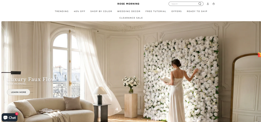
The hero section sets the emotional tone of the website immediately.
Instead of displaying a typical product grid, the opening scene features a beautifully styled lifestyle image showing a bride interacting with a flower wall in an elegant interior setting.
Design considerations
- Large cinematic imagery creates emotional connection instantly.
- Minimal text overlays maintain visual elegance.
- Clear call-to-action encourages users to explore the collection.
- Natural lighting photography enhances realism and warmth.
This approach helps visitors understand the brand within seconds and immediately positions the product as part of a luxury wedding environment.
Color Collection Navigation
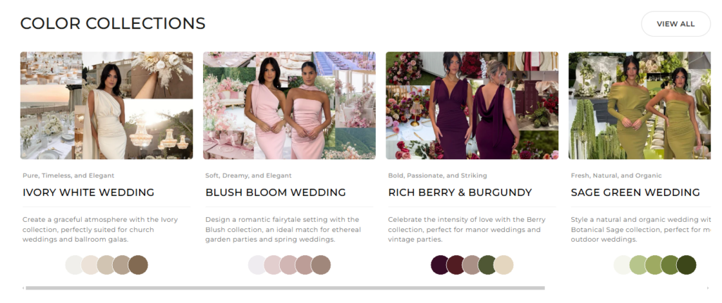
Wedding décor shopping often begins with color theme selection. Instead of forcing visitors to browse generic categories, the design introduces curated color collections.
Why this works
Couples typically plan weddings around color palettes. Organizing products by color immediately aligns the browsing experience with real wedding planning behavior.
Design benefits
- Makes navigation more intuitive
- Helps users visualize full wedding themes
- Creates a more editorial shopping experience
- Encourages exploration across collections
Each color collection card uses lifestyle imagery combined with subtle color swatches to visually communicate the theme.
Editorial Product Showcase
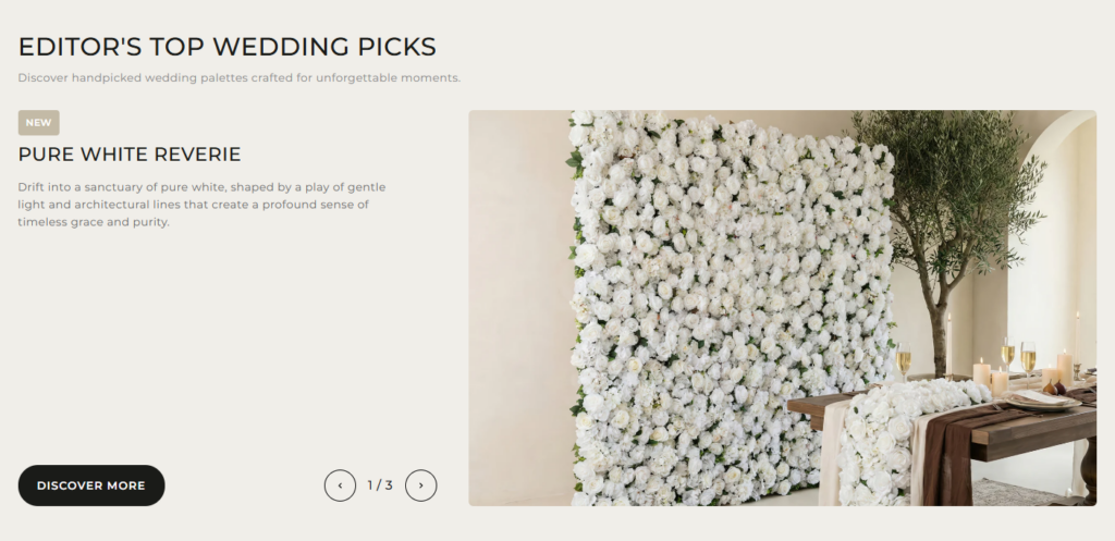
Instead of presenting products in a conventional grid, the site uses editorial-style showcase sections.
These sections blend product imagery with real wedding styling scenes.
Design strategy
- Pair floral walls with styled tables and candles
- Show full event compositions
- Allow users to imagine entire setups rather than single products
This storytelling method significantly improves emotional engagement because customers see how the product transforms an event space.
“Shop the Look” Experience
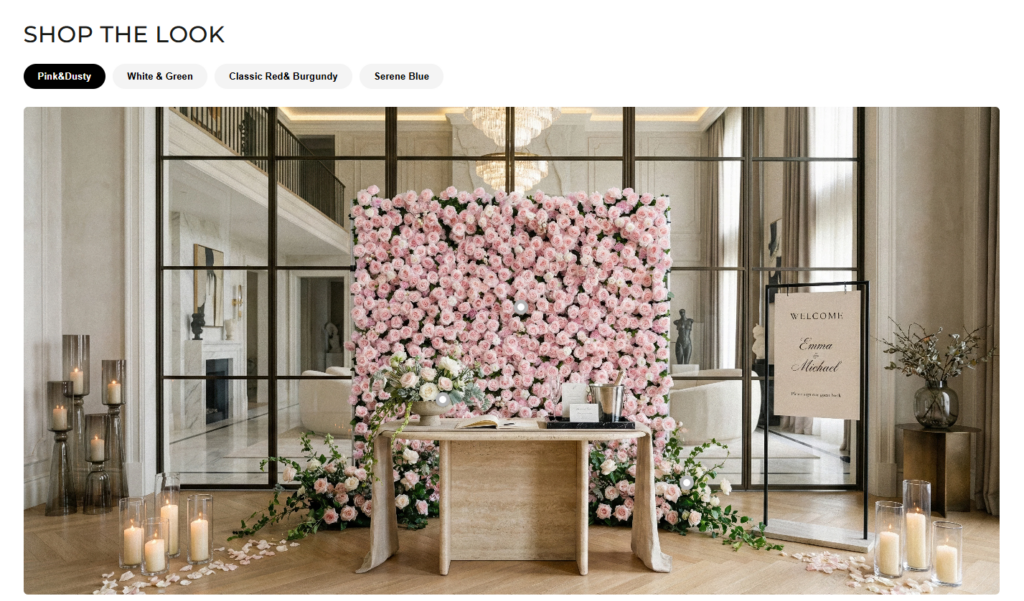
One of the most important design features on the homepage is the “Shop the Look” section.
Rather than isolating products, this section presents a complete styled scene that integrates multiple décor elements.
Design objectives
- Inspire customers with full event concepts
- Encourage larger basket sizes
- Provide context for how products work together
This type of section is extremely effective for wedding and lifestyle brands because it mirrors the way people plan real events.
Category Discovery and Product Browsing
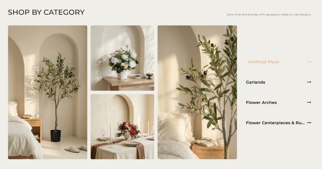
The category section was designed with simplicity and visual balance in mind.
Instead of overwhelming users with dozens of product thumbnails, the layout highlights:
- Artificial plants
- Centerpieces
- Flower arches
- Floral backdrops and walls
Each category is supported by soft editorial imagery that blends seamlessly with the site’s aesthetic.
Why this structure works
- Reduz a fadiga decisória
- Keeps the design clean and minimal
- Allows users to quickly locate relevant product groups
The layout prioritizes clarity and elegance, both of which are essential for luxury wedding brands.
Building Trust Through Real Event Photos
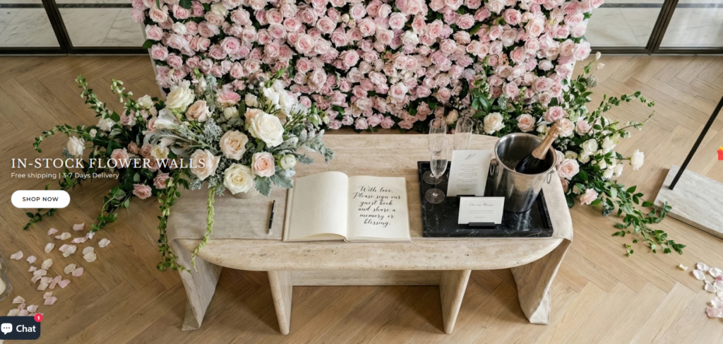
Social proof plays a critical role in the wedding industry. Couples want reassurance that the décor will look beautiful at real events.
The Customer Showcase section highlights real photos submitted by customers and event planners.
Design impact
- Demonstrates authenticity
- Builds trust quickly
- Encourages user-generated content
- Shows product versatility across different events
Real wedding photography also strengthens the emotional storytelling of the site.
Design Process and Methodology
The design of the website followed a structured approach that prioritizes user experience and brand storytelling.
Research and Inspiration Phase
The first step involved analyzing:
- Wedding décor websites
- Luxury lifestyle brands
- Bridal fashion websites
- Event planning platforms
This research helped define the visual language needed for the brand.
UX Structure Planning
Next, the homepage architecture was mapped to create a logical user journey.
The layout sequence included:
- Brand introduction
- Wedding inspiration
- Collection discovery
- Product exploration
- Prova social
- Credibilidade da marca
Every section was designed to naturally guide visitors toward purchase.
Visual Design and Layout Development
Once the structure was finalized, the focus shifted to visual execution.
Design elements included:
- Clean typography
- Neutral color palettes
- Large image blocks
- Editorial spacing
- Soft transitions between sections
The result is a site that feels calm, elegant, and premium.
Challenges During the Project
Designing an e-commerce website for wedding décor introduced several unique challenges.
Challenge 1: Balancing inspiration with commerce
Wedding shoppers want inspiration before they want to buy.
A typical product-first layout would not have created the emotional connection necessary for this audience.
Challenge 2: Avoiding visual clutter
Floral imagery can quickly become overwhelming if not carefully arranged.
Too many colors and textures can distract from the products themselves.
Challenge 3: Creating a premium aesthetic
Luxury brands must maintain visual consistency across every section of the site.
Even small design inconsistencies can weaken the brand perception.
Nossas Soluções de Design
To solve these challenges, several strategic design decisions were implemented.
Editorial Layouts
Instead of standard product grids, editorial layouts were used to create storytelling moments throughout the homepage.
Controlled Color Palette
Soft neutral backgrounds allow colorful floral installations to stand out naturally.
Photography Hierarchy
Large hero imagery establishes emotional context, while smaller images provide browsing options.
Curated Sections
Rather than showing too many items at once, the design highlights carefully selected products and collections.
Resultados e impacto
The final design achieves several important outcomes for the brand.
Stronger emotional engagement
Visitors immediately understand the product’s purpose within a wedding environment.
Posicionamento de marca claro
The site feels premium and aligned with luxury wedding aesthetics.
Improved browsing flow
The homepage guides users from inspiration to discovery and finally to product exploration.
Enhanced trust and credibility
Customer event photos demonstrate that the products work beautifully in real-world weddings.
Conclusão
Designing an effective Shopify store requires more than arranging products on a page. It involves understanding the brand’s story, the emotional motivations of the audience, and the visual language needed to bring the experience to life.
O RoseMorning website demonstrates how thoughtful design can transform a standard e-commerce store into an immersive brand environment. By focusing on storytelling, curated layouts, and elegant visual presentation, the site invites visitors to imagine their own wedding moments while naturally guiding them toward product discovery.
This project highlights how strategic Shopify design can elevate a brand’s identity, improve the customer journey, and create a memorable shopping experience that resonates with its audience.
For brands looking to build visually compelling Shopify experiences that combine aesthetic storytelling with conversion-focused structure, AIRSANG specializes in crafting elegant e-commerce design solutions tailored to modern online businesses.


Conceber e construir um sítio Web WordPress ou um sítio empresarial com um sistema de comércio eletrónico completo para si.
Faixa de preço: $200.00 a $2,500.00custom-requirements-or-special-quotations
O preço original era: $2.00.$1.00O preço atual é: $1.00. Explicação do design da imagem principal para o dispositivo de fisioterapia doméstica da Amazon
Introdução: Construindo uma imagem confiável para dispositivos de terapia doméstica na Amazon Ao projetar a imagem principal de um dispositivo de terapia doméstica na Amazon, nosso principal...

Design da imagem principal para conversão de batom da Amazon
Introdução: Conceber uma imagem principal de batom que vende na Amazon Quando concebemos uma imagem principal para um batom da Amazon, a nossa responsabilidade vai muito além...

Como os hackers roubam e-mails de administradores do WordPress (e como impedi-los)
Vamos começar com uma verdade incómoda: o seu e-mail de administrador do WordPress é provavelmente muito mais público do que pensa e os hackers? Eles adoram isso. Para eles, o seu...

O que faz uma base líquida da Amazon converter a imagem principal?
Introdução: Criar uma imagem principal para a base líquida da Amazon não se resume apenas a deixar o produto bonito. Na Amazon, a imagem principal e...

Como projetar uma imagem principal eficaz para cartuchos de filtro Amazon
Introdução: Criar uma imagem principal para a Amazon nunca se resume apenas a tornar um produto atraente. Trata-se de clareza, confiança e compreensão imediata — especialmente para...

Ataques de repetição no WordPress: ameaça real ou mito exagerado?
Vamos esclarecer uma coisa primeiro. Ataques de repetição não parecem assustadores. Eles não quebram senhas. Eles não injetam código malicioso com texto verde de hacker voando por toda parte. Eles são sorrateiros...

Como duplicar páginas do WordPress sem danificar nada
Vamos ser sinceros. Às vezes você não quer criar uma página nova. Você só quer a mesma página… mas um pouco diferente. Mesmo layout. Mesmos blocos. Mesmas configurações. Porque….

Comparativo de cinco temas WordPress para animais de estimação
Introdução Escolher o tema WordPress certo para o seu negócio de animais de estimação é mais do que uma decisão de design — afeta diretamente a usabilidade, a escalabilidade e o crescimento a longo prazo. Cuidados com animais de estimação e...

Comparando cinco temas de e-commerce de moda praia
Introdução: Escolher o tema certo para uma loja independente de moda praia ou lingerie não é apenas uma decisão visual — afeta diretamente as taxas de conversão, a escalabilidade e o sucesso a longo prazo...

Como desativar os comentários no WordPress (sem enlouquecer)
Vamos falar sobre os comentários do WordPress. Em teoria, os comentários são ótimos. Eles incentivam a discussão, constroem comunidade e dão vida ao seu site. Na prática? Muitas vezes, eles atraem...

Criando um site WordPress escalável para uma marca voltada para a ciência: o projeto AminoUSA
Introdução No cenário digital atual, um website é mais do que um lugar para listar produtos. Para marcas com foco em ciência que atuam em setores regulamentados ou voltados para pesquisa, um...

Construindo uma loja Shopify escalável para uma marca global de lâminas: O Projeto CoolKatana
Introdução No comércio eletrônico internacional, um site Shopify é muito mais do que uma vitrine. Para marcas que atuam em nichos de mercado e categorias culturais específicas, o site precisa fazer muito mais do que...

Criando uma loja Shopify de alta conversão para cartas Pokémon.
Introdução No mundo do comércio eletrônico de itens colecionáveis, especialmente no mercado do Pokémon Trading Card Game (TCG), um site precisa fazer mais do que simplesmente listar produtos...

Design Shopify de alta conversão para uma marca de tijolos personalizada.
Introdução No cenário competitivo do comércio eletrônico atual, especialmente no segmento de presentes personalizados e itens colecionáveis, um site Shopify precisa fazer muito mais do que simplesmente exibir produtos. Ele...

Como entrar em contato com o suporte da Shopify: um guia simples e sem complicações.
Gerir uma loja Shopify deve ser uma experiência empolgante, não confusa. Quando surgem dúvidas ou problemas que atrapalham o seu trabalho, a Shopify oferece diversas opções de suporte, dependendo da situação.

Como desativar uma loja Shopify: um guia claro e prático
Desativar uma loja Shopify não é complicado, mas acarreta consequências que muitos lojistas ignoram. Este guia explica o processo de forma simples e didática...

Estudo de caso de design de website Shopify para uma marca de flores premium
Introdução No cenário competitivo do comércio eletrônico atual, um site Shopify precisa fazer muito mais do que exibir produtos. Ele precisa comunicar o valor da marca instantaneamente, guiar os usuários...

Estudo de Caso de Design da Shopify: Loja de Jogos Retrô
Introdução Em um ambiente de comércio eletrônico altamente competitivo, a clareza visual e a conexão emocional muitas vezes determinam se um visitante se torna um cliente. Isso é especialmente verdadeiro em...