


Uma estratégia visual focada em conversão para um suporte de smartphone 3 em 1.
Em mercados altamente competitivos como Ozônio, Hoje em dia, os compradores não leem primeiro — eles escaneiam. O conjunto principal de imagens de um produto deve comunicar função, valor e usabilidade em segundos, especialmente na categoria de acessórios para celular, onde os produtos costumam parecer semelhantes à primeira vista.
Para este suporte de celular, nosso objetivo de design era claro: usar recursos visuais estruturados e passo a passo para explicar instantaneamente a versatilidade, a estabilidade e a facilidade de uso, mantendo uma estética limpa, amigável e confiável que ressoe com o público da Ozon.
Em vez de nos basearmos em narrativas abstratas sobre estilo de vida, focamos na clareza funcional. Cada imagem neste conjunto desempenha um papel específico, guiando o cliente da conscientização à confiança. Abaixo, detalhamos a lógica de design por trás de cada imagem e explicamos como a hierarquia visual, o layout, a cor e a densidade de informações trabalham em conjunto para melhorar a taxa de cliques e a conversão.
| Prazo de entrega | Categoria | Plataforma de Aplicação |
| 8 dias | suporte para celular | Ozônio |
| Designers envolvidos | Custo | Efeito |
| Lin Zhang | $150 | Vendas📈260% |
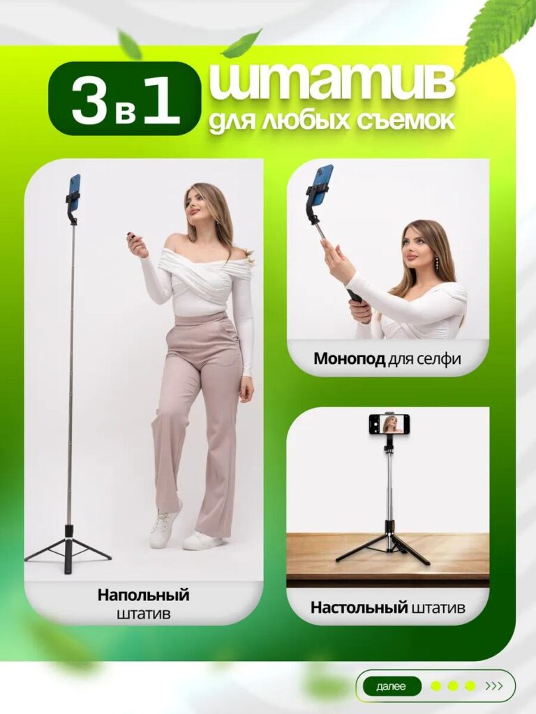
Imagem 1: Imagem principal — Reconhecimento instantâneo do produto e valor essencial
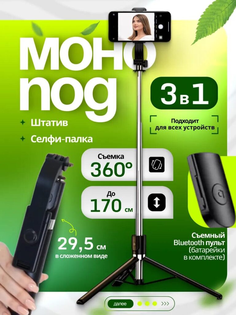
A primeira imagem funciona como âncora visual de todo o anúncio. Posicionamos o suporte para celular totalmente estendido e centralizado, garantindo que o produto fique claramente visível, sem cortes. Isso comunica imediatamente escala, estrutura e completude.
A tipografia grande destaca o conceito "3 em 1", pois a multifuncionalidade é a maior vantagem competitiva do produto. Em vez de listar as funcionalidades em textos longos, usamos rótulos curtos e em negrito, combinados com ícones, para tornar as informações legíveis mesmo em telas pequenas.
As principais especificações — como rotação de 360°, altura ajustável até 170 cm e tamanho compacto quando dobrado — são apresentadas em blocos visuais claramente separados. Esse layout modular ajuda os compradores a absorverem rapidamente os detalhes técnicos sem se sentirem sobrecarregados. O fundo com gradiente verde adiciona frescor e energia, mantendo o contraste com o texto branco e garantindo excelente legibilidade em dispositivos móveis.
Essa imagem responde imediatamente à primeira pergunta do comprador: O que é esse produto e por que eu deveria clicar?
Imagem 2: Controle remoto Bluetooth destacável — resolvendo um problema real do usuário.
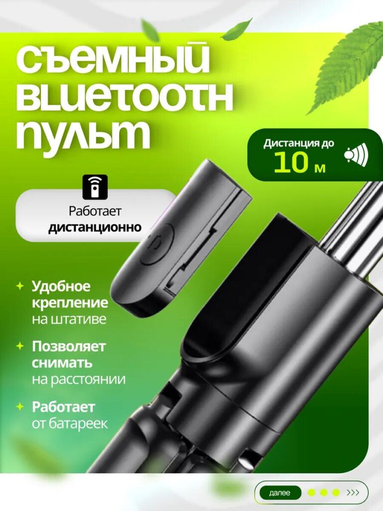
A segunda imagem amplia o controle remoto Bluetooth destacável, um dos recursos mais práticos do produto. Em vez de mostrá-lo como um pequeno acessório, ampliamos a imagem e a colocamos ao lado do suporte para reforçar visualmente que ele está incluído e não é opcional.
Criamos esta imagem para transmitir liberdade e praticidade. Instruções claras explicam que o controle remoto funciona sem fio, tem alcance de até 10 metros e funciona com pilhas. Esses detalhes eliminam dúvidas comuns dos compradores, como compatibilidade ou complexidade de configuração.
Ao isolar o controle remoto em um fundo limpo e combiná-lo com ícones simples, tornamos o recurso intuitivo e confiável. Essa imagem é especialmente importante para criadores de conteúdo, viajantes individuais e usuários que tiram fotos em grupo, pois destaca a operação sem as mãos, sem jargões técnicos.
Imagem 3: Vantagens Estruturais — Estabilidade e Qualidade de Construção
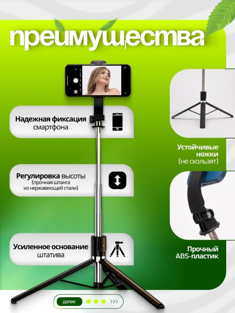
A confiança é fundamental na venda de suportes para celular, especialmente os modelos altos ou ajustáveis. Na terceira imagem, focamos na confiabilidade estrutural.
Separamos visualmente cada vantagem física: suporte firme para smartphone, base reforçada do tripé, mecanismo de ajuste de altura e componentes duráveis em plástico ABS. As fotos em close-up ajudam os usuários a ver a qualidade do material e os detalhes de construção que muitas vezes são difíceis de avaliar online.
O layout segue um percurso de leitura vertical, guiando o olhar naturalmente de cima para baixo. Cada benefício é acompanhado de uma explicação concisa, reforçando que o produto não é apenas flexível, mas também estável e seguro para smartphones caros.
Esta imagem tranquiliza os compradores, garantindo que o suporte não irá oscilar, tombar ou danificar o dispositivo.
Imagem 4: Inclusão de brindes — aumentando o valor percebido
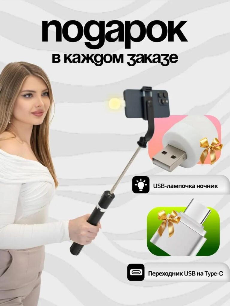
A quarta imagem apresenta os acessórios bônus incluídos em cada pedido, como uma lâmpada USB e um adaptador USB para Tipo-C. Do ponto de vista do design, esta imagem não se concentra nas funcionalidades, mas sim na percepção de valor.
Optamos por usar um fundo mais suave e uma composição que retratasse o cotidiano da modelo para adicionar apelo emocional. Os ícones de presente e os laços gráficos indicam claramente que esses itens não têm custo adicional, desencadeando uma resposta psicológica positiva.
Essa imagem ajuda a reduzir a hesitação na compra, tornando a oferta mais atraente. Ela também diferencia o anúncio de produtos similares que não incluem acessórios, mesmo que o preço base seja parecido.
Imagem 5: Cenários de uso 3 em 1 — Versatilidade em um só olhar
Esta imagem explica visualmente os três principais modos de uso: tripé de chão, bastão de selfie e suporte de mesa. Em vez de descrever esses modos em texto, mostramos as duas imagens lado a lado para tornar a transformação imediatamente compreensível.
Usamos enquadramento e espaçamento consistentes para manter a composição limpa. Cada modo é claramente identificado, garantindo que os compradores entendam imediatamente como o produto se adapta a diferentes ambientes — casa, viagens, trabalho ou criação de conteúdo.
Essa imagem é especialmente eficaz para usuários que precisam de um único dispositivo para múltiplas finalidades, reforçando a ideia de que não precisam comprar acessórios separadamente.
Imagem 6: Flexibilidade de ângulo e rotação — Controle criativo
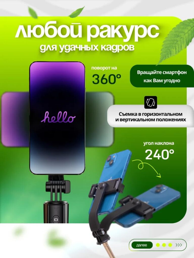
A sexta imagem foca no movimento e na capacidade de ajuste, duas características difíceis de transmitir apenas com palavras.
Ao demonstrar visualmente a rotação de 360° e o ângulo de inclinação de 240°, permitimos que os usuários imaginem como enquadrar as fotos tanto na vertical quanto na horizontal. Setas e indicadores de movimento guiam a compreensão do usuário sem sobrecarregar o design.
Essa imagem atrai bastante vloggers, streamers e usuários de redes sociais que precisam de ângulos de câmera flexíveis. Ela reforça o papel do produto como uma ferramenta criativa, e não apenas como um suporte básico.
Imagem 7: Portabilidade — Projetado para uso diário
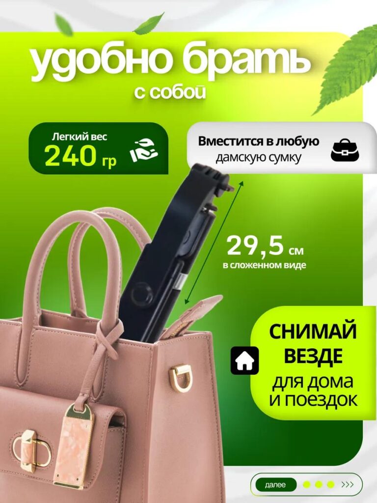
A portabilidade muitas vezes determina se um suporte para celular se tornará parte da rotina diária do usuário. Nesta imagem, mostramos o produto dobrado e dentro de uma bolsa para confirmar visualmente seu tamanho compacto.
Medidas claras e indicadores de peso comunicam que o suporte é leve e fácil de transportar. Em vez de afirmações abstratas, usamos um contexto do mundo real que faz sentido imediatamente.
Essa imagem reduz o atrito para compradores que viajam com frequência ou que desejam um suporte que possam levar para qualquer lugar sem inconvenientes.
Imagem 8: Guia de Emparelhamento Bluetooth — Reduzindo o Atrito Pós-Compra
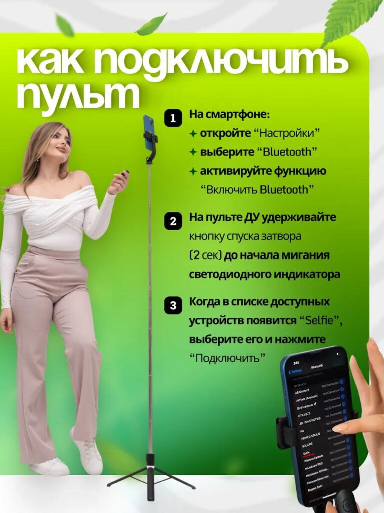
A imagem final tem um propósito didático. Incluímos um guia simples, passo a passo, de emparelhamento Bluetooth para evitar qualquer confusão após a compra.
Do ponto de vista do design, esta imagem transmite confiança. Ela tranquiliza os usuários, mostrando que a configuração é rápida e fácil, mesmo para clientes sem conhecimento técnico. A numeração visual e o texto minimalista mantêm o processo claro e acessível.
Ao abordar a usabilidade desde o início, esta imagem ajuda a reduzir devoluções, avaliações negativas e solicitações de suporte ao cliente — um aspecto crucial, porém frequentemente negligenciado, do design de alta qualidade de um marketplace.
Estratégia de design geral: por que este conjunto de imagens funciona no Ozon
O design da imagem principal segue três princípios fundamentais:
- Clareza antes da criatividade
Cada imagem responde a uma pergunta específica do cliente. Nenhum elemento visual é meramente decorativo e sem propósito. - Legibilidade otimizada para dispositivos móveis
Texto grande, alto contraste e layouts estruturados garantem clareza mesmo em telas pequenas. - Narrativa progressiva
A sequência de imagens guia os usuários desde a visão geral do produto, passando pela compreensão dos recursos, até a confiança no uso.
Ao combinar precisão técnica com simplicidade visual, este design transforma um produto funcional em uma decisão fácil para o comprador.
Considerações finais
Eficaz Ozônio O design da imagem principal não se resume a adicionar mais texto ou gráficos chamativos — trata-se de comunicação visual estratégica. Para este suporte de celular, utilizamos uma estrutura narrativa clara, um estilo consistente e layouts focados nas funcionalidades para maximizar a confiança e a conversão.
Essa abordagem reflete a mesma metodologia que aplicamos em plataformas de comércio eletrônico transfronteiriço: primeiro, entender o comportamento do usuário e, em seguida, criar elementos visuais que eliminem dúvidas e destaquem o valor.
Se você busca melhorar o desempenho do produto por meio de sistemas visuais profissionais e otimizados para cada plataforma, esse é exatamente o tipo de pensamento de design que aplicamos na [nome da empresa/site]. AIRSANG.


Conceber e construir um sítio Web WordPress ou um sítio empresarial com um sistema de comércio eletrónico completo para si.
Faixa de preço: $200.00 a $2,500.00custom-requirements-or-special-quotations
O preço original era: $2.00.$1.00O preço atual é: $1.00. Explicação do design da imagem principal para o dispositivo de fisioterapia doméstica da Amazon
Introdução: Construindo uma imagem confiável para dispositivos de terapia doméstica na Amazon Ao projetar a imagem principal de um dispositivo de terapia doméstica na Amazon, nosso principal...

Design da imagem principal para conversão de batom da Amazon
Introdução: Conceber uma imagem principal de batom que vende na Amazon Quando concebemos uma imagem principal para um batom da Amazon, a nossa responsabilidade vai muito além...

O que faz uma base líquida da Amazon converter a imagem principal?
Introdução: Criar uma imagem principal para a base líquida da Amazon não se resume apenas a deixar o produto bonito. Na Amazon, a imagem principal e...

Como projetar uma imagem principal eficaz para cartuchos de filtro Amazon
Introdução: Criar uma imagem principal para a Amazon nunca se resume apenas a tornar um produto atraente. Trata-se de clareza, confiança e compreensão imediata — especialmente para...

Comparativo de cinco temas WordPress para animais de estimação
Introdução Escolher o tema WordPress certo para o seu negócio de animais de estimação é mais do que uma decisão de design — afeta diretamente a usabilidade, a escalabilidade e o crescimento a longo prazo. Cuidados com animais de estimação e...

Criando um site WordPress escalável para uma marca voltada para a ciência: o projeto AminoUSA
Introdução No cenário digital atual, um website é mais do que um lugar para listar produtos. Para marcas com foco em ciência que atuam em setores regulamentados ou voltados para pesquisa, um...

Construindo uma loja Shopify escalável para uma marca global de lâminas: O Projeto CoolKatana
Introdução No comércio eletrônico internacional, um site Shopify é muito mais do que uma vitrine. Para marcas que atuam em nichos de mercado e categorias culturais específicas, o site precisa fazer muito mais do que...

Criando uma loja Shopify de alta conversão para cartas Pokémon.
Introdução No mundo do comércio eletrônico de itens colecionáveis, especialmente no mercado do Pokémon Trading Card Game (TCG), um site precisa fazer mais do que simplesmente listar produtos...

Design Shopify de alta conversão para uma marca de tijolos personalizada.
Introdução No cenário competitivo do comércio eletrônico atual, especialmente no segmento de presentes personalizados e itens colecionáveis, um site Shopify precisa fazer muito mais do que simplesmente exibir produtos. Ele...

Estudo de caso de design de website Shopify para uma marca de flores premium
Introdução No cenário competitivo do comércio eletrônico atual, um site Shopify precisa fazer muito mais do que exibir produtos. Ele precisa comunicar o valor da marca instantaneamente, guiar os usuários...

Estudo de Caso de Design da Shopify: Loja de Jogos Retrô
Introdução Em um ambiente de comércio eletrônico altamente competitivo, a clareza visual e a conexão emocional muitas vezes determinam se um visitante se torna um cliente. Isso é especialmente verdadeiro em...

Estudo de Caso de Design da Shopify: Marca de Resgate Tático
Introdução Um site Shopify robusto faz mais do que exibir produtos — ele comunica propósito, constrói confiança e guia os usuários para decisões de compra seguras. Isso é especialmente verdadeiro...

Estudo de caso de design de website Shopify para uma marca de bicicletas elétricas
Introdução No competitivo mercado de bicicletas elétricas atual, um site Shopify precisa fazer mais do que exibir produtos — ele precisa contar uma história, construir confiança e guiar os usuários...

E-commerce escalável no Shopify para uma marca criativa
Introdução: Quando marcas criativas crescem, seus sites muitas vezes têm dificuldade em acompanhar o ritmo. À medida que as linhas de produtos se expandem, o conteúdo aumenta e o tráfego cresce, muitas marcas com foco visual...

Estudo de caso de design de website Shopify para uma marca de decoração de interiores
Introdução No mercado altamente competitivo de decoração de interiores, a identidade visual não se resume mais à estética — ela influencia diretamente a confiança, o comportamento de navegação e as decisões de compra. Para...

Estudo de caso: Construindo um site de assinatura WordPress escalável
Introdução Para as marcas de e-commerce modernas, um website não é mais apenas uma vitrine digital. É o motor que sustenta assinaturas, narrativa de conteúdo, construção de confiança...

Design WordPress de Alta Conversão para Marcas Adultas
Introdução Em mercados de comércio eletrônico altamente competitivos, recursos visuais atraentes por si só não são suficientes. Um site WordPress de sucesso deve guiar os visitantes por uma jornada clara e intencional — uma jornada que...

Site de comércio eletrônico de bonecas sexuais escalável em WordPress
Introdução Lançar um site de comércio eletrônico transfronteiriço de alto desempenho nunca se resume apenas a colocar produtos online. Para marcas que operam em mercados altamente competitivos e visualmente orientados, o site...