


 Japanese
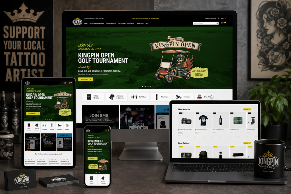
導入
Building a successful tattoo supply website requires more than simply putting products online. It demands a clear structure, intuitive navigation, and a design system that builds trust while guiding users toward purchase decisions. For a brand operating in a highly competitive niche like tattoo equipment, the website must balance professionalism, creativity, and usability.
In this project, we helped transform a tattoo supply business into a structured, conversion-focused WordPress website. From initial setup to refined page design, every step was guided by one goal: creating a seamless shopping experience that reflects the brand’s identity while maximizing usability and performance.
This case study explores how we approached the website construction process, how design and structure work together, and how strategic decisions shaped the final result.
| 配達時間 | カテゴリ | アプリケーションプラットフォーム |
| 9日間 | Tattoo | ワードプレス |
| 関与するデザイナー | 料金 | 効果 |
| ナンシー | $800 | Sales📈297% |
Understanding the Project Goals
Defining the Core Objectives
Before starting the build, we aligned on several key goals:
- Create a professional and trustworthy brand presence
- Organize a large catalog of tattoo products clearly
- Improve navigation for both beginners and professionals
- Optimize the site for conversions without overwhelming users
- Ensure scalability for future product expansion
These goals shaped both the structure of the WordPress build and the visual direction of the design.
Our WordPress Website Construction Approach
Building a Strong Structural Foundation
We approached the project by first establishing a clean and scalable site structure. Instead of focusing on visual elements immediately, we prioritized:
- Logical product categorization
- Clear navigation hierarchy
- Page consistency across the site
- Simplified user journeys
This ensured that every design decision later would sit on top of a solid foundation.
Structuring the Main Pages
We organized the website into several key page types:
ホームページ
The homepage serves as the central hub and first impression. It needed to:
- Highlight core product categories
- Showcase featured and new products
- Reinforce brand identity
- Provide quick access to key sections
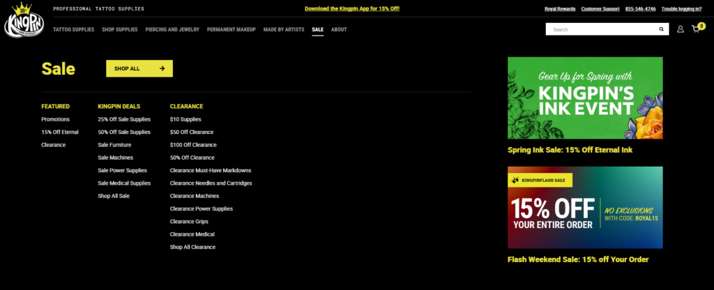
Category Pages
Each category page was designed to:
- Display products in a clean grid layout
- Allow easy browsing and filtering
- Maintain consistent spacing and typography
Product Pages
Product pages focus heavily on conversion:
- Clear product images and details
- Easy-to-scan descriptions
- Trust-building elements like reviews
Supporting Pages
We also structured:
- About page to build brand credibility
- Contact page for accessibility
- Blog section for long-term content strategy
Design Process and Visual Direction
Creating a Clean and Professional Look
In the tattoo industry, visual identity matters. We designed the website to feel:
- Bold but not overwhelming
- Modern and minimal
- Easy to navigate
We avoided clutter and focused on clear layouts that highlight the products.
Typography and Layout Decisions
使用したのは:
- Strong, readable headings for hierarchy
- Clean body text for product descriptions
- Consistent spacing across all sections
This ensures users can quickly scan information without confusion.
Color Strategy
The color palette was carefully chosen to:
- Reflect the tattoo culture’s bold aesthetic
- Maintain readability and contrast
- Support product visibility
Homepage Design Breakdown
ヒーローセクション
The hero section is the first visual users encounter. We designed it to:
- Showcase key products or collections
- Communicate the brand instantly
- Encourage immediate engagement
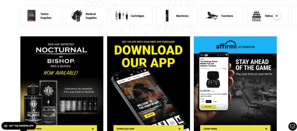
Product Highlights
We included sections for:
- Best sellers
- 新着
- 注目のコレクション
These help guide users toward popular products quickly.
Category Navigation
Clear category blocks allow users to:
- Jump directly to what they need
- Reduce browsing friction
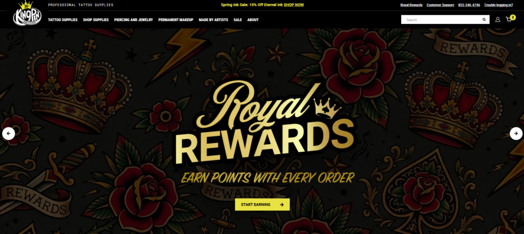
信頼要素
To build credibility, we added:
- 顧客レビュー
- Brand messaging
- Professional imagery
直面した課題
Managing a Large Product Catalog
Tattoo supply stores often have extensive product ranges. The challenge was:
- Avoid overwhelming users
- Maintain clarity across categories
Balancing Style and Usability
Tattoo brands tend to favor strong visuals, but too much design can reduce usability. We needed to:
- Keep the design visually appealing
- Ensure it remains functional
Ensuring Consistency Across Pages
With multiple page types, maintaining consistency was critical:
- Layout uniformity
- Typography consistency
- Design system alignment
当社のソリューション
Simplified Navigation Structure
We implemented a streamlined navigation system:
- Clear menu hierarchy
- Logical category grouping
- 気を散らすものが最小限
モジュラーページデザイン
We used a modular approach:
- Reusable design sections
- Consistent layouts across pages
- Faster updates and scalability
Conversion-Focused Layouts
Every page was designed with conversion in mind:
- 明確な行動喚起
- Strategic product placement
- Reduced friction in user flow
Advantages of Our Approach
ユーザーエクスペリエンスの向上
Users can:
- Find products faster
- Navigate effortlessly
- Understand the brand clearly
Strong Visual Identity
The design reinforces:
- Professionalism
- ブランドの一貫性
- 業界の関連性
Scalability for Growth
The structure allows:
- Easy addition of new products
- Expansion into new categories
- Future design updates
How Design and Structure Work Together
A key part of this project was ensuring that design and structure were not treated separately.
- Structure defines how users move
- Design enhances how users feel
By aligning both, we created a cohesive experience that supports both usability and branding.
結果と影響
Better Navigation and Clarity
Users now experience:
- Faster browsing
- Clearer product organization
- Reduced confusion
Increased Engagement
The improved layout encourages:
- より長いブラウジングセッション
- More product exploration
Stronger Brand Presence
The website now communicates:
- Professionalism
- Trustworthiness
- Industry expertise
Our Methodology in Practice
Step 1: Research and Planning
分析結果:
- Competitor websites
- User behavior expectations
- Industry standards
Step 2: Structure Design
We created:
- Site architecture
- Navigation systems
- Page frameworks
Step 3: Visual Design
We developed:
- Layout systems
- タイポグラフィの階層
- Color consistency
Step 4: Implementation
We built the site on WordPress with:
- Clean structure
- Flexible layouts
- Scalable components
Step 5: Optimization
We refined:
- ユーザーフロー
- Page clarity
- Visual consistency
WordPressが正しい選択だった理由
WordPress provides:
- Flexibility for content and product management
- Easy scalability
- Strong ecosystem for eCommerce integration
For this project, it allowed us to focus on structure and design without unnecessary complexity.
Key Takeaways
- A successful website starts with structure, not visuals
- Clear navigation is essential for large catalogs
- Design should enhance usability, not compete with it
- Consistency across pages builds trust
- Conversion-focused layouts drive better results
結論
このプロジェクトは、思慮深い ワードプレス website construction can transform a tattoo supply business into a professional, scalable, and conversion-driven online store. By focusing on structure first and aligning design with user behavior, we created a site that not only looks strong but performs effectively.
で エアサン, we specialize in building and designing websites that prioritize clarity, user experience, and conversion. Our approach focuses on creating structured, scalable solutions that help brands grow in competitive markets—without relying on complex development or code-heavy processes.


WordPressのウェブサイトや、完全なeコマースシステムを備えたコーポレートサイトをデザイン・構築します。.
価格帯$200.00~$2,500.00custom-requirements-or-special-quotations
元価格は$2.00。.$1.00現在の価格は$1.00。. Amazonホーム理学療法機器のメイン画像デザイン解説
はじめにAmazonで家庭用治療器の信頼できるイメージを構築する Amazonで家庭用治療器のメインイメージをデザインする際、私たちが最も重視するのは...

Amazon リップスティックコンバージョンのメイン画像デザイン
はじめにアマゾンで売れる口紅のメイン画像をデザインする アマゾンの口紅のメイン画像をデザインするとき、私たちの責任は...

ハッカーがWordPress管理者のメールアドレスを盗む方法(そしてそれを阻止する方法)
WordPressの管理者メールアドレスは、あなたが思っている以上に公開されているのです。ハッカーはそれが大好きです。彼らにとって、あなたの...

Amazonのリキッドファンデーションのメイン画像がコンバージョンにつながる理由
はじめに Amazonリキッドファンデーションのメイン画像デザインは、単に商品を美しく見せるだけではありません。Amazonでは、メイン画像と….

フィルターカートリッジの効果的なAmazonメインイメージのデザイン
はじめに Amazonのメイン画像をデザインする上で、商品を魅力的に見せることは決して重要ではありません。明確さ、信頼性、そして瞬時に理解できることが何よりも重要です。特に….

WordPress へのリプレイ攻撃: 本当の脅威か、それとも誇張された神話か?
まず最初に明確にしておきましょう。リプレイ攻撃は見た目には怖くありません。パスワードを破壊したり、緑色のハッカーテキストが飛び交うような悪質なコードを挿入したりもしません。彼らは狡猾なのです…。.

WordPressページを何も壊さずに複製する方法
正直に言って、新しいページを作りたくない時もあるでしょう。同じページを少しだけ変えたいだけなのに。レイアウトもブロックも設定も全部同じ。なぜなら….

ペット向けWordPressテーマ5選を比較
はじめに ペット関連のWordPressテーマを適切に選ぶことは、単なるデザイン上の決定ではありません。使いやすさ、拡張性、そして長期的なビジネスの成長に直接影響します。ペットケアとペット...

5つの水着eコマーステーマを比較
はじめに 水着やランジェリーの独立ストアに適切なテーマを選択することは、見た目だけの問題ではなく、コンバージョン率、拡張性、長期的な効果に直接影響します...

WordPressでコメント機能をオフにする方法(気が狂わずに)
WordPressのコメントについてお話しましょう。理論上は、コメントは素晴らしいものです。議論を促し、コミュニティを築き、ウェブサイトに「活気」を与えてくれます。しかし実際にはどうでしょうか?コメントはしばしば人を惹きつけ….

科学主導のブランドのためのスケーラブルなWordPressウェブサイトの構築:AminoUSAプロジェクト
はじめに 今日のデジタル環境において、ウェブサイトは単なる製品リストを掲載する場所ではありません。規制の厳しい業界や研究重視の業界で事業を展開する科学主導のブランドにとって、ウェブサイトは….

グローバルブレードブランドのためのスケーラブルなShopifyストアの構築:CoolKatanaプロジェクト
はじめに 越境電子商取引において、Shopify の Web サイトは単なる店舗ではありません。ニッチで文化主導のカテゴリーで活動するブランドにとって、Web サイトは単なる店舗以上のものを実現する必要があります...

ポケモンカード向け高コンバージョンShopifyストアの設計
はじめに 収集可能な電子商取引の世界、特にポケモン トレーディング カード ゲーム (TCG) 市場では、Web サイトは単に製品をリストするだけでは不十分です。...

カスタムレンガブランドのための高コンバージョンShopifyデザイン
はじめに 今日の競争の激しいeコマース市場、特にパーソナライズされたギフトやコレクターズアイテムの分野では、Shopifyのウェブサイトは商品を展示する以上の機能を提供する必要があります。それは….

Shopifyサポートへの問い合わせ方法:シンプルでストレスフリーなガイド
Shopifyストアの運営は、混乱するのではなく、ワクワクするものであるべきです。疑問が生じたり、問題が発生して作業が滞ったりした場合でも、Shopifyは状況に応じて複数のサポートパスをご用意しています。.

Shopifyストアを非アクティブ化する方法:分かりやすく実践的なガイド
Shopifyストアの無効化はそれほど複雑ではありませんが、多くのマーチャントが見落としている影響があります。このガイドでは、そのプロセスを分かりやすく解説します。.

高級花卉ブランド向けShopifyウェブサイトデザイン事例
はじめに 今日の競争の激しいeコマース市場において、Shopifyのウェブサイトは商品を表示する以上の機能を提供する必要があります。ブランド価値を瞬時に伝え、ユーザーを誘導する必要があります….

Shopifyデザインケーススタディ:レトロゲームストア
はじめに 競争の激しいeコマース環境では、視覚的な明瞭さと感情的な繋がりが、訪問者が顧客になるかどうかを左右することがよくあります。これは特に….